
Salesforce Reports allow organizations to drive more revenue with data-based decision-making.
You can use Salesforce Reports & Dashboards to chart the productivity of your company, understand how employees are utilizing sales tactics, and adjust selling strategies to hit quotas.
In this article, we’ll review everything you need to know about joined reports in Salesforce, including what they are, how to use them, and common use cases.
Salesforce report blockers holding you back? Sync live Salesforce data into Google Sheets, build any report you need, and share with your stakeholders for free (no extra Salesforce license needed).
Salesforce Report Types
Before we dive into joined reports, let’s review the different report types in Salesforce CRM. There are primarily four report types which we’ve outlined below.
Tabular Reports
Tabular Reports, often called Tables, are a basic list of data. There are no groupings, and this is an ideal option when it comes to exporting data for manipulation in Google Sheets.
Tabular reports are often used as a starting point for data to be cleansed and uploaded via other tools such as Data Loader. However, the Data Loader is often limited and prone to error, which is why many users leverage a dedicated Google Sheets Salesforce connector instead.
Tabular report formats are also ideal for “top ten” lists of Accounts (or other object records). Some examples of these reports would include Accounts at High Risk, Highest Grossing Opportunities, or Contracts Up for Renewals.
Summary Reports
Summary Reports are one of the most popular report types, based on their flexibility and visualization capabilities, such as charts and graphs. In a Summary Report, data is grouped by a common field, such as Account Name, or Opportunity Owner. The visualizations available for summary reports include, but are not limited to, funnels, pie graphs, and bar graphs.
Matrix Reports
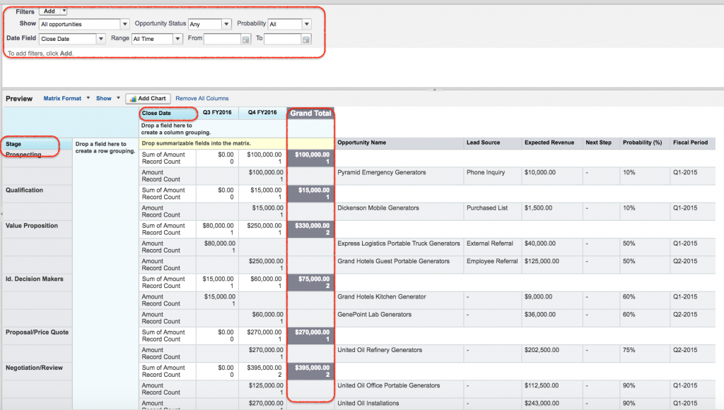
Matrix Reports are more complex than tabular or summary reports and are best used for financial or complicated numerical data. You can group both by rows and columns and see it in more of a “matrix” pattern.
Examples of matrix reports include Closed Opportunities per Sales Rep, per month, or year over year data for the past five years on the value of top accounts. And now, we get to the main event: Salesforce Joined Reports!
Joined Reports
A joined report is a Salesforce report that allows you to show data that share a relationship with one or more objects.
Joined reports are often used when objects are not in parent-child relationships, such as Accounts and Opportunities.
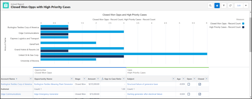
Here’s an example. A joined report might show relationships between Opportunities and Cases, since they share a relationship with Accounts.
This differs from the Tabular, Summary, and Matrix report type in that it’s a unified display of different reports.
Examples of Joined Reports in Salesforce
There are many examples of joined reports functionality that you can take advantage of to build out your analytics, such as:
- Opportunities with High Priority Cases Ratios (seen in tutorial below)
- Support Reps Scorecard
- Pipeline Predictor by Sales Rep Success
- Any custom object + Accounts
- Top Accounts with Open Cases
As long as a relationship exists with a common object, you can build a joined report in Salesforce.
Step-by-Step Walkthrough: Joined Reports in Salesforce
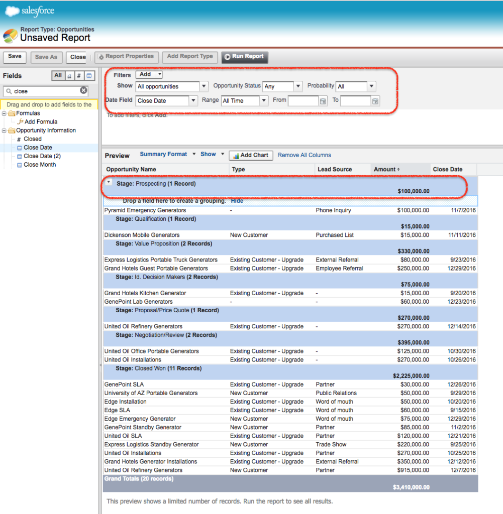
Let’s say you want to see a connection between Closed Won Opportunities and how many high priority Cases there are for that Account. This will help you gauge if there is a correlation between deal size and customer issues.
To do this, we must create a joined report that shows a ratio between Closed Won Opportunities and High Priority Cases.
Here’s a step-by-step guide on how to set the joined report up:
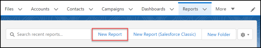
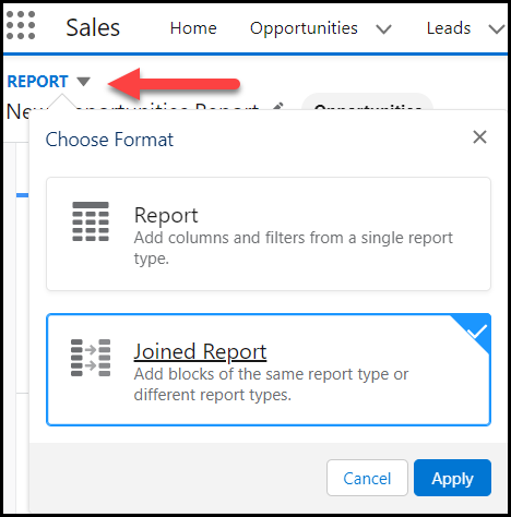
- Navigate to the Reports tab and select New Report.
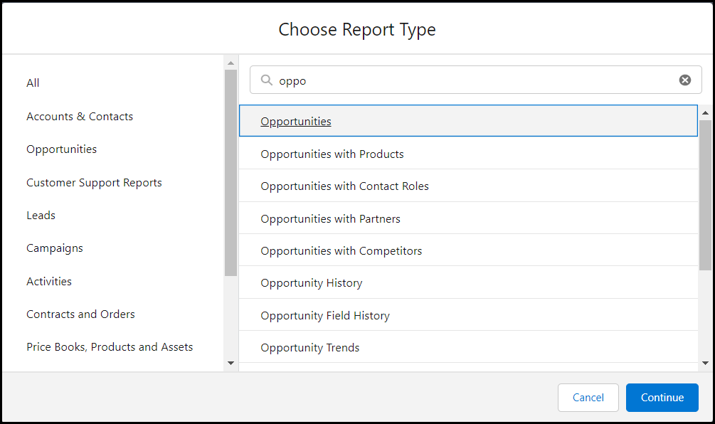
- Choose your primary report type. In this example, we chose Opportunities. Select Continue.
- After the report is generated, choose the drop down beside Report and choose Joined Report. Select Apply.
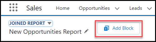
5. Select Add Block in order to add your second report type.
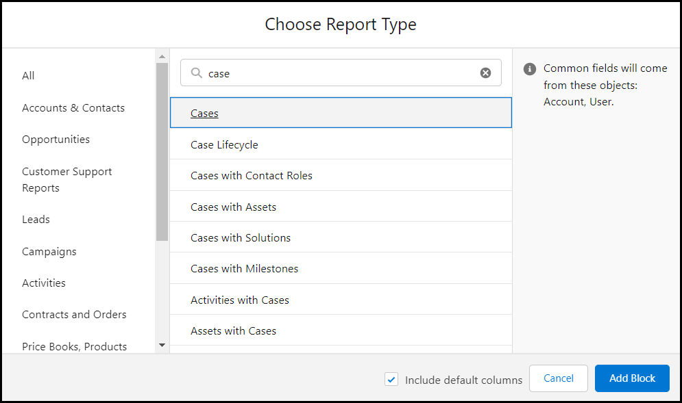
6. Choose your second report type. In our example, we chose Cases. Select Add Block.
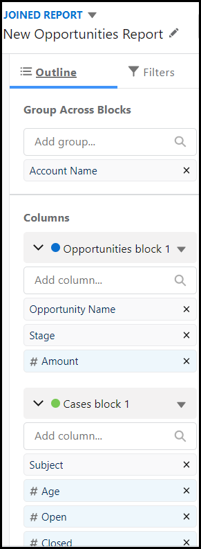
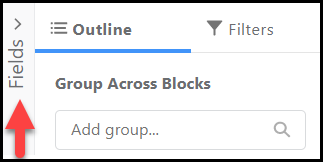
7. Adjust your columns by ensuring the Outline tab is selected. Add columns under the appropriate block based on your objects.
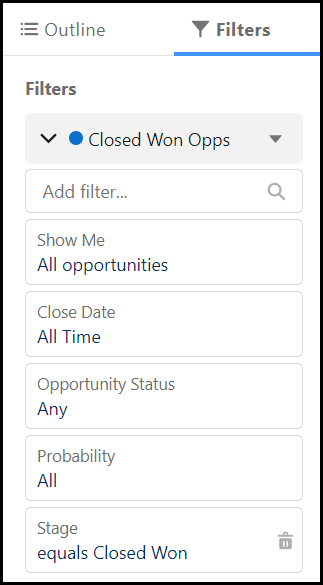
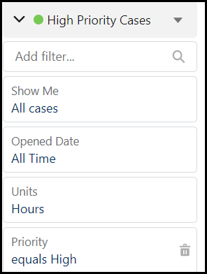
8. Select the Filters tab to reduce the results in the report and focus the data. We added a report filter for Stage under the Opportunities block and a filter for case priority under the Case block.
Don’t forget to Save & Run.
Congrats – You’ve built a Joined Report in Salesforce! But don’t stop there – you can still make additions to your joined report to make it more robust.

Stop exporting data manually. Sync data from your business systems into Google Sheets or Excel with Coefficient and set it on a refresh schedule.
Get Started
Add a Formula to a Salesforce Joined Report
Adding a formula to a joined report in Salesforce can help make the data more useful for analysis.
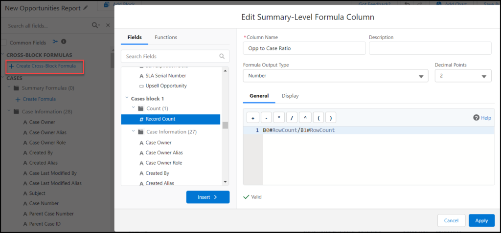
Let’s continue with the example above and build a formula that divides the number of opportunities by the number of high priority cases.
9. Select the Fields expandable menu (vertical, beside Outline).
10. Select Create Cross-Block Formula. Build your formula by selecting and inserting fields into the formula box.
In our example, we want to create a ratio between Opportunities and Cases, so we’ll select the Record Count option from each block. You can validate your formula, and once Valid, can select Apply.
Add a Chart to a Joined Report
Adding a chart to a joined report is a great way to visualize the intersection of your Salesforce data.
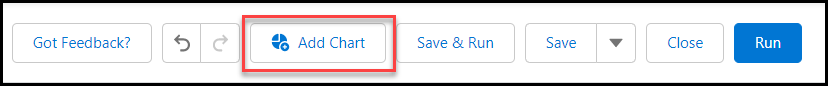
11. Select Add Chart at the top of your report.
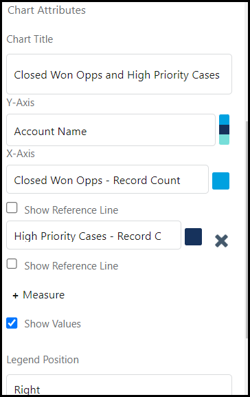
12. Select the wheel in the chart widget to edit Chart Attributes.
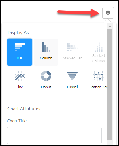
13. Adjust the attributes to fit the image you need to display.
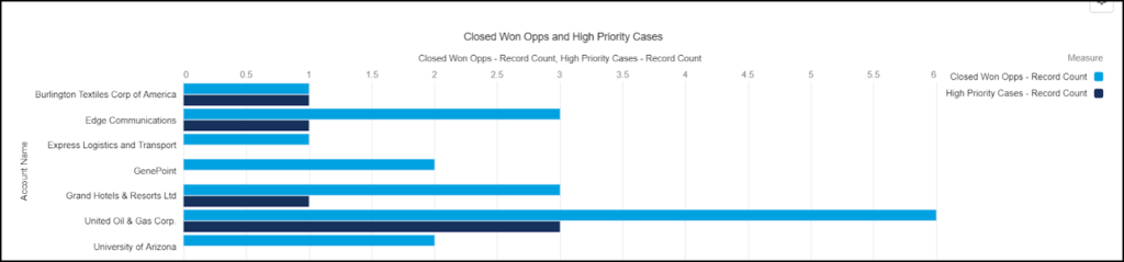
And there you have it! A chart that now complements your Salesforce Joined Report!
Check out Salesforce Emily’s walkthrough on joined reports for a full video tutorial on how to create joined reports:
Video Walkthrough: How to Create a Joined Report in Salesforce
What Permissions Do I Need for a Joined Report?
The two permissions needed in order to create a joined report in Salesforce are:
- Create and Customize Reports
- Report Builder
These permissions are usually included in System Administrator profiles, but can also be given to super users and assigned via permission sets.
Limitations for Joined Reports in Salesforce
Here are some limitations you should consider before you leverage joined reports in Salesforce. Joined reports cannot do the following:
- Add bucket fields
- Add cross filters
- Apply conditional formatting
- Contain five report blocks or less
- Utilize report types such as Account History or Lead History
- subscribe to joined reports
- Certain limitations on dashboard filtering
Joined Reports: Build Multifaceted Data Stories in Salesforce
To summarize, joined reports are a great tool for combining different types of data into a collective visualization to understand a bigger picture of what’s going on in your org.
However, reality is, you will run into reports that can’t be built in Salesforce from time to time, for whatever reason. That’s when the flexibility of spreadsheets come in handy. Tools like Coefficient allow you to sync Salesforce data to your spreadsheet to automate data imports, exports, reports, and notifications without ever leaving your sheet.
Bonus? You can easily blend your Salesforce data with data from your BI tool, DB, payment platform, and other SaaS systems with this one, simple Google Sheets add-on.


