The ability to analyze sales performance at any moment in time is vital for any business.
High-performing sales and revenue leaders rely on this to quickly identify key insights for strategic decision making on a day-to-day basis. However, slicing and dicing data to visualize this information can be complex, time-consuming, manual, and repetitive.
In the attempt to make data-driven decisions, most run into blockers such as:
- Native reporting limitations in SaaS systems
- The need to analyze data that lives in multiple systems
- Manual data refreshes in spreadsheets
- Lack of advanced spreadsheet skills
Fortunately, it’s easy to leverage and blend live data, schedule automations, and use AI in Google Sheets to streamline the entire process!
In this example, we’ll walk through importing live data into Google Sheets and using GPT in Sheets to analyze sales performance by product category, and even break it down further by salesperson, all within Google Sheets.
Watch our video guide below for a quick overview of the sales analysis process with Google Sheets and AI. Use it as a visual aid as you follow the step-by-step guide.
Step-by-Step Example: Product Performance by Salesperson and Revenue Analysis
Coefficient is a free Google Sheets add-on that allows you to connect your business systems to Google Sheets and pull real-time data into your spreadsheet.
It has several powerful AI features that help with a wide range of analyses, like the one we’ll walk through shortly.
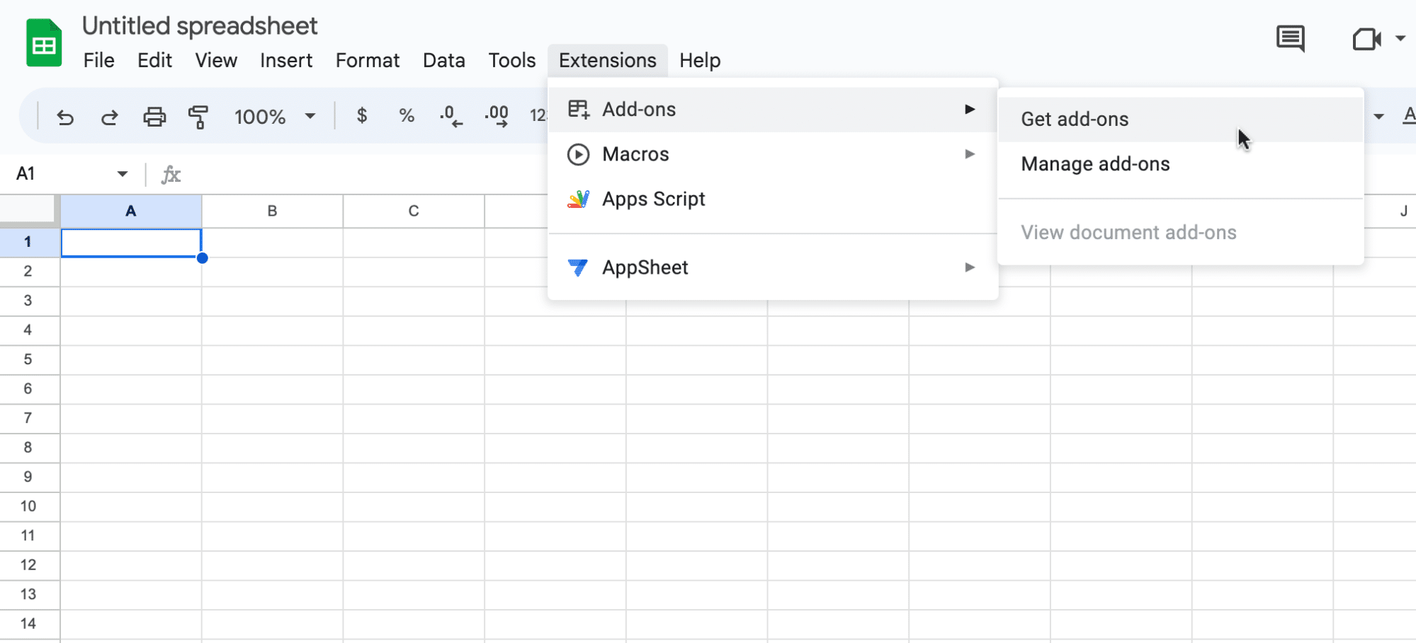
To install Coefficient, open your spreadsheet and click Extensions on the menu bar ‘Add-ons’ -> ‘Get add-ons.’
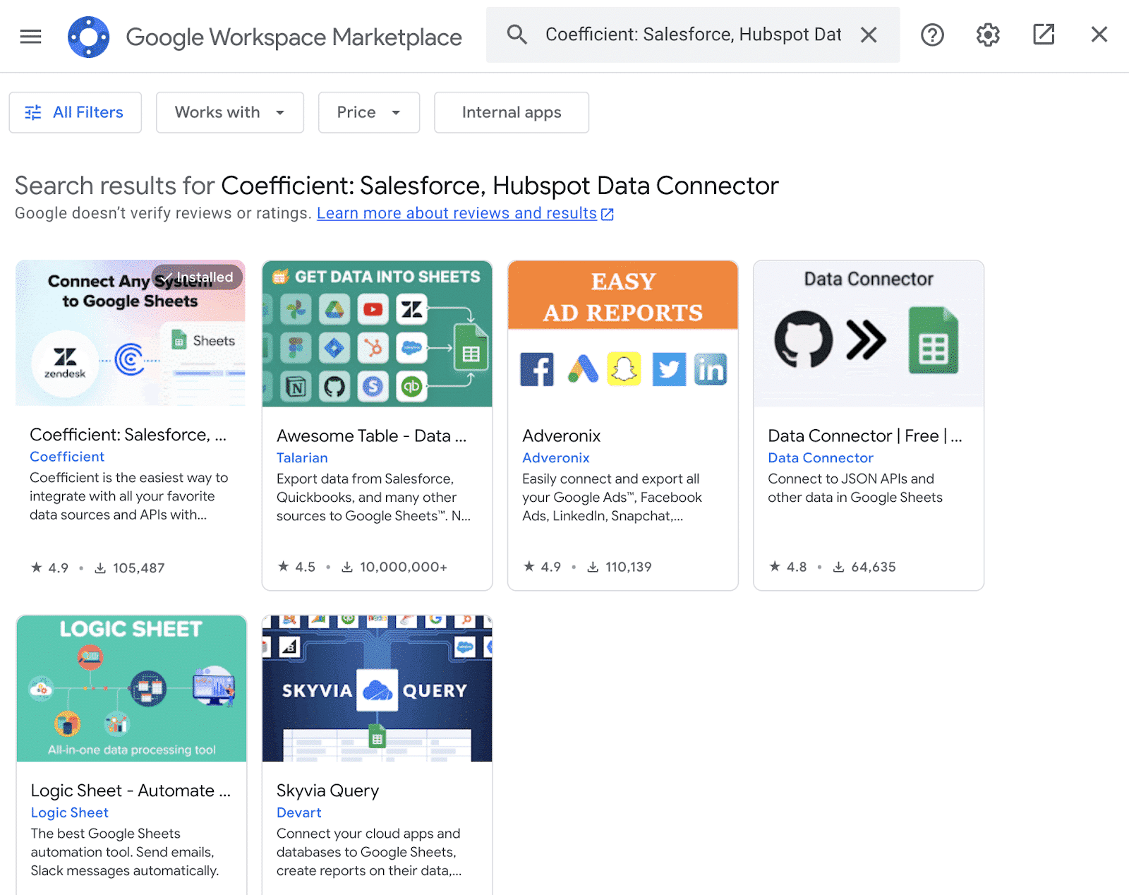
Once the Google Workspace Marketplace launches, search for “Coefficient” and select the Coefficient app.
Press ‘Allow’ to grant Coefficient access to your Google account.

Wait a few moments for the installation to finish, then return to your spreadsheet menu.
Click Extensions -> Coefficient -> Launch.
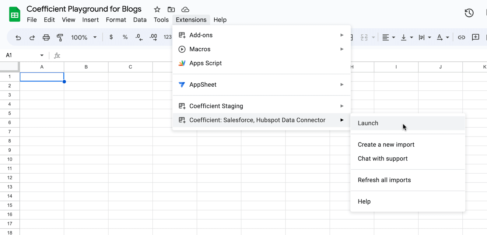
Coefficient will appear on the sidebar of your Google Sheet. Next, we will connect Google Sheets to Snowflake.
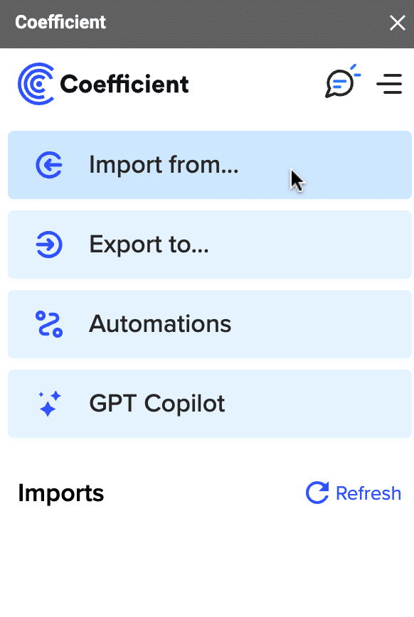
Click ‘Import from…’ on the Coefficient sidebar menu.
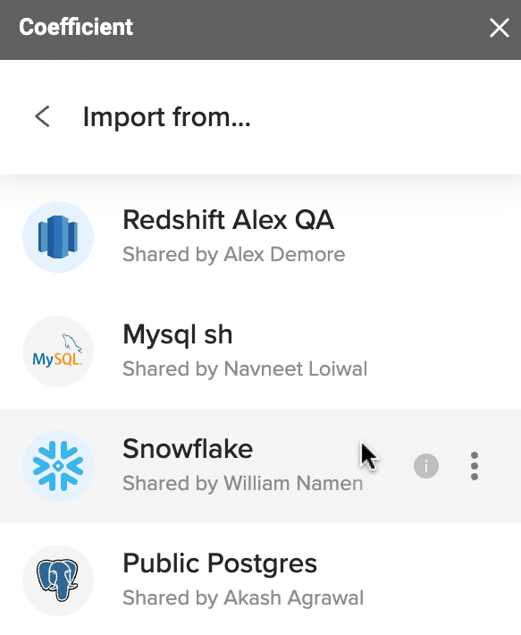
Select ‘Snowflake’ as your data source.
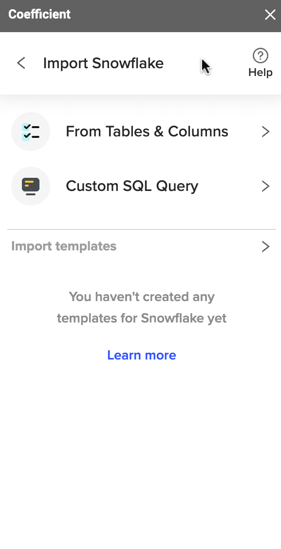
From there, you can choose to import your data from ‘Tables & Columns’ or a Custom SQL Query.
Select the data you need to perform your analysis. In this example, ‘Date,’ ‘Sales Person,’ ‘Product Category,’ and ‘Sales Revenue.’ This data will be imported into a new tab in your spreadsheet.
You’ll have the ability to set this import on automatic refresh in your cadence of choice or refresh manually by clicking on the ‘Refresh’ button in the top row.
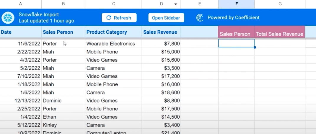
To start the analysis, create a table summarizing the sales revenue by salesperson. This is done using the Coefficient’s Formula Builder to generate the appropriate formulas.
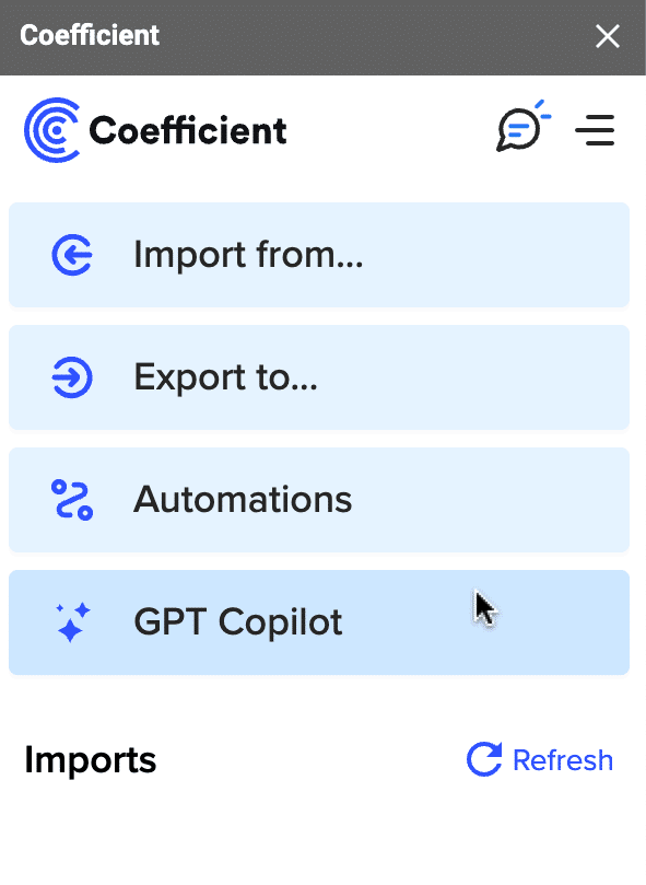
From the Coefficient menu, click ‘GPT Copilot.’
Select ‘Formula Builder.’
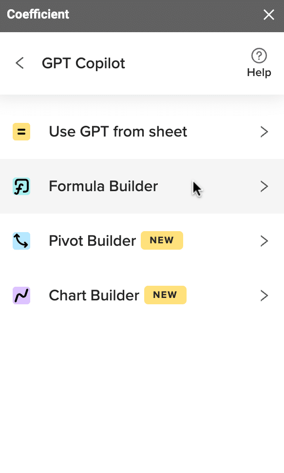
Next, describe the formula you want to build: “Get a unique list of values in B starting at row 3.”
Click ‘Build’ to generate your formula. Copy the formula from the output and paste it into the cell under Sales Person to apply it.

We’ll repeat this process for sales revenue.
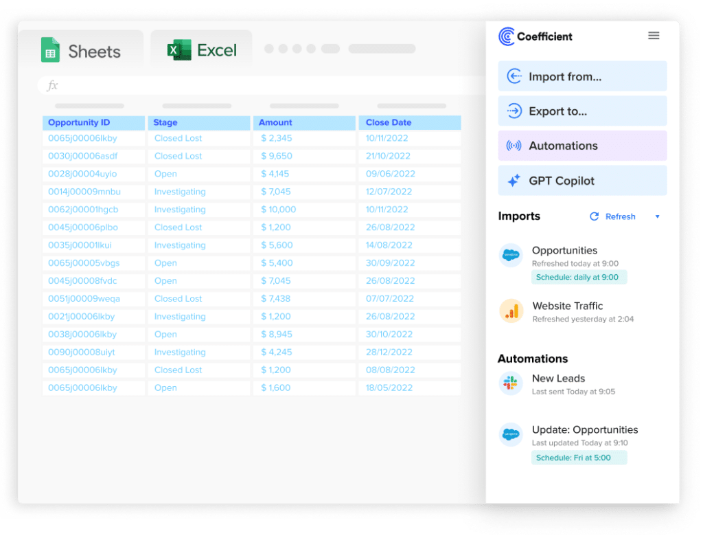
Stop exporting data manually. Sync data from your business systems into Google Sheets or Excel with Coefficient and set it on a refresh schedule.


Copy the formula and paste it into the cell under Sales Revenue.

Quickly format your data by adding dollar signs.
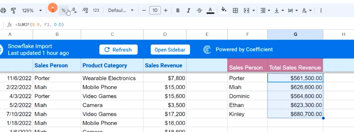
You can also remove decimals.
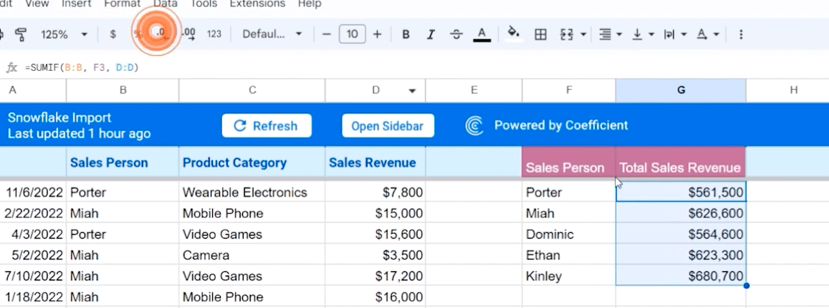
Next, let’s break down the amount of sales by salesperson and product category using the Pivot Builder.
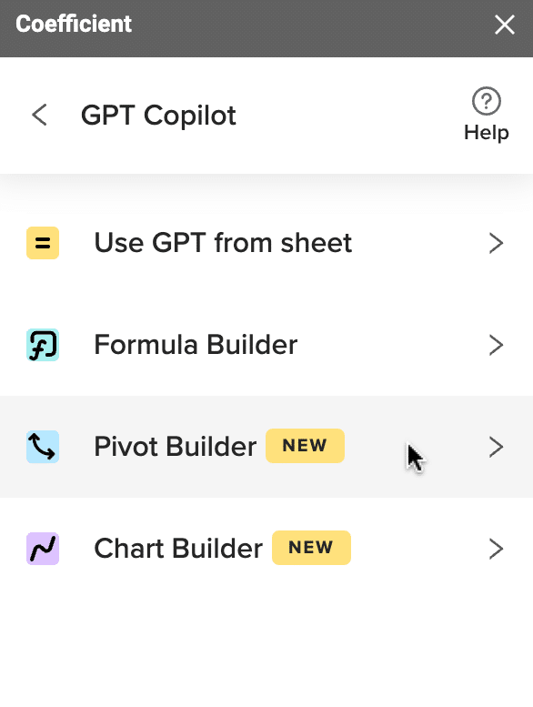
Return to the GPT Copilot menu and click on ‘Pivot Builder.’
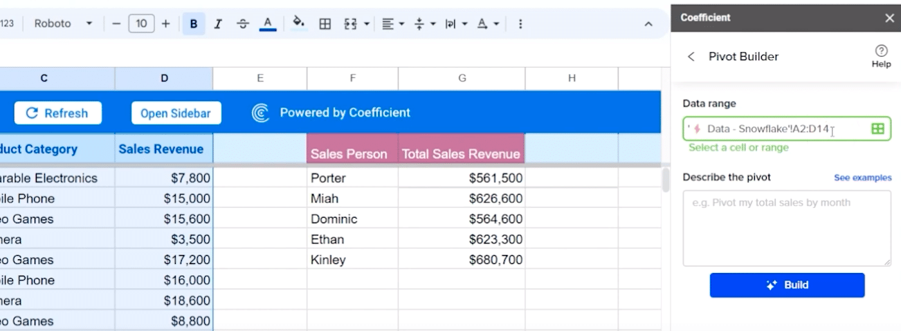
Next, you’ll want to select the range of data you want to use.
Pro tip: Delete the end reference (‘14’), and the Pivot Builder will automatically grab your data!
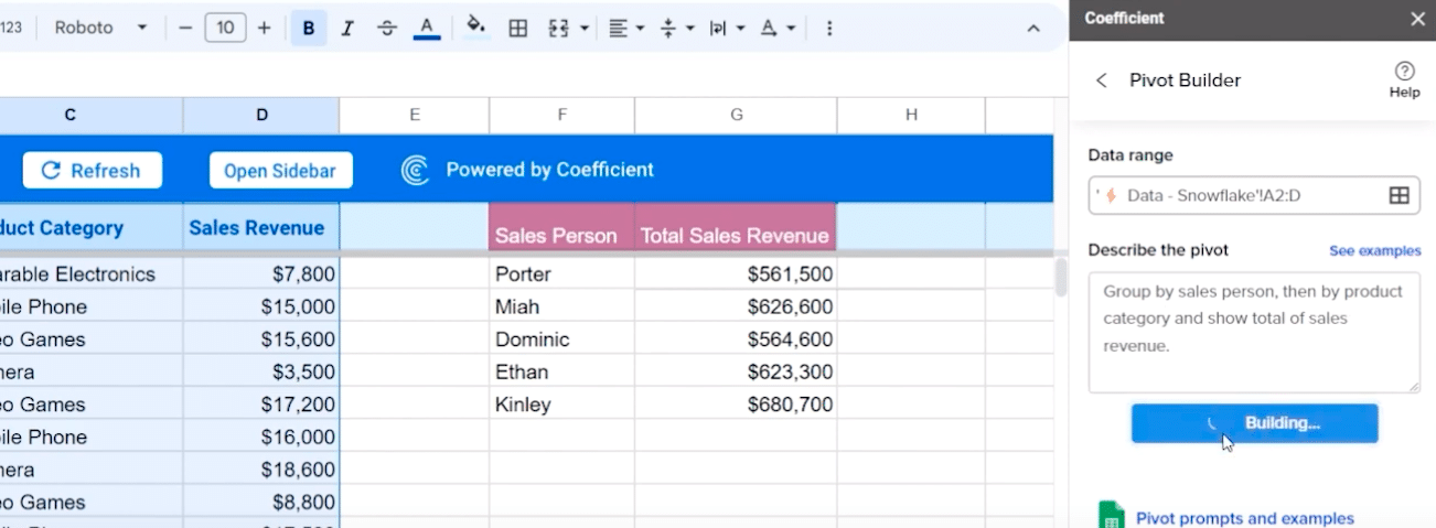
Once your data range is selected, you can describe the pivot you wish to visualize: “Group by salesperson, then by product category, and show total of sales revenue.”
Click ‘Build.’
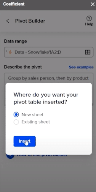
Select where you want to insert your pivot table. In this example, choose to insert your table in a new sheet.
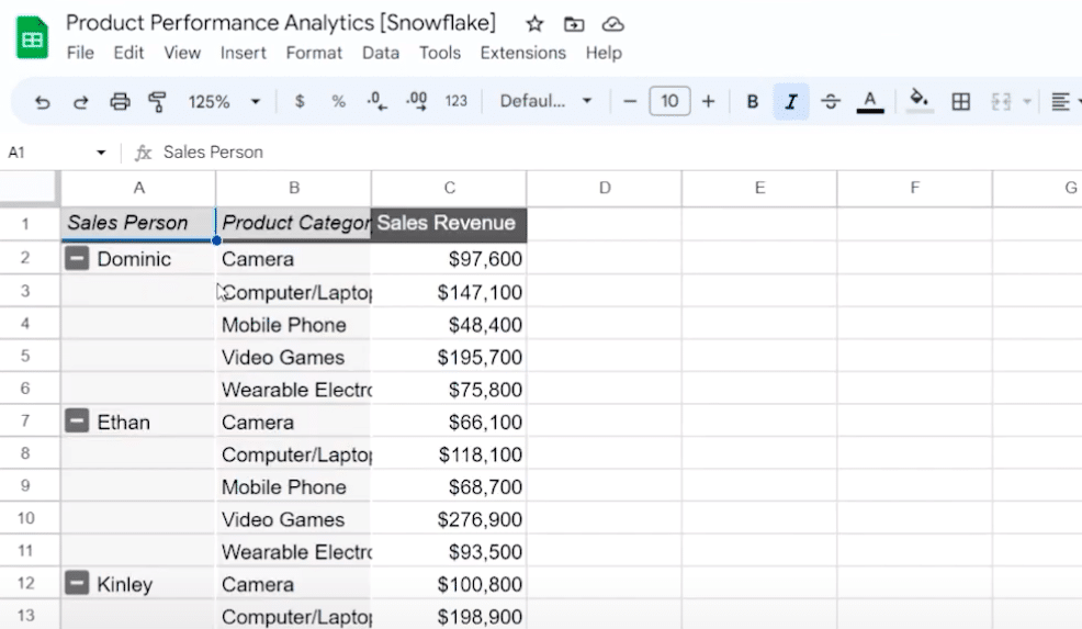
Select the tab, and you’ll see your data organized by Sales Person, Product Category, and Sales Revenue by Product Category.
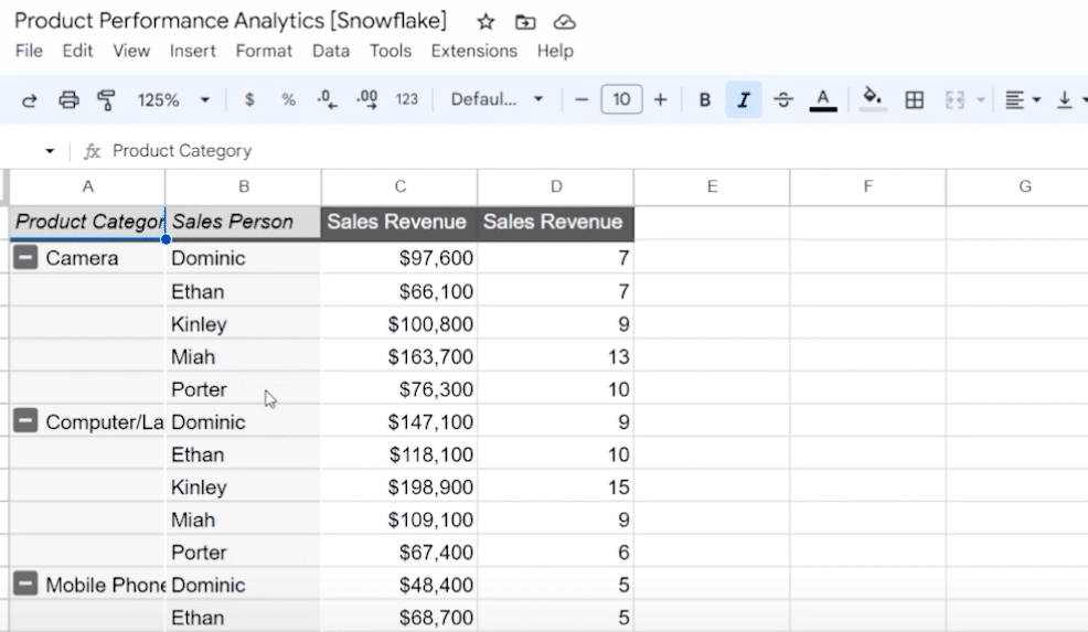
Note: If you wish to see a breakdown of product category first instead of salesperson, simply repeat the same process as before. This time you will modify the prompt to read “Group by product category, then by salesperson, and show the total sales revenue and count of sales revenue.”
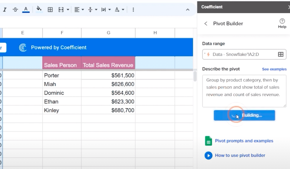
Insert your pivot table into a new sheet once more to see the result.
And just like that, you’ve explored how you can use Coefficient’s GPT Copilot to help build formulas and pivot tables.
Analyze Sales Performance Across Product Lines and More with Coefficient + AI
Coefficient helps bring your sales analysis to the next level by harnessing the power of AI and Google Sheets. Here, we walked through how to analyze sales performance by product category, salesperson, and revenue with ease and efficiency, but this is only one of many use cases.
Get started with Coefficient for free today to learn more!
