
Select your data range (like exam scores)
Go to Insert menu and select “Chart”
In the Chart editor panel that appears on the right, click “Chart type” to see chart options
Choose histogram from the chart type list
Use the Customize tab to make adjustments to your chart
In the digital era, data is gold. Leverage it effectively, and it can power a business forward.
Google Sheets Histogram charts are a popular way to transform data into meaningful insights at a glance.
Whether you’re a seasoned data analyst or a sales professional looking for better ways to interpret monthly figures, this guide will teach you how to create a histogram chart in google sheets.
Let’s dive in.
What is a Histogram Chart?
A histogram chart investigates your data step-by-step and presents it in an easy-to-grasp way. It takes a bunch of numbers and arranges them neatly into groups for easier comprehension.
These groups, or “buckets,” are called intervals or bins that show you how often different values in your data appear.
Imagine you’re tracking your webpage traffic scores. With a Histogram, you can quickly see if most pages score in the middle, if there are a few superstars, or if some need extra help.
In simple terms, a Histogram tells you the story of your data’s distribution.
When Would You Use a Histogram Chart?
Here are some scenarios where Histogram charts shine:
1. Understanding Distributions
If you have a dataset of student test scores, Histograms can show you if most students scored around the same mark or if the scores are spread out widely. This helps educators tailor their teaching methods.
2. Spotting Trends
Businesses use Histograms to analyze customer feedback. Are most customers rating their product satisfaction very high, or is it scattered across the board? Spotting trends helps improve products and services.
3. Quality Control
In manufacturing, Histograms help ensure product consistency. If you’re producing widgets, you want to know if they all meet the same quality standards. Histograms can flag any deviations.
4. Identifying Outliers
Sometimes, you need to find those pesky outliers—data points that don’t fit the norm. Histograms make outliers stand out like a sore thumb, which is crucial for anomaly detection.
How to Build a Histogram Chart in Google Sheets?
In this section, we’ll walk you through the process so you can easily replicate it for your datasets.
Step 1: Prepare Your Data
First, open Google Sheets and make sure your data is ready. Your data should be organized in a single column.
Step 2: Select Your Data
Click and drag to select the data range you want to create a Histogram. In our case, select the exam scores.

Step 3: Insert the Chart
Double-click the “Insert” drop-down menu at the top of your Google Sheets and select “Chart.”

Step 4: Choose Chart Type
The Chart editor panel will appear on the right. Click on “Chart type,” and a list of chart options will appear.

Select “Histogram.”

Step 5: Customize Your Histogram
You’ll see a preview of your Histogram chart. Google Sheets will automatically suggest templates with the number of bins (intervals) based on your data.
You can customize various aspects of your chart, such as the title, gridlines, axis labels, and text color.

Step 6: Finalize Your Chart
Once you’re satisfied with the appearance of your Histogram chart, click “Insert” in the Chart editor panel. Your Histogram chart will appear in your Google Sheets spreadsheet.
Now, you can visually analyze the distribution of your data with ease.

But there are more ways to edit a chart and create a Histogram!
How to Add a Double Histogram Chart to Google Sheets?
Creating a double Histogram in Google Sheets allows you to compare two datasets visually.
Step 1: Prepare Both Datasets
Ensure you have two separate datasets in your Google Sheets filled with numerical and categorical data. Each is organized in its column chart.
Step 2: Select Both Data Ranges
Click and drag to select both data ranges by holding the Ctrl key (Cmd on Mac) and selecting the columns containing your data.

Step 3: Insert the Chart
Go to the “Insert” menu at the top of your Google Sheets and select “Chart.”
Step 4: Choose Chart Type

Supercharge your spreadsheets with GPT-powered AI tools for building formulas, charts, pivots, SQL and more. Simple prompts for automatic generation.

In the Chart editor panel on the right, click on “Chart type.” A list of chart options will appear.
Select the chart title “Histogram.”
Step 5: Customize Your Double Histogram
Your double Histogram chart will appear, showing both datasets side by side. Again, use the Customize tab to make adjustments to your chart.

To make the data analysis part easier with 2 sets of data, use color codes and highlight the differences/ purpose of both charts.
Step 6: Finalize Your Chart Style
Likewise, once you’re satisfied with the chart style of your double Histogram chart, click “Insert” in the Chart editor panel.

Your double Histogram chart will appear in your spreadsheet.
What is the Difference Between a Histogram and Bar Graph?
While both Histograms and Bar Graphs use bars, they serve distinct data visualization purposes.
Histogram Charts:
Histograms are tools for displaying the distribution of continuous data. They break down your data into intervals or bins, grouping ages into ranges.
The height of each bar in a Histogram represents the frequency or count of data points within that interval. Histograms are ideal for showcasing the distribution pattern, such as whether it’s skewed or symmetric.
Bar Graph:
In contrast, bar graphs compare discrete categories. They have two axis titles—the horizontal axis (X-axis) for categories and the vertical axis (Y-axis) for values.
Each bar represents a category, and the height of the bar corresponds to the value. Bar Graphs are better at showing how different categories compare regarding values.
How to Convert a Bar Graph into a Histogram?
Step 1: Create a Bar Graph with Your Data
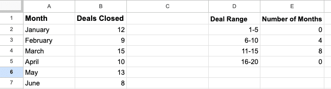
For example, let’s say a sales team is tracking the number of deals they close each month.

The categories on the X-axis should represent intervals instead of discrete categories.
Step 2: Convert the Data for a Histogram
Create bins for your deal ranges in column D (e.g., 1-5, 6-10, 11-15, 16-20).
Next, count the number of months that fall into each deal range and record it in column E.
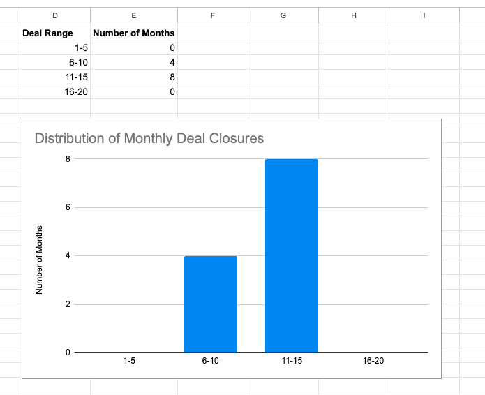
Step 3: Create your Histogram
Highlight the range in columns D and E > Insert > Chart.

Your histogram will automatically populate your spreadsheet.

Step 3: Customize Your Histogram
For example, you can remove category labels, adjust bar colors, and more!
Unlocking Insights with Histograms in Google Sheets
Data visualization goes beyond crafting charts—it’s about narrating stories, unveiling patterns, and steering data-driven decisions. Histograms offer a snapshot of deep insights from your data.
But that’s only scratching the surface of what’s possible in Google Sheets.
Install Coefficient for free today to learn how it can transform how you analyze and visualize data.


