
Waterfall charts are indispensable in business analytics for visualizing sequential financial changes. Particularly for B2B SaaS companies, they provide clarity on complex data like revenue streams, expenses, and customer metrics.
This guide will walk you through creating a waterfall chart in Google Sheets, using business operations data as an example.
Understanding Waterfall Charts
Fundamentals of Waterfall Charts
Waterfall charts are a type of data visualization that helps demonstrate how a value is affected by a series of positive and negative changes.
These charts are typically used for displaying the cumulative effects of different items, such as financial gains and losses or budget changes over time.
In Google Sheets, you can create a waterfall chart by setting up your data in a specific format and selecting the appropriate chart type.
The basic structure of a waterfall chart consists of:
- A starting point (initial value)
- A series of increases and decreases (changes)
- An ending point (final value)
When setting up your data in Google Sheets, follow these steps:
- Use the first column to list the categories or points in time (e.g., quarters or months)
- Use the second column to enter the numeric data corresponding to each category (positive or negative values)
Note: It is essential to have the starting and ending values in your data set.
Interpretation of Waterfall Charts
Interpreting a waterfall chart involves understanding the relationships between the starting value, the individual changes, and the end value.
Each bar on the chart represents a change, with positive values displayed as rising bars and negative values as falling bars. The chart is meant to provide a clear, easy-to-read visual representation of how multiple changes accumulate over time.
Some key points to remember while interpreting a waterfall chart include:
- Positive changes are represented by rising bars, while negative changes are represented by falling bars.
- The sequence of bars is crucial, as it shows the progression of changes over time or across categories.
- The ending point represents the cumulative effect of all changes applied to the starting point.
Creating Waterfall Charts in Google Sheets
Getting Started
Before creating a waterfall chart, it’s essential to have your data organized in a way that makes sense for this chart type.
Typically, you’ll have a starting value, followed by a series of positive or negative incremental values, and finally, an ending value that represents the sum of all previous values.
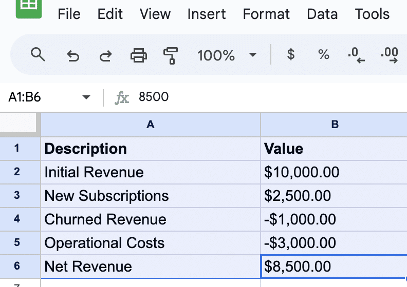
Here’s an example of how your data might look in Google Sheets:

Step-By-Step Creation
Once your data is ready, follow these steps to create a waterfall chart in Google Sheets:

Supercharge your spreadsheets with GPT-powered AI tools for building formulas, charts, pivots, SQL and more. Simple prompts for automatic generation.

- Select your data: Click and drag to highlight the data you want to include in your chart. Make sure to include both the descriptions and the values.
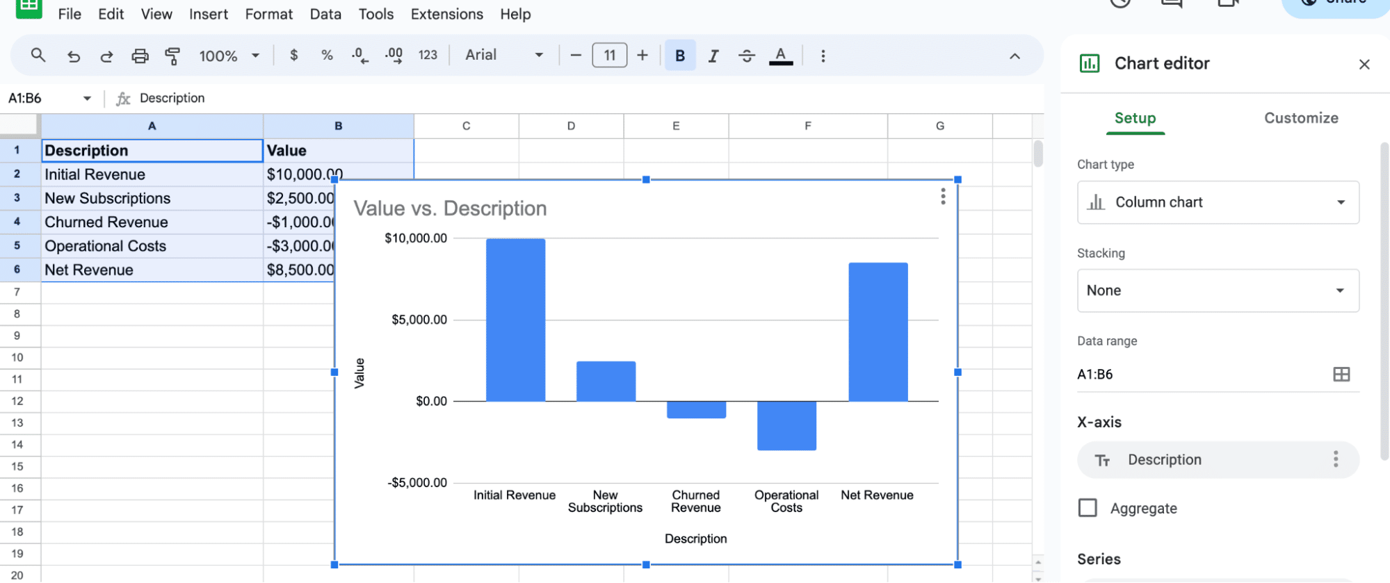
2. Insert a chart: With your data selected, go to the top menu, and click on “Insert” > “Chart.” This will open the Chart editor in the right sidebar.
3. Choose the Waterfall chart type: In the Chart editor sidebar, under the Setup tab, click on the “Chart type” drop-down box.
Scroll down and select the “Waterfall” chart type under “Other” option.
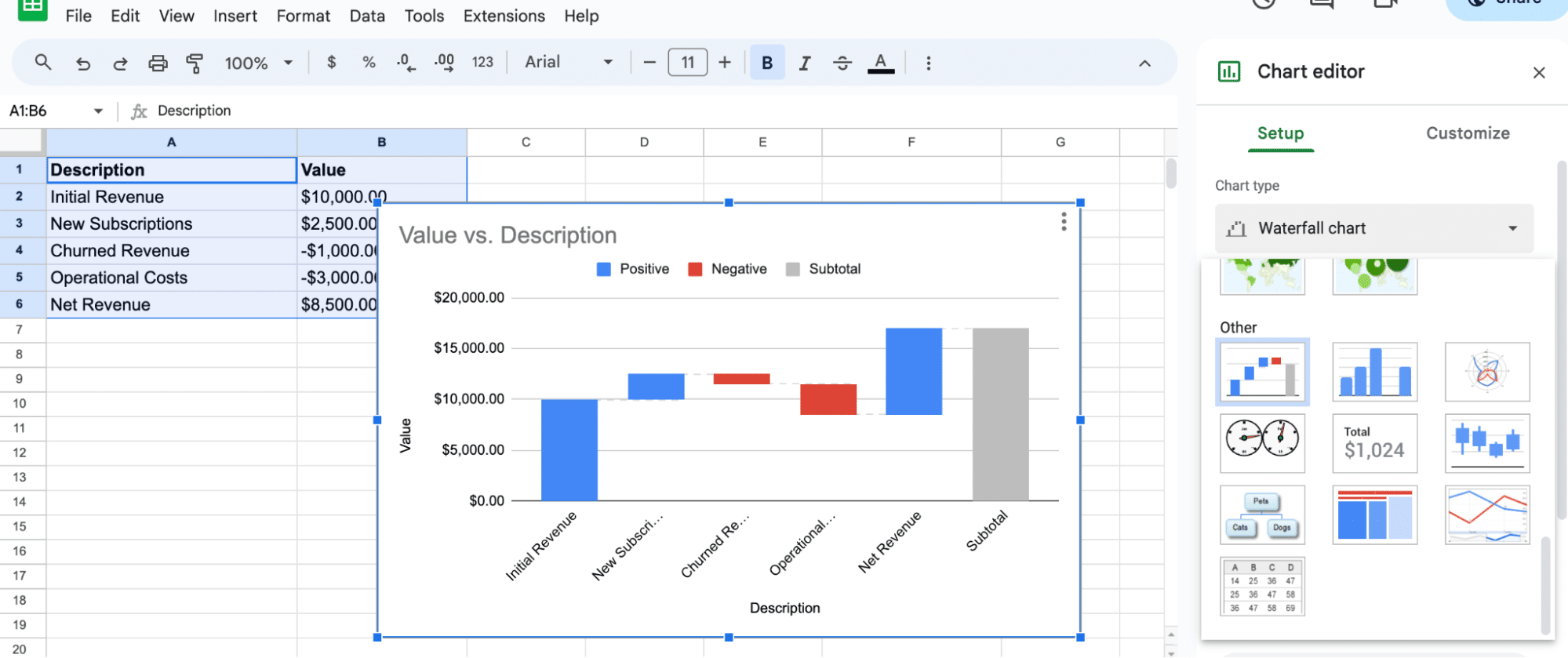
Your chart should now appear in the sheet, visually representing the data you selected.
4. Customize your chart: Navigate to the Chart editor and select the Customize tab.
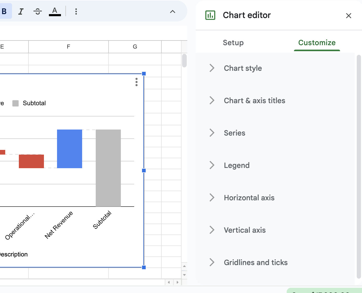
Here, you’ll find several customization options, such as changing the chart title, style, and colors.
Spend some time adjusting the settings according to your preferences.
Conclusion
By following these steps, you should now have a well-structured, visually appealing waterfall chart in Google Sheets. Remember that you can always update your data, and the chart will dynamically adjust to represent these changes.
To further enhance your data analysis, consider integrating live data from business solutions using Coefficient. Get started today for free!


