

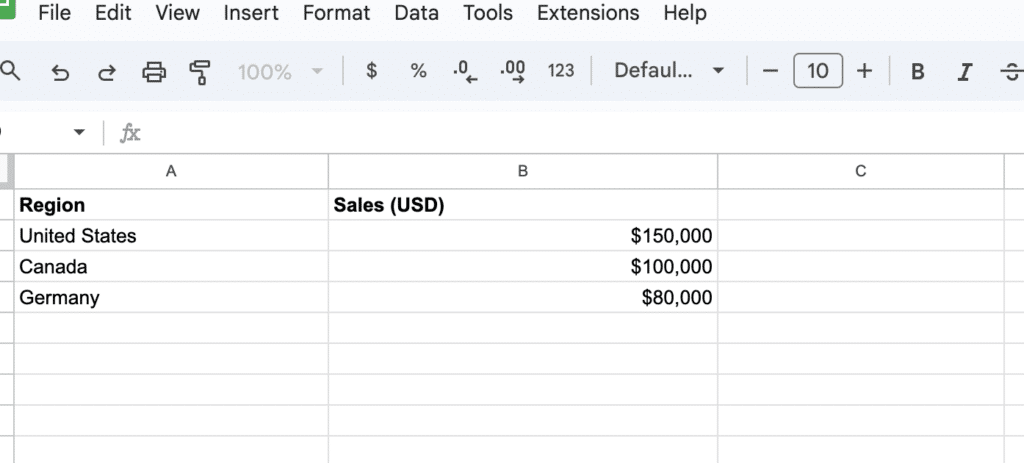
Organize your data in a table format with at least two columns – the first column should contain geographical data (like country, region, or city names), and the second column should contain values (such as population or sales figures)
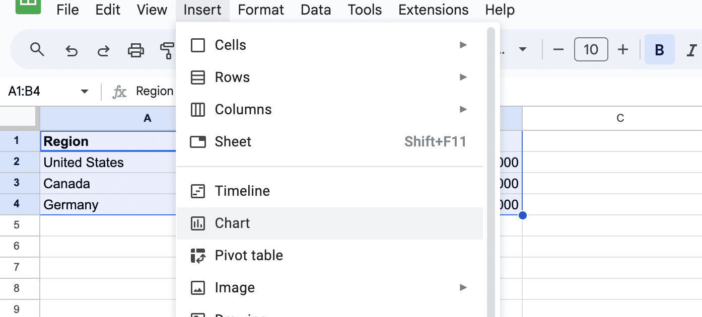
Select your data range and click Insert > Chart from the Google Sheets menu
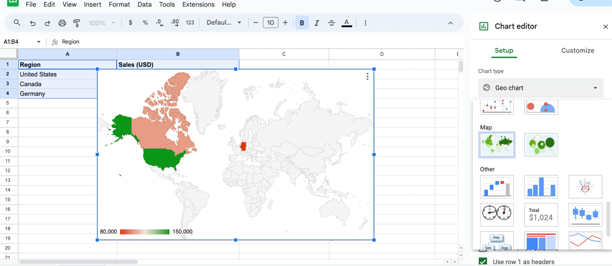
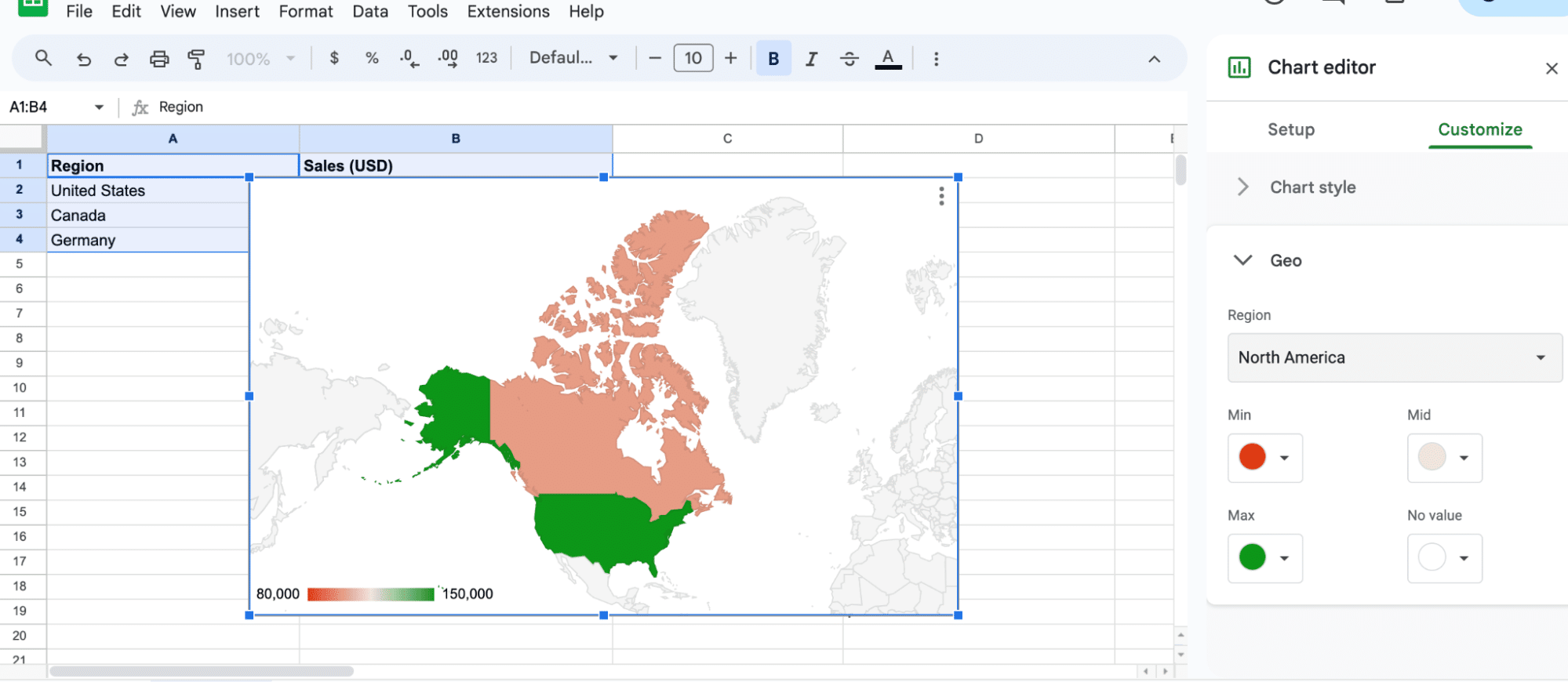
In the Chart Editor panel, click on the Chart type dropdown and select “Geo chart” or “Geo chart with markers”
The map will be generated automatically and displayed on your sheet
Customize the appearance using the Customize tab in the Chart editor panel to adjust chart style, geo regions, and color axis settings
Geo charts in Google Sheets provide a powerful visual representation of geographical data. They allow users to transform data sets into interactive maps with markers, color-coding, and customizable options.
By using geo charts, people can reveal patterns and trends hidden within the data, making it easier to understand and analyze.
In this article, we will walk you through the process of creating and customizing geo charts in Google Sheets. We will demonstrate how to organize data effectively, insert the chart, and make adjustments to enhance the visual aspect and overall functionality of your geo chart.
Understanding Geo Charts
Purpose of Geo Charts
Geo charts are invaluable for visualizing key business metrics across different regions. For instance, they can illustrate regional sales trends, customer density, or market share, providing a quick snapshot of business performance.
Key Components of Geo Charts
There are two main types of geo charts in Google Sheets: Region mode and Markers mode.
- Region mode: This mode colors entire regions, such as countries, provinces, or states. It is useful when you want to highlight data for specific areas.
Example Region mode:
|
Country |
Income |
|---|---|
|
United States |
64500 |
|
Canada |
48500 |
|
Mexico |
18500 |
- Markers mode: In this mode, circular markers are used to display data for specific locations. The marker size is based on the data for each location. Markers mode can be helpful when presenting data for cities or specific points on a map.
Example Markers mode:
|
City |
CO2 (tonnes) |
|---|---|
|
New York |
545000 |
|
Los Angeles 
Free AI-Powered Tools Right Within Your Spreadsheet
Supercharge your spreadsheets with GPT-powered AI tools for building formulas, charts, pivots, SQL and more. Simple prompts for automatic generation.  |
430000 |
|
Chicago |
322000 |
Using Geo Charts in Google Sheets
Data Preparation
Before creating a geo chart, it’s essential to prepare the data accurately. The data should be organized in a table format with at least two columns.
The first column should contain geographical data (like country, region, or city names), and the second column should contain values (such as population or sales figures).
File Name: business-operations-data-table.png
Alt Text: Sample data table showing business metrics for geo chart in Google Sheets.
Creating a Geo Chart
Once the data is prepared, follow these steps to create a geo chart:
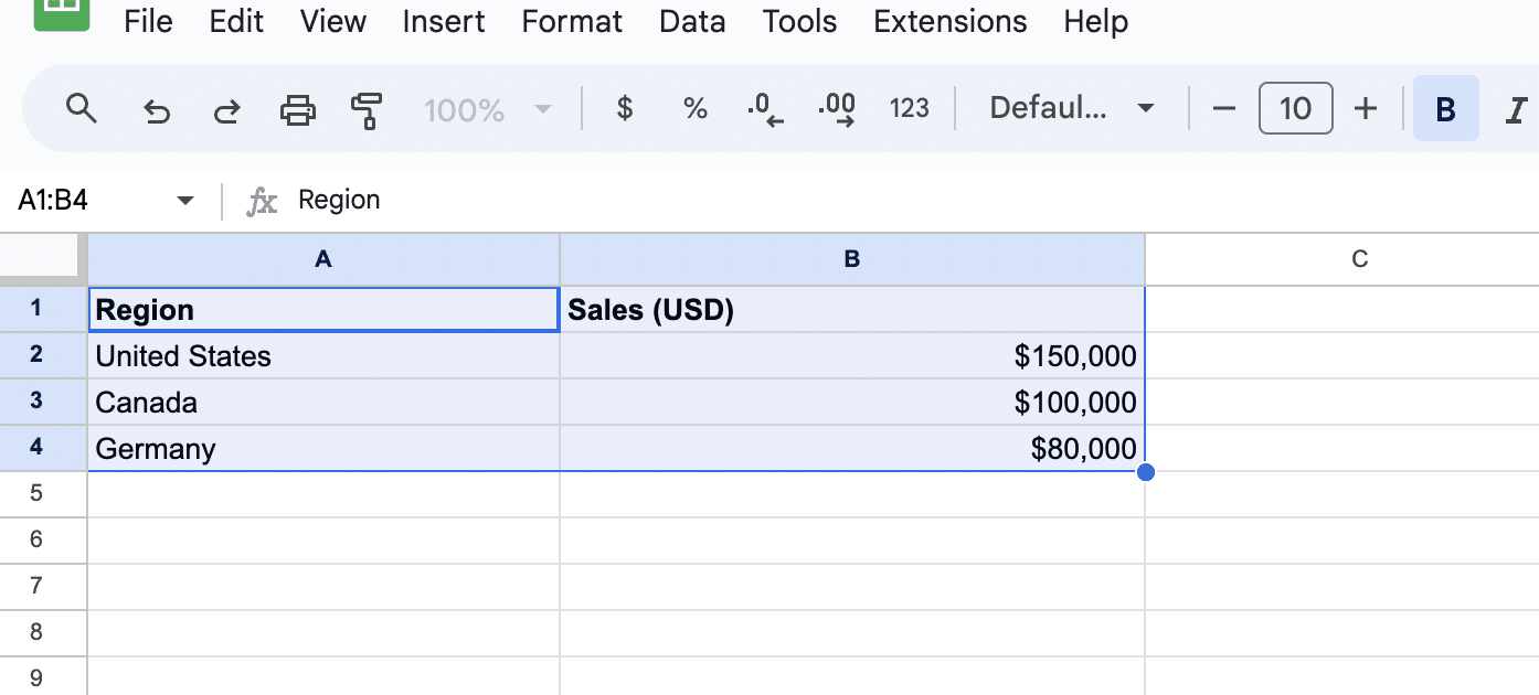
- Select the data range, including column headers.
Click on Insert in the menu, and then select Chart.
By default, Google Sheets might generate a different type of chart.
To change it to a geo chart, click on the Chart type dropdown in the Chart editor panel and select Geo chart or Geo chart with markers. The map will be generated automatically and displayed on your sheet.
Customizing the Geo Chart
To customize the appearance and settings of the geo chart, use the Customize tab in the Chart editor panel. Some available options include:
- Chart Style: Opt for professional color schemes.
- Geo: Focus on regions relevant to your business.
- Color Axis: Set colors to reflect thresholds, like sales targets.
Conclusion
Geo charts in Google Sheets are a powerful tool for visualizing and understanding business data geographically. By following these steps and tips, you can create insightful geo charts tailored to your business needs.
Ready to transform your business data into actionable insights? Install Coefficient now and elevate your data analysis in Google Sheets.


