Ready to transform your data into stunning, intuitive visualizations? Dive into the world of treemap charts in Google Sheets and discover how to create powerful hierarchical displays that will revolutionize your data analysis and presentation skills.
Creating Your First Tree Map Chart
Selecting Your Data: The Building Blocks of Your Tree Map
- Open your Google Sheets document with the prepared data
- Highlight the entire dataset, including headers
- Ensure you’ve selected columns for hierarchy levels and the value to be represented
The Chart Creation Process
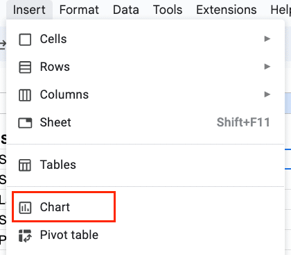
- Click “Insert” in the top menu

- Select “Chart” from the dropdown menu
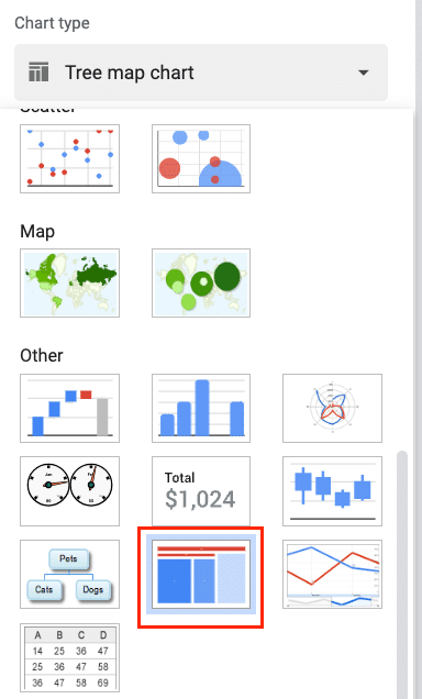
- In the Chart Editor sidebar, click on the chart type dropdown
- Scroll down and select “Treemap” under the “Other” category
Configuration and Settings
Once your tree map is inserted, you’ll need to configure it:
- In the Chart Editor, under “Setup,” verify that your data range is correct
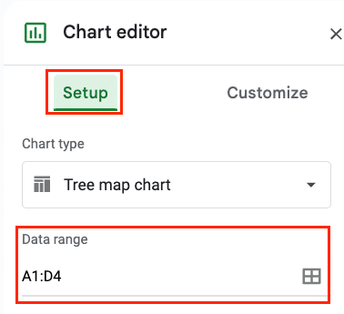
- Set the “ID” to your highest hierarchy level (e.g., Category)

- Set the “Parent” to the next level down (e.g., Subcategory)

- Set the “Size” to your value column (e.g., Sales Amount)

- Optionally, set “Color” to another column if you want to represent an additional variable

Making Your Tree Map Chart Pop
Color Theory for Tree Maps: Beyond the Basics
Effective use of color can enhance your tree map’s impact:
- In the Chart Editor, go to the “Customize” tab
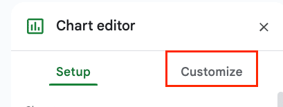
- Under “Chart style,” choose a color palette that fits your data and brand
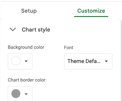
- Consider using a sequential color scheme for continuous data or a categorical scheme for discrete categories
- Ensure sufficient contrast between colors for readability
Pro tip: Use tools like ColorBrewer (colorbrewer2.org) to select color-blind-friendly palettes.
Labels and Tooltips: Telling Your Data Story
Enhance your tree map’s information delivery:
- Under “Series,” customize label font, size, and color
- Enable or disable labels for different hierarchy levels
- Configure tooltips to display additional information on hover
- Use the “Aggregate” option to show total values for parent categories
Layout Mastery: Perfecting Your Tree Map’s Look
Fine-tune your tree map’s appearance:
Stop exporting data manually. Sync data from your business systems into Google Sheets or Excel with Coefficient and set it on a refresh schedule.
Get Started
- Adjust the “Layout” settings to change the overall structure
- Experiment with “Horizontal” vs. “Vertical” orientations
- Modify the “Header font” and “Font size” for better readability
- Add a descriptive chart title and adjust its styling
Make Tree Map Charts in Google Sheets Better with Coefficient
By mastering these techniques and best practices, you’ll be able to create compelling, informative tree map charts that bring your data to life in Google Sheets. Remember, the key to great data visualization is clear communication of insights, so always keep your audience and goals in mind as you craft your tree maps.
Ready to take your data visualization skills to the next level? Explore how Coefficient can supercharge your Google Sheets experience with advanced data integration and real-time updates.

