Are you looking to create visually appealing gauge charts in Google Sheets? This comprehensive guide will walk you through the entire process, from understanding gauge charts to advanced customization techniques. By the end of this tutorial, you’ll be able to create professional-looking gauge charts to enhance your spreadsheets and presentations.
Step-by-Step Guide to Creating a Gauge Chart
Selecting your data
- Highlight the cells containing your data, including the headers.
- Ensure you’ve selected the metric name, value, minimum, and maximum.
Inserting a gauge chart
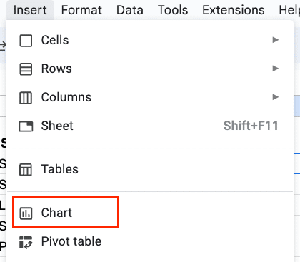
- Click on “Insert” in the top menu.

- Select “Chart” from the dropdown menu.
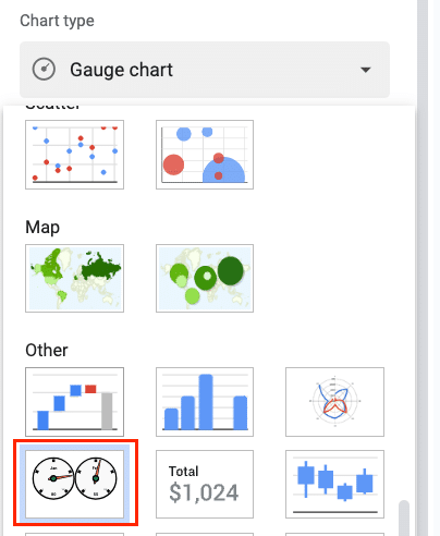
- In the Chart Editor sidebar, click on the “Chart type” dropdown.

- Scroll down to the “Other” section and select “Gauge chart.”
Configuring chart settings
- In the Chart Editor, go to the “Setup” tab.

- Verify that the correct ranges are selected for your data.
- Under “Series,” ensure that your value column is selected.

- Set the “Min value” and “Max value” fields to match your data.

Customizing chart appearance
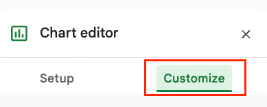
- Switch to the “Customize” tab in the Chart Editor.
- Adjust the following settings to personalize your gauge chart:
- Chart style: Choose between “Standard” or “Gradient” fill
- Color: Select colors for the gauge segments
- Font: Modify the font style, size, and color for labels and values
- Chart axis: Adjust the number of major and minor ticks on the gauge
- Gauge angle: Set the start and end angles for the gauge arc
Advanced Customization Techniques
Adjusting gauge ranges and colors
- In the Chart Editor, go to the “Customize” tab.
- Expand the “Gauge” section.
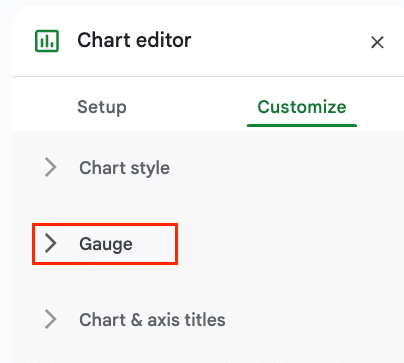
- Set the Gauge range and colour
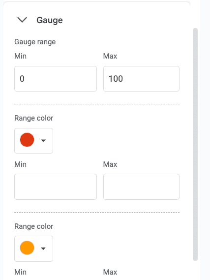
- Set the value for each threshold and choose a color.
- Use these thresholds to create visual benchmarks (e.g., red for low, yellow for medium, green for high).
Adding and formatting chart titles
- In the “Customize” tab, expand the “Chart & axis titles” section.
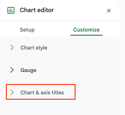
- Enter your desired title in the “Title text” field.

- Adjust the font, size, and color of the title as needed.
- Consider adding a subtitle for additional context or instructions.
Modifying chart size and position
- Click on the chart to select it.
- Use the handles on the corners and edges to resize the chart.
- Click and drag the chart to reposition it within your spreadsheet.
- For precise sizing, right-click the chart and select “Chart Area > Resize Chart Area” to enter exact dimensions.

Examples and Use Cases
Project progress tracking
Create a gauge chart to visualize the percentage of completed tasks in a project:
- Set up your data:
| Metric | Value | Minimum | Maximum |
| Progress | 65 | 0 | 100 |
- Create the gauge chart following the steps outlined earlier.
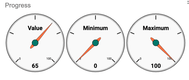
- Customize the chart with color thresholds:
- 0-33: Red (Behind schedule)
- 34-66: Yellow (On track)
- 67-100: Green (Ahead of schedule)

Sales performance dashboard
Design a sales dashboard with multiple gauge charts:
- Set up your data for various sales metrics:
| Metric | Value | Minimum | Maximum |
| Revenue | 850000 | 0 | 1000000 |
| New Customers | 120 | 0 | 200 |
| Customer Satisfaction | 4.2 | 1 | 5 |
- Create individual gauge charts for each metric.
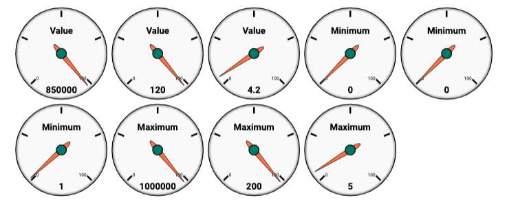
- Arrange the charts in a grid layout on your spreadsheet.
- Add text boxes or shapes to provide context and explanations for each chart.
Resource utilization monitoring
Visualize server resource usage with a set of gauge charts:
- Prepare your data:
| Metric | Value | Minimum | Maximum |
| CPU Usage | 78 | 0 | 100 |
| Memory Usage | 62 | 0 | 100 |
| Disk Usage | 45 | 0 | 100 |
- Create gauge charts for each resource metric.

- Use color thresholds to indicate usage levels:
- 0-60: Green (Normal)
- 61-80: Yellow (Moderate)
- 81-100: Red (High)

- Consider adding data labels to show the exact percentage for each metric.
Understanding Gauge Charts
What is a gauge chart?
A gauge chart, also known as a speedometer chart or dial chart, is a data visualization tool that displays a single value within a predefined range. It resembles a physical gauge or speedometer, with a needle pointing to the current value on a semicircular scale.
Gauge charts are particularly effective for:
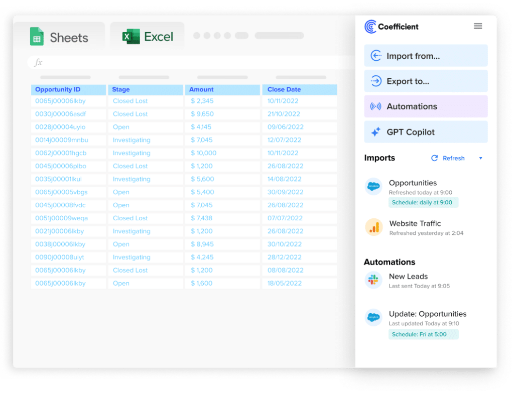
Stop exporting data manually. Sync data from your business systems into Google Sheets or Excel with Coefficient and set it on a refresh schedule.
Get Started
- Showing progress toward a goal
- Displaying key performance indicators (KPIs)
- Visualizing percentages or scores
- Comparing a value to predefined benchmarks
Use cases for gauge charts
Gauge charts can be applied in various scenarios across different industries:
- Sales: Tracking progress towards monthly or quarterly targets
- Project Management: Visualizing project completion rates
- Customer Satisfaction: Displaying Net Promoter Scores (NPS)
- Finance: Showing budget utilization or expense ratios
- Manufacturing: Monitoring production efficiency or quality metrics
- Human Resources: Visualizing employee performance ratings
Advantages of using gauge charts in Google Sheets
- Visual Impact: Gauge charts provide an instant visual representation of data, making it easy for viewers to grasp information quickly.
- Customization: Google Sheets offers extensive customization options for gauge charts, allowing you to tailor the appearance to your specific needs.
- Real-time Updates: When linked to live data, gauge charts in Google Sheets can update automatically, providing up-to-date visualizations.
- Integration: Gauge charts can be easily incorporated into larger dashboards or reports within Google Sheets.
- Accessibility: Google Sheets is a cloud-based tool, making it easy to share and collaborate on gauge charts with team members.
Make Your Gauge Charts Live with Coefficient
By following this comprehensive guide, you now have the knowledge and skills to create impressive gauge charts in Google Sheets. Remember to practice and experiment with different customization options to find the perfect design for your specific needs.
Ready to take your data visualization to the next level? Try Coefficient to seamlessly integrate your data sources and create dynamic, real-time dashboards in Google Sheets. Get started with Coefficient today and unlock the full potential of your data!

