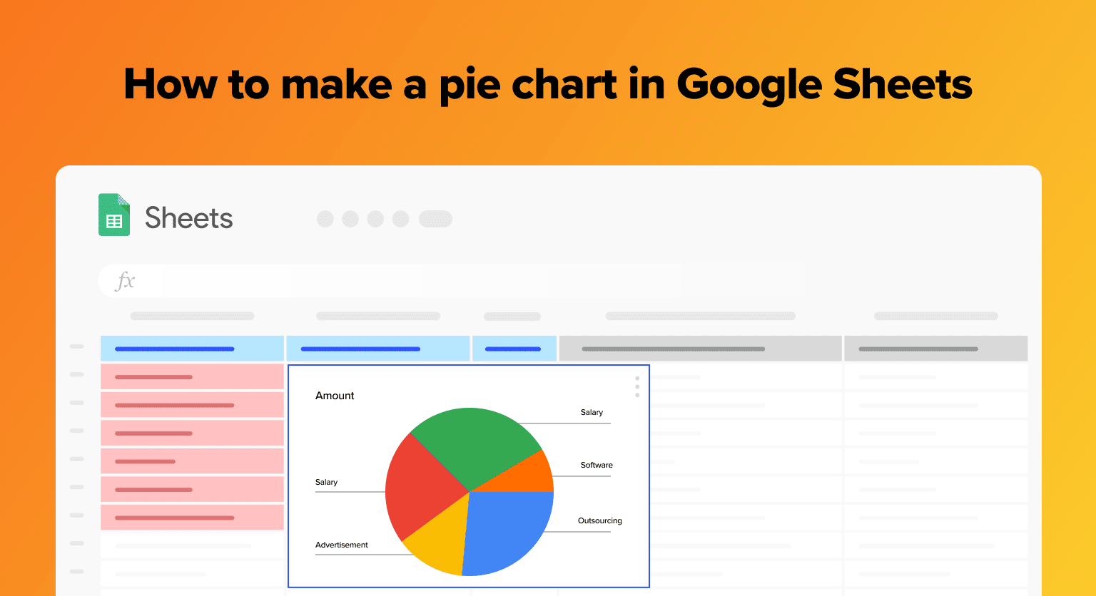
Creating a pie chart in Google Sheets is an essential skill for anyone in the B2B SaaS sector. Whether you’re analyzing sales data or reviewing departmental expenditures, a well-crafted pie chart can transform columns of data into a clear, concise visual representation.
This blog will walk you through how to create a pie chart in Google Sheets, complete with screenshots.
Creating a Basic Pie Chart
Step 1: Prepare Your Data
Start by inputting your data into Google Sheets. In the example below, we’re tracking monthly software feature usage by different departments within the company.
![Screenshot of a Google Sheets data table displaying software feature usage hours by Sales, Marketing, Development, Customer Support, Human Resources, and Administration departments.](https://coefficient.io/wp-content/uploads/2023/11/google-sheets-data-table-by-department-1024x494.png)
Alt text: “Data table in Google Sheets showing software feature usage by department.”)
Step 2: Select Your Data
Highlight the data range you wish to visualize. This should include both the categories and their corresponding values.
![Highlighted data range in Google Sheets ready for pie chart creation, including department names and software feature usage hours.](https://coefficient.io/wp-content/uploads/2023/11/google-sheets-data-selection-for-pie-chart-1024x494.png)
Step 3: Create Your Pie Chart
Go to the “Insert” menu, choose “Chart.”
![Google Sheets 'Insert' menu with the 'Chart' option highlighted, demonstrating how to add a new chart to a spreadsheet.](https://coefficient.io/wp-content/uploads/2023/11/google-sheets-insert-menu-chart-option-1024x494.png)
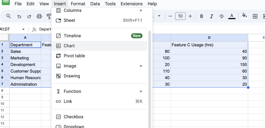
Google Sheets will automatically select a chart type.
![Google Sheets automatically generated a bar chart from the selected data, showing the initial chart type before changing to a pie chart](https://coefficient.io/wp-content/uploads/2023/11/google-sheets-auto-chart-selection-1024x443.png)
To change your chart type, open the drop down menu and scroll down until you find pie charts.
![Dropdown menu in Google Sheets for selecting a pie chart type among different chart options.](https://coefficient.io/wp-content/uploads/2023/11/google-sheets-pie-chart-type-selection-1024x443.png)
Click the pie chart button. Your chart will automatically update.
![A newly created pie chart in Google Sheets displaying software feature usage percentages by department.](https://coefficient.io/wp-content/uploads/2023/11/google-sheets-new-pie-chart-display-1024x443.png)
Step 4: Customize Your Chart
Personalizing your pie chart enhances its clarity and impact. In Google Sheets, you can easily modify aspects like the title, legend positioning, and slice colors to better represent your data.
![spreadsheet ai](https://coefficient.io/wp-content/uploads/2024/02/spreadsheet-ai-1024x981.png)
Supercharge your spreadsheets with GPT-powered AI tools for building formulas, charts, pivots, SQL and more. Simple prompts for automatic generation.
![](https://coefficient.io/wp-content/uploads/2024/02/blog-form-cta.png)
To begin customizing, click on the “Customize” tab in the Chart Editor sidebar. From here, you have various options to tweak the chart’s appearance to your preferences.
![Customization options in the Chart Editor sidebar of Google Sheets, with various settings to personalize the pie chart.](https://coefficient.io/wp-content/uploads/2023/11/google-sheets-chart-customization-options-1024x443.png)
For example, change the chart title by selecting ‘Chart & axis titles’ on the sidebar.
![Editing chart title in Google Sheets Chart Editor, where 'Chart & axis titles' option is selected to update the pie chart title.](https://coefficient.io/wp-content/uploads/2023/11/google-sheets-edit-chart-title-1024x443.png)
Enter your new title. Google Sheets will automatically update the chart.
![Updated pie chart in Google Sheets with a new title 'Feature Usage by Department', showing a clear visual representation of data.](https://coefficient.io/wp-content/uploads/2023/11/google-sheets-updated-pie-chart-with-title-1024x443.png)
Conclusion
Creating a pie chart in Google Sheets is straightforward and can offer valuable insights into your SaaS business operations. With this guide, you’re now equipped to turn your data into informative visuals.
Remember, Coefficient can take your data analysis to the next level. Install it for free and unlock advanced analytics for your business.