

Calculate mean and standard deviation using =AVERAGE() and =STDEV() functions
Create standard deviation extremes using formulas for -3 and +3 values from the mean
Generate X-axis sequence with =SEQUENCE(High-Low+1,1,Low) formula
Calculate normal distribution using =ArrayFormula(NORM.DIST()) function
Create scatter chart by selecting data columns and choosing Insert > Chart
A bell curve is a graphical representation of a normal distribution, which is a type of probability distribution that occurs frequently in various data sets.
Bell curves are often employed in data analysis to visualize and understand the trends, patterns, and variability in the data being analyzed. By using Google Sheets, one can create a bell curve that represents the distribution of their data effectively and efficiently.
Let’s walk through the process.
Gathering and Preparing Data
Before creating a bell curve in Google Sheets, it is crucial to gather and prepare the data properly.
This section will cover two important aspects of this process: Identifying Key Data and Entering and Organizing Data.
Identifying Key Data
When working with data in Google Sheets, the first step is to identify the key data points needed for creating the bell curve.
For a standard bell curve, a few parameters should be known:
- Mean: The average value of the dataset, which will be the center of the bell curve.
- Standard Deviation: A measure of the dispersion of the data, which determines the width of the curve.
- The +/- 3 standard deviation values of the average. These represent the standard deviation extremes (Low and High).
- A range sequence.
- The normal distribution for all data points.
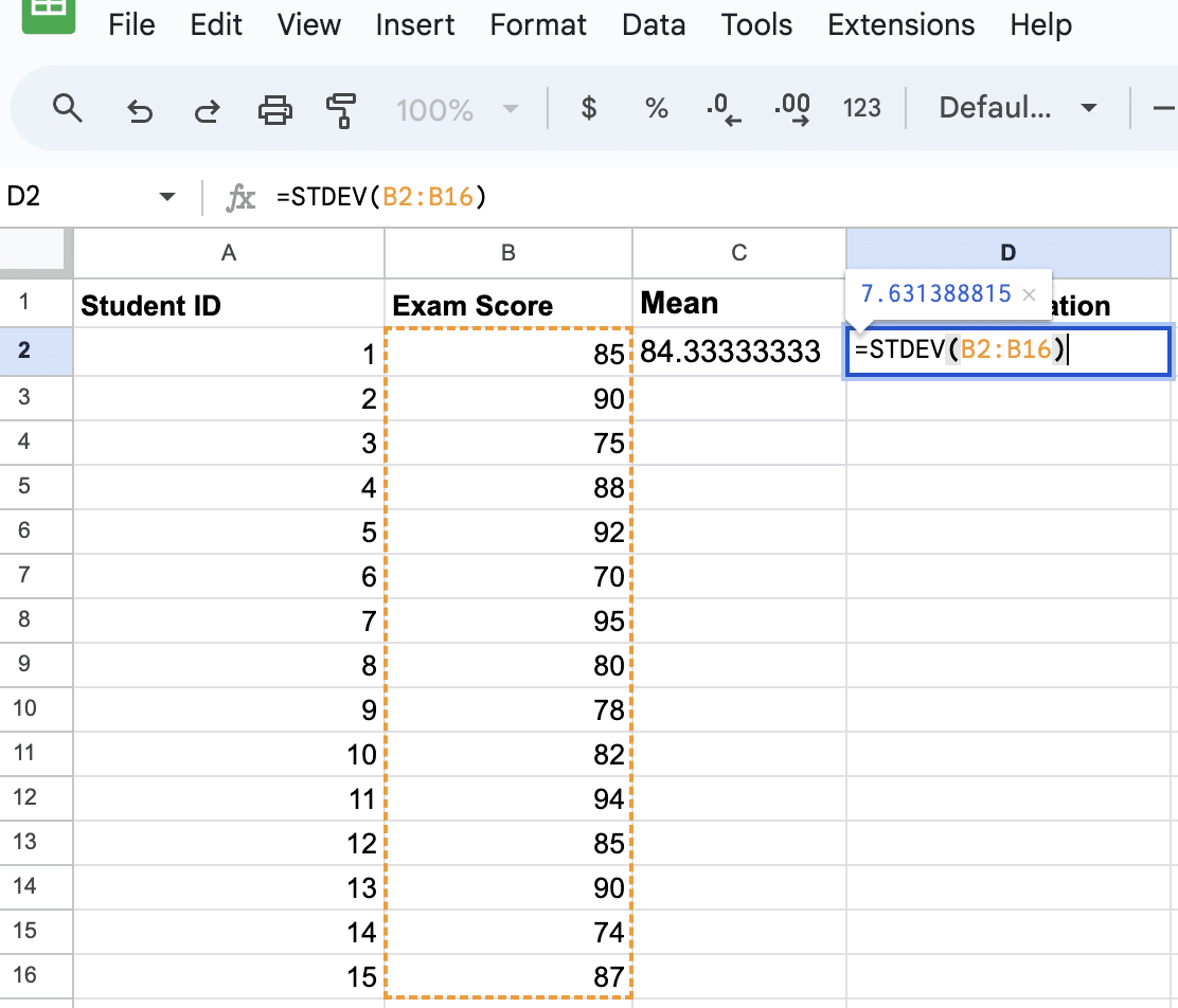
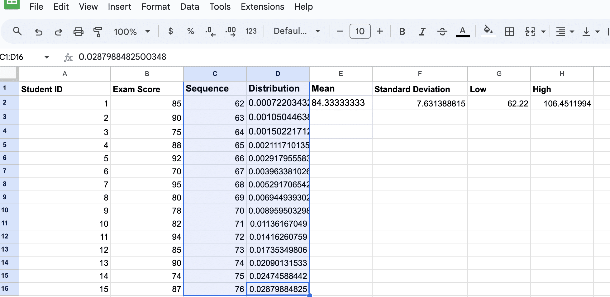
The mean and standard deviation can be calculated using the AVERAGE() and STDEV() functions in Google Sheets, respectively.
Entering and Organizing Data
Once the key data points have been identified, it’s essential to enter and organize the data in Google Sheets correctly.
Follow these steps to ensure properly formatted data for creating a bell curve:
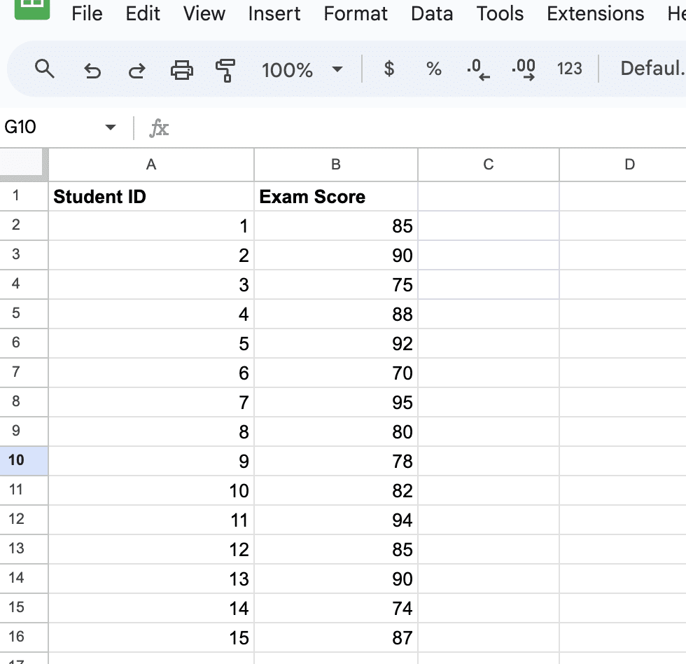
Input all the data points into a single column or row. Make sure there are no blank cells between the data points, as this could lead to incorrect results.
Calculate the mean and standard deviation of the dataset with the following formulas:
- Mean: =AVERAGE(B2:B16)
- Standard Deviation: =STDEV(B2:B16)
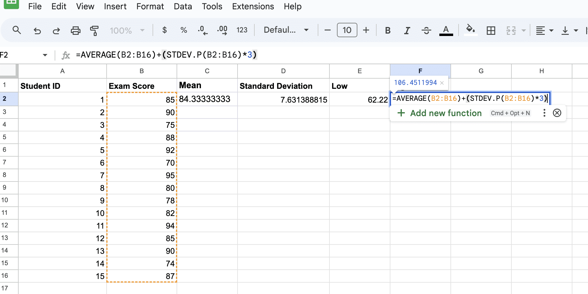
Next, we’ll calculate the standard deviation extremes (Low and High): -3 and +3.
Use the formula ‘=D2-(E2*3)’ for Low ‘=D2+(E2*3)’ for the High, where D2 is the mean and E2 is the standard deviation.
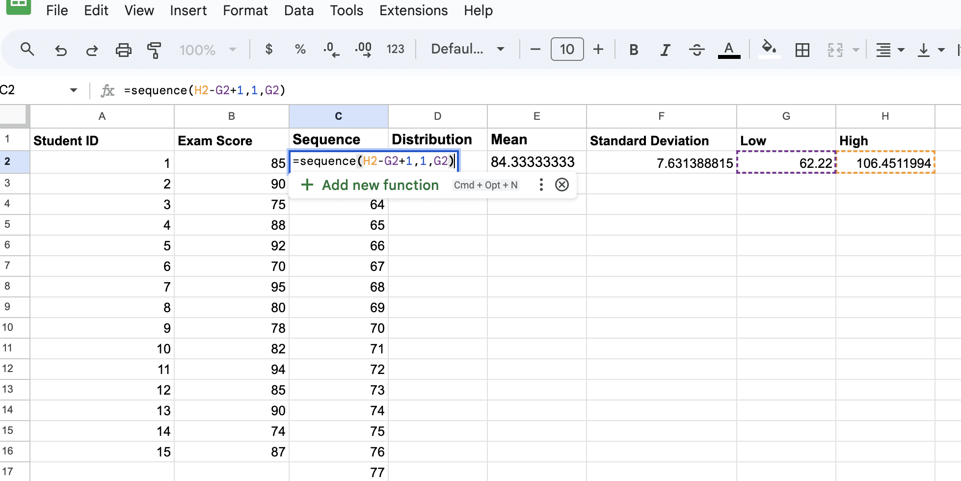
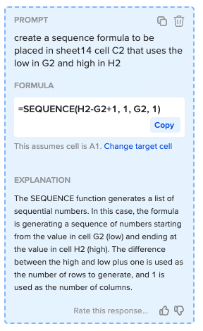
Next, create a sequence of numbers that will be used for the X-axis of the bell curve using the formula: =sequence(High-Low+1,1,Low).
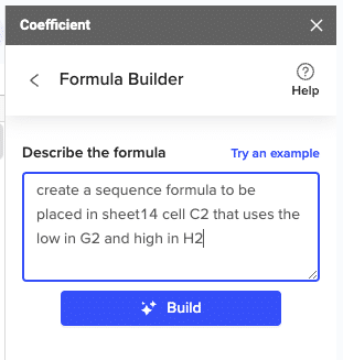
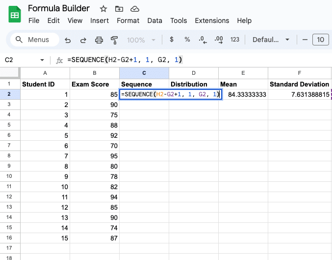
Insert a new column to the right of your exam scores and label it ‘Sequence.’ Then copy the formula ‘=sequence(H2-G2+1,1,G2)’ and paste it into cell C2.
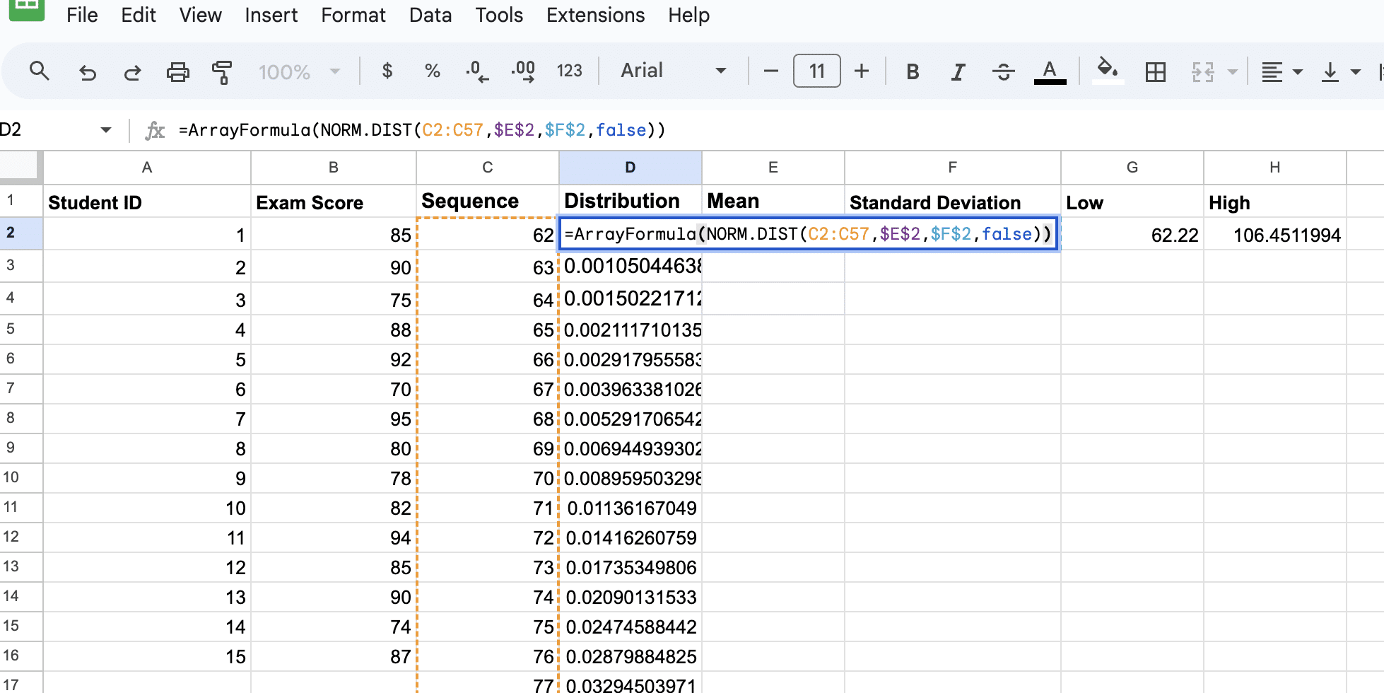
Now let’s calculate the normal distribution using the formula: =ArrayFormula(NORM.DIST(Data Cell Range ,Average,Standard Deviation,false)).
In this example, copy the formula ‘=ArrayFormula(NORM.DIST(C2:C57,$E$2,$F$2,false))’ and paste it in cell D2.
We now have all the required fields to create our bell curve.
Creating The Bell Curve
To create a bell curve in Google Sheets, you must chart your data. This method is quite straightforward and allows you to quickly visualize a normal distribution of your data.

Supercharge your spreadsheets with GPT-powered AI tools for building formulas, charts, pivots, SQL and more. Simple prompts for automatic generation.

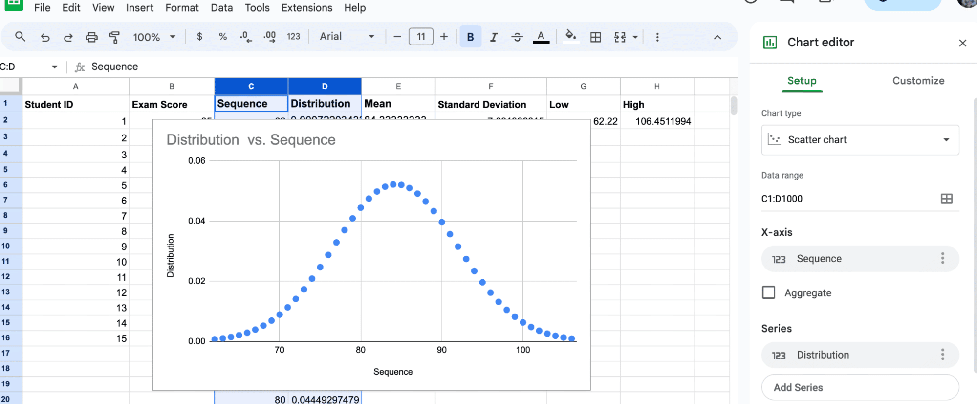
Start by selecting columns C and D.
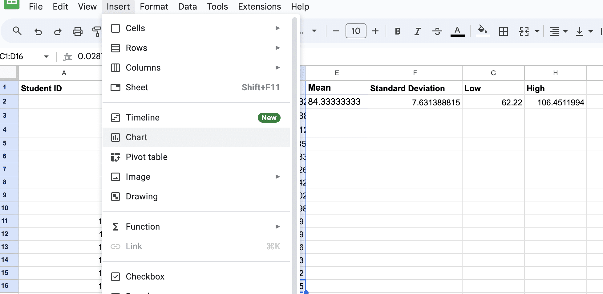
Insert a chart: Click on Insert > Chart to add a new chart in your Google Sheets document.
In the Chart editor sidebar, select the Chart type dropdown menu and choose Scatter Chart.
Leverage AI for Bell Curve Formulas & Charts
You can use Coefficient’s free GPT Copilot to automatically create the Google Sheets formulas and charts you need to create your bell curve.
First, you’ll need to install the free Google Sheets Extension. You can get started with GPT Copilot here.
After you submit your email, follow along, and accept the prompts to install. Once the installation is finished, navigate to Extensions on the Google Sheets menu. Coefficient will be available as an add-on.
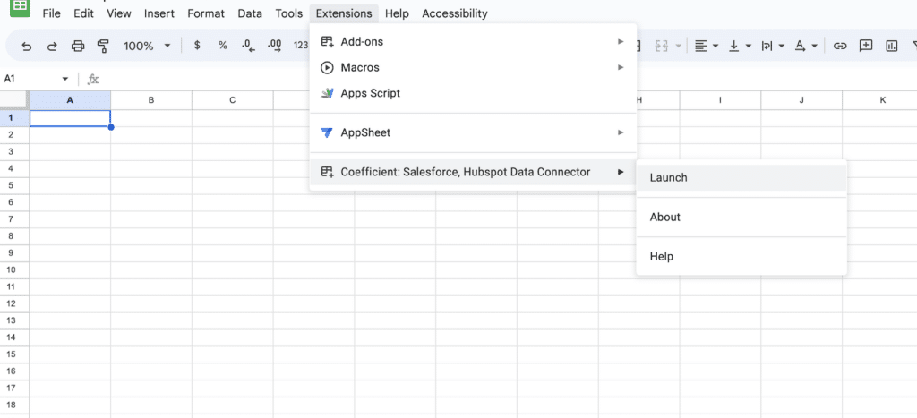
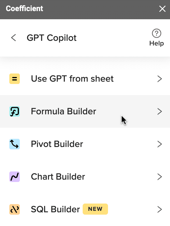
Now launch the app. Coefficient will run on the sidebar of your Google Sheet. Select GPT Copilot on the Coefficient sidebar.

Then click Formula Builder.
Type a description of a formula into the text box. For this example, we’ve not had issues creating our mean, standard deviation, or high and low formulas. But, we’ve gotten stuck with the format of our sequence formula.
Simply type: Sort dates in column A in sheet9 by most recent date.
Then press ‘Build’. Formula Builder will automatically generate your sort formula.
And, it’s that easy! Simply, place the formula in the desired cell.
You can also use GPT Copilot’s Chart Builder to then build your bell curve for you.
Conclusion
By following these steps, you have successfully prepared your data for creating a bell curve in Google Sheets.
Ready to elevate your business operations with advanced data analysis? Install Coefficient today and unlock the full potential of your spreadsheets.


