Sparklines pack a powerful punch in data visualization. In Google Sheets, creating these mini-charts is straightforward.
This guide walks you through the process, ensuring your business data speaks volumes in just a few steps.
Preparing Your Data
Before inserting sparklines in Google Sheets, it is important to prepare your data. This section will cover two important subsections for preparing your data: selecting the appropriate range and organizing data for sparklines.
Selecting the Appropriate Range
To create sparklines, you need to select a range of data that you want to visualize. The range can be a single row or column, or multiple rows and columns. It is important to select the appropriate range to create meaningful and accurate sparklines.
For example, if you want to create a sparkline to show the trend of sales data over a period of time, you should select a range that includes all the sales data for that period. Similarly, if you want to create a sparkline to show the performance of different products, you should select a range that includes the data for all the products.
Organizing Data for Sparklines
Organizing data is an important step in preparing your data for sparklines. Sparklines work best when the data is organized in a logical and consistent manner. Here are a few tips for organizing data for sparklines:
- Use consistent units: If you are using different units for different data points, it can be difficult to compare them. Make sure to use consistent units throughout the range of data you are selecting.
- Use headings: Use headings to label the data and make it easier to understand. Headings can also be used to group related data together.
- Avoid empty cells: Sparklines work best when there are no empty cells in the range of data. If there are empty cells, the sparklines may not be accurate or may not show up at all.
By following these tips, you can ensure that your data is well-organized and ready for sparklines.
Inserting Sparklines
Sparklines are mini charts that can be inserted into a single cell in a Google Sheets spreadsheet. They are a great way to visualize data without taking up too much space. In this section, we will discuss how to insert sparklines into a Google Sheets spreadsheet.
Using the Sparkline Function
To insert a sparkline into a cell, you will need to use the SPARKLINE function. This function takes a range of data as input and creates a sparkline chart based on that data. To use the function, simply select the cell where you want to insert the sparkline and enter the SPARKLINE function with the range of data as the argument.
For example, to create a line sparkline chart that shows the trend of sales over time, select the cell where you want to insert the sparkline and enter the following formula:
=SPARKLINE(B2:F2,{“charttype”,”line”})
This formula will create a line sparkline chart based on the data in cells B2 to F2.
Customizing Sparkline Appearance
Once you have inserted a sparkline into a cell, you can customize its appearance by using the SPARKLINE function’s optional arguments. These arguments allow you to change the chart type, color, and other visual properties of the sparkline.
For example, to change the color of a sparkline, you can use the color argument. The following formula creates a red line sparkline chart:

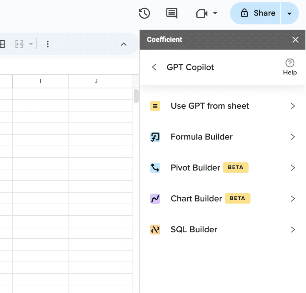
Supercharge your spreadsheets with GPT-powered AI tools for building formulas, charts, pivots, SQL and more. Simple prompts for automatic generation.

=SPARKLINE(B2:F2,{“charttype”,”line”;”color”,”red”})
Analyzing Sparkline Data
Sparklines are a great way to visualize data, but they can also be used to analyze data. For example, you can use sparklines to identify trends, patterns, and outliers in your data.
To analyze sparkline data, you can use the SPARKLINE function’s optional arguments to add reference lines and markers to the chart. These reference lines and markers can help you identify important data points and trends.
For example, to add a reference line to a sparkline that shows the average sales for a product, you can use the average argument. The following formula creates a line sparkline chart with an average reference line:
=SPARKLINE(B2:F2,{“charttype”,”line”;”color”,”blue”;”linewidth”,2;”average”,TRUE})
This formula creates a blue line sparkline chart with a thickness of 2 and an average reference line.
Streamline Your Data Analysis
Sparklines in Google Sheets offer a compact, insightful view of your data. With these simple steps, you can transform rows of figures into meaningful visualizations, making data analysis in your B2B SaaS operations more efficient.
Ready to enhance your Google Sheets experience? Install Coefficient for more powerful data connectivity and analysis tools. Get started with Coefficient today.


