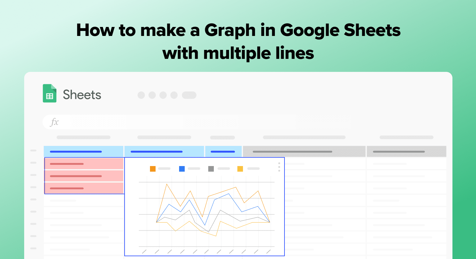
Multiple line graphs are a useful way to compare data sets and track changes over time. Perfect for analyzing sales, website traffic, or other metrics, they offer deep insights into your data.
Google Sheets simplifies this process, allowing you to create multi-line graphs with ease.
This guide will show you how, complete with helpful screenshots.
Creating a Graph with Multiple Lines in Google Sheets
Users need to follow a few simple steps to create a graph with multiple lines in Google Sheets.
Preparing Data
Prepare your data for the multiple-line graph in Google Sheets.
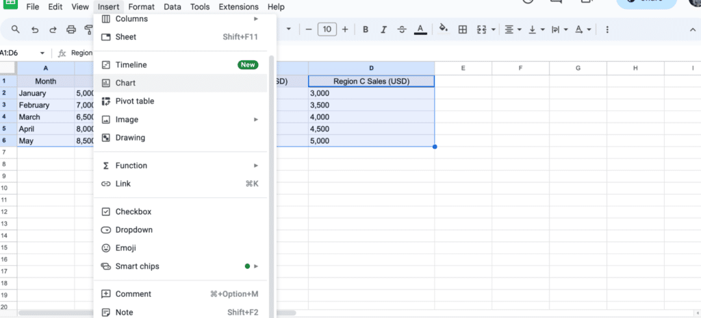
Arrange each data set you wish to represent as a line in its own column. This ensures Google Sheets can accurately generate your graph.
In this example, we’re examining monthly sales figures across three regions (Region A, B, and C).

Alt Text: “Organizing monthly sales data for line graph analysis in Google Sheets.”
Creating the Graph
Once your data is ready, highlight the entire dataset to include all regions in your graph.

Navigate to your spreadsheet menu and click ‘Insert’ > ‘Chart.’
Google Sheets will automatically generate a chart.

To change your chart, open the drop-down menu under ‘Chart type.’

Scroll down and select a line chart. Your chart will automatically update.

Supercharge your spreadsheets with GPT-powered AI tools for building formulas, charts, pivots, SQL and more. Simple prompts for automatic generation.


Customizing the Graph
You can modify titles, axis labels, and color schemes to enhance clarity and readability.
For example, let’s change the chart title.
Click the ‘Customize’ tab in the Chart editor.

Select ‘Chart & axis titles.’

Change the title text to ‘Regional Sales Data’ and click enter.
Your chart title will automatically update.

Conclusion
Creating multiple line graphs in Google Sheets is a straightforward yet powerful way to visualize complex sales data. This guide helps SaaS businesses leverage Google Sheets for insightful and actionable sales trend analysis.
Consider Coefficient for more advanced data analytics with your business data. Install it free today to elevate your Google Sheets experience.


