Working with charts on Google Sheets allows you to visualize data, helping you convey important information and insights effectively.
One aspect of creating a chart that may sometimes be overlooked is adding labels to the axes, which can significantly improve the readability and interpretation of the chart.
In this article, we will discuss adding x-axis labels to a chart in Google Sheets, ensuring that your data is represented clearly and accurately.
Understanding Google Sheets Graphs
Graphs in Google Sheets are built based on data ranges, with different series represented along the X and Y axes.
The X-axis label helps identify the different data points represented horizontally in the chart. Google Sheets lets you customize these labels to make them more descriptive and meaningful. It is important to use clear and concise labels that accurately represent the data and enable easy comprehension.
In most cases, you’ll come across different types of charts in Google Sheets, such as line, bar, column, pie, and more. Each chart type has its own set of unique characteristics and visual appeal that cater to varying data representation needs. Some of the common features that you can modify include titles, legends, axis labels, and data labels.
To create a graph in Google Sheets, you will follow a general workflow:
- Enter your data in a tabular format (with headers)
- Select the data range you want to chart (including headers)
- Open the ‘Insert’ menu, and select ‘Chart’
- Adjust the chart settings in the ‘Chart Editor’ sidebar to customize the chart (including X-axis labels
For example, let’s consider a B2B SaaS company analyzing monthly revenue:
| Month | Revenue ($) |
| January | 12,000 |
| February | 15,500 |
| March | 18,200 |
Once you’ve created a chart based on this data, you can use the Chart Editor panel to customize the appearance, including the X-axis labels.
How to Add X-Axis Labels in Google Sheets
Accessing Chart Editor
To add X axis labels in Google Sheets, you need to access the chart editor first. Begin by opening the Google Sheets spreadsheet containing the chart you want to edit.

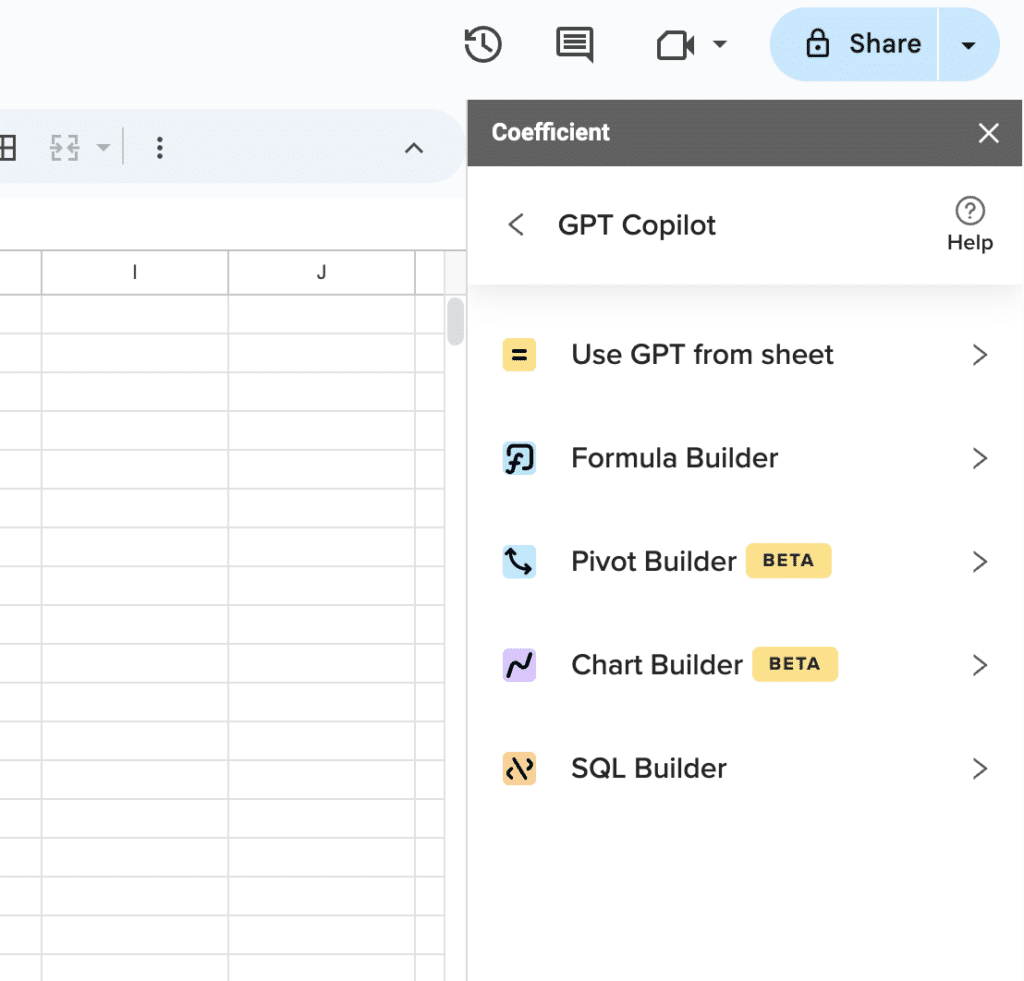
Supercharge your spreadsheets with GPT-powered AI tools for building formulas, charts, pivots, SQL and more. Simple prompts for automatic generation.

Double-click on the chart to bring up the chart editor panel on the right side of the screen.
Configuring Horizontal Axis
Once the chart editor is open, follow these steps to modify the X-axis labels:
- Click on the Customize tab. This tab allows you to edit various aspects of the chart, including axis labels.
- Select Chart & Axis Titles from the options. This will open a dropdown menu with choices for editing titles and axis labels.
- Choose the Horizontal Axis Title option. This will specifically target the X-axis labels for editing.
- Enter your desired label in the text box. Type in the new label you want for the X-axis. Keep it clear and concise to improve readability.
Conclusion
By customizing your X-axis labels, you’re not just adding clarity to your charts; you’re ensuring that your business operations team can quickly grasp the trends and insights your data presents.
Looking to take your spreadsheet to the next level? Consider Coefficient.
Coefficient is a must-have for business operations professionals, seamlessly integrating live data from business tools like HubSpot, Salesforce, and more into Google Sheets.
Get started for free today to try it out for yourself!


