Discover how to filter data dynamically using Google Sheets slicers.
Learn to make your reports and dashboards interactive and user-friendly in this guide.
Understanding Google Sheets Slicers
Google Sheets slicers are powerful tools that offer interactive filtering capabilities, enhancing the way users manage and display data in their spreadsheets.
What Are Slicers?
In Google Sheets, slicers are user-friendly, interactive objects that allow users to filter data within charts, tables, and pivot tables.
A slicer acts as a visual filter, providing a straightforward way for users to filter by value or filter by condition, without diving into complex menu options. They make data sets more manageable by allowing users to focus on specific rows, columns, or values.
Creating and Customizing Slicers
To add a slicer, users go to the Data menu and select “Add a slicer”. Once inserted, the edit slicer options facilitate customization of appearance and filter criteria.
The customize tab includes options to adjust the slicer’s title, position, color, background color, text color, and font style. This customization enhances the slicer’s functionality while blending in with the spreadsheet’s design.
Slicer Data Management
With slicers, managing filter data becomes a breeze as users can apply filters based on various criteria such as dates, numbers, or values from a specific city column or order date.
For example, setting a condition to show only data where the date is after a certain point is done with a few clicks. This level of control is essential when dealing with large datasets that require quick and efficient analysis.
Advanced Slicer Usage
To master Google Sheets, understanding the advanced slicer usage is imperative. Slicers, when properly used, can greatly enhance data analysis and presentation by offering interactive filtering options and the ability to connect with multiple datasets.
Connecting Slicers to Multiple Data Ranges
Multi-range slicers are quintessential for those working with complex datasets containing multiple tables or charts. To create these connections, customize the slicer by accessing the slicer settings in Google Sheets.

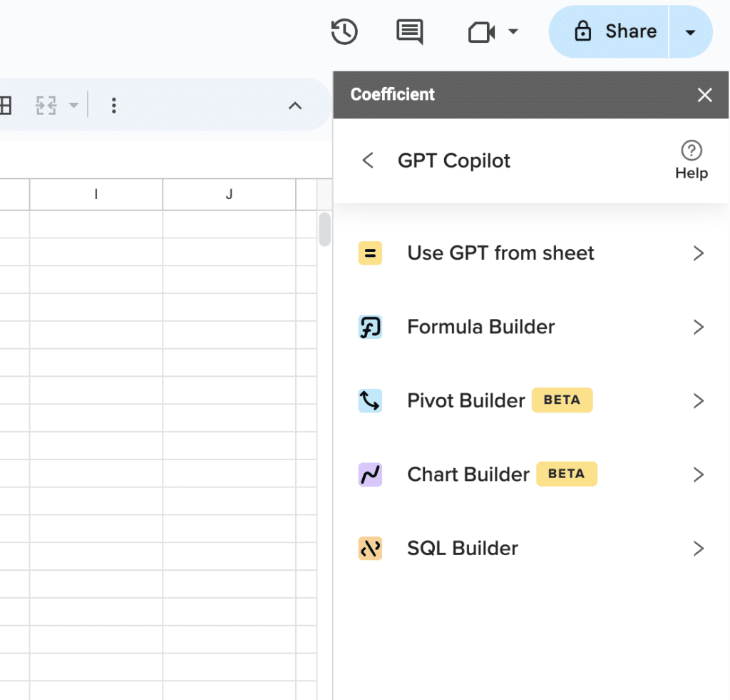
Supercharge your spreadsheets with GPT-powered AI tools for building formulas, charts, pivots, SQL and more. Simple prompts for automatic generation.

Users will find options to associate the slicer with various data ranges such as tables, charts, and pivot tables. This centralized control allows for coherent navigation and uniform data representation across different views within a custom dashboard.
Interactive Filtering with Slicers
Interactive slicers serve as dynamic filtering tools that transform the way data is analyzed. By implementing a slicer, one can filter columns directly within the Google Sheets interface.
The interactive nature of slicers stems from a filter menu that provides a dropdown list of filtering options including sorting and differentiating between unique values.
Using Slicers to Enhance Data Presentation
In terms of data presentation, slicers are the linchpin for creating interactive dashboards. The visual appeal and functionality of slicers allow users to format and position them strategically within a sheet or a custom dashboard.
To complement the existing layout, one can copy and paste an existing slicer to maintain consistent formatting or delete a slicer if it no longer serves the presentation’s purpose. The great utility of slicers in Google Sheets lies in their ability to offer quick and responsive views that facilitate an efficient and clear data exploration experience.
Conclusion
Google Sheets slicers are key in dynamic data analysis. They streamline the process, making it more efficient and user-friendly.
Ready to enhance your data analysis? Start with Coefficient.


