

Structure your data to reflect the frequency of occurrences within a given period
Highlight the data range and click the Insert tab, then click Chart
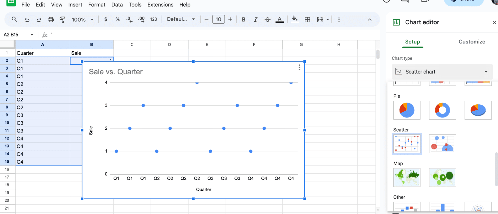
From the Chart Type dropdown, choose Scatter Chart
Customize the chart type and marker settings to create your dot plot
Use Google Sheets’ customization options to fine-tune the appearance of your chart
Creating a dot plot in Google Sheets is an essential skill for data analysts, especially in the realm of business operations.
Dot plots offer a straightforward method to display and analyze univariate data frequencies, making them invaluable for B2B SaaS companies.
While Google Sheets doesn’t have a built-in dot plot feature, you can easily create one using the Scatter Chart option.
Let’s explore how to create a dot plot in Google Sheets.
Creating a Dot Plot in Google Sheets
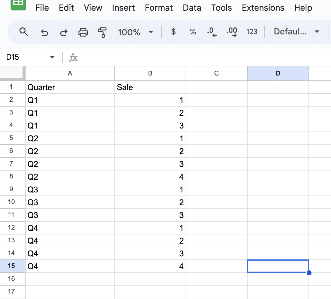
When analyzing data in business operations, it’s often helpful to visualize trends and patterns over time. Let’s say we’re examining the frequency of sales each quarter.
Transforming Data into Long Format
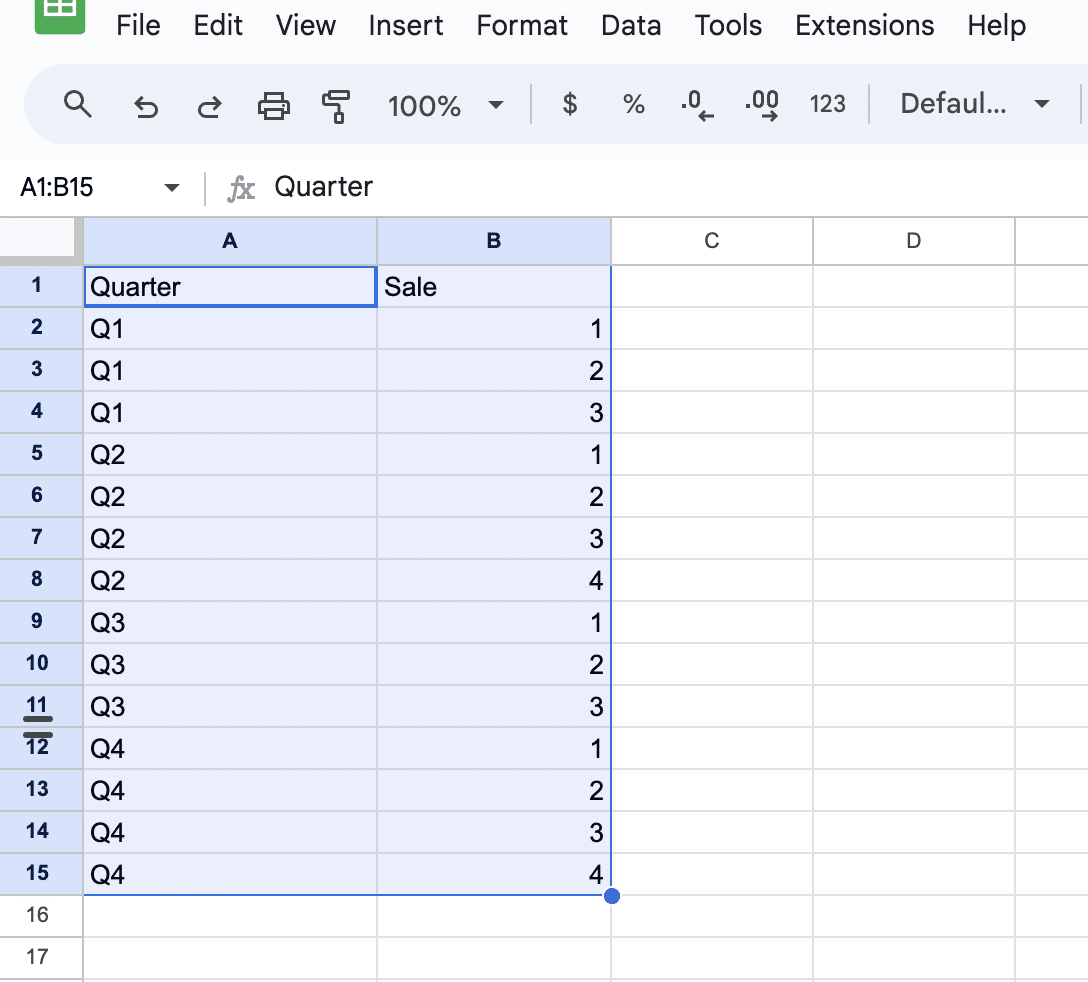
To effectively create a dot plot in Google Sheets, the data must be structured in a way that reflects the frequency of occurrences within a given period.
In our example, we’re breaking down quarterly sales into a format that represents each individual sale as a separate data point.
.”
Marker Selection
Now that the data is organized, we need to choose the appropriate marker for our dot plot.
In Google Sheets, we can use a scatter chart to create a dot plot by customizing the chart type and marker settings. To do this, follow these steps:

Supercharge your spreadsheets with GPT-powered AI tools for building formulas, charts, pivots, SQL and more. Simple prompts for automatic generation.

Highlight the data range.
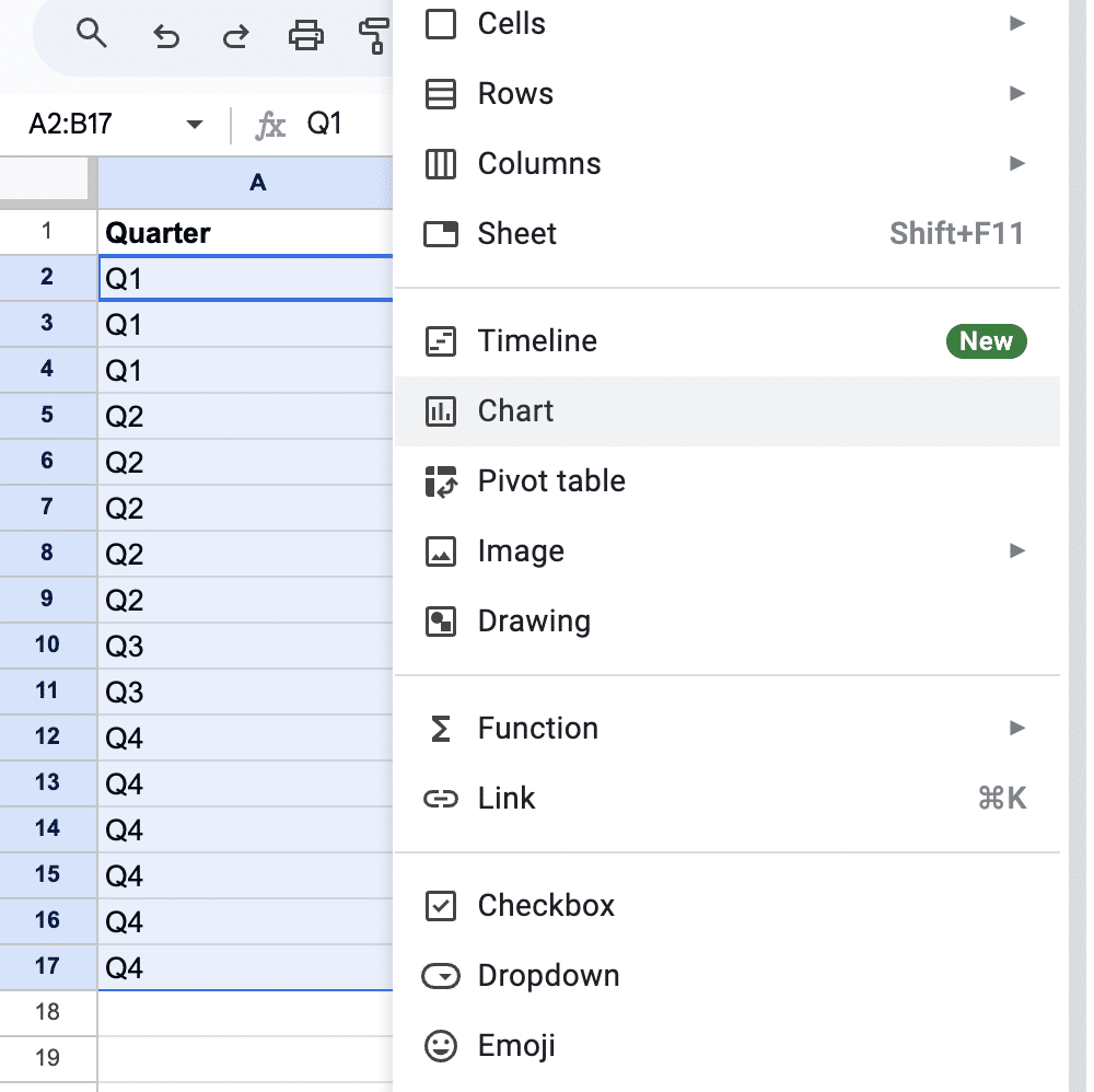
Click the Insert tab, then click Chart.
From the Chart Type dropdown, choose Scatter Chart.
Advanced Tips for Dot Plots
In this section, we will explore advanced tips for creating dot plots in Google Sheets, covering topics such as data filtering, customization options, and troubleshooting techniques.
Customization Options
A well-customized dot plot can improve data visualization and make it more meaningful to the audience. Google Sheets offers various customization options that can fine-tune the appearance of your chart. Some of these options include:
- Axis properties: Adjust the minimum and maximum values, and the tick intervals for the x and y axes.
- Data labels: Display the labels above the data points to make them more informative.
- Color and style: Customizing the color, size, and shape of the data points can help differentiate categories or emphasize specific data points.
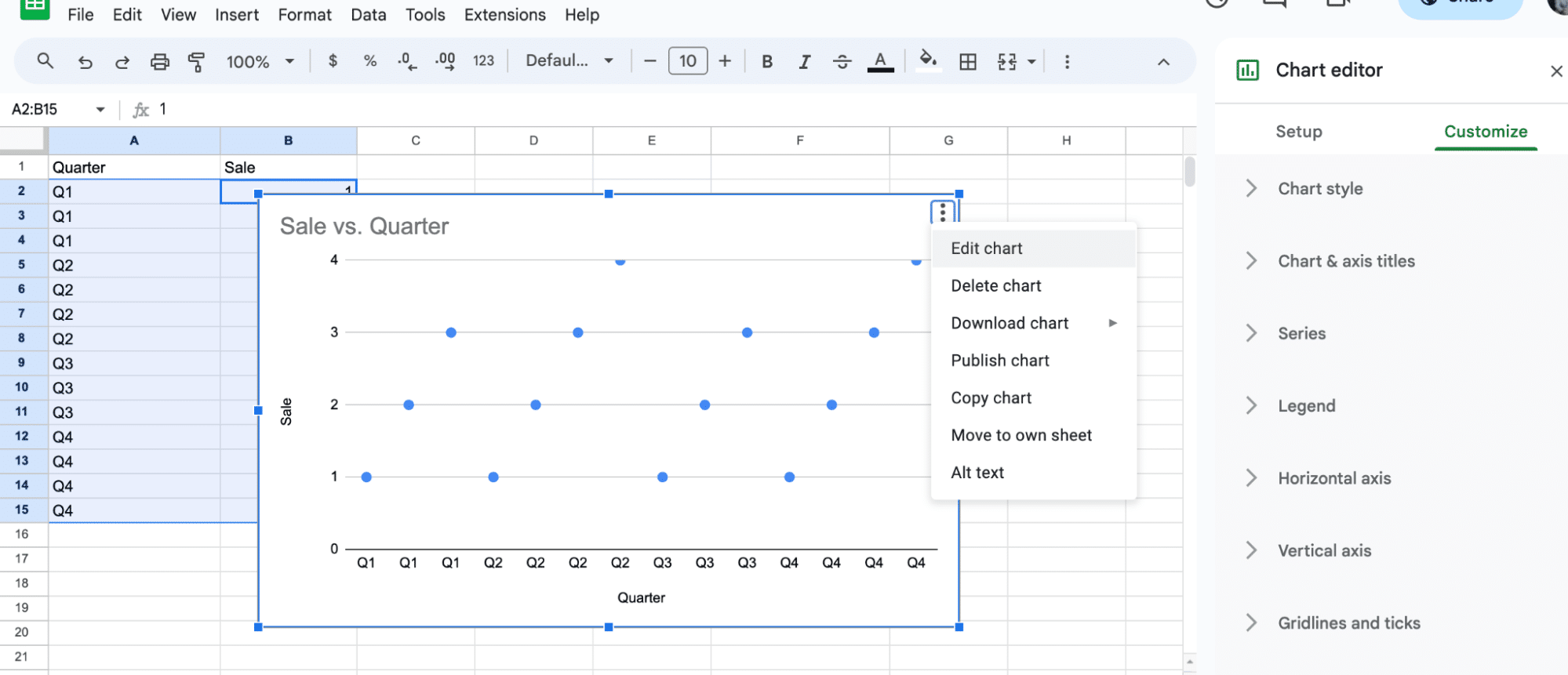
To access these customization options, after creating a scatter chart for your dot plot data, click the chart, select the “three dots” in the upper right corner, and choose Edit Chart.
From the Chart Editor, you can adjust various properties under the tab “Customize”.
Troubleshooting
Sometimes, the dot plot created in Google Sheets may not appear as expected, or the data points might not be properly displayed. In such cases, you can try the following troubleshooting techniques:
- Check the data format: Ensure that the data is in the required format (long format) and there are no missing values, errors, or unnecessary empty cells.
- Verify the chart type: As Google Sheets might insert a histogram by default, make sure to choose the scatter chart from the Chart Editor to create a dot plot.
- Adjust axis properties: If the data points are clustered together or not well distributed, you can modify the axis properties by changing the minimum, maximum, or interval values as mentioned in the “Customization Options” subsection above.
Conclusion
By following these advanced tips, it is possible to create effective and insightful dot plots in Google Sheets that can help visualize and analyze your data more efficiently.
Ready to take your business analytics to the next level? Install Coefficient to integrate live data from your favorite business solutions into your spreadsheets.


