
Prepare your data properly by making sure your dataset is clean, organized, and structured in a way that corresponds to your desired chart
Highlight the dataset that you want to include in your bubble chart
Click Insert > Chart from the top menu
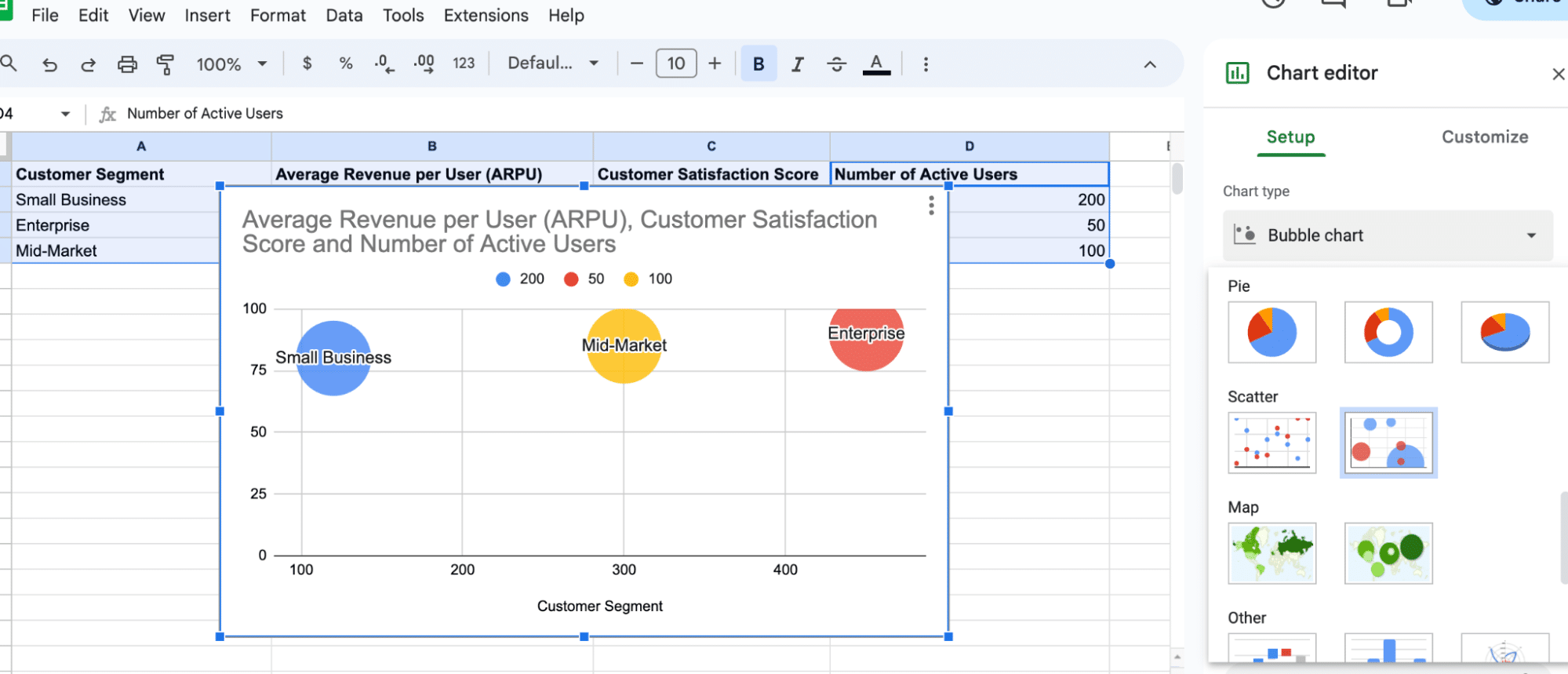
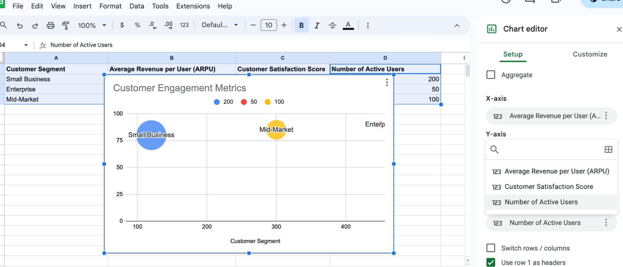
In the Chart Editor, under Scatter, select Bubble chart
Adjust the bubble size by mapping a data column to the size variable in the chart editor, like ‘Active Users’, to control bubble size
Bubble charts in Google Sheets offer a dynamic way to visualize complex data. Ideal for B2B SaaS companies, these charts help analyze customer engagement, sales performance, and other key metrics.
This guide will walk you through creating and customizing bubble charts, with practical examples specific to business operations.
Creating a Bubble Chart in Google Sheets
Data Preparation
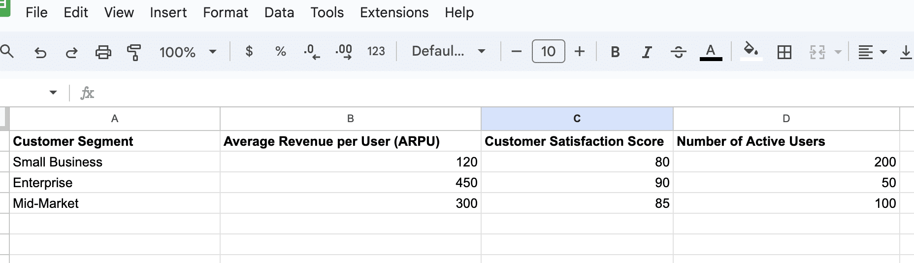
Before creating a bubble chart, it’s crucial to prepare your data properly. Make sure your dataset is clean, organized, and structured in a way that corresponds to your desired chart.
In this example, we’re analyzing a company’s customer engagement metrics.
After arranging your data, highlight the dataset. Click Insert > Chart.
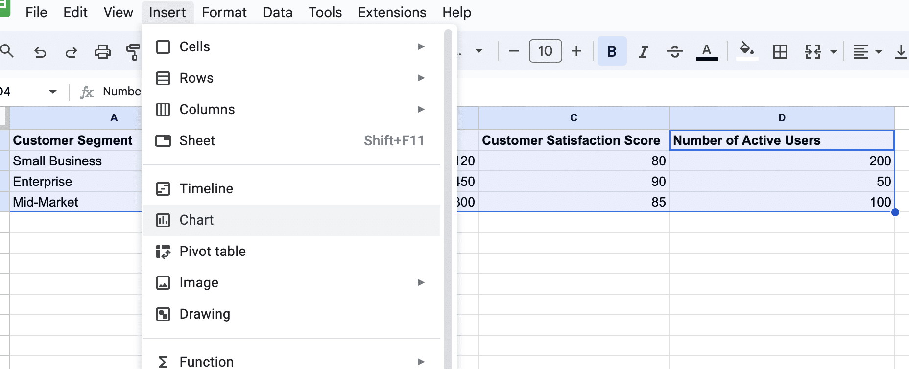
In the Chart Editor, under Scatter, select Bubble chart.

Supercharge your spreadsheets with GPT-powered AI tools for building formulas, charts, pivots, SQL and more. Simple prompts for automatic generation.

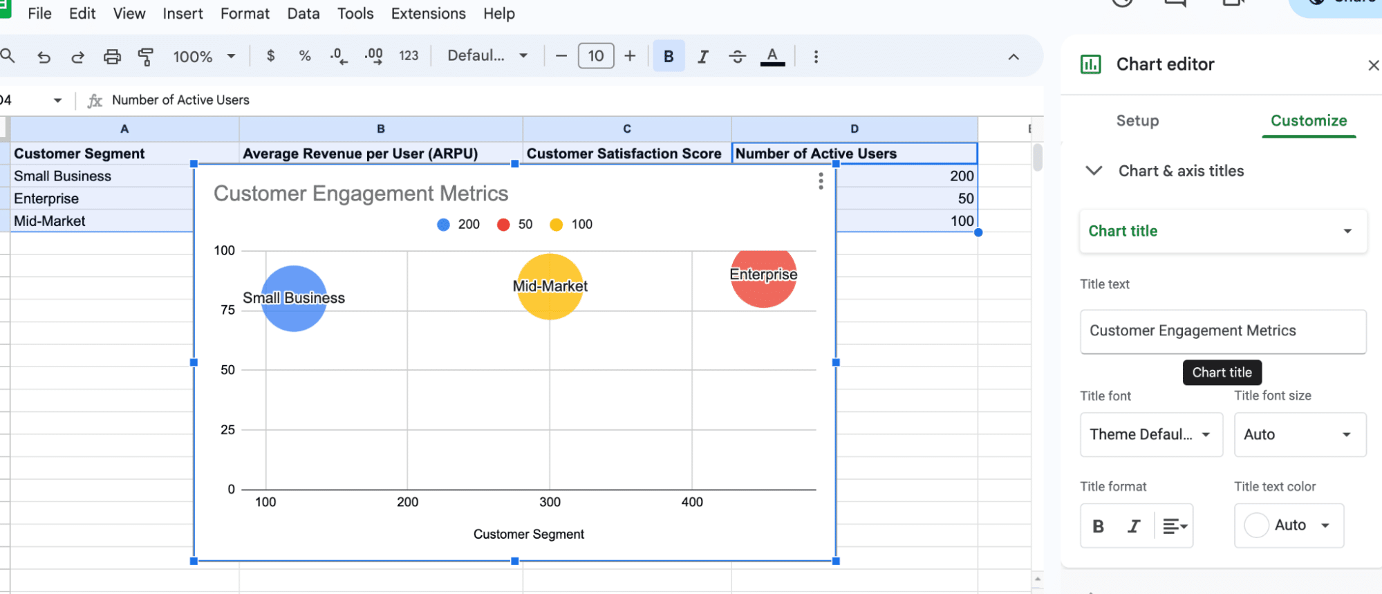
Customizing the Chart
Once your bubble chart is created, you can customize its appearance and settings using the Chart Editor present on the right side of the screen.
You can modify chart title, axis titles, legend, colors, and other aspects. Here are some tips for customization:
- Adjust the chart title and axis titles using the Customize tab.
- Change bubble colors by using the Series section and selecting different colors for each data group.
- Control bubble sizes by adjusting the Size Axis setting to get the desired range.
Advanced Features of Bubble Chart
Bubble Size Control
One of the advanced features of bubble charts in Google Sheets is the ability to control the size of the bubbles. The size of the bubbles can be used to represent a third data dimension, adding more depth to the visualization.
In Google Sheets, you can easily adjust the bubble size by mapping a data column to the size variable in the chart editor.
Map a data column, like ‘Active Users’, to control bubble size.
Tips and Tricks
- Avoid clutter: Too many bubbles can make your chart hard to read.
- Use contrasting colors for different data groups for better visualization.
- Regularly update your data for dynamic charting.
Conclusion
Mastering bubble charts in Google Sheets can transform your data storytelling, especially in a business context.
To further enhance your data analysis capabilities, consider integrating live data from business solutions into your spreadsheets with Coefficient.


