Best-in-Class Google Sheets Sales Templates
Best-in-Class Google Sheets Sales Templates
We hear you: creating and maintaining sales dashboards is one of the most time-consuming tasks in your SalesOps role.
Every step drains your bandwidth. Scoping the right metrics, building dashboards in limited systems, and maintaining dashboards so they’re up-to-date is not a fun process. And it takes you away from the million other things you need to get done.
But what if we eliminated these dashboard headaches for you? Spoiler alert: we can, and we will.
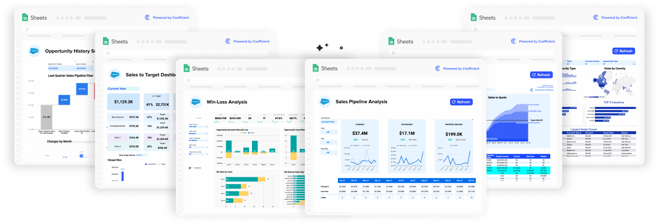
Now you can launch pre-built sales dashboards in a single click with our library of free Google Sheets sales templates. Our sales templates automate all the steps in the dashboarding process in Google Sheets, from scoping, to building, to maintenance.
- Scoping – Our dashboards track best-in-class KPIs. We’ve helped hundreds of sales teams build dashboards for all kinds of use cases, so we know what works, and what doesn’t.
- Building – The dashboards themselves are entirely pre-built. We’ve already implemented all the logic, formulae, and functions in Google Sheets to output beautiful dashboards. We also automate data imports from your CRMs. Now you and your team can focus on insights, not on the nuts-and-bolts of dashboard creation.
- Maintenance – We automatically update your CRM data in Google Sheets, so your dashboards are always up-to-date. No more manually copying-and-pasting data into your spreadsheet every time you need to send the dashboard out.
We’ve built our Google Sheets sales templates around some of the most popular use cases our SalesOps customers face. And our templates are totally free to use — you can dive in and give them a try right now.
Here’s an overview of some of the top Google Sheets sales templates in our free library.
Win Loss Analysis Template
Win loss analysis is critical to understanding why sales deals were won or lost. This helps sales teams adjust tactics and optimize the sales cycle.
SalesOps managers typically build win loss analysis reports in CRMs that can track these metrics across orgs, teams, and sales reps. But these CRMs often make win loss analysis reporting quite difficult. Salesforce, for instance, restrains users to basic inputs such as pick-lists or open-text fields.
Google Sheets offers more flexibility in terms of building dashboards, but it cannot access real-time CRM data natively. And then, regardless of what platform you use, you must build out the dashboards from scratch.
But slow down there — our Win Loss Analysis Template takes care of all of these dashboarding issues in a single click.
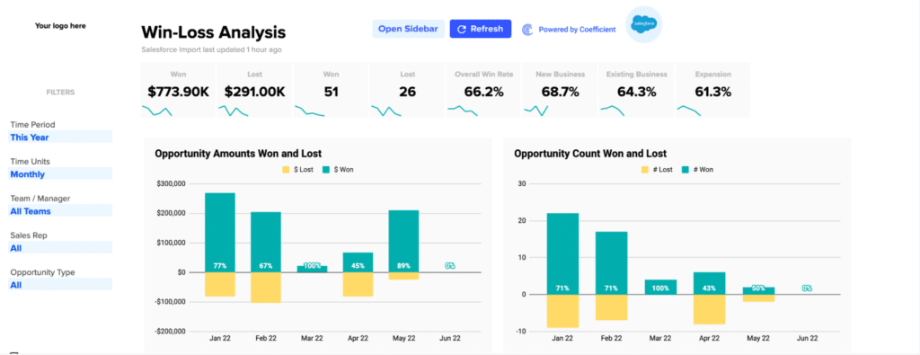
Our Win Loss Analysis Template contains all the metrics and visualizations needed to perform an incisive win/loss analysis, presented in pretty dashboards that capture the core KPIs your team needs:
Dashboards within the template can be customized with a toggle menu at the top of the Sheet. Filter dashboards based on Time Period, Time Units, Team/Manager, Sales Rep, and Opportunity Type.
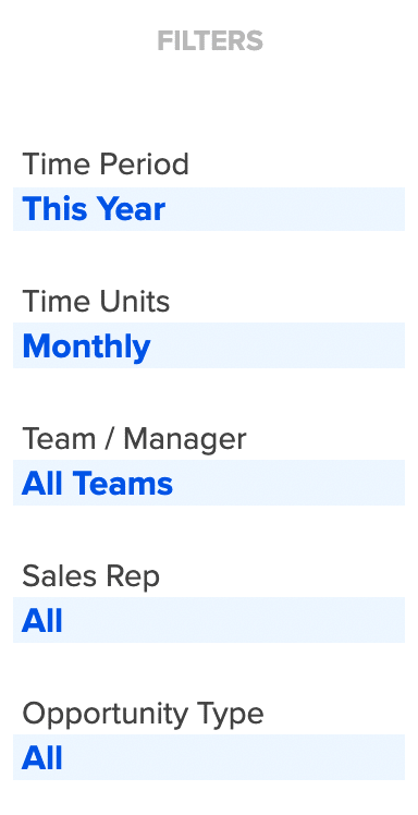
This allows your team to slice-and-dice the CRM data however they want. The filtered data is then fed into the pre-built win loss analysis dashboards:

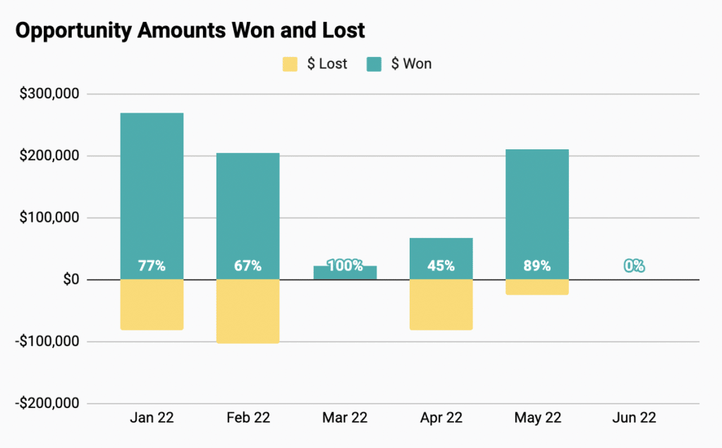
Keep track of key metrics such as won/lost by revenue and volume, win rate, and wins by customer stage with high-level charts. View contrasting visualizations of opp amounts/counts won and lost.
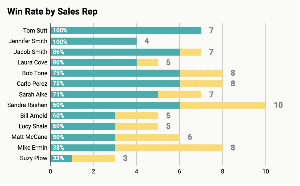
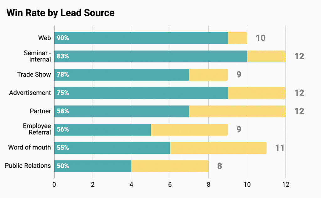
Break down win rates by reps, teams, opp size, opp age, lead source, and more.
Get a comprehensive report of lost opportunities, including opp owners, age, amount, and reason lost.

And these dashboards are always up-to-date and shareable — the template automatically updates your CRM data. Give it a try now: launch our free win loss template in Google Sheets for your Salesforce or HubSpot CRM.
Sales Opportunity Template
A sales opportunity dashboard is another key reporting tool for sales teams. The dashboard enables sales teams to track open pipe by stage and sales quotas by orgs, teams, and reps. It’s a critical dashboard that SalesOps managers are often required to build and maintain for sales leadership.
We’ve created many sales opportunity dashboards with the hundreds of sales teams that we’ve partnered with. During that process, we discovered what the most effective metrics and visualizations are for this dashboard, and worked them into our pre-built Sales Opportunity Dashboard Template.
Here are some of the most important sales opportunity metrics, based on our competitive intelligence, and how we incorporated them into our one-click Sales Opportunity Dashboard Template.
Open Pipe by Stage (Company-Wide)
Open Pipeline by Stage offers a complete view of sales across the funnel. This allows you to track sales pipeline for the entire org.
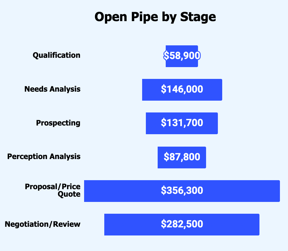
Our Sales Opportunity Dashboard Template highlights stages of concern, sales potential, and trends in the sales cycle. You can also maintain a full overview of deal stages, such as prospecting, negotiations, and more.
Sales to Quota by Rep
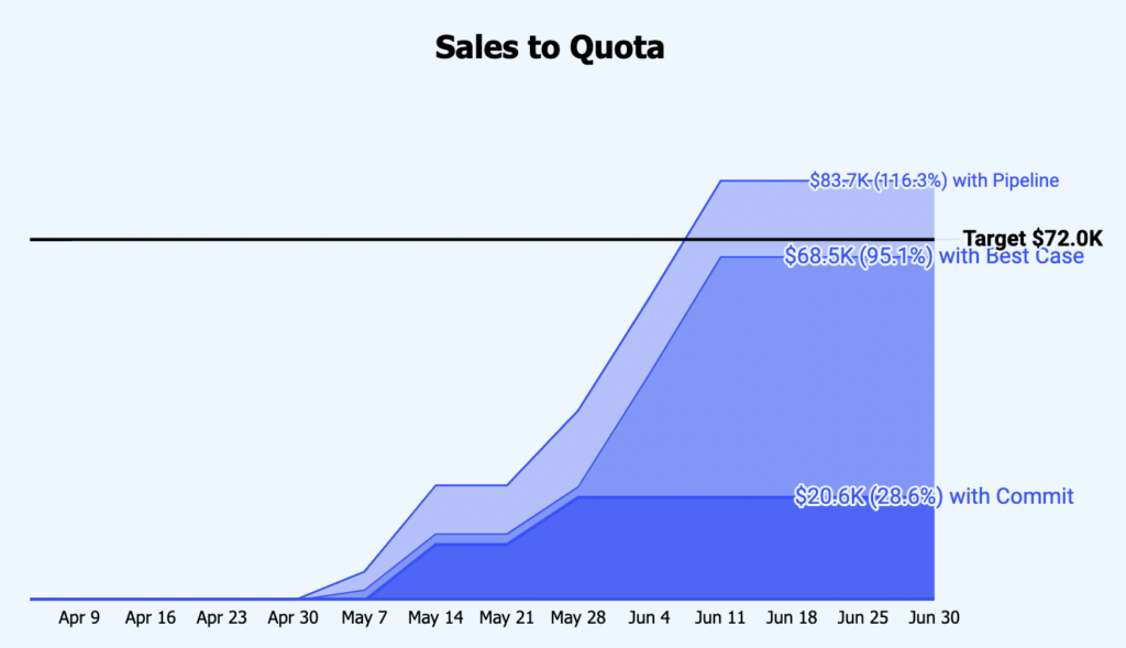
One metric that our sales partners pay close attention to is sales to quota by rep. Our Sales Opportunity Dashboard Template visualizes sales to quota metrics by individual sales rep, by team, or by company.
Simply choose the sales rep you want to examine:
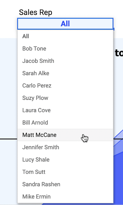
The Sales to Quota dashboard will then display that salesperson’s total open pipeline by forecast category or opportunity stage in a gradient graph.
Opportunity List by Team
An opportunity list report gives you a view of opportunity metrics, including stages, source, amount, and many more KPIs. The Sales Opportunity Dashboard Template has a pre-built Opportunity List pivot table. You can segment by team with the drop down menu.
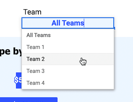
The template’s Opportunity List report will display the deals and metrics for the team’s pipeline.

Pipeline Created by Rep
Pipeline created by rep allows you to track the pipeline creation of individual salespeople. Adjust sales tactics, cultivate sustainable pipelines for each rep, and fine tune forecasts based on these KPIs.
Our Sales Opportunity Dashboard Template makes it easy to measure the pipeline created per sales rep. Choose the sales rep you want to explore, and check out the “Key Metrics by Month” report.

You will see the monthly pipeline created in dollar value and number of opportunities for the sales rep.
Sales Targets by Rep
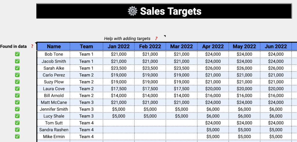
Sales quotas are difficult to maintain in CRMs like Salesforce and HubSpot. That’s why SalesOps teams prefer to store monthly or quarterly targets in spreadsheets. And it’s why we built our template in Google Sheets — to give SalesOps managers the interface they prefer.
Our Sales Opportunity Dashboard Template has a Sales Targets report. In this report, you can easily list out your sales reps and teams and then input their monthly sales quotas to track progress.
Get access to these best-in-class KPIs and dashboards right now. Try our free Sales Opportunity Dashboard Template for Salesforce or HubSpot:
Sales to Target Template
Setting and tracking sales targets is a key initiative for most sales teams. These goals allow teams to measure performance, adjust tactics, and project sales within a given month, quarter, or year.
However, dashboards that track sales targets often require SalesOps managers to corral data from multiple business systems. It’s a messy, time-consuming process to blend sales data in CRMs with sales targets in spreadsheets.
That’s why we created our Sales to Target Template. Our template offers pre-built sales to target dashboards, so SalesOps Managers can avoid building, maintaining, and updating complicated reports involving multiple data systems.
Our Sales to Target Template combines Salesforce or HubSpot data with sales targets, calculates revenue projections, and visualizes progress for teams and opportunity types, by month, quarter, or year. Track yearly or quarterly company revenue side-by-side with open pipeline and target achieved.
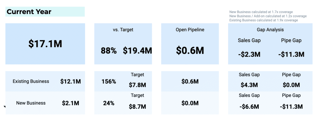
Leverage the pre-built Gap Analysis dashboard to reconcile your sales goals, and see where you can make up the difference.
Segment revenue and opportunities by existing business and new business. Measure your sub-targets and learn where your pipeline needs supplementation. Also harness these same high-level dashboards for sales targets by team.

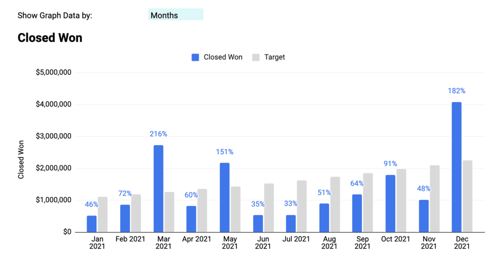
Visualize closed-won opportunities vs. targets by month to analyze performance over time and see where holes need to be plugged.
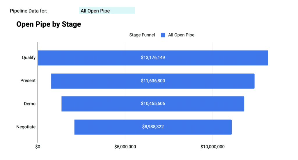
Get a full overview of open pipe by stage to understand where the opportunities are that will allow you to meet sales targets.
Our Sales to Target Template allows you to bypass all that tedious dashboard building and focus on analysis. With the template, your team will gain access to a comprehensive view of how sales targets are progressing, and where they can make up the gaps.
And you don’t have to worry about updating the sales data in Google Sheets — that’s done automatically by the template. Launch the Sales to Target Template now with your Salesforce or HubSpot CRM data.
Pipeline Analysis Template
Pipeline analysis dashboards are some of the most common visualizations SalesOps Managers are tasked with creating. These dashboards visualize every stage of the sales cycle, but more than that, they tell a story by stitching together the right KPIs.
In our work with hundreds of sales teams, we’ve learned exactly what these KPIs are. And now we’ve leveraged this expertise to develop a pre-built Pipeline Analysis Template for Google Sheets.
Our Pipeline Analysis Template combines all of these best-in-class sales pipeline KPIs into pre-built dashboards. Here are some of those best-in-class KPIs, along with examples of the template dashboards in action.
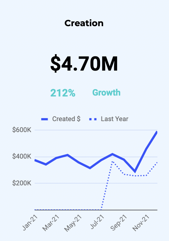
SQLs per Month
A consistent stream of SQLs is critical to the health of any sales pipeline. That’s why so many of our sales partners track SQLs per month as a core KPI. SQLs per month allows you to understand how your lead generation efforts are performing, and also how to forecast sales accurately.
Our Sales Pipeline Analysis template visualizes SQLs by month with a pre-built dashboard in Google Sheets.
Average Deal Value per Team
Average deal value per team shows if individual sales teams in your org are on track to hit revenue targets. You can use this KPI to ascertain what’s working and what’s not within your different sales teams, and adjust course accordingly.
Our Sales Pipeline Analysis template calculates average deal value by team automatically.

Win Rate by Sales Rep
Win rate by sales rep enables you to measure how individual reps are performing, what they’re contributing to total revenue, and also where they need instruction or assistance. That’s why the sales teams we support like this KPI — it allows them to drill down into specific reps and sales cycle issues.
The Sales Pipeline Analysis template automatically generates win rate by sales rep.
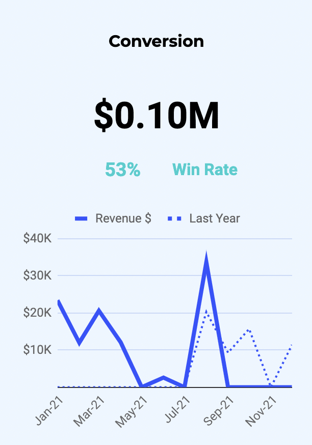
Average Sales Cycle Length
Average sales cycle length quantifies the time from first touch to conversion, across closed deals. This KPI is a good measure of how your sales strategy is performing overall, and also helps with sales forecasting.
The Sales Pipeline Analysis Template computes average sales cycle length.
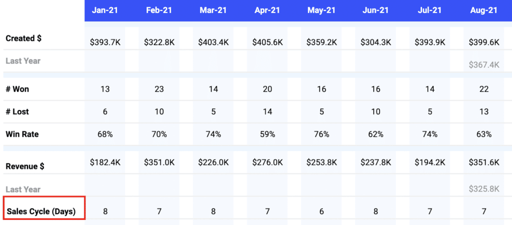
Monthly Sales Pipeline Velocity
Monthly sales pipeline velocity captures how much revenue passes through the sales pipeline each month. This KPI is a good measure of pipeline health. It calculates how fast your sales reps are converting leads.
Our Sales Pipeline Analysis template comes with a monthly sales velocity dashboard, by team, opportunity type, or sales rep.
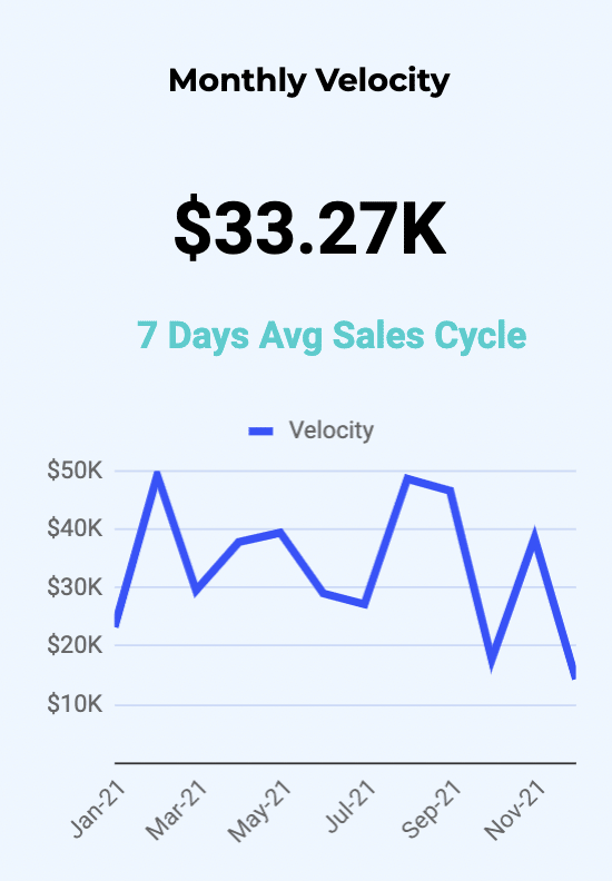
Launch our Sales Pipeline Analysis Template now to deploy pre-built dashboards for these best-in-class pipeline KPIs.
Sales Performance Template
Many sales teams rely on year-over-year sales performance dashboards to analyze growth, adjust tactics, and plan future initiatives. That’s why many SalesOps users have asked us for a pre-built template to handle this use case.
Ask and ye shall receive. Our Sales Performance Template allows sales leaders to compare year-over-year sales performance by industry, region, and account.
Now you can slice-and-dice performance data by sales team, deal type, and more, using a pre-built Google Sheets dashboard that automatically syncs with your Salesforce and HubSpot CRM data.
Here’s a hands-on look at how the Sales Performance Template works.
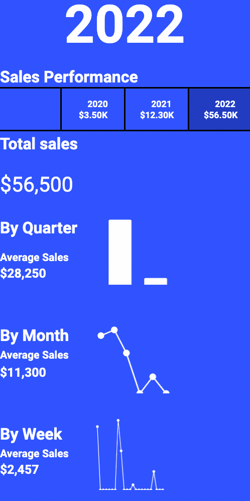
At the top of the template, you can toggle between year, team, country, and opportunity. This will segment the dashboards in the template to show the specified data.

The top-line dashboard in the template displays critical sales performance KPIs, including yearly historic revenue, and total sales by year, quarter, month, and week.
See a high-level overview of monthly sales by deal type — including new business, existing business, and expansion — and sales by country with a geographic gradient map.

Keep track of your top 5 accounts and industries with up-to-date graphs powered by real-time CRM data.

View the largest deals closed in a pre-designed report, including deal name, account name, amount, close date, and owner.

Our Sales Performance Template offers all the performance dashboards your team needs to measure yearly, monthly, weekly, and daily growth. Give it a try — it only takes one click to launch the template.
Opportunity History Changes Template
Opportunity History Field Tracking is a powerful Salesforce report that records the change history of opportunity fields. But it is difficult to maximize the potential of the report due to the rigid reporting functionality in Salesforce.
Combining Opportunity History metrics with the flexibility of Google Sheets opens up a new dimension of sales pipeline analysis. In Google Sheets, SalesOps Managers can track historical pipeline conditions and expand sales forecasting with augmented data about past trends in opportunities.
However, getting this Opportunity History data into Google Sheets, and creating dashboards to visualize it, is a challenge in its own right. That’s why we designed our pre-built Salesforce Opportunity History Template for Google Sheets.
Coefficient’s Opportunity History Template shows how new sales pipelines, lost opportunities, changing close dates, and up-sells impact your bottom-line revenue streams. The template unleashes the full potential of Salesforce’s Opportunity History Field Tracking:
- Track your sales pipeline over any period of time
- Identify opportunities with value changes or time frame modifications
- Set custom fiscal year periods and monitor changes by month, quarter, or year
- Slice and dice opportunity changes by sales team, opportunity type, or account details
- Identify changes to close dates, opportunity amounts, and other fields that affect sales forecast
Here are some of the top use cases our users have leveraged the Opportunity History Template for.
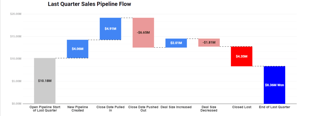
The Sales Pipeline Flow dashboard tells you how the size of your deals change over time when significant events occur. This dashboard gives you a great high-level overview of how all of your deals are doing and how they’ve been impacted by significant events.
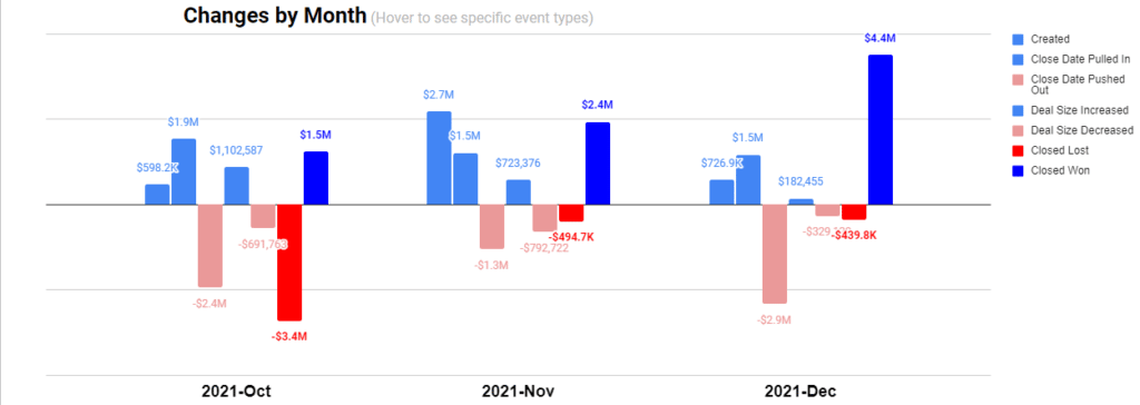
The Changes by Month dashboard tracks significant events in your sales pipeline, and demonstrates how those events occurred over time. The dashboard can help you directly attribute substantial changes in deal size to major events in and out of the company, such as staffing, market changes, or new product offerings.
Forecast Changes by Date
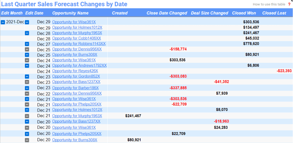
Forecast Changes by Date measures changes by day. The list offers links to each individual Salesforce record, so you can examine in the most granular detail why a specific Opportunity value changed.
Custom Data Filters
If there’s a filter you need in the template, but you can’t find, you can add new data filters from custom fields on your reports. Click Add fields, select the field you would like to use as a filter, and then click Done Selecting Fields.
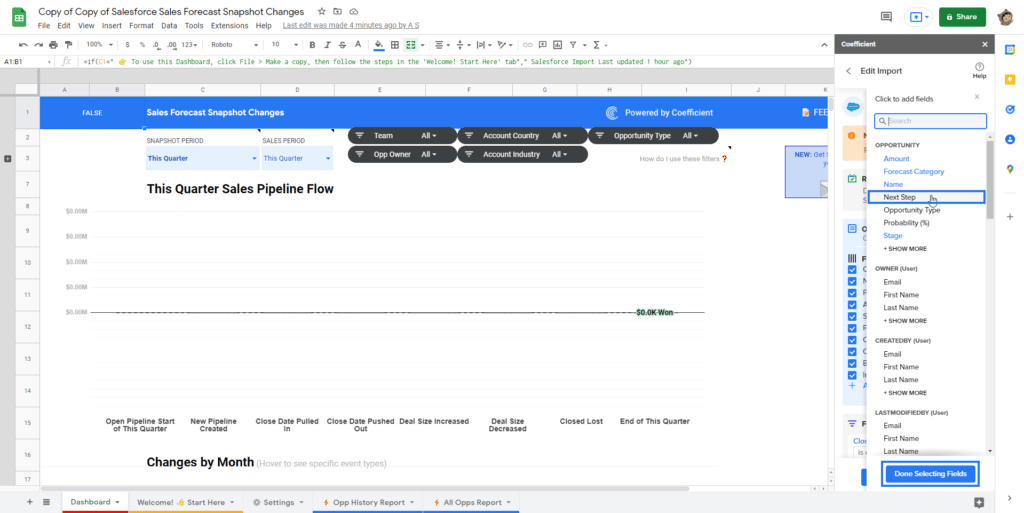
The Salesforce Opportunity History Template allows you to apply a more incisive analysis to your opportunities and historical sales pipeline trends. Launch the free template now to get started:
Try Our Free Google Sheets Sales Templates
There’s only so much time in the day for SalesOps Managers to complete their long list of tasks.
That’s why we’ve built these free Google Sheets sales templates — we want to take the burden of building and maintaining sales dashboards off your plate. We’ve already scoped the KPIs for you, built the dashboards, and taken care of maintenance so the dashboards stay up-to-date and shareable at all times.
Our templates are designed to make your life easier, and they’re free to use, so why not give them a shot?
