Create columns for task titles, start dates, end dates, and task duration in your spreadsheet
Select your complete data range and click Insert > Chart from the Google Sheets menu
Choose “Stacked bar chart” as your chart type in the Chart Editor
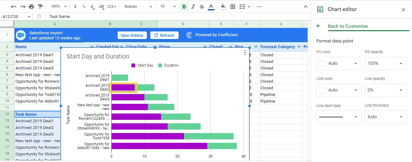
Make the start day section transparent by double-clicking the purple bars, selecting 0% fill opacity to create the Gantt chart appearance
Click Done to finalize your Gantt chart in Google Sheets
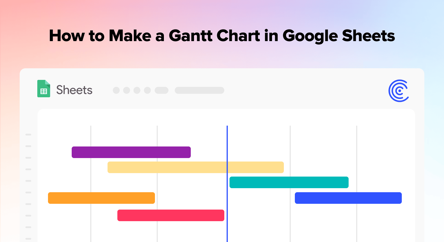
Read the following guide on how to make a Gantt chart in Google Sheets so you can streamline task management for your team.
Gantt charts are powerful tools for helping teams distribute, share, and assign tasks among team members for diverse projects. This allows you to keep projects on schedule by controlling and tracking tasks from a centralized view.
While there are countless apps for creating Gantt charts such as Inspire Planner and Airtable, you can also make them quite easily in Google Sheets.
In a few quick steps, the following guide will show you how to make Gantt charts in Google Sheets, so you can make your projects run smoother.
Video Walkthrough: How to Make a Gantt Chart in Google Sheets
What Do You Use Gantt Charts For?
A Gantt chart is commonly used for visualizing a project’s individual tasks. In a Gantt chart, each task is represented as a bar, in a timeline-like format. The bar length represents each task’s start, duration, and end dates.
Gantt charts convey the following visually:
- Your project’s tasks
- Each task’s relative duration
- The points where the tasks overlap and by how much
- The minimum time required to complete or deliver the project
Gantt charts help teams stick to the project timelines and delivery date. You can use the charts to keep stakeholders up-to-date and hold task owners accountable.
How to Create a Gantt Chart in Google Sheets
You can create a Gantt chart in a Google Sheet using the three methods below.
1. Stacked Bar Chart
As of November 2022, Google Sheets doesn’t offer a built-in option to create a Gantt chart.
However, there’s a workaround — you can harness the stacked bar graph or chart in Google Sheets to make a Gantt chart.
Here’s how.
Before we start building a Gantt chart, let’s import real-time sample Salesforce data using Coefficient. Read Coefficient’s step-by-step walkthrough on how to connect Salesforce to Google Sheets to see how.
Coefficient is a powerful app that lets you automatically import and sync business and project data from your business systems, such as Salesforce, HubSpot, Looker, Jira, and other platforms, in one click.
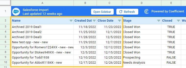
We’ve pulled the sample Salesforce dataset below with Coefficient:
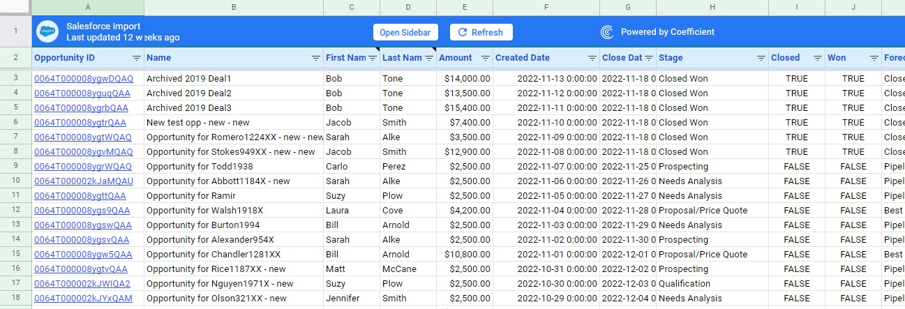
Now let’s make a Gantt chart using this data. We’ll leverage these three columns in the dataset for this example:
- Name
- Created Date
- Close Date
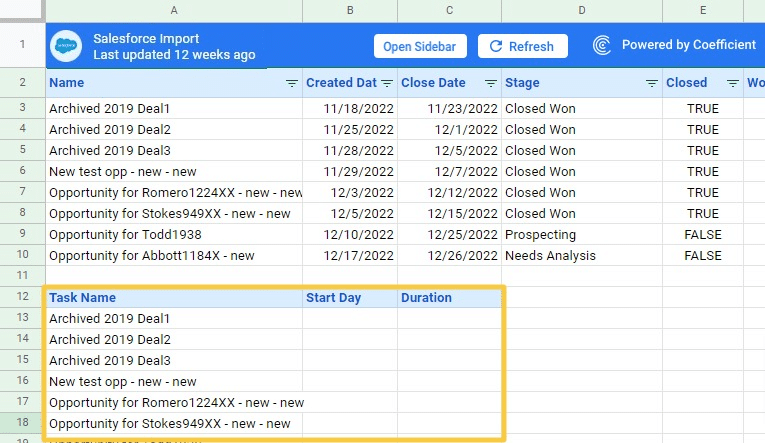
Create a new table with these three columns:
- Task Name
- Start Day
- Task Duration
Then copy the original tasks into the Task Name column.
Type this formula into the new Start Day column. In this example, that’s cell B13.
=INT(B3)-INT($B$3)
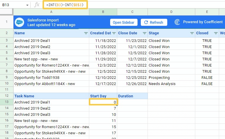
Copy the same formula to the rest of the cells in the Start Day column.
This formula helps you determine the number of days from the starting date when each task should begin.
Next type in this formula under the Duration column (cell C13):
=C3-B3
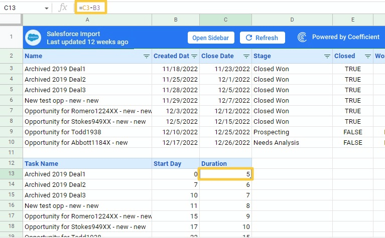
Copy the formula to the rest of the cells in the Duration column.
This formula calculates the duration of a task by calculating the difference between the end date and the start date of the task.
Now that our data table is ready, let’s start building our Gantt chart.
Select the complete cell range within the data table we created (cells A12:C20).
Click on ‘Insert’ on the top Google Sheets menu and select Chart.
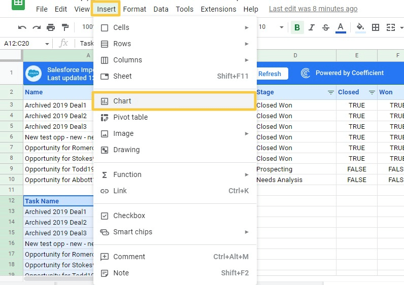
Select Setup on the Chart Editor menu or side panel. Click on the Chart type and choose the Stacked bar chart from the options.
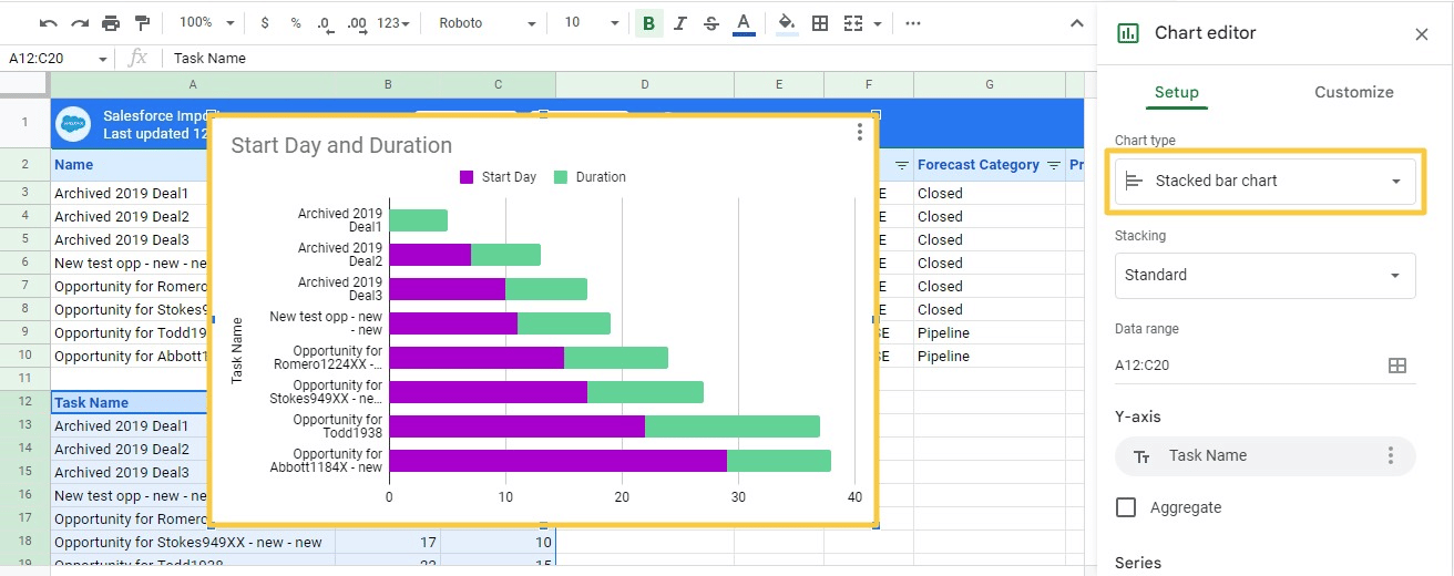
The stacked bar chart will show two sections: the Start Day in purple and the Task Duration in green.
Now you can make the Start Day section transparent, so the chart resembles a Gantt chart. To do this, double-click any Start Day bar (the purple part of the bar).
Select the Customize tab on the Chart editor side pane. Ensure that the Start Day is selected under the Series section.
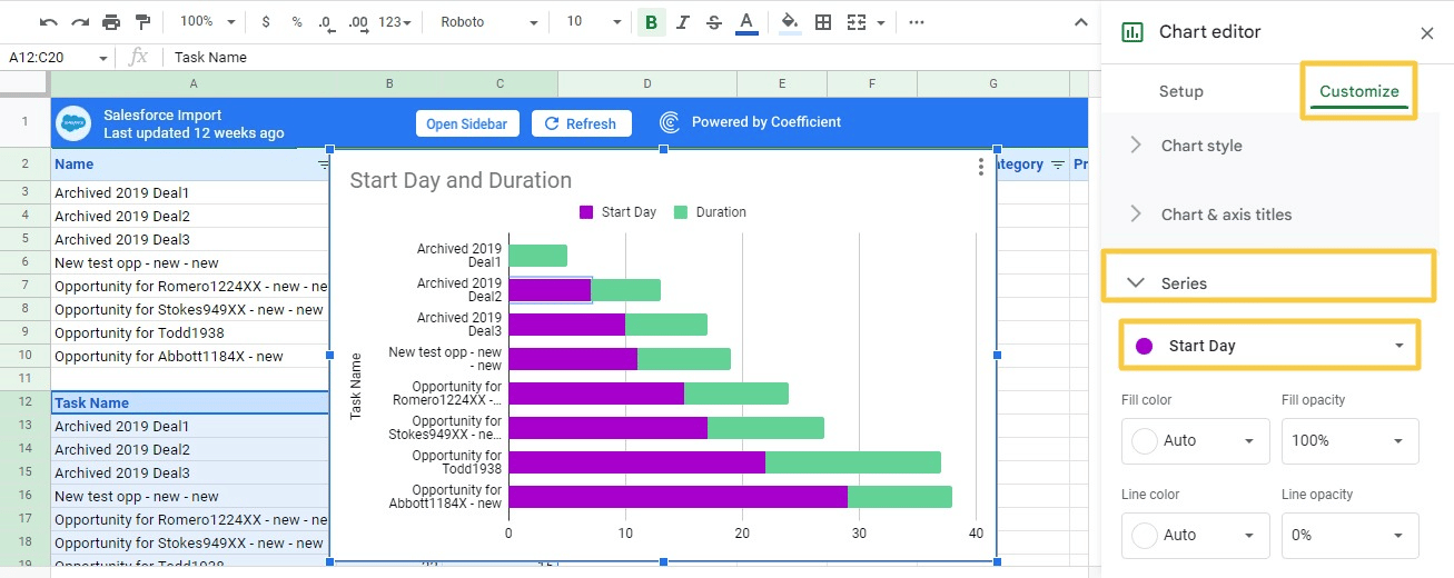
Click the Fill opacity drop down menu and select 0%.
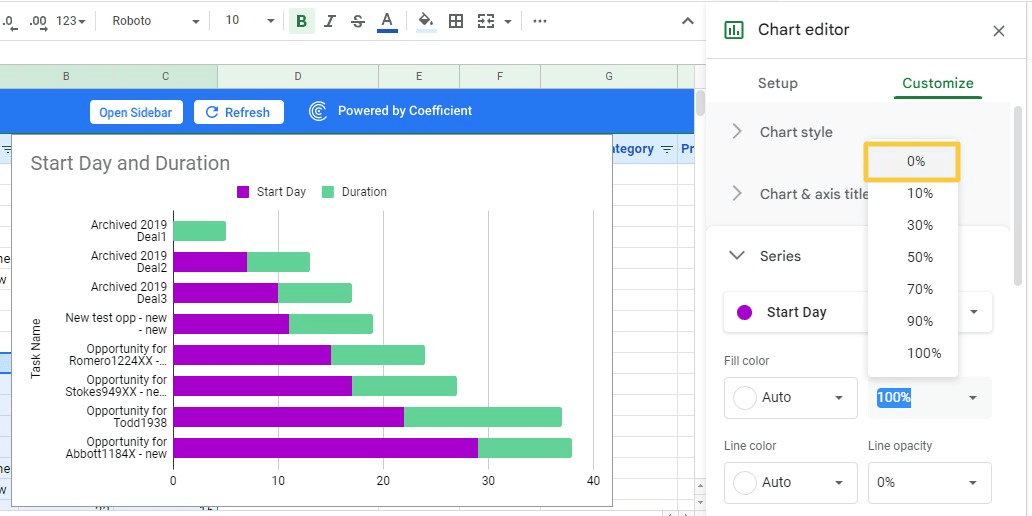
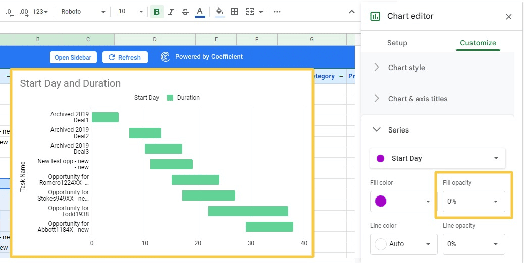
This will make the Start Day sections of your bar chart invisible. Click Done to close the Chart editor.
And voila – you now have a Gantt chart in Google Sheets!
2. Build Google Sheets Gantt Chart from Scratch
If a stacked bar chart doesn’t make sense, you can always build a Gantt chart from scratch in Google Sheets.
The steps below will help you create a straightforward Gantt chart template for efficient project task tracking.
Here’s how.
Begin by creating columns for titles, days, start date, end date, task duration, and other details. Then add other necessary slots, such as project manager, company name, and project title.
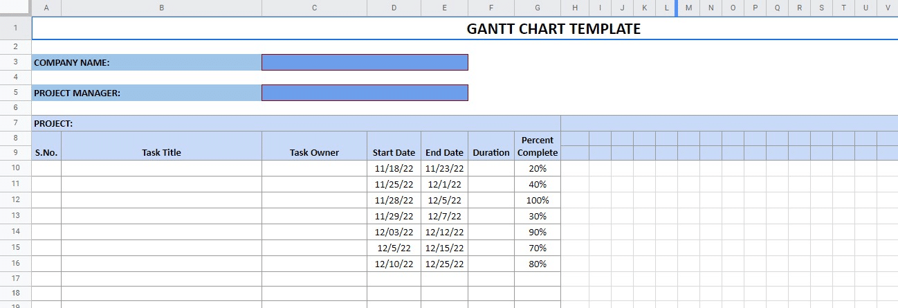
Next, add the formulas to automatically calculate the task durations, days, and dates of the week.
Then we’ll use conditional formatting to format the Gantt chart and color scale. This will help visualize the percentage of each completed task.
Once you’re done creating the main skeleton, start filling in the basic details. Type in each task title, start date, end date, and task owner entry.
Let’s use a formula that automatically displays the number of days needed to complete each task in column F.
We’ll enter this formula in cell F10:
=INT(E10)-INT(D10)+1
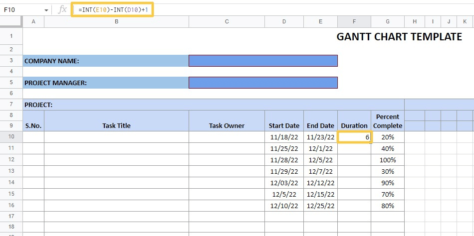
Drag and copy the formula to the rest of the cells in column F.
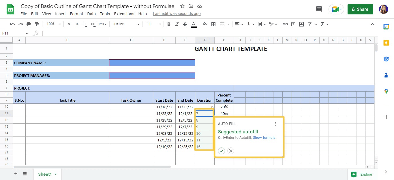
Next, let’s customize the Gantt chart outline and update it with automation. We’ll use color scale conditional formatting for the Percent Complete column.
The column (column G) allows you to enter how much of each task has been completed. The color scale conditional formatting lets us show a darker color as the completion percentage increases.
0% completion will show completely white, and 100% completion will show the darkest shade of the color you’ve chosen.
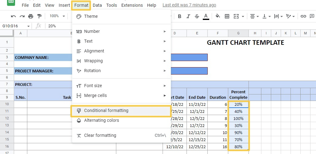
Select the cells in column G (G10 to G16). Go to the Format tab on the top Google Sheets menu and click Conditional Formatting.
You should see the Conditional format rules sidebar pop up on the right side of the screen.
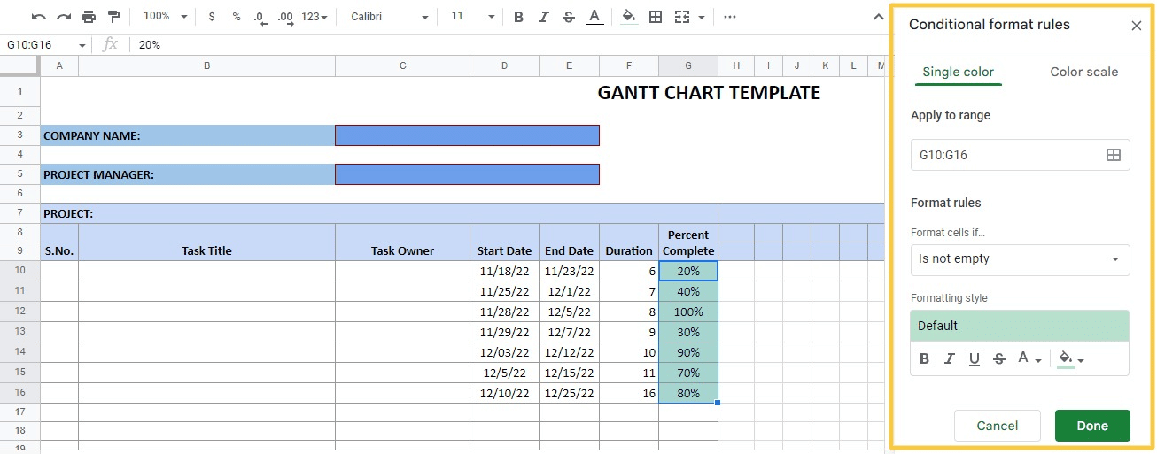
Click on the Color scale tab and select the Preview option. Choose from the suggested color scales or find a custom option by clicking Custom color scale.
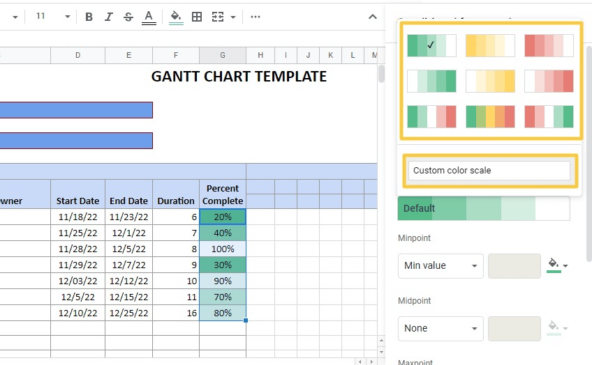
For this example, let’s use a light-to-dark magenta custom color scale.
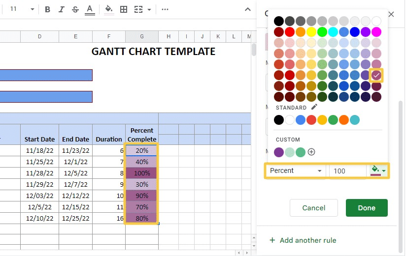
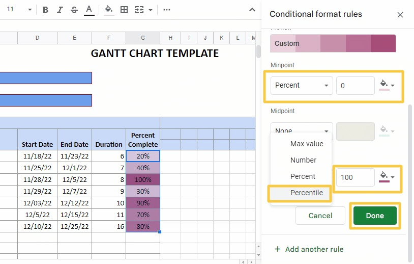
Change Minpoint to 0 and Maxpoint to 100. Then click ‘Done’.
Supercharge your spreadsheets with GPT-powered AI tools for building formulas, charts, pivots, SQL and more. Simple prompts for automatic generation.

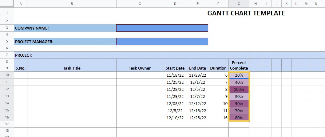
Google Sheets automatically fills each column with colors on the scale depending on each cell’s percentage value.
The third step is to fill in the sequence of days in our Gantt chart.
We can automate Google Sheets to display the sequence of dates depending on the first task’s starting date in the project.
For instance, if the date in cell D10 is 11/18/2022, cells H8 to AK8 will display days 11/19/2022 to 12/18/2022 (30 days).
Let’s start counting days from the first day of November using this formula (in cell H8):
=EOMONTH(D10,-1)+1
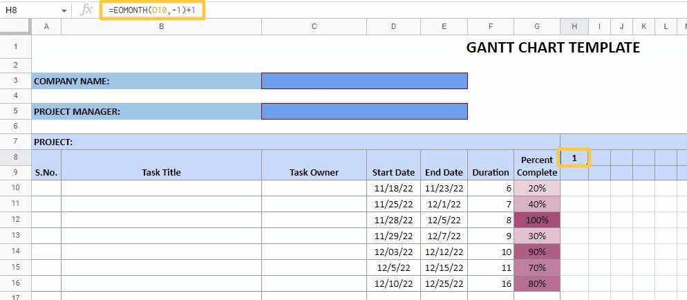
The formula returns the first day of the month in cell D10.
As you can see, EOMONTH finds the last day of the previous month. To get the first day of the given month, we used -1 as the second parameter and added a 1 to the formula.
To display the rest of the days of the month, we’ll add one day to the previous cell. Use this formula in cell I8:
=H8+1
Copy the formula to the rest of the cells in row eight (until cell AK8).
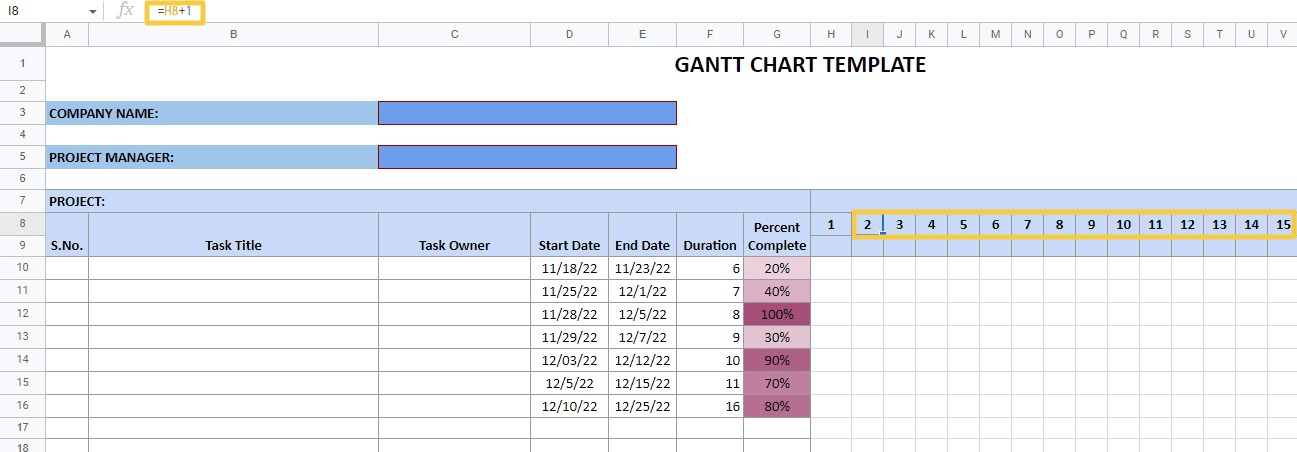
Now you can fill in the days of the week.
We can change the days of the week based on the corresponding dates in row eight, depending on the start date you entered in cell D10.
If the Start date is 11/18/2022, the days of the week displayed will start on Tuesday, since November 1, 2022, is a Tuesday.
Use the formula in cell H9 to show the day of the week, with the sequence starting based on the corresponding date in row eight.
Here is the formula:
=LEFT(TEXT(H8,”ddd”),1)
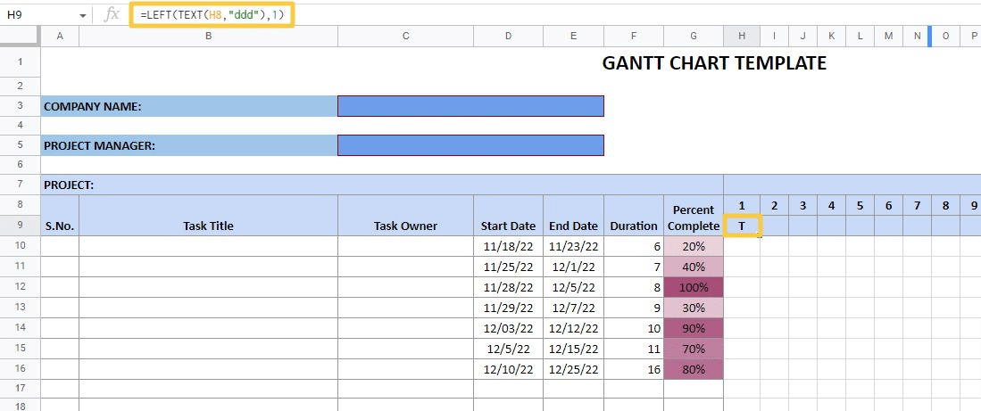
The formula converts the date in cell H8 into the day of the week using the TEXT function.
Then the formula extracts only the first letter from the day’s name, using the LEFT function, and passes 1 as the second argument.
Drag the fill handle to apply the same formula to the remaining cells (until cell AK9).
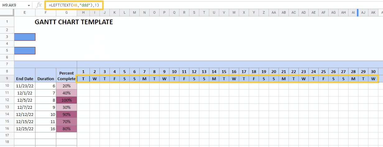
Then we can automate the Gantt chart area to display the Google Sheets bars according to each task’s start and end dates.
Let’s use conditional formatting to add a new rule to the same set of cells.
Select the Gantt chart area (cell range H10 to BJ16 in our example).
Go to Format>Conditional formatting to open the Conditional format rules sidebar.
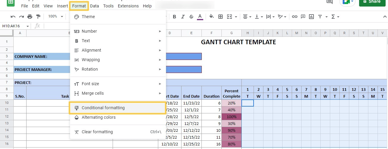
Click on the Format cells if… drop down menu and select Custom formula is.
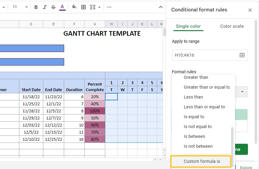
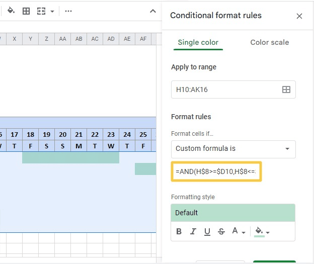
A new input box will appear below the Format cells if… dropdown.
Enter this formula into the value or formula input box:
=AND(H$8>=$D10,H$8<=$E10)
Choose your preferred formatting under Formatting style and click Done.
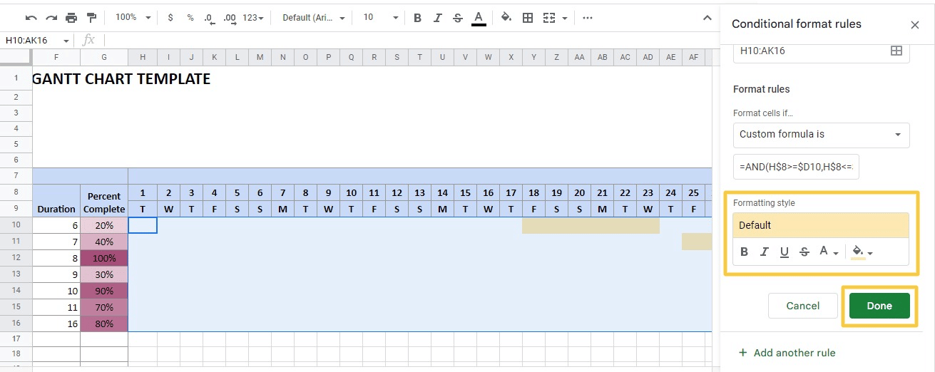
You should now see the final Gantt chart. Each task is automatically updated based on columns D and E’s start and end dates input.
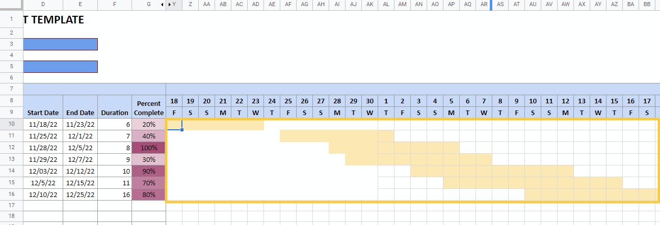
There you have it. That’s how you can create a Gantt chart in Google Sheets from scratch.
3. Gantt Chart Google Sheets Templates
You can also use a Google Sheets template to launch a pre-built Gantt chart in a few clicks. This takes all the manual work associated with building a Gantt chart in Google Sheets off your plate.
These templates also typically add additional functionality to your Gantt chart, including task statuses, completion percentages, and other more advanced functions. It’s a win-win option for busy teams.
There are many free Gantt chart templates online. One of our favorites Gantt templates is contained on HubSpot’s 21 of the Best Free Google Sheets Templates for 2022.
Here’s a sample of the Gantt template from the HubSpot list:
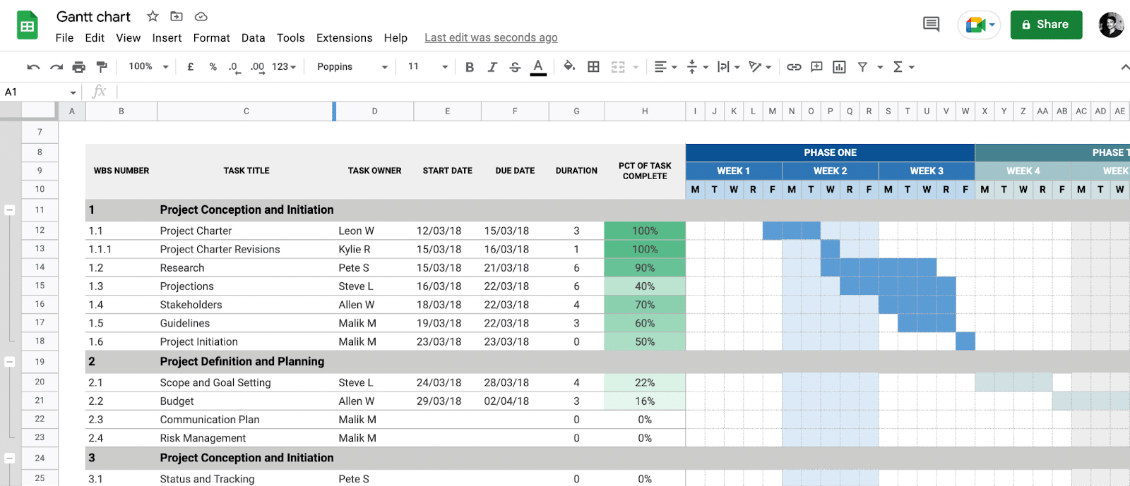
Our Sales Operations Dashboard template is also included in the HubSpot list. And you can also browse the full collection of our dashboard templates.
Build Gantt Charts in Google Sheets Now
It’s easy to create Gantt charts with Google Sheets. The methods in this guide simplify the process for you, allowing you to follow along and create your Gantt charts in Google Sheets as quickly as possible.
And now, with Coefficient, you can combine live data from your company systems with Gantt charts to track tasks in real-time. Try Coefficient for free now to optimize your workflows and team efficiency.
