Waterfall charts transform complex financial data into clear visual stories that show how values change over time or across categories. Whether you’re analyzing budget variances or presenting financial statements, Excel’s built-in waterfall chart functionality helps you create professional visualizations without complex formulas or manual formatting.
How to Create a Basic Waterfall Chart in Excel
Creating your first waterfall chart requires just a few clicks once your data is properly organized.
- Prepare Your Data
- Open a new Excel worksheet
- Create three columns: Category, Value, and Subtotal
- Enter your starting value, intermediate changes, and final total
Example data structure:
|
Category |
Value |
Subtotal |
|---|---|---|
|
Starting Balance |
10000 |
10000 |
|
Revenue |
5000 |
15000 |
|
Expenses |
-3000 |
12000 |
|
Taxes |
-1000 |
11000 |
|
Final Balance |
11000 |
11000 |
- Insert the Chart
- Select your data range
- Click Insert > Charts > Waterfall Chart

-
- If you don’t see it immediately, look under “All Charts” > “Stock, Surface, or Radar“
- Initial Formatting
- Excel automatically colors increases in blue and decreases in red
- The first and last columns appear as gray totals

Customizing Your Waterfall Chart Colors
Make your chart match your brand or presentation style with these formatting options:

Stop exporting data manually. Sync data from your business systems into Google Sheets or Excel with Coefficient and set it on a refresh schedule.
Get Started
- Change Bar Colors
- Click any bar to select all bars of that type
- Right-click > Format Data Series
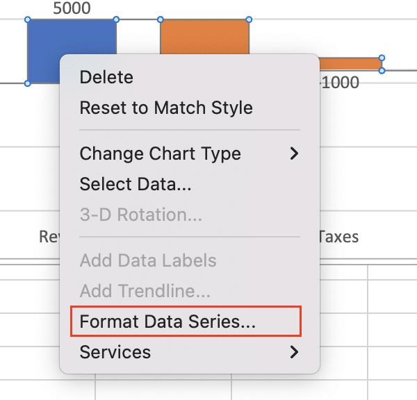
-
- Select “Fill” and choose your desired colors
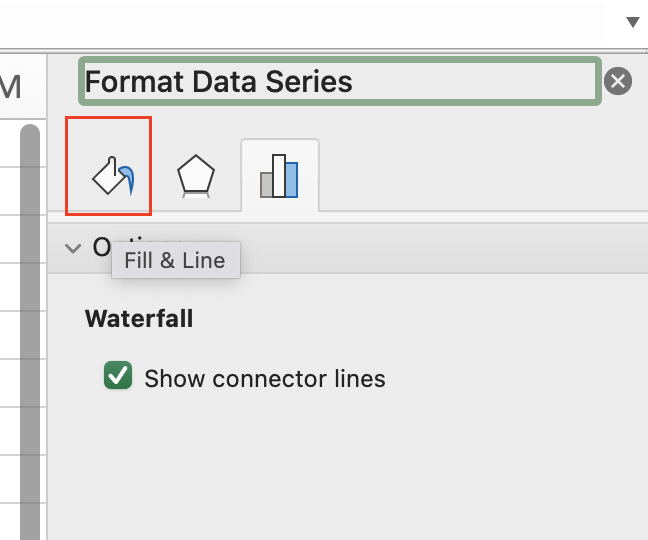
-
- Recommended: Use distinct colors for increases and decreases
- Format Total Bars
- Click a total bar
- Right-click > Format Data Point
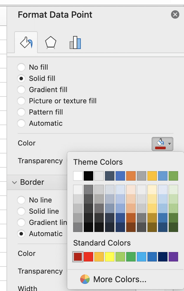
-
- Choose a neutral color that contrasts with your increase/decrease colors
Adding and Formatting Chart Elements
Enhance your chart’s clarity and professionalism:
- Add Title and Labels
- Click the chart
- Select Chart Design > Add Chart Element

-
- Add:

-
-
- Chart Title
- Axis Titles
- Data Labels
-
- Format Data Labels
- Right-click any data label
- Select “Format Data Labels“
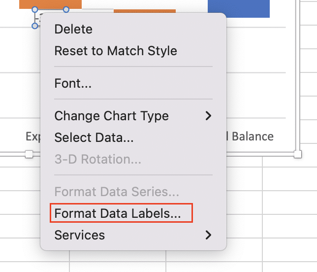
-
- Choose position (inside/outside end)
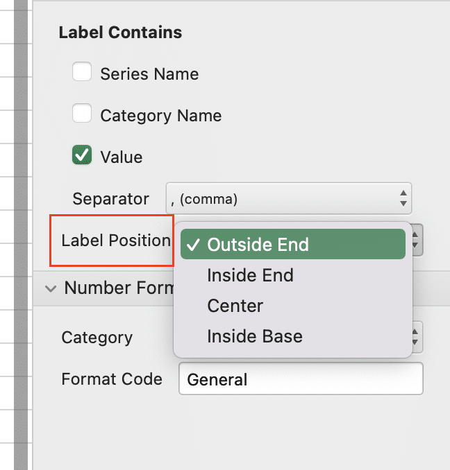
-
- Select number format (currency, percentage, etc.)

Creating a Total Column in Your Waterfall Chart
Designate specific bars as running totals to show cumulative impact:
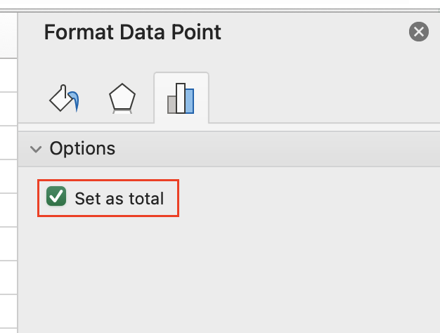
- Set Total Columns
- Click the bar you want to set as a total
- Right-click > Format Data Point

-
- Check “Set as total“
- Format Total Columns
- Adjust width using the “Gap Width” slider
- Change fill color to distinguish from regular bars
- Add custom labels if needed
What You Can Do With Your Waterfall Chart
Export your chart for various uses:
- Copy directly into PowerPoint
- Save as image for reports
- Print with gridlines for handouts
Keep your data current by connecting your Excel waterfall charts to live data sources. With Coefficient, you can automatically refresh your charts with real-time data from 50+ business systems.


