
Are you struggling to present complex hierarchical data in a clear, visually appealing way? Treemap charts in Excel offer a powerful solution, allowing you to display multiple levels of categorical data in a single, easy-to-understand visualization.
This comprehensive guide will walk you through the process of creating, customizing, and effectively using treemap charts in Excel, empowering you to transform your data into actionable insights.
Step-by-Step Guide to Creating a Treemap Chart in Excel
Creating a treemap chart in Excel is a straightforward process once you have your data prepared. Follow these steps to bring your hierarchical data to life:
Selecting Your Data Range
- Open your Excel spreadsheet containing the prepared hierarchical data.
- Click and drag to select the entire range of data, including the column headers and all rows with data.
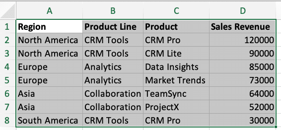
- Make sure to include all hierarchy columns and the value column in your selection.
Pro tip: Use the keyboard shortcut Ctrl + A to quickly select all contiguous data in your worksheet.
Inserting a Treemap Chart
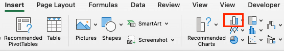
- With your data selected, navigate to the “Insert” tab on the Excel ribbon.
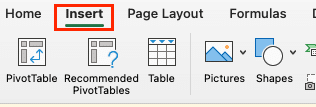
- In the “Charts” section, click on the “Hierarchy” button (it looks like a hierarchical diagram).
- From the dropdown menu, select “Treemap.”
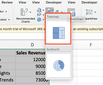
Excel will now create a basic treemap chart based on your selected data. Don’t worry if it doesn’t look perfect yet – we’ll customize it in the next steps!
Adjusting Chart Layout and Design
Now that you have your basic treemap chart, let’s refine its layout and design:
- Adjust chart size: Click and drag the corners of the chart to resize it as needed.
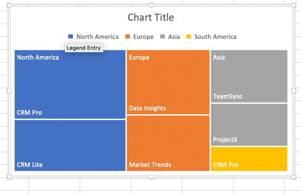
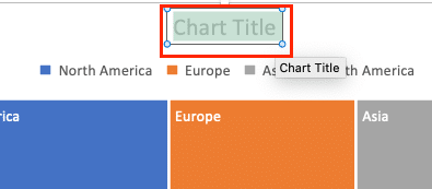
- Modify chart title: Double-click the chart title to edit it. Give your treemap a clear, descriptive title.
- Rearrange hierarchy levels: If your treemap doesn’t reflect the desired hierarchy:
- Right-click on the chart and select “Select Data.”
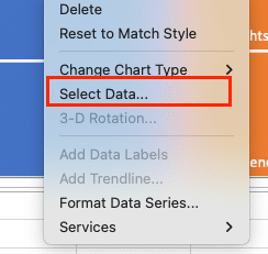
- In the “Select Data Source” dialog, use the up and down arrows to reorder your hierarchy levels.

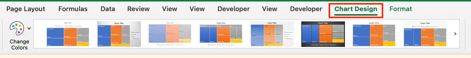
- Change chart style:
- Click on the chart to reveal the “Chart Tools” contextual tabs.
- Go to the “Chart Design” tab and explore different chart styles in the “Chart Styles” gallery.
- Adjust layout options:
- Still in the “Design” tab, click “Add Chart Element.”
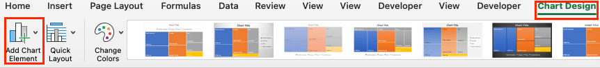
- Experiment with adding or removing elements like data labels or a legend.
Remember, these are just initial adjustments. In the next section, we’ll dive deeper into customizing your treemap chart to make it truly shine.
Customizing Your Treemap Chart
Now that you have a basic treemap chart, it’s time to customize it to enhance its visual appeal and effectiveness. Excel offers a wide range of customization options to make your treemap chart stand out.
Modifying Colors and Styles
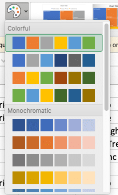
- Change color scheme:
- Click on your chart to open the “Chart Tools” contextual tabs.
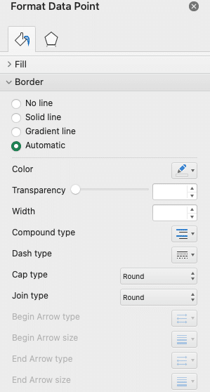
- Go to the Chart Design” tab and click “Change Colors.”
- Choose a color scheme that fits your data and preferences.
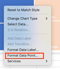
- Customize individual rectangle colors:
- Click on a rectangle in your treemap.
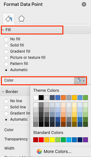
- Right-click and select “Format Data Point.”
- In the Format Data Point pane, click on “Fill” and choose your desired color.
- Apply a gradient effect:
- In the Format Data Point pane, under “Fill,” select “Gradient fill.”
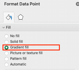
- Experiment with different gradient options to add depth to your treemap.
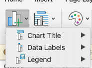
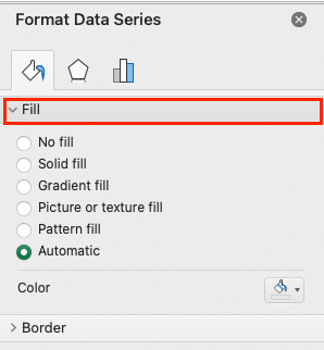
- Modify border styles:
- In the Format Data Point pane, click on “Border.”
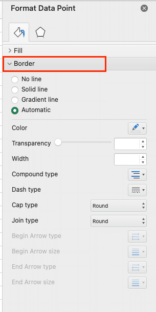
- Adjust the color, width, and style of the borders between rectangles.
Adding and Formatting Data Labels
Data labels can provide additional context and make your treemap more informative:
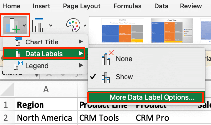
- Add data labels:
- Click on your chart.
- Go to the “Chart Tools” > “Design” tab.

- Click “Add Chart Element” > “Data Labels” > “More Data Label Options.”
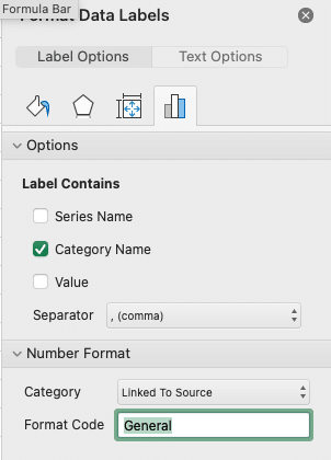
- Customize label content:
- In the Format Data Labels pane, under “Label Options,” choose what information to display (e.g., category name, value, or percentage).
- Adjust label position:
- In the same pane, experiment with label position options like “Center” or “Best Fit.”
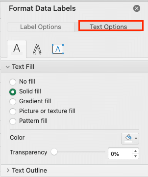
- Format label text:
- Use the “Text Options” in the Format Data Labels pane to change font, size, and color.
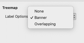
- Apply label styles:
- Try different label styles from the “Label Options” section, such as “Banner” or “Overlapping.”
Adjusting Size and Proportions
Fine-tuning the size and proportions of your treemap can significantly impact its readability:
- Resize the entire chart:
- Click and drag the chart corners to adjust its overall size.
- Modify the chart area:
- Right-click on the chart area (the space around the treemap).
- Select “Format Chart Area” and adjust the size and position as needed.
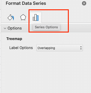
- Adjust white space:
- In the Format Data Series pane, look for the “Series Options” section.
- Experiment with the “Gap” slider to adjust the space between rectangles.
Implementing Hierarchical Levels
To make your treemap more informative, you can visually distinguish between different hierarchical levels:
- Show parent labels:
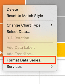
- Right-click on the treemap and select “Format Data Series.”
- In the Format Data Series pane, under “Series Options,” check “Show parent labels.”
- Customize level colors:
- In the same pane, under “Fill,” you can set different colors for each hierarchical level.
- Adjust level layout:
- Experiment with the “Layout” options in the Series Options section to change how levels are displayed.
Video Tutorial
Check out the tutorial below for a complete video walkthrough!

Stop exporting data manually. Sync data from your business systems into Google Sheets or Excel with Coefficient and set it on a refresh schedule.
Get Started
What is a Treemap Chart?
A treemap chart is a hierarchical visualization tool that displays data as nested rectangles. Each rectangle represents a category or subcategory, with its size proportional to the value it represents. This unique layout allows you to see patterns and compare values across different levels of categorization at a glance.
Treemap charts are particularly useful for visualizing large datasets with multiple levels of hierarchy. They provide a compact and intuitive way to represent complex data structures, making it easier to identify trends and outliers.
When to Use Treemap Charts
Treemap charts excel in situations where you need to:
- Visualize hierarchical data with multiple levels
- Compare values across different categories and subcategories
- Identify patterns and proportions within a dataset
- Present complex information in a space-efficient manner
Some common use cases for treemap charts include:
- Analyzing sales data by product category and subcategory
- Visualizing budget allocations across departments and projects
- Displaying file and folder structures on a hard drive
- Comparing market share among companies in different industries
Benefits of Treemap Charts for Data Visualization
Treemap charts offer several advantages over other chart types:
- Efficient use of space: Treemaps can display large amounts of hierarchical data in a compact format, making them ideal for dashboards and presentations.
- Intuitive representation: The size and color of rectangles make it easy to grasp relative proportions and identify significant categories at a glance.
- Multilevel analysis: Treemaps allow users to explore data at different levels of granularity, from high-level categories to detailed subcategories.
- Pattern recognition: The arrangement of rectangles helps users quickly identify trends, outliers, and relationships within the data.
- Customizable visualization: Excel provides various options to customize treemap charts, allowing you to tailor the visualization to your specific needs.
Now that we understand the basics of treemap charts, let’s move on to preparing your data for this powerful visualization tool.
Beyond Treemaps: Keeping Charts Live
Excel allows you to create treemap charts for visualizing hierarchical data. However, maintaining these charts with the latest information can be time-consuming. Coefficient connects your Excel sheets to various data sources. This lets you automatically update your treemap data, create real-time visualizations, and refresh your charts without manual input. To explore how this can improve your data visualization process, check out Coefficient.


