
Organize your data correctly in Excel with columns for Date, Open, High, Low, Close, and Volume (if applicable), ensuring dates are in chronological order
Select the data range containing your stock data (excluding header rows)
Navigate to the “Insert” tab, click on the “Stock” chart icon in the Charts section, and choose the appropriate stock chart type from the dropdown menu
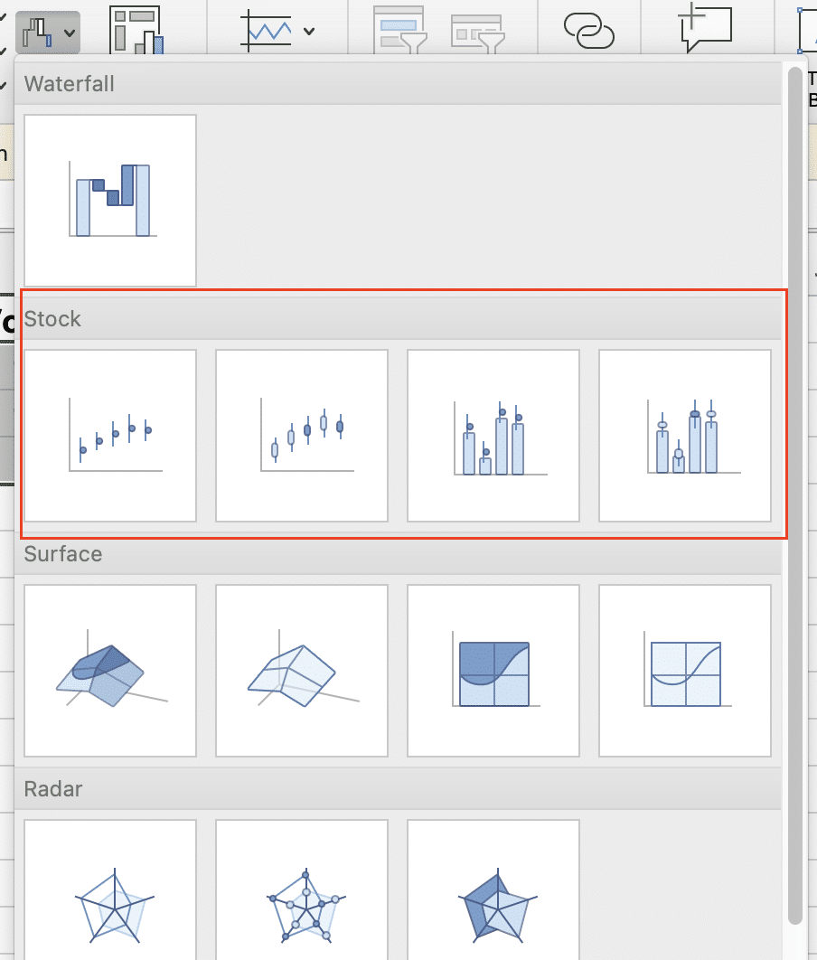
Select the chart type that best suits your needs: Open-High-Low-Close for comprehensive price movements, High-Low-Close when opening prices aren’t available, or Volume-High-Low-Close to include trading volume
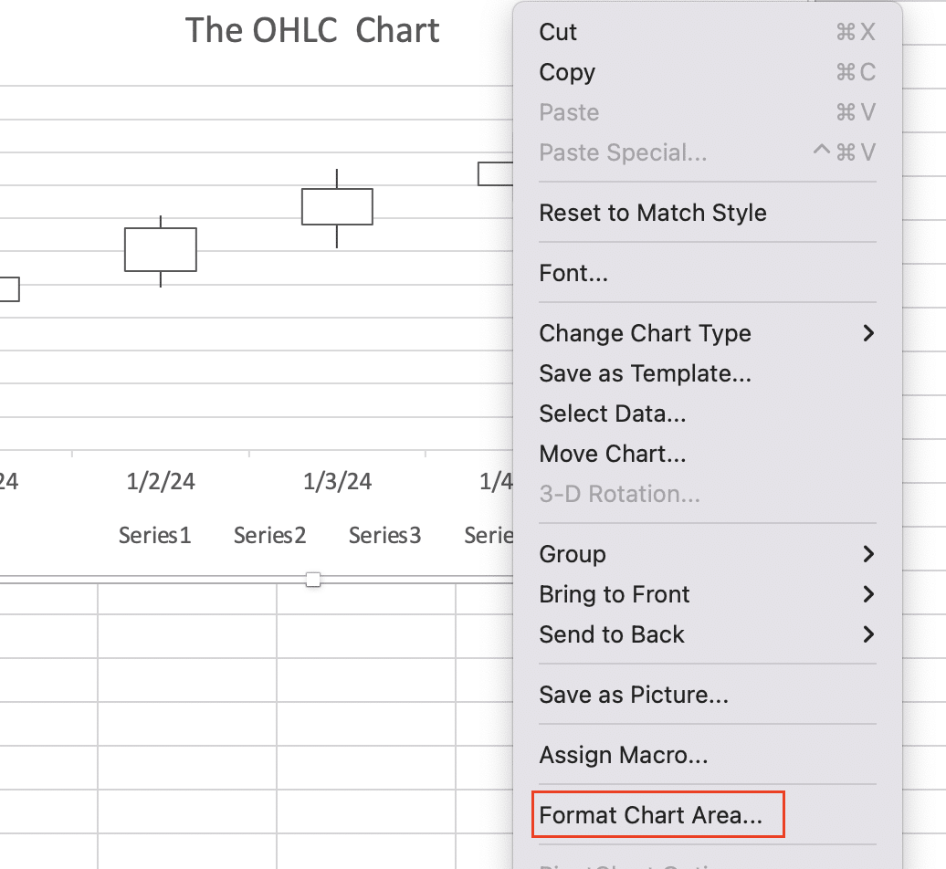
Customize your chart by right-clicking to access “Format Chart Area” and add chart titles, axis titles, and adjust formatting as needed
Are you struggling to visualize stock data effectively in Excel? This comprehensive guide will walk you through the process of creating professional-looking stock charts, from basic setup to advanced techniques. By the end, you’ll have the skills to create powerful visual representations of financial data for better analysis and decision-making.
Step-by-Step Guide: Creating Your First Stock Chart
Before creating a stock chart, you need to organize your data correctly in Excel. This step is crucial for ensuring your chart accurately represents the stock’s performance.
Organizing stock data in Excel
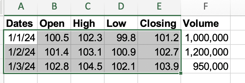
To create an effective stock chart, arrange your data in columns with the following structure:
- Date
- Open price
- High price
- Low price
- Close price
- Volume (optional)
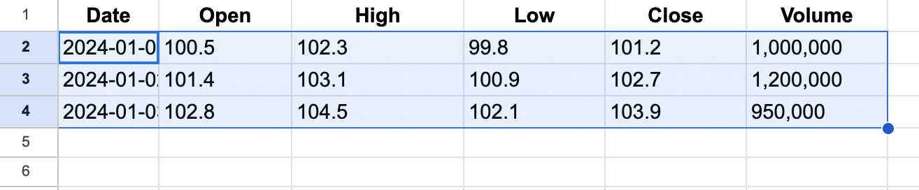
Here’s an example of how your data should be organized:
| Date | Open | High | Low | Close | Volume |
| 2024-01-01 | 100.5 | 102.3 | 99.8 | 101.2 | 1,000,000 |
| 2024-01-02 | 101.4 | 103.1 | 100.9 | 102.7 | 1,200,000 |
| 2024-01-03 | 102.8 | 104.5 | 102.1 | 103.9 | 950,000 |
Ensure that your dates are in chronological order, with the oldest date at the top of the column.
Required data points for different chart types
Different stock chart types require specific data points:
- OHLC charts: Date, Open, High, Low, Close
- HLC charts: Date, High, Low, Close
- Volume-High-Low-Close charts: Date, High, Low, Close, Volume
- Candlestick charts: Date, Open, High, Low, Close
Step-by-Step Guide: Creating a Basic Stock Chart
Now that your data is organized, let’s create a basic stock chart in Excel.
Selecting your data
- Highlight the columns containing your stock data (Date, Open, High, Low, Close, and Volume if applicable).
- Ensure you’ve selected only the cells containing data, excluding any header rows.
Inserting a stock chart
- Navigate to the “Insert” tab on the Excel ribbon
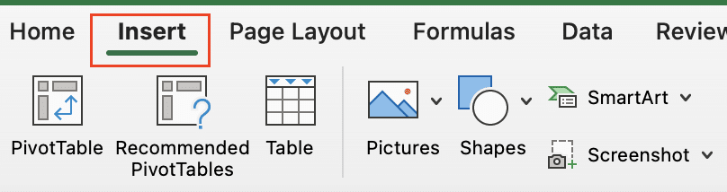
- In the “Charts” section, click on the “Stock” chart icon
.
- Choose the appropriate stock chart type from the dropdown menu.
Choosing the right chart type
Select the chart type that best suits your data and analysis needs:
- Open-High-Low-Close: For a comprehensive view of price movements
- High-Low-Close: When opening prices are less important or unavailable
- Volume-High-Low-Close: To include trading volume data in your analysis
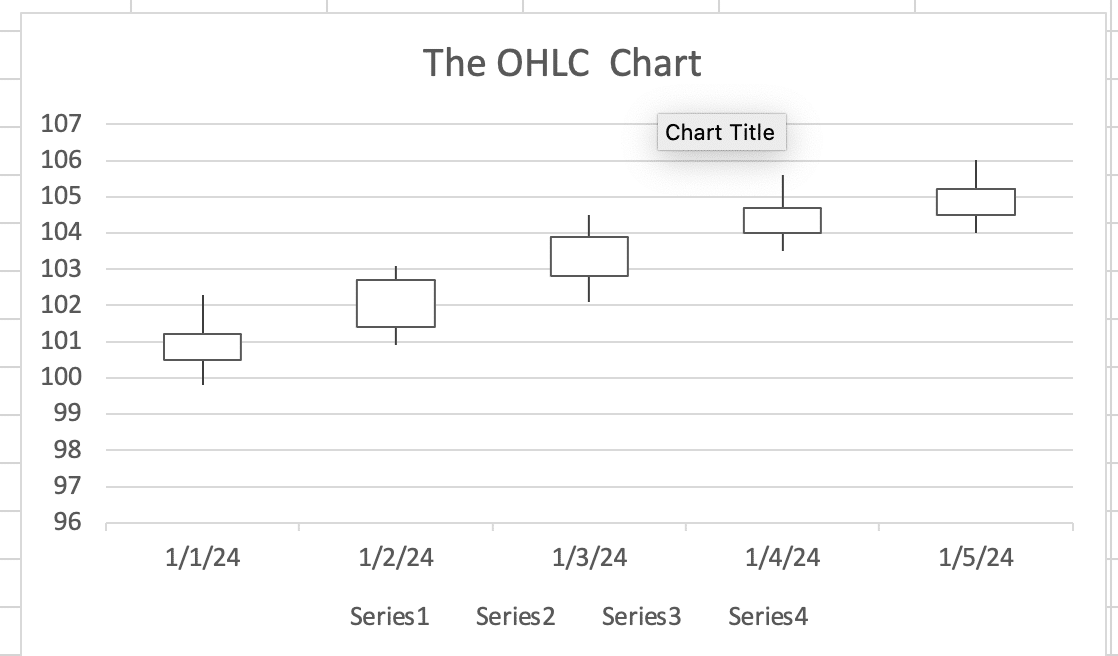
Excel will generate a basic stock chart based on your selected data and chart type.
Customizing Your Excel Stock Chart
A well-designed stock chart enhances data visualization and improves understanding. Let’s explore how to customize your chart for maximum impact.
Formatting chart elements
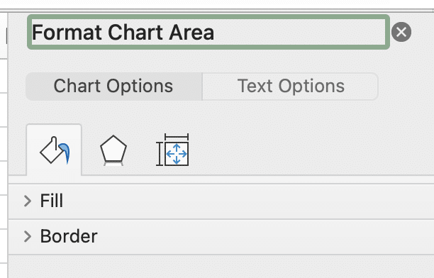
- Right-click on the chart and select “Format Chart Area.”
- Use the formatting options to:
- Change the chart background color
- Adjust the chart border style and color
- Modify the chart’s font style, size, and color
Adding and modifying chart titles and axes
- Click on the “Chart Title” and “Axis Titles” options to add or edit titles.
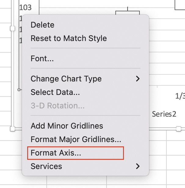
- Customize the appearance of axes by right-clicking on them and selecting “Format Axis.”
Incorporating volume data
To add volume data to your chart:
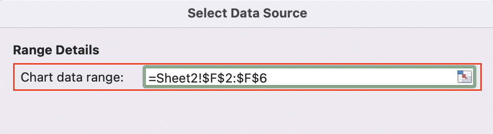
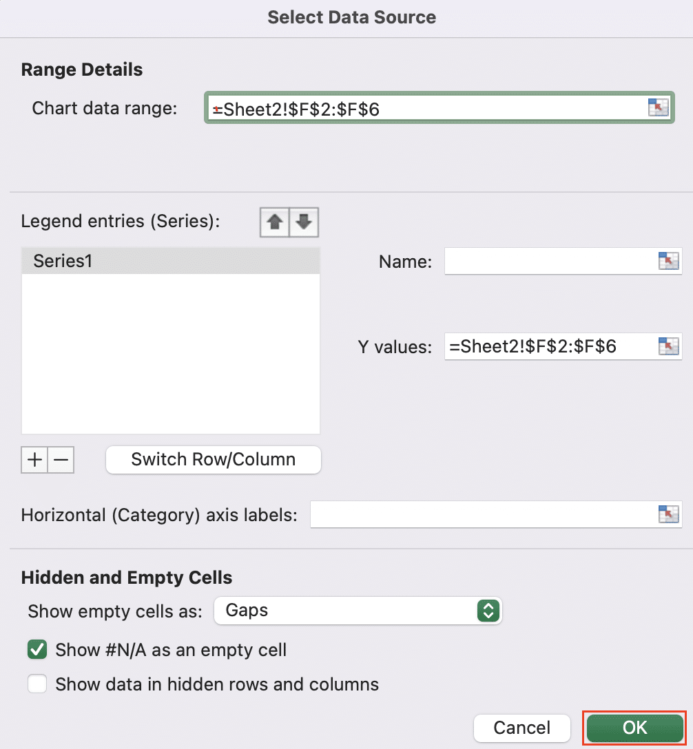
- Right-click on the chart and select “Select Data.”

- Click “Add” in the “Series” section.
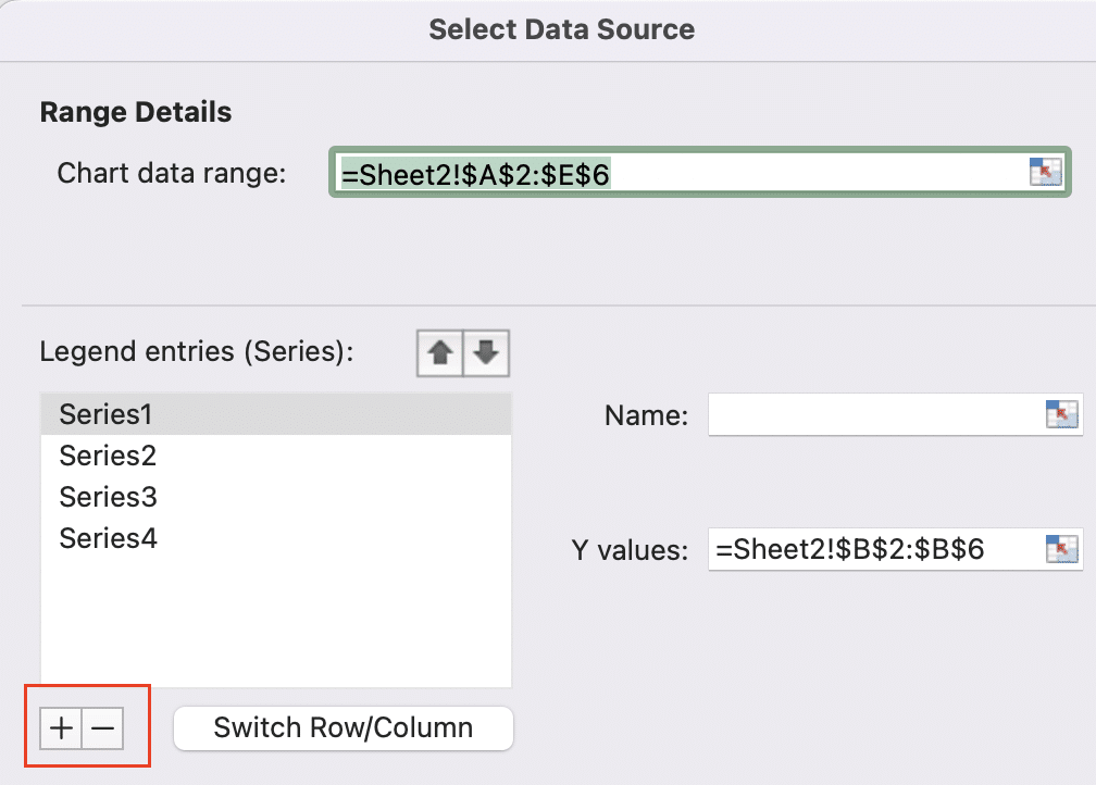
- Enter a name for the series (e.g., “Volume“).
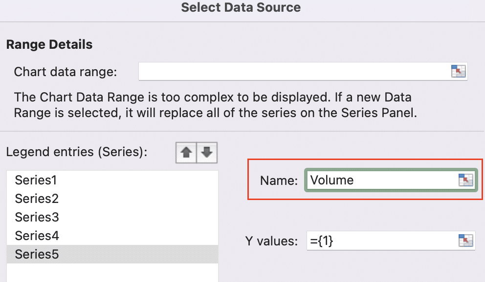
- Select the range of cells containing your volume data for the “Series values.”
- Click “OK” to add the volume data as a separate series on your chart.
Using different time periods
To adjust the time period displayed on your chart:
- Right-click on the horizontal axis and select “Format Axis.”
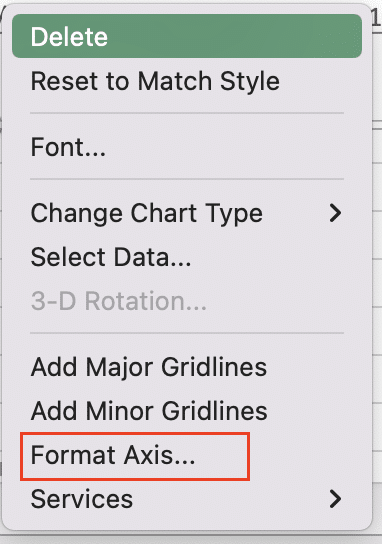
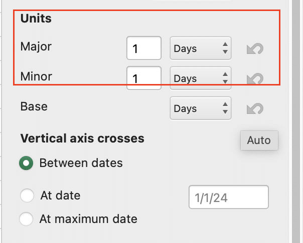
- In the “Axis Options” section, modify the “Minimum” and “Maximum” values to set your desired date range.
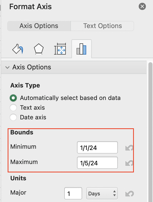
- Adjust the “Major unit” and “Minor unit” settings to control the spacing of date labels on the axis.
Advanced Stock Chart Techniques
Take your stock charts to the next level with these advanced techniques.
Creating candlestick charts
Candlestick charts offer a more detailed view of price movements:
- Select your data (Date, Open, High, Low, Close).
- Go to Insert > Stock > Stock Volume-Open-High-Low-Close.
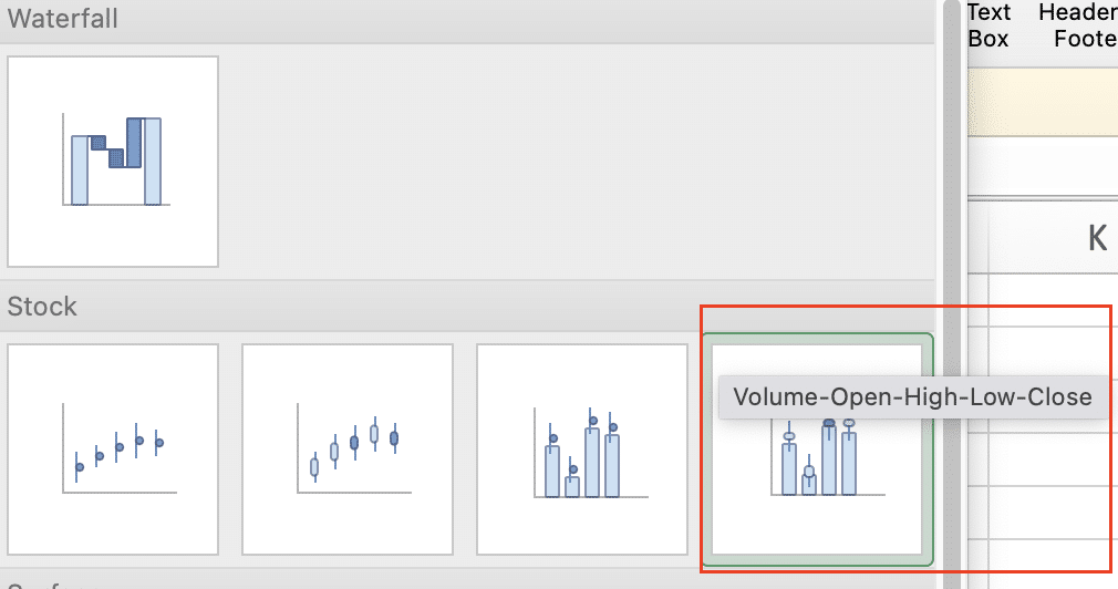
- Right-click on the chart and choose “Change Chart Type.”
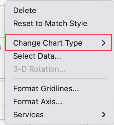
- Select “Waterfall > Stock” and then “Open-High-Low-Close” which is the candlestick pattern from the available options.
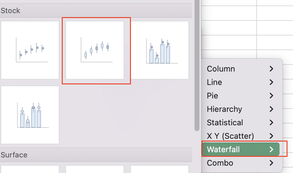
- Click “OK” to apply the changes.
Adding moving averages and trend lines
To add a moving average:
- Right-click on the chart and select “Select Data.”
- Click “Add” to create a new series.
- Name the series (e.g., “20-day MA”).
- Use an Excel formula to calculate the moving average for your closing prices.
- Select the range containing your moving average calculations for the “Series values.”
To add a trend line:

Stop exporting data manually. Sync data from your business systems into Google Sheets or Excel with Coefficient and set it on a refresh schedule.
Get Started
- Navigate to ‘Chart Design’ in the Excel ribbon
- Click ‘Add chart element’ ‘ and select “Trendline” from the context menu.
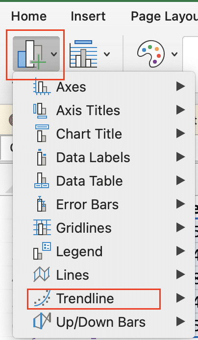
- Choose the type of trendline you want to add (e.g., Linear, Exponential).
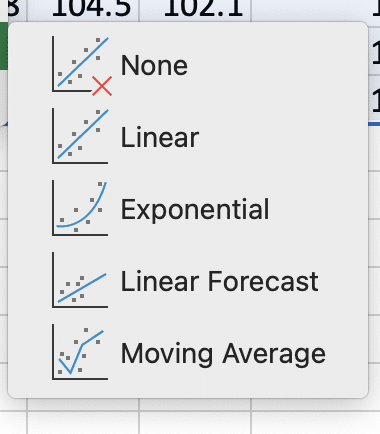
- Customize the trendline’s appearance and options as needed.
Plotting multiple stocks on one chart
To compare multiple stocks:
- Organize data for each stock in separate columns.
- Select all the data you want to include.
- Insert a stock chart as usual.
- Excel will automatically create separate series for each stock.
- Customize colors and labels to distinguish between stocks.
Automating chart updates with formulas and macros
For automatic updates:
- Use dynamic named ranges to automatically include new data.
Create a macro to refresh data sources and update charts:
a. Open the Visual Basic Editor (Alt + F11).
b. Insert a new module and add this code:
vba
Copy
Sub UpdateStockCharts()
ActiveWorkbook.RefreshAll
ActiveSheet.ChartObjects(“YourChartName”).Activate
ActiveChart.Refresh
End Sub
- Assign the macro to a button or set it to run automatically on workbook open.
Understanding Stock Charts in Excel
Stock charts are specialized graphs designed to display financial data, particularly the price movements of stocks over time. They provide a visual representation of a stock’s performance, making it easier to identify trends, patterns, and potential investment opportunities.
What is a stock chart?
A stock chart is a graphical representation of a stock’s price movements over a specific period. It typically includes information such as the opening price, closing price, highest price, and lowest price for each time interval (e.g., day, week, or month).
Types of stock charts available in Excel
Excel offers several types of stock charts to suit different analysis needs:
- Open-High-Low-Close (OHLC) charts: Display four data points for each time interval – the opening price, highest price, lowest price, and closing price.
- High-Low-Close (HLC) charts: Similar to OHLC charts but omit the opening price.
- Volume-High-Low-Close charts: Combine price information with trading volume data.
- Candlestick charts: Provide a more detailed view of price movements, using “candles” to represent the open, high, low, and close prices.
When to use stock charts
Stock charts are invaluable tools for:
- Analyzing historical price trends
- Identifying potential buy or sell signals
- Comparing the performance of multiple stocks
- Visualizing the impact of market events on stock prices
- Communicating financial data to stakeholders or clients
Beyond Stock Charts: Real-Time Financial Data in Excel
Excel offers tools for creating stock charts, but financial analysis often requires up-to-date data from various sources. Coefficient connects your spreadsheets directly to financial data systems. This allows you to import live stock data, create real-time financial reports, and automate chart updates in Excel. To see how this can streamline your stock analysis, try Coefficient.


