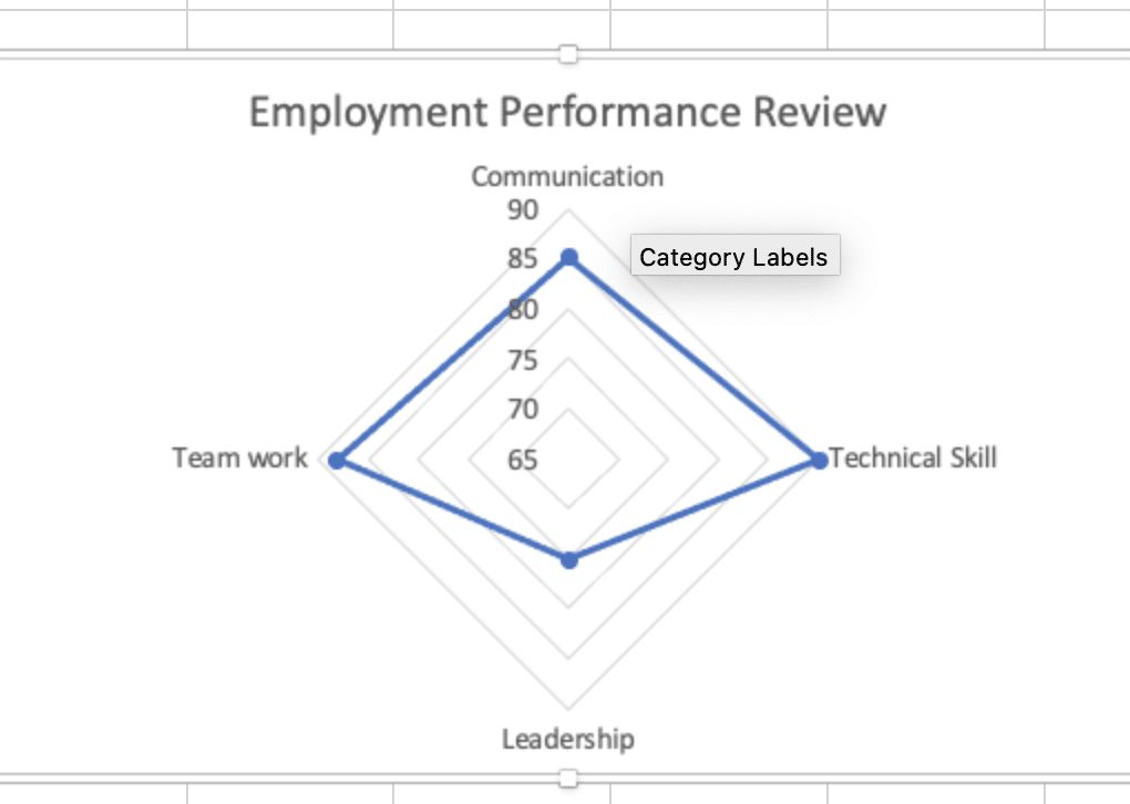
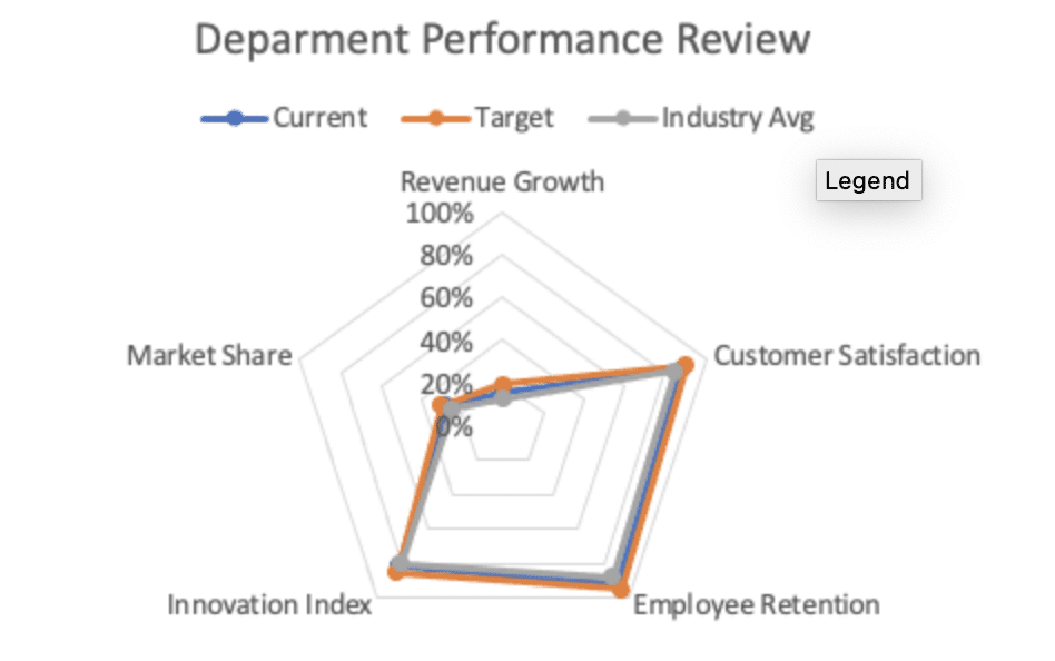
Radar charts offer a powerful way to visualize multivariate data across multiple dimensions. Whether you need to compare performance metrics, product features, or team competencies, this comprehensive guide will show you how to create and customize professional radar charts in Excel.
How to Create a Radar Chart in Excel
Let’s start with the basic steps to create a radar chart:
- Prepare Your Data
Open your Excel spreadsheet
Select your data range, including headers
Ensure categories are in the first column
Place values in subsequent columns
Example data structure:
|
Metrics |
Product A |
Product B |
Product C |
|---|---|---|---|
|
Speed |
85 |
75 |
90 |
|
Quality |
90 |
85 |
80 |
|
Price |
70 |
95 |
75 |
|
Support |
80 |
70 |
85 |
|
Features |
75 |
80 |
90 |
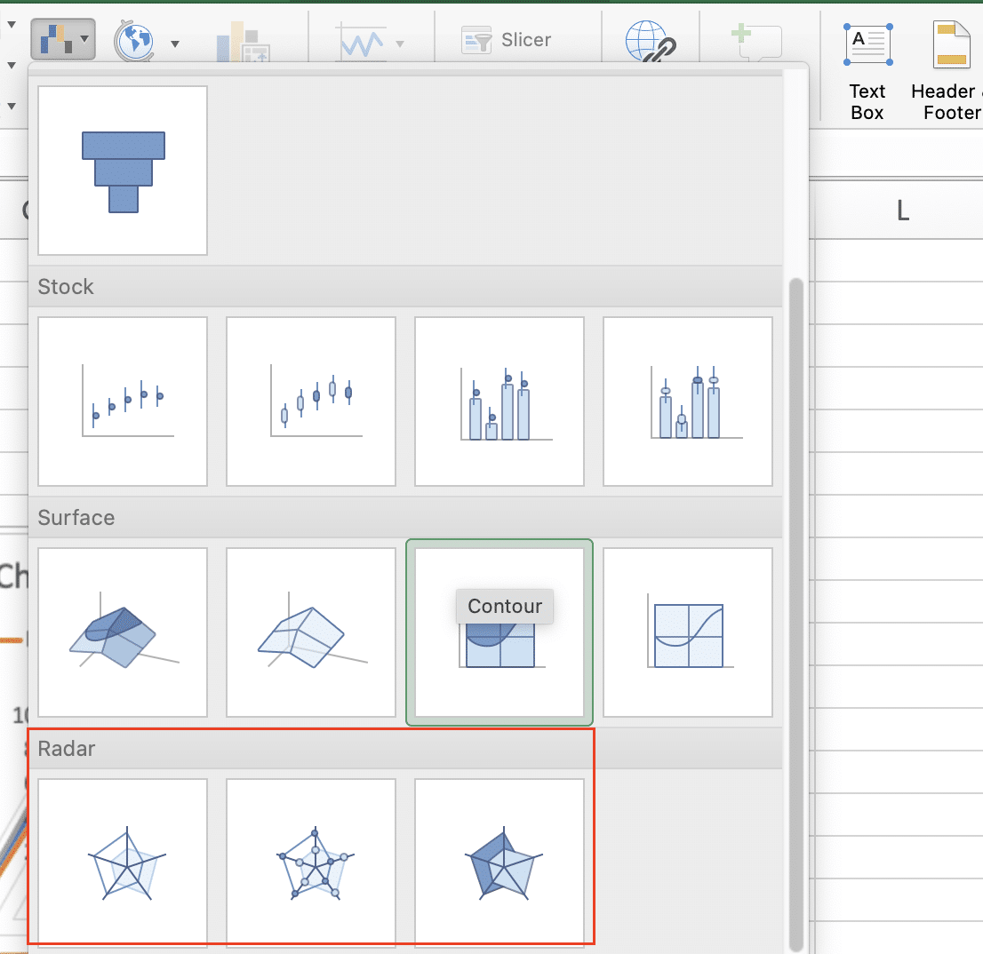
- Insert the Radar Chart
Click the ‘Insert’ tab on the Excel ribbon

Navigate to the Charts group
Click ‘Insert Statistical Chart‘
Select your preferred radar chart type from the options
Customizing Your Radar Chart’s Appearance
Adjust Chart Colors and Lines
Right-click any data series
Select ‘Format Data Series‘

Choose from options:
– Line color and weight
– Marker style and size
– Fill opacity
Example color scheme:
|
Element |
Color Code |
Style |
|---|---|---|
|
Series 1 |
#4472C4 |
Solid |
|
Series 2 |
#ED7D31 |
Dashed |
|
Series 3 |
#A5A5A5 |
Dotted |
Format Axis Labels
Click axis labels
Select ‘Format Axis‘
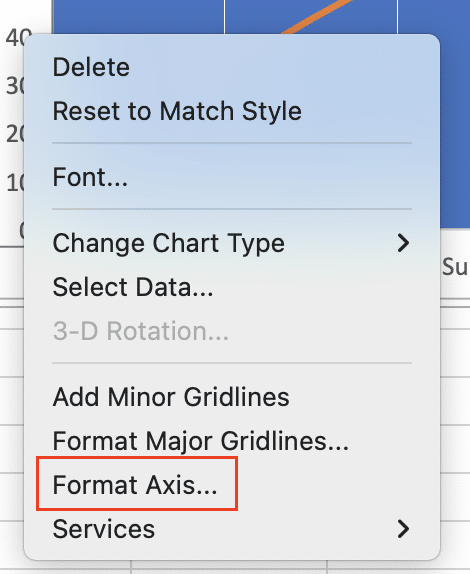
Customize:
– Font, size, and style
– Number format
– Label position
Adding Multiple Data Series
- Structure Multi-Series Data Example setup:
|
Categories |
Q1 2023 |
Q2 2023 |
Q3 2023 |
|---|---|---|---|
|
Sales |
82 |
88 |
91 |
|
Marketing |
75 |
80 |
85 |
|
Operations |
90 |
85 |
88 |
- Layer Visualization
Select entire data range
Insert radar chart
Right-click series to adjust:
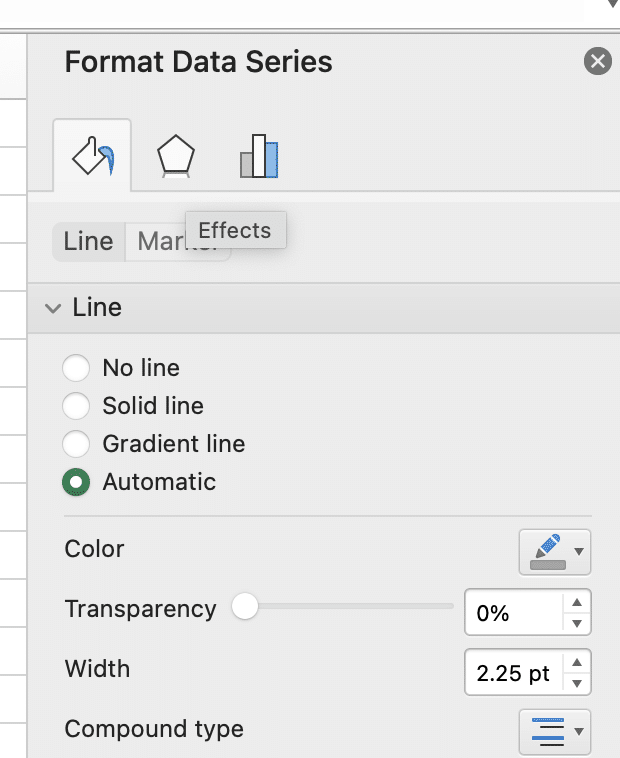
– Fill opacity (try 40% for overlay effect)
– Line weight (0.75pt to 2.25pt)
– Marker options
Working with Different Radar Chart Types
Standard Radar Chart
Best for:
- Comparing individual values
- Highlighting specific points
- Tracking changes over time
Example use case:
Employee Performance Review
– Communication: 85
– Technical Skills: 90
– Leadership: 75
– Teamwork: 88
– Innovation: 82
Filled Radar Chart
Ideal for:
- Area comparison
- Pattern recognition
- Overall performance visualization
Formatting Data for Radar Charts
Structure Your Data Properly
- Basic Data Organization
Place categories in first column
Align values horizontally
Use consistent measurement scales
Remove blank rows/columns
Example of properly structured data:
|
KPI Category |
Team A |
Team B |
Team C |
|---|---|---|---|
|
Innovation |
8.5 |
7.2 |
9.0 |
|
Efficiency |
9.2 |
8.5 |
7.8 |
|
Quality |
7.8 |
9.0 |
8.4 |
|
Cost Control |
8.0 |
8.8 |
7.5 |
- Scale Management
Normalize values if using different scales
Convert percentages to decimals
Use consistent decimal places
Scaling formula example:
Normalized Value = (Value – Min) / (Max – Min) * 100
Handle Missing Data Points
Options for managing incomplete data:
|
Approach |
Method |
When to Use 
Try the Free Spreadsheet Extension Over 500,000 Pros Are Raving About
Stop exporting data manually. Sync data from your business systems into Google Sheets or Excel with Coefficient and set it on a refresh schedule. Get Started |
|---|---|---|
|
Zero substitution |
Replace blank with 0 |
When absence means no value |
|
Average substitution |
Use category mean |
When estimating missing data |
|
Exclude point |
Break line connection |
When data is truly unavailable |
Real-World Applications
Performance Evaluation Scenario
Example: Department Performance Review
|
Metric |
Current |
Target |
Industry Avg |
|---|---|---|---|
|
Revenue Growth |
15% |
20% |
12% |
|
Customer Satisfaction |
88% |
90% |
85% |
|
Employee Retention |
92% |
95% |
88% |
|
Innovation Index |
82% |
85% |
80% |
|
Market Share |
28% |
30% |
25% |
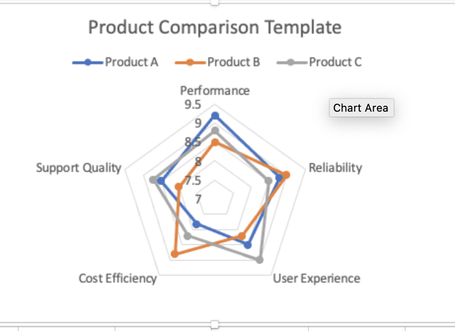
Product Comparison Template
Create a standardized comparison matrix:
|
Feature |
Product A |
Product B |
Product C |
|---|---|---|---|
|
Performance |
9.2 |
8.5 |
8.8 |
|
Reliability |
8.8 |
9.0 |
8.5 |
|
User Experience |
8.5 |
8.2 |
9.0 |
|
Cost Efficiency |
7.8 |
8.8 |
8.2 |
|
Support Quality |
8.5 |
8.0 |
8.7 |
Making Your Radar Chart Interactive
Add Dynamic Data Labels
- Create Custom Labels
Select data series
Right-click > Add Data Labels
Format labels with custom formula
Example formula for dynamic labels:
=IF([@Value]>Target,”↑”,”↓”) & ” ” & [@Value]
Include Interactive Elements
- Add Tooltips
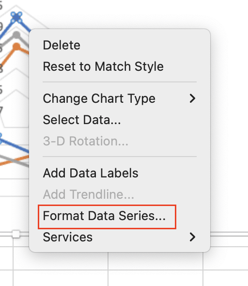
Right-click data point
Select ‘Format Data Series‘
Add custom tooltip information
Example tooltip structure:
|
Element |
Description |
|---|---|
|
Value |
Current metric value |
|
Comparison |
% vs. previous period |
|
Context |
Brief explanation |
- Create Dynamic Ranges
Name your data ranges
Use OFFSET or INDEX functions
Link to control cells
Example named range formula:
=OFFSET(Sheet1!$A$1,0,0,COUNTA(Sheet1!$A:$A),COUNTA(Sheet1!$1:$1))
Final Tips for Professional Radar Charts
- Data Presentation Best Practices
- Limit categories to 5-8 for readability
- Order metrics logically (clockwise flow)
- Use consistent color schemes across related charts
- Include clear legends and data labels
- Scale Considerations
- Start axes at zero when possible
- Use consistent scales across comparable charts
- Consider logarithmic scales for wide value ranges
- Audience-Focused Design
- Match complexity to audience expertise
- Include explanatory notes for technical terms
- Highlight key insights with callouts
Transform Your Excel Analytics with Coefficient
Take your radar charts to the next level by connecting them to live data sources. Coefficient helps you:
- Automatically refresh data from your business systems
- Create real-time dashboard updates
- Share insights automatically with stakeholders
- Maintain single source of truth
Ready to automate your Excel analytics? Start your journey with Coefficient today
