Excel pivot charts transform complex data into clear, interactive visualizations that help you spot trends and patterns instantly. Whether you’re analyzing sales data or tracking project metrics, pivot charts make it simple to create dynamic reports that update automatically when your data changes.
Create Your First Pivot Chart in Excel
Let’s start with the fundamental steps to create a basic pivot chart:
- Prepare Your Data
- Open your Excel spreadsheet
- Ensure your data is organized in columns with headers
- Remove any blank rows or columns
- Format your data as a table (Ctrl + T) for better management
- Insert the Pivot Chart
Click any cell in your dataset > Insert tab > PivotChart > PivotChart & PivotTable

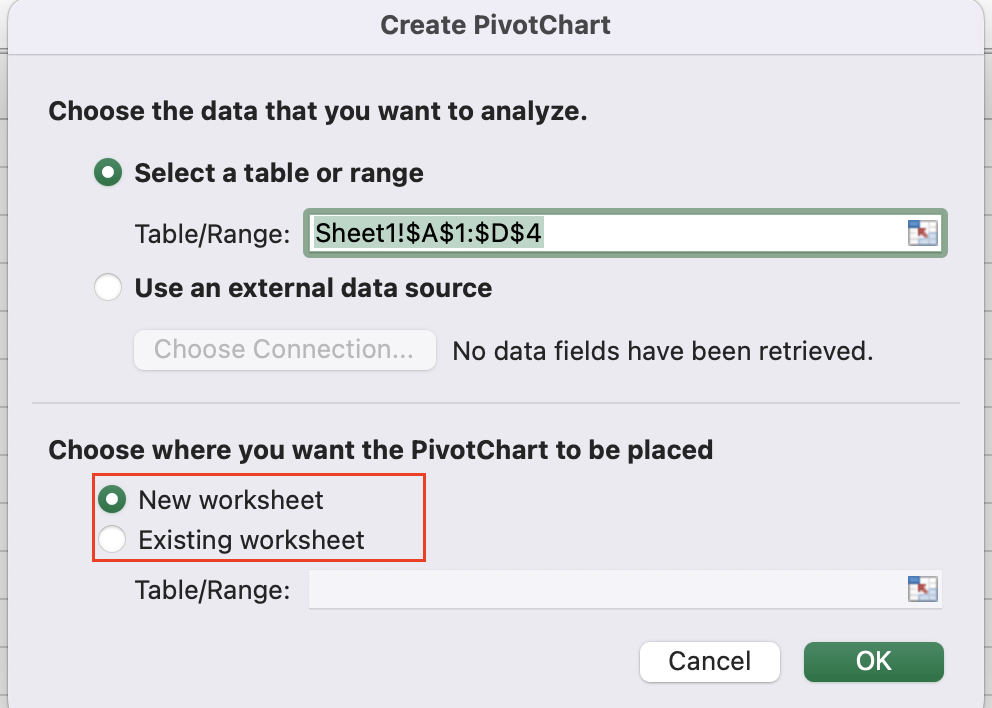
- Select Location
-
- Choose “New Worksheet” for a clean workspace
- Or select “Existing Worksheet” and specify the location
Example Dataset Structure:
|
Date |
Product |
Region |
Sales |
|---|---|---|---|
|
1/1/2024 |
Widget |
East |
$1,200 |
|
1/1/2024 |
Gadget |
West |
$800 |
|
1/2/2024 |
Widget |
North |
$950 |
Build the Chart Structure
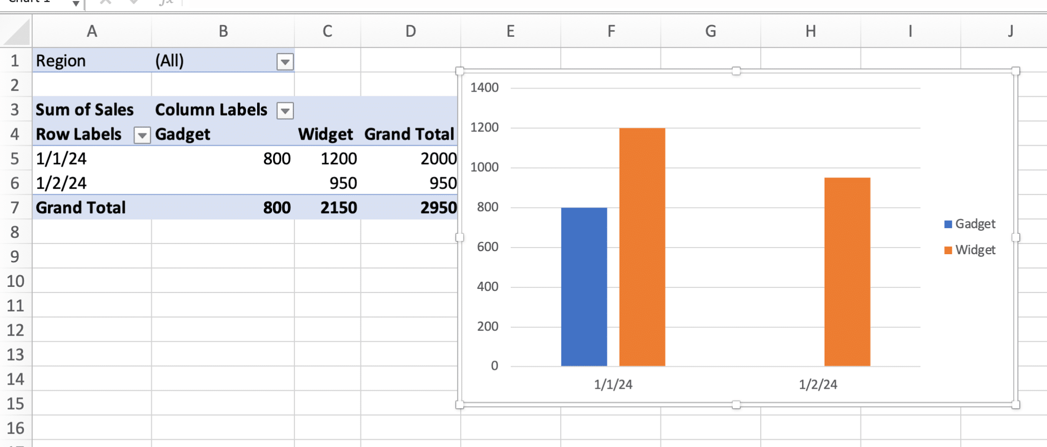
- Configure Fields:
- Drag “Date” to Axis (Categories)
- Drag “Sales” to Values
- Drag “Product” to Legend (Series)
- Drag “Region” to Filters
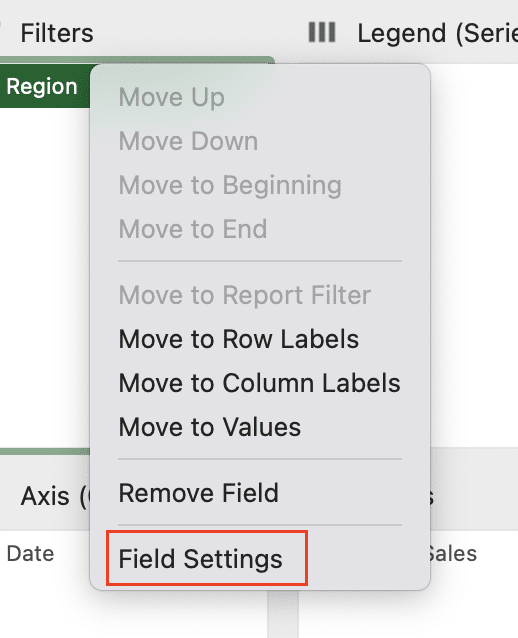
- Field Settings Customization:
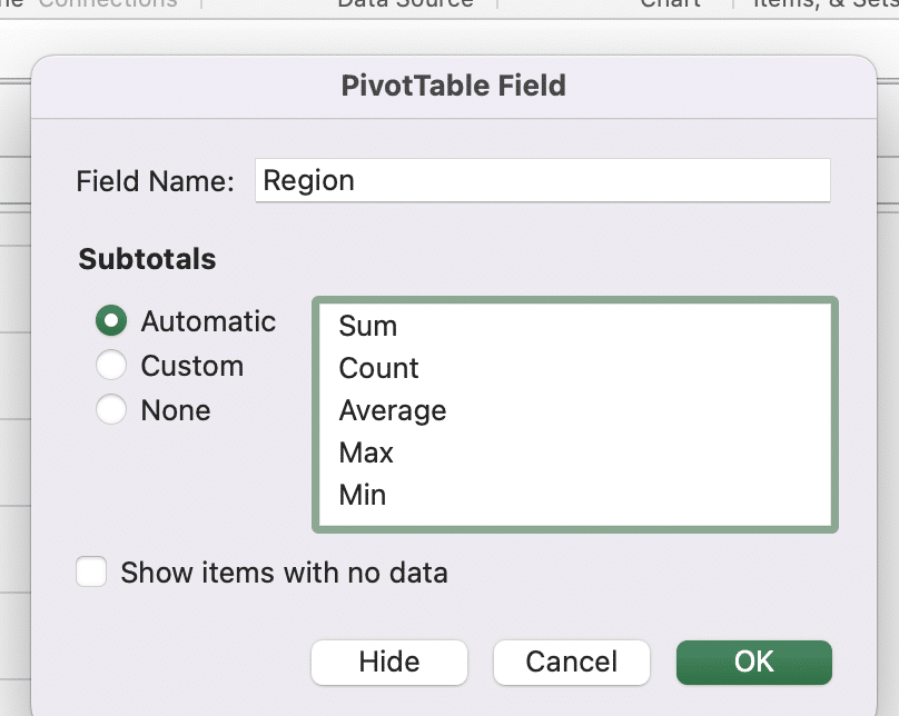
Right-click value field > Field Settings
Common Value Field Settings:
|
Calculation Type |
Use Case |
|---|---|
|
Sum |
Total sales by period |
|
Average |
Average order value |
|
Count |
Number of transactions 
Try the Free Spreadsheet Extension Over 500,000 Pros Are Raving About
Stop exporting data manually. Sync data from your business systems into Google Sheets or Excel with Coefficient and set it on a refresh schedule. Get Started |
|
Max/Min |
Highest/lowest sales |
What are Pivot Charts Used For?
Sales Trend Analysis
Example setup:
- X-axis: Months
- Y-axis: Sum of Sales
- Legend: Product Categories
- Filter: Fiscal Year
Regional Performance
Configuration:
- X-axis: Regions
- Y-axis: Revenue
- Series: Product Lines
- Slicers: Time Period
Financial Reporting
Sample structure:
- X-axis: Quarters
- Y-axis: Profit Margins
- Legend: Department
- Filter: Cost Centers
Customize Your Pivot Chart Design
- Apply Chart Styles
PivotChart Tools > Design > Chart Styles

- Format Elements
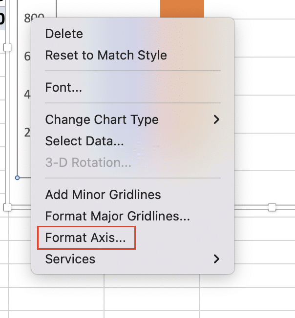
- Right-click axis > Format Axis
-
- Edit number formats
- Adjust scale
- Modify gridlines
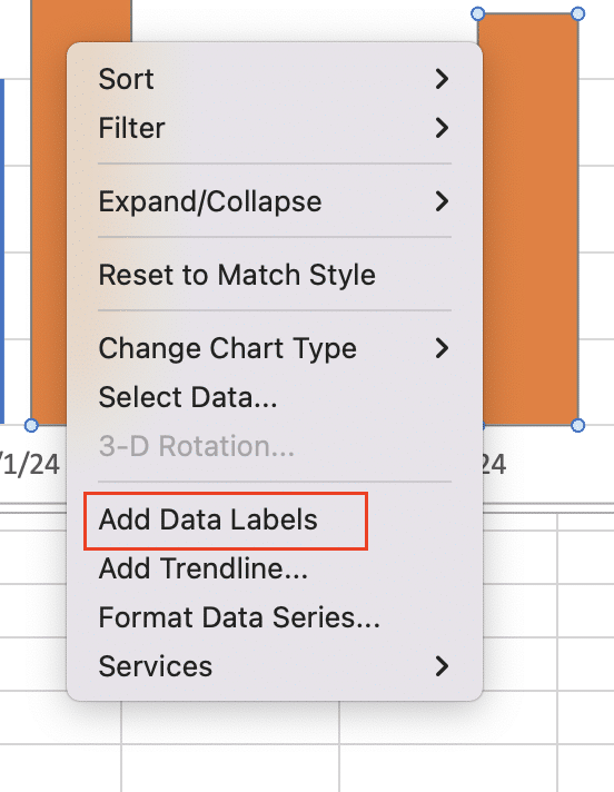
- Data Labels Settings to consider:
-
- Position (Inside End, Outside End, Center)
- Content (Value, Percentage, Category Name)
- Format (Font, Size, Color)
Add Interactive Elements
Slicers
- Insert Slicer:
PivotTable Tools > Analyze > Insert Slicer

- Configure Settings:
- Buttons per row
- Size and position
- Style and colors
Timeline Controls
- Add Timeline:
PivotTable Tools > Analyze > Insert Timeline

- Customize Display:
- Time level (Years, Quarters, Months, Days)
- Style and format
- Filter selections
Transform Your Pivot Chart
Change Chart Types
Available transformations:
- Column to Line Chart: Trend visualization
- Bar to Column: Category comparison
- Area Chart: Part-to-whole relationships
- Combo Chart: Mixed metric display
Group Data
Common grouping options:
- Date grouping (Years, Quarters, Months)
- Numeric grouping (Size, Range)
- Text grouping (Categories, Regions)
Calculated Fields
Example formulas:
Profit Margin = ([Revenue] – [Cost]) / [Revenue]
Growth Rate = ([Current Period] – [Previous Period]) / [Previous Period]
Connect Multiple Charts
- Create Dashboard Layout
- Arrange charts in grid
- Align elements
- Add title and legends
- Synchronize Filters
Right-click Slicer > Report Connections > Select target charts

- Report Connections
- Link related visualizations
- Share filter context
- Maintain consistent view
Making the Most of Your Pivot Charts
Pivot charts in Excel offer powerful data visualization capabilities that transform raw data into actionable insights. By mastering these techniques, you can create dynamic, interactive reports that adapt to your business needs.
Ready to take your data visualization to the next level? Try Coefficient to automatically sync your business data directly into Excel and create real-time pivot charts that update automatically. Get started with Coefficient today and transform how you work with data.


