Ever tried showing small percentages in a pie chart? The tiny slices make it nearly impossible to read. That’s where pie of pie charts come in. They split smaller segments into a separate, more readable pie chart. Let me show you how to create one.
Creating Your First Pie of Pie Chart in Excel
Let’s start with a basic example. Here’s our sample data:
|
Department |
Sales ($) |
|---|---|
|
Electronics |
450,000 |
|
Furniture |
380,000 |
|
Books |
25,000 |
|
Games |
18,000 |
|
Music |
15,000 |
|
Movies |
12,000 |
Step 1: Select Your Data
- Click and drag to highlight your data range
- Include both column headers and all values
- Double-check that you’ve selected complete rows and columns
Step 2: Insert the Chart
- Click the Insert tab on Excel’s ribbon
- Look for the pie chart icon in the Charts group
- Click the arrow next to the pie chart
- Select “Pie of Pie” from the 2-D Pie section

Your chart appears, but it needs adjustment. Excel automatically moves the smallest values to the second pie.
Selecting Which Values Move to the Second Pie
The magic happens when you decide which data points belong in the secondary pie.
Step 1: Access Split Settings
- Right-click the chart
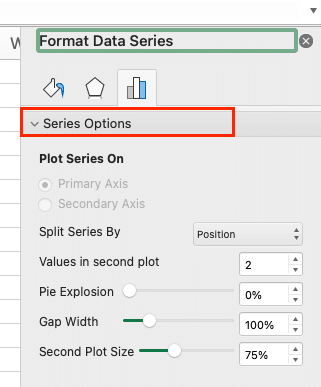
- Select “Format Data Series“

- Find “Series Options” in the task pane

Step 2: Choose Your Split Method Excel offers several ways to split your data:
- By Value: Move all segments below a specific amount
- By Position: Select a fixed number of smallest values
- By Percentage: Transfer segments below a percentage threshold
- Custom: Hand-pick which segments to split
Pro Tip: Start with “By Value” for most business cases. It creates logical groupings based on actual numbers.
Customizing Your Pie of Pie Display
Time to make your chart clear and professional.
Size and Position
- Click the secondary pie
- Use the handles to resize it proportionally
- Drag to position it where it makes sense
Connection Lines
- Select the lines between pies
- Format them to match your style
- Adjust thickness (suggested: 1.5 pt)
- Pick a color that complements both pies
Adding Data Labels and Percentages
Data without context is just numbers. Let’s add clarity.
Step 1: Add Basic Labels

Stop exporting data manually. Sync data from your business systems into Google Sheets or Excel with Coefficient and set it on a refresh schedule.
Get Started
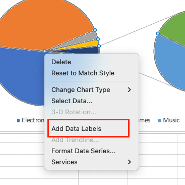
- Right-click either pie
- Choose “Add Data Labels“

- Select “Format Data Labels“

Step 2: Customize Label Content Choose what to display:
- Percentage
- Value
- Category Name
- Or combinations of these
|
Label Type |
Best Use Case |
|---|---|
|
Percentage |
When comparing relative sizes |
|
Values |
For actual numbers focus |
|
Categories |
With limited space |
Making Your Pie Charts Work Together
Unity creates impact. Your charts should feel like one cohesive unit.
Color Harmony
- Use related colors for both pies
- Keep the main pie segments darker
- Use lighter shades for the secondary pie
Spacing Guidelines
- Leave enough space between pies for labels
- Maintain equal distance from chart borders
- Align connection lines at natural angles
Formatting for Professional Presentation
Final touches make the difference between good and great.
Chart Title
- Double-click the title
- Keep it short but descriptive
- Use sentence case
- Position above the main pie
Legend Placement
- Right side works best for most layouts
- Bottom placement if horizontal space is tight
- Match font style with data labels
Next Steps
You’ve mastered pie of pie charts in Excel. These skills help you present complex data clearly and professionally. Ready to take your spreadsheet skills further?
Want to connect your Excel charts to live data sources? Try Coefficient. It syncs real-time data from 50+ business systems directly into your spreadsheets. Get started with Coefficient today.

