Pivot tables are a powerful data analysis tool in Excel that can transform complex datasets into meaningful insights. Whether you’re a seasoned Excel user or just starting to explore the world of pivot tables, this comprehensive guide will equip you with the knowledge and techniques to become a pivot table pro.
Pivot Tables 101: The Basics
A pivot table is a data analysis tool that allows users to summarize, analyze, sort, and reorganize selected columns and rows of data in a spreadsheet. It enables you to extract insights from large, detailed datasets by displaying the essence of the data in a summarized form.
Benefits of Using Pivot Tables in Excel
Pivot tables are not just a fancy feature of Excel; they are a necessity for anyone dealing with data. Here’s why:
- Efficiency: Pivot tables reduce the time needed to manually create extensive formulas to calculate sums, averages, or other statistics.
- Accuracy: By handling large data sets, pivot tables help minimize the errors that can come from manual calculations.
- Flexibility: Users can quickly change the data representation in a pivot table by dragging and dropping fields within the tables.
- Comprehensive Data Analysis: They allow for a better, more thorough understanding of data by highlighting trends, comparisons, and patterns.
Overview of Pivot Table Components
Understanding the components of a pivot table will help you get the most out of its capabilities:
- Rows: The row area is where you place the fields of data you want to list down vertically.
- Columns: The column area will display data horizontally across the top of the pivot table.
- Values: This area is used to display data being summarized, typically numerical values that are calculated or aggregated.
- Filters: Filters are used to selectively display data based on certain criteria, allowing for more targeted analysis.
Creating Your First Pivot Table: Step-by-Step Guide
Now that you understand the basics, let’s walk through the process of creating a pivot table from scratch using a sample dataset.
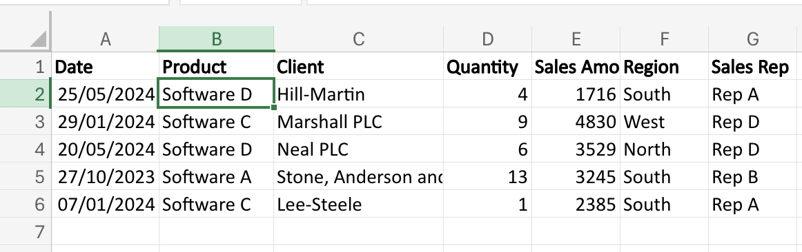
Imagine you manage a retail store and need to analyze your sales data. You have a spreadsheet that contains information about each sale, including the product sold, the quantity, the price, and the date of the sale.
To create a pivot table from this data:
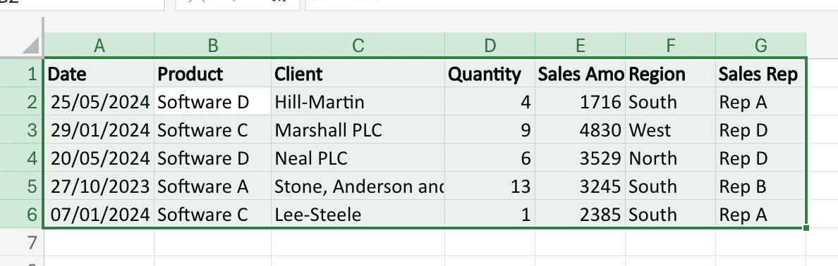
- Select the entire data range, including the column headers.
- Go to the Insert tab and click the PivotTable button.
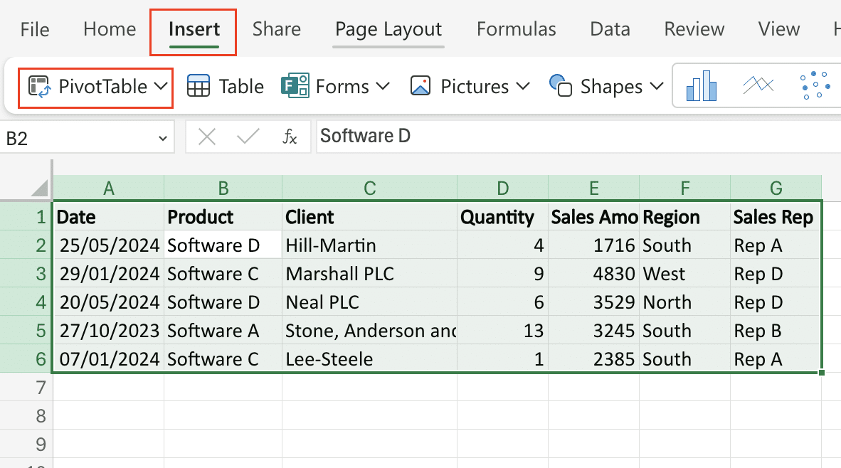
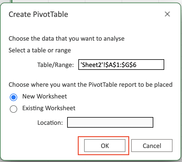
- In the Create PivotTable dialog box, verify that the data range is correct and choose where you want the pivot table to be placed.
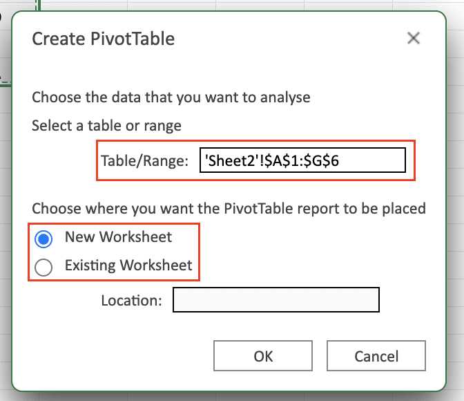
- Click OK to create the empty pivot table.
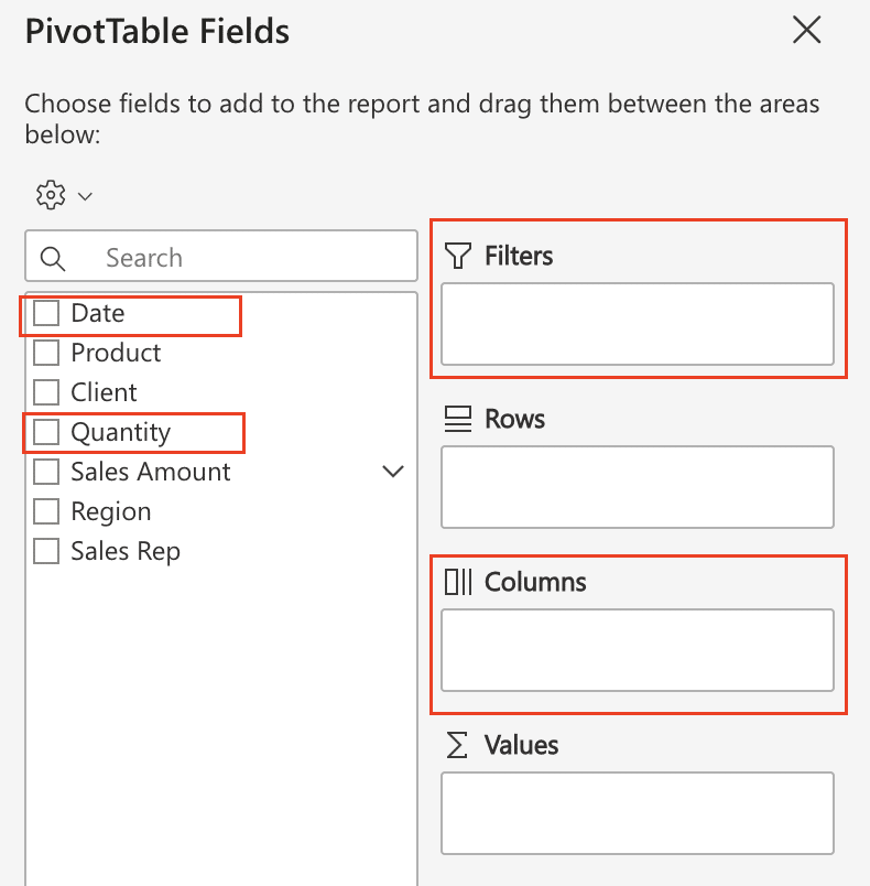
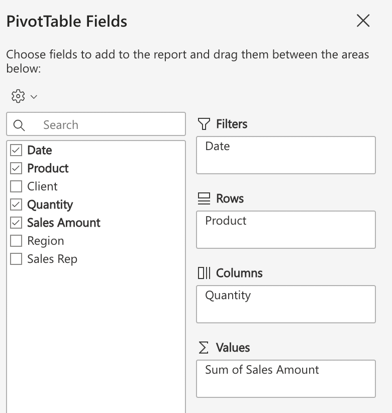
At this point, you’ll see the PivotTable Fields pane on the right side of the Excel window. This is where you’ll drag and drop the fields you want to include in your analysis.
- Drag the “Product” field to the Rows area.

- Drag the “Sales Amount” field to the Values area.
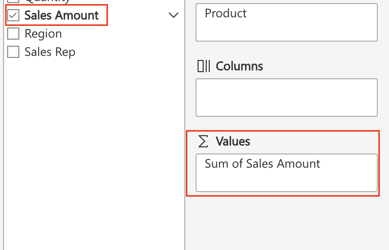
- Optionally, you can add additional fields, such as “Date” or “Quantity,” to the Columns or Filters areas to further refine your analysis.
As you make these selections, the pivot table will automatically update to show the sales data summarized by product.
Customizing Your Pivot Table
Once you’ve created your first pivot table, you can start customizing it to better suit your needs. Here are some of the key customization options:
Rearranging Fields and Items
You can easily rearrange the fields and items in your pivot table by dragging and dropping them to different areas (Rows, Columns, Values, Filters). This allows you to change the way the data is displayed and focus on the information that’s most important to your analysis.
Formatting Options
To enhance the visual appeal and readability of your pivot table, you can apply various formatting options, such as:
- Adjusting column widths and row heights
- Applying custom number formats (e.g., currency, percentages)
- Changing the font, size, and style
- Applying conditional formatting to highlight important data
These formatting changes can make your pivot table more intuitive and easier for your audience to understand.
Adding and Removing Data Fields
As your analysis needs evolve, you may want to add or remove data fields from your pivot table. Simply drag and drop the desired fields to or from the PivotTable Fields pane to customize the information displayed.
Advanced Pivot Table Techniques
Calculated Fields and Items
Pivot tables in Excel allow you to create calculated fields and items, enhancing your data analysis capabilities:
- Calculated Fields: Perform custom calculations on the data in your pivot table.
- Example: Create a calculated field to calculate the profit margin for each product.
- Calculated Items: Group or categorize your data in unique ways.
- Example: Create a calculated item to group sales by high, medium, and low-performing regions.
To create a calculated field or item:
- Click the “Fields, Items & Sets” button on the Pivot Table Analyze tab.
- Select the appropriate option (Calculated Field or Calculated Item).
- Define your formula using Excel’s function library.
Grouping Data
Pivot tables allow you to group your data in various ways, making it easier to analyze and understand:
- Group dates into quarters or years.
- Group product SKUs into broader product categories.
- Quickly identify trends and patterns at a higher level, especially when working with large datasets.
To group data in a pivot table:
- Select the field you want to group.
- Click the “Group” button on the Pivot Table Analyze tab.
- Choose how you want to group the data (e.g., by date or custom groupings).
Pivot Charts
Excel allows you to create pivot charts to visualize your data in a more intuitive and engaging way:
- Pivot charts are directly connected to your pivot table.
- Changes made to the pivot table are automatically reflected in the chart.
To create a pivot chart:
- Click the “PivotChart” button on the Pivot Table Analyze tab.
- Choose the chart type that best fits your data and analysis needs.
- Customize the chart’s appearance, add labels and titles, and create multiple charts to explore different aspects of your data.
Pivot Tables in Excel: Business Applications
Pivot tables are an essential tool for data analysis in various business scenarios. Let’s dive into a few more examples to showcase the power and versatility of pivot tables in Excel.
Example 1: Sales Data Analysis
Consider a sales dataset where you need to analyze monthly sales across different regions:
- Summarize Data: Create a pivot table to summarize total sales by region and month. Drag the sales data into the values area and set it to display the sum. Then, add the month to the rows and region to the columns.
- Visualize Data: Convert the pivot table into a chart by selecting it and choosing the ‘PivotChart’ option from the toolbar. Use pivot charts to visually compare these figures, making it easier to spot trends and outliers.
- Identify Top-Performing Regions: Add a filter to the pivot table to display only the top 5 regions by sales. This will help you focus on the most significant contributors to your overall sales performance.
- Calculate Growth Rates: Use calculated fields to determine the month-over-month or year-over-year growth rates for each region. This will provide insights into the relative performance and growth of each region over time.
Example 2: Customer Segmentation
Suppose you have a dataset containing customer information, such as demographics, purchase history, and customer lifetime value (CLV). You can use pivot tables to segment your customers and identify high-value target groups.
- Segment by Demographics: Create a pivot table that summarizes CLV by age group and gender. This will help you identify which demographic segments are most valuable to your business.
- Analyze Purchase Behavior: Add product categories to the pivot table to see which customer segments are most likely to purchase specific types of products. This information can guide your marketing and product development strategies.
- Identify Loyalty Tiers: Use calculated fields to categorize customers into loyalty tiers based on their CLV or purchase frequency. This segmentation can help you tailor your customer retention and reward programs.
Pivot Table Best Practices
Organizing and Cleaning Data
One of the keys to creating effective pivot tables is to ensure that your source data is well-organized and clean. This means taking the time to review your data, remove any unnecessary columns or rows, and standardize the formatting and structure of your data.
Best practices for data preparation include:
- Removing any blank or duplicate rows or columns
- Ensuring that all data is properly formatted (e.g., dates, numbers, text)
- Standardizing naming conventions and terminology
- Identifying and addressing any missing or erroneous data
- Organizing your data into logical, hierarchical structures
By taking these steps upfront, you can make the process of creating and working with pivot tables much smoother and more efficient.
Updating, Maintaining, and Sharing Pivot Tables
Once you’ve created a pivot table, it’s important to have a plan in place for keeping it up-to-date, accurate, and accessible to others. This involves:
- Regularly refreshing the data source and updating any calculated fields or items
- Reviewing the pivot table structure to ensure that it still aligns with your analysis needs
- Documenting any changes or updates made to the pivot table for future reference
- Considering the needs and preferences of your audience when sharing pivot table reports
- Exploring ways to make your pivot table reports more visually engaging and intuitive
To maintain pivot table accuracy:
- Regularly review and clean your source data, removing duplicates and correcting errors
- Keep your pivot tables up-to-date by refreshing the data source connection frequently
- Document any changes or adjustments made to the pivot table structure or calculations
Coefficient offers automated data updates, ensuring your pivot tables always reflect the most current data. It also provides alerts and notifications to help you maintain data integrity by flagging unexpected changes or discrepancies.

Stop exporting data manually. Sync data from your business systems into Google Sheets or Excel with Coefficient and set it on a refresh schedule.
Get Started
Integrating Pivot Tables with Other Excel Features
While pivot tables are powerful on their own, they can be even more effective when combined with other Excel features and capabilities, such as:
- Using Excel’s data connection tools to link your pivot table to an external data source
- Incorporating conditional formatting, sparklines, and data validation to enhance the visual appeal and interactivity of your pivot table reports
- Leveraging Excel’s robust formula and function library to create custom calculations and metrics
By combining pivot tables with other Excel tools and techniques, you can create powerful, flexible, and insightful reports that drive better decision-making and more successful business outcomes.
Troubleshooting Common Pivot Table Issues
Incorrect or Missing Data
Inconsistencies or errors in the source data can lead to incorrect or incomplete information in pivot tables, disrupting analysis and leading to inaccurate conclusions.
Solution:
- Check for inconsistencies, duplicates, and missing values in your source data
- Correct any errors or inconsistencies found
- Ensure all relevant data is properly formatted and included
- Verify that data types are correct for each column (e.g., dates, numbers, text)
Unexpected or Confusing Results
Incorrect configuration or settings can lead to unexpected or confusing pivot table results, causing misleading analysis.
Solution:
- Double-check the configuration and settings of your pivot table
- Confirm that the fields, filters, and calculated items align with your analysis goals
- Verify that the summarized or aggregated data matches your expectations
- Experiment with rearranging data fields or modifying filters to resolve discrepancies
Difficulty Updating or Refreshing
Outdated or incomplete data may appear in the pivot table if the data source connection is not properly maintained.
Solution:
- Verify that the data source is correctly connected and accessible
- Check that you have the necessary permissions to refresh the data
- For external data sources, confirm that the connections are stable and up-to-date
- Refresh the pivot table regularly to include the latest data
- Validate the link between your pivot table and its data source to ensure it functions correctly
Challenges with Formatting and Layout
Poor formatting and layout can affect the readability and visual appeal of pivot tables.
Solution:
- Use the “Design” and “Format” tabs in Excel to customize your pivot table’s appearance
- Adjust column widths and row heights to ensure all data is visible
- Apply custom formatting, such as number formats, fonts, and colors, to enhance readability
- Utilize conditional formatting to highlight key data points or trends
Trouble Connecting to External Data Sources
Integrating and analyzing external data within a pivot table can be problematic due to compatibility issues or improper connections.
Solution:
- Use Excel’s built-in data connection tools, such as Power Query, to integrate external data sources with your pivot table
- Ensure the external data is in a compatible format, such as CSV, Excel, or a supported database format
- Follow the proper steps to configure the connection, including providing the correct server name, database name, and credentials
- Use direct database connections or ODBC drivers for more advanced data sources
Pro-tip: Coefficient streamlines the process of integrating external data sources by enabling seamless data integration from platforms like Salesforce, Snowflake, and Tableau directly into Google Sheets or Excel. With Coefficient, your data is always up-to-date and accessible, reducing the manual effort required to maintain data connections.
Create Dynamic Pivot Tables in Excel
Excel’s pivot tables offer powerful data analysis. But refreshing them with new data from various sources can be time-consuming.
Coefficient links Excel directly to your data in Salesforce, Google Analytics, and other systems. Build auto-updating pivot tables today.


