
Are you struggling to make sense of your Excel data? Proper organization is the key to unlocking valuable insights. This guide will walk you through how to organize data in Excel with proven techniques to structure, clean, and prepare your data for in-depth analysis.
Setting Up Your Excel Worksheet for Data Analysis
Creating a Consistent Data Structure
The foundation of effective data analysis begins with a well-structured worksheet. Follow these best practices:
- Use clear column headers and labels
- Choose descriptive, concise names for each column
- Avoid abbreviations or cryptic codes
- Ensure consistency across related worksheets
Example:
| Customer ID | First Name | Last Name | Purchase Date | Total Amount |
| 1001 | John | Doe | 2023-05-15 | $150.00 |
| 1002 | Jane | Smith | 2023-05-16 | $75.50 |
- Avoid blank rows and columns
- Remove any empty rows or columns within your data set
- Use Excel’s “Find & Select” feature to quickly identify and delete blank cells

- Implement a standardized naming convention
- Create a system for naming worksheets, ranges, and files
- Use prefixes or suffixes to indicate data types or categories
- Example: “Sales_Q2_2023” for a quarterly sales report
Formatting Data for Easy Analysis
Proper formatting enhances readability and simplifies analysis:
- Apply appropriate number formats
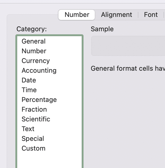
- Use currency format for monetary values
- Apply percentage format for rates or proportions
- Format dates consistently (e.g., YYYY-MM-DD)
- Use cell borders and colors to distinguish data categories
- Apply light background colors to header rows
- Use borders to separate distinct sections of your data
- Be consistent with your color scheme across worksheets
- Implement conditional formatting to highlight key information
- Highlight values above or below certain thresholds
- Use color scales to visualize trends
- Apply icon sets for quick visual indicators
Steps to apply conditional formatting:
- Select the range of cells you want to format
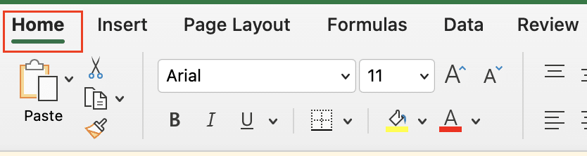
- Go to the “Home” tab on the Excel ribbon
- Click “Conditional Formatting“

- Choose a rule type (e.g., “Highlight Cells Rules” or “Color Scales”)
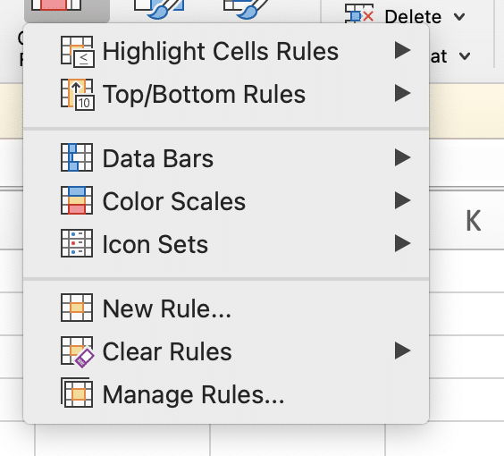
- Set your desired parameters and select formatting options
Removing Duplicate Data
Duplicate entries can skew your analysis. Here’s how to address them:
- Identify and remove duplicate entries
- Use Excel’s built-in “Remove Duplicates” feature
- Consider which columns should be used to determine uniqueness
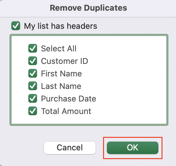
Steps to remove duplicates:
- Select your data range
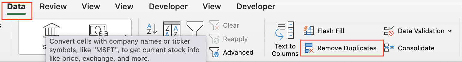
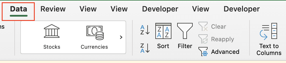
- Go to the “Data” tab on the Excel ribbon
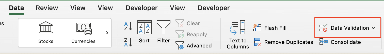
- Click “Remove Duplicates“
- Choose the columns to check for duplicates
- Click “OK” to remove the duplicates
- Implement data validation to prevent future duplicates
- Set up rules to restrict data entry
- Use custom formulas to check for existing values
Steps to set up data validation:
- Select the cells where you want to apply validation
- Go to the “Data” tab on the Excel ribbon
- Click “Data Validation“
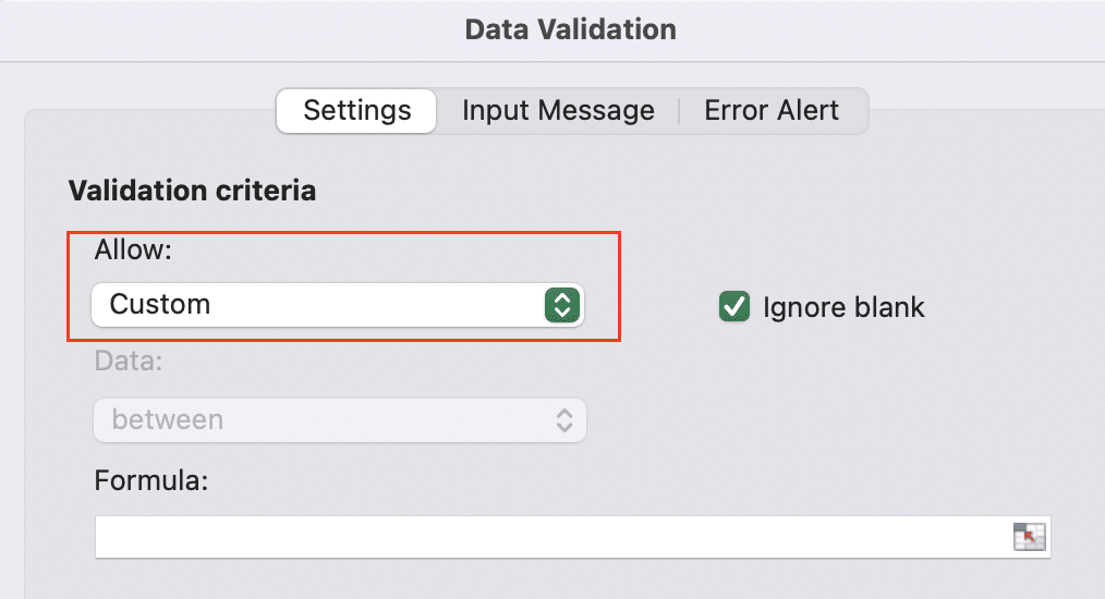
- Choose your validation criteria (e.g., “Custom” for a formula)
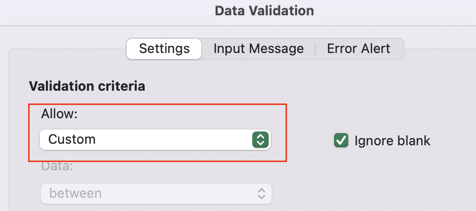
- Enter a formula to check for duplicates (e.g., =COUNTIF($A$2:$A$1000,A2)=1)
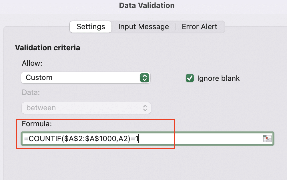
- Set up an error message to guide users
Sorting and Filtering Data in Excel
Basic Sorting Techniques
Sorting helps you quickly organize your data:
- Sort data in ascending or descending order
- Click the column header and use the sort buttons
- Or use the “Sort” feature in the “Data” tab for more options
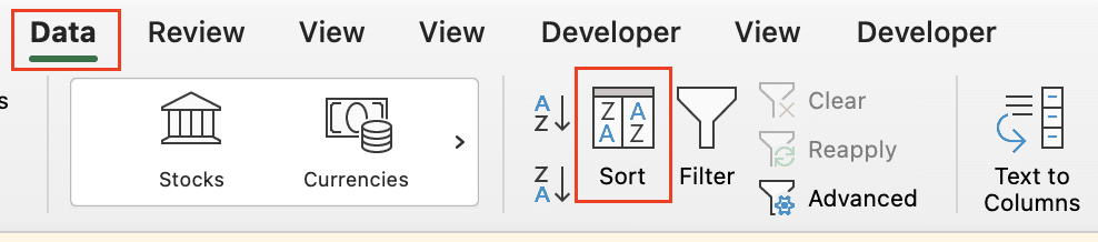
- Sort by multiple columns simultaneously
- Go to the “Data” tab and click “Sort“
- Add levels to your sort criteria
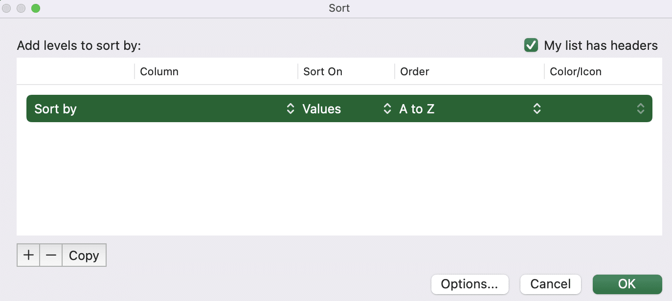
- Specify the order for each column
- Use custom sort orders for specific data types
- Create a custom list for non-standard sorting (e.g., days of the week)
- Apply this custom order when sorting your data
Steps to create a custom sort order:
- Go to File > Options > Advanced
- Scroll down to the “General” section
- Click “Edit Custom Lists“
- Enter your custom list items
- Click “Add” to save the new list
Advanced Filtering Options
Filters allow you to focus on specific subsets of your data:
- Apply basic filters to isolate specific data points
- Click the filter button in the column header
- Select or deselect values to show or hide
- Use advanced filters for complex criteria
- Go to the “Data” tab and click “Advanced“
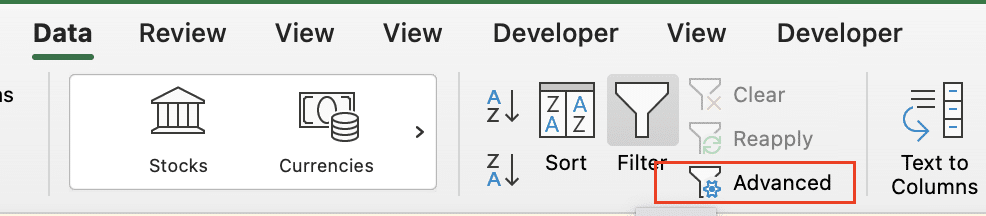
- Set up a criteria range with your filter conditions
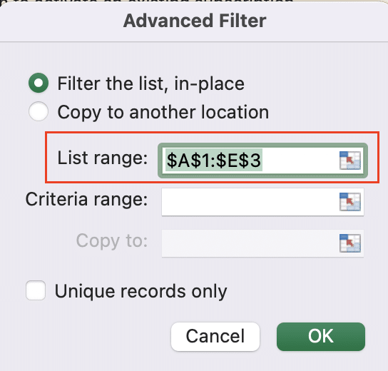
- Apply the advanced filter to your data
- Create and save custom filter views
- Set up your desired filters
- Go to the “View” tab and click “Save View“
- Name and save your custom view for future use
Implementing Data Validation
Ensure data integrity with validation rules:
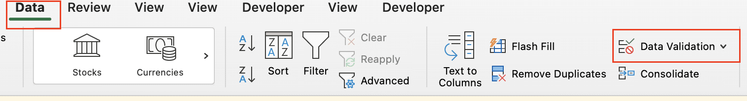
- Set up data validation rules
- Select the cells to validate
- Go to the “Data” tab and click “Data Validation“
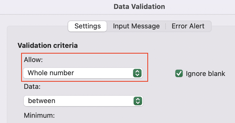
- Choose the validation criteria (e.g., whole number, date range)
- Create drop-down lists for consistent data entry
- Use the “List” option in data validation
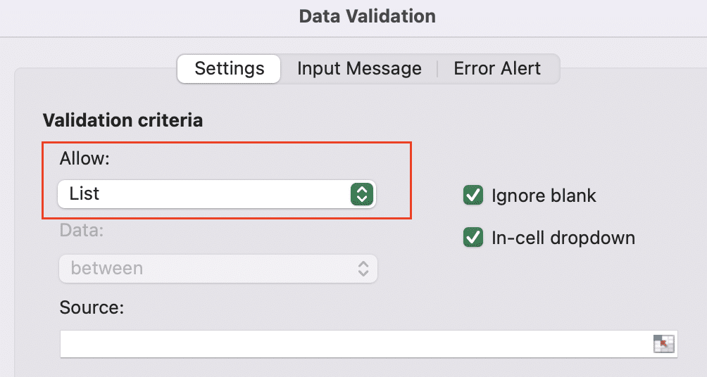
- Enter your list items or reference a range of cells
- Use custom formulas for advanced validation rules
- Select “Custom” in the data validation dialog
- Enter a formula that returns TRUE for valid entries
Example formula to ensure a value is unique: =COUNTIF($A$2:$A$1000,A2)=1
Leveraging Excel Functions for Data Organization
Using VLOOKUP and HLOOKUP
These functions help you combine data from different sources:
- Combine data from multiple sheets or workbooks
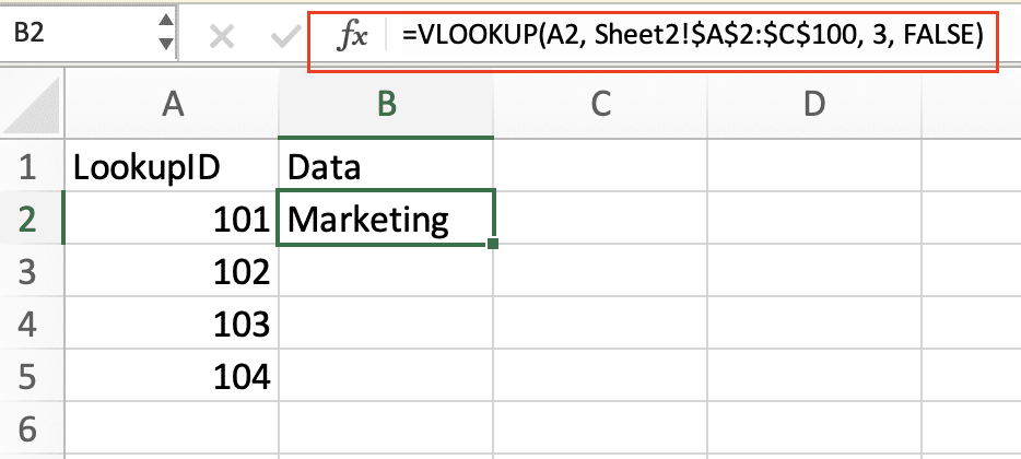
- Use VLOOKUP to find matching values in another table
- Syntax: =VLOOKUP(lookup_value, table_array, col_index_num, [range_lookup])
Example: =VLOOKUP(A2, Sheet2!$A$2:$C$100, 3, FALSE)
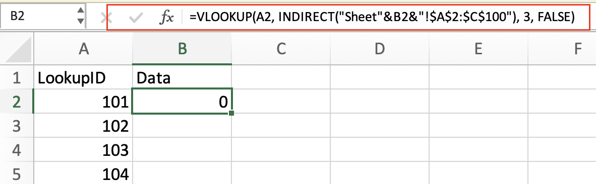
- Implement dynamic lookups for real-time data updates
- Use INDIRECT function with VLOOKUP for flexible references
- Example: =VLOOKUP(A2, INDIRECT(“Sheet”&B2&”!$A$2:$C$100″), 3, FALSE)
- Troubleshoot common lookup errors
- Check for exact matches (use FALSE as the last argument)
- Ensure lookup values are in the leftmost column of the table array
- Verify that your lookup value exists in the table array
Implementing INDEX and MATCH Functions
For more flexible lookups:
- Create more flexible lookups than VLOOKUP
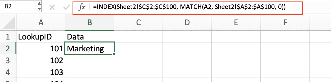
- Use INDEX and MATCH together for two-way lookups
- Syntax: =INDEX(return_range, MATCH(lookup_value, lookup_range, 0))
Example: =INDEX(Sheet2!$C$2:$C$100, MATCH(A2, Sheet2!$A$2:$A$100, 0))

Stop exporting data manually. Sync data from your business systems into Google Sheets or Excel with Coefficient and set it on a refresh schedule.
Get Started
- Combine INDEX and MATCH for two-way lookups
- Use nested MATCH functions to find row and column positions
- Example: =INDEX(data_range, MATCH(row_criteria, row_lookup, 0), MATCH(column_criteria, column_lookup, 0))
- Use array formulas for advanced data manipulation
- Press Ctrl+Shift+Enter to enter array formulas
- Example (to find the nth largest value): =INDEX(data_range, MATCH(LARGE(data_range, n), data_range, 0))
Utilizing Text Functions for Data Cleanup
Clean and standardize your text data:
- Split and combine text data
- Use LEFT, RIGHT, and MID functions to extract parts of text
- Example (extract first 3 characters): =LEFT(A2, 3)
- Combine text with the CONCATENATE function or the & operator
- Remove unwanted spaces and characters
- Use TRIM to remove extra spaces
- CLEAN removes non-printable characters
- Example: =TRIM(CLEAN(A2))
- Standardize text data
- PROPER capitalizes the first letter of each word
- UPPER converts text to all uppercase
- LOWER converts text to all lowercase
- Example: =PROPER(A2)
Creating Pivot Tables for Data Analysis
Building Basic PivotTables
PivotTables offer powerful data summarization:
- Select appropriate data ranges for PivotTables
- Ensure your data is in a tabular format with headers
- Select the entire range including headers
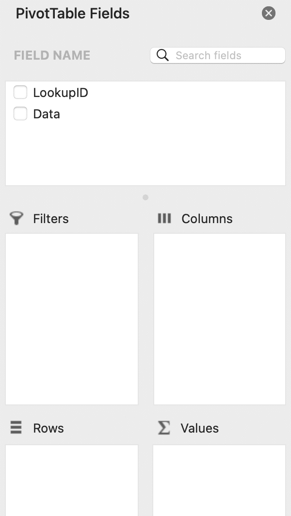
- Choose fields for rows, columns, and values
- Drag and drop fields into the PivotTable areas
- Experiment with different arrangements to gain insights
- Apply basic calculations and summarizations
- Change the value field settings to sum, count, average, etc.
- Add calculated fields for custom metrics
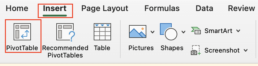
Steps to create a basic PivotTable:
- Select your data range
- Go to the “Insert” tab and click “PivotTable“
- Choose where to place the PivotTable
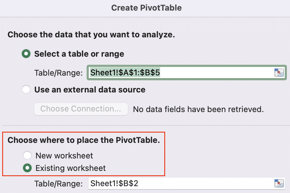
- Drag fields to the row, column, and values areas
- Adjust calculations as needed in the value field settings
Advanced Pivot Table Techniques
Enhance your PivotTables with these features:
- Group and ungroup data for more insightful analysis
- Right-click on a field and select “Group“
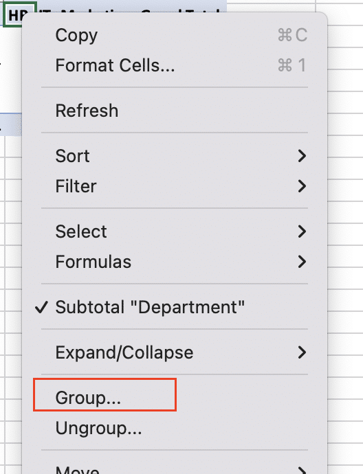
- Group dates by months, quarters, or custom periods
- Create numeric groups for ranges (e.g., age groups)
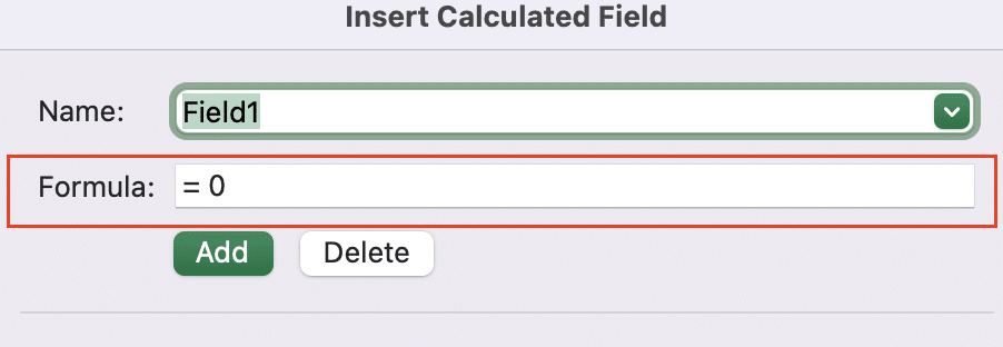
- Create calculated fields and items
- Go to “PivotTable Analyze” > “Fields, Items, & Sets” > “Calculated Field“
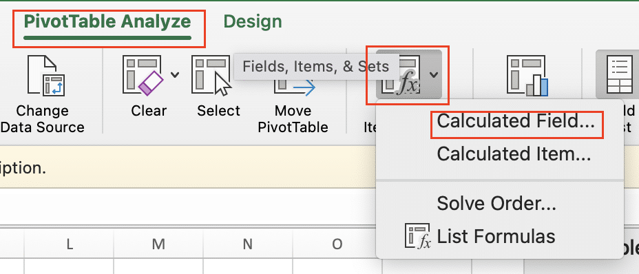
- Enter a formula using existing fields
- Use calculated items to create custom groupings within a field
- Use slicers and timelines for interactive filtering
- Insert slicers from the “PivotTable Analyze” tab
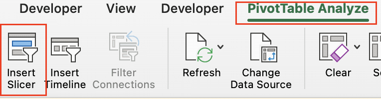
- Add timelines for date-based filtering
- Connect slicers to multiple PivotTables for synchronized filtering
Visualizing Pivot Table Data
Turn your data into compelling visuals:
- Create PivotCharts for visual data representation
- Select your PivotTable and go to “Insert” > “PivotChart“
- Choose an appropriate chart type for your data
- Customize chart types and styles
- Experiment with different chart types (column, bar, line, etc.)
- Apply built-in styles or create custom formatting
- Implement dynamic titles and labels
- Use formulas in chart titles to reflect current filters
- Add data labels to provide context to chart elements
Implementing Excel’s Data Analysis Tools
Using the Analysis ToolPak
Access advanced statistical tools:
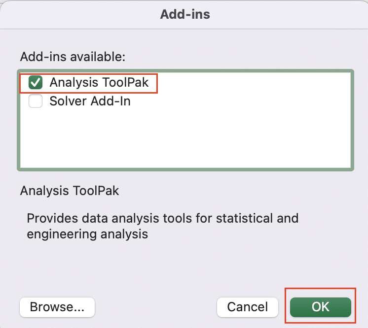
- Enable and access the Analysis ToolPak add-in
- Go to Tools > Excel Add-Ins
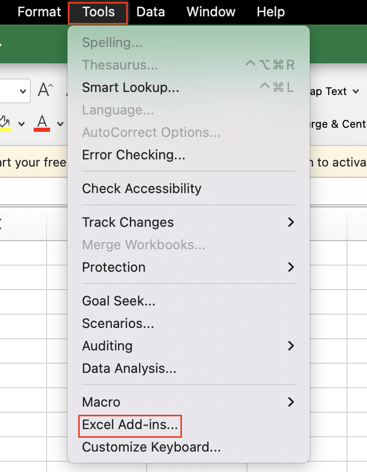
- Select “Analysis ToolPak” and click “OK“
- Perform statistical analysis
- Use regression analysis to find relationships between variables
- Conduct t-tests to compare means
- Access these tools from the “Data” tab > “Data Analysis“
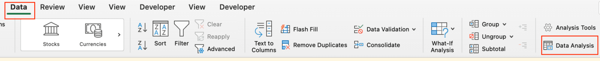
- Generate histograms and other statistical charts
- Use the histogram tool to visualize data distribution
- Create box plots for comparing distributions across groups
Creating What-If Scenarios
Explore different outcomes:
- Use Goal Seek for single-variable analysis
- Go to “Data” > “What-If Analysis” > “Goal Seek“
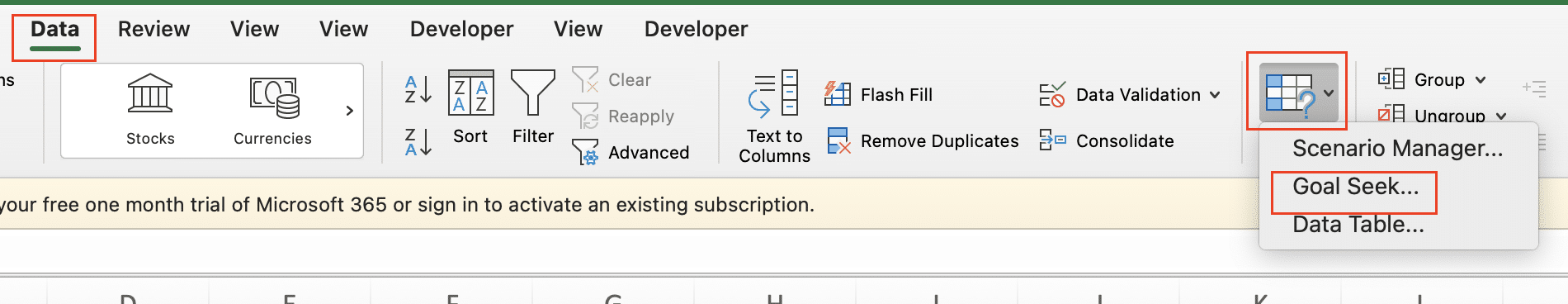
- Set a target value for a formula by changing one input cell
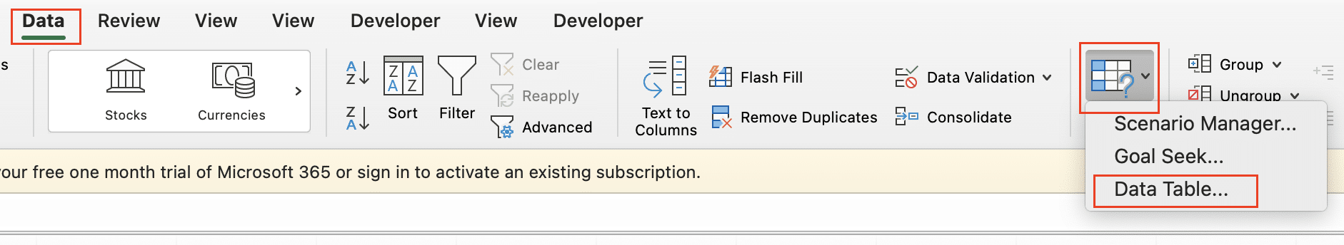
- Implement Data Tables for multi-variable scenarios
- Create a table with different input values
- Use “Data” > “What-If Analysis” > “Data Table” to calculate results
- Utilize Scenario Manager for complex model comparisons
- Set up different scenarios with multiple changing cells
- Go to “Data” > “What-If Analysis” > “Scenario Manager“
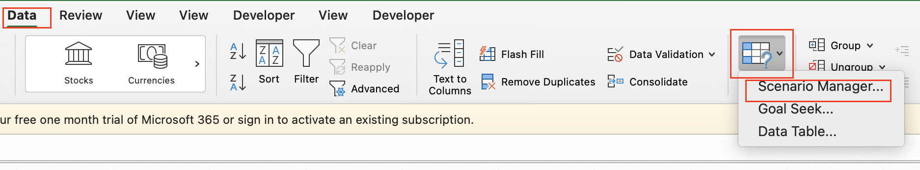
- Create, view, and compare different scenarios
Applying Forecasting Tools
Predict future trends:
- Use trendlines to predict future values
- Add a trendline to a chart
- Extend the trendline to forecast future periods
- Display the R-squared value to assess fit
- Implement moving averages for time-series data
- Use the AVERAGE function with a sliding window
- Example: =AVERAGE(A1:A3) for a 3-period moving average
- Utilize Excel’s built-in forecasting functions
- Use FORECAST.ETS for automatic forecasting
- Apply FORECAST.LINEAR for simple linear predictions
- Example: =FORECAST.ETS(A1, B2:B100, A2:A100)
Organizing Data in Excel
By implementing these strategies and techniques, you’ll be well-equipped to organize and analyze your Excel data effectively. Remember, good data organization is the foundation for insightful analysis and informed decision-making.
Ready to take your Excel data analysis to the next level? Discover how Coefficient can enhance your spreadsheet capabilities and streamline your workflow. Get started with Coefficient today and unlock the full potential of your data!


