
Excel is a powerful tool for data analysis and visualization, and one of the most commonly used chart types is the line graph. Line graphs are an effective way to display trends, patterns, and changes in data over time. Whether you’re tracking sales figures, monitoring website traffic, or analyzing financial data, creating a line graph in Excel can help you make sense of your information and communicate your findings clearly.
In this comprehensive guide, we’ll walk you through the process of creating a line graph in Excel, from preparing your data to customizing the final chart. By the end, you’ll have the skills and knowledge to transform your data into visually compelling line graphs that tell a compelling story.
Line Graphs in Excel 101
A line graph is a type of chart that uses a series of data points connected by straight line segments to display how a value changes over time or across different categories. Line graphs are particularly useful for:
- Visualizing trends and patterns in data over time, such as sales figures, stock prices, or website traffic.
- Comparing the performance of multiple data series, such as the growth of different product lines or the performance of various investment portfolios.
- Identifying turning points, peaks, and valleys in data, which can help you spot important changes or events.
By using a line graph, you can quickly and easily identify the direction and rate of change in your data, making it a valuable tool for data analysis and decision-making.
Preparing Your Data for a Line Graph
Before you can create a line graph in Excel, you’ll need to ensure that your data is properly structured and organized. Here are some tips to help you get your data ready:
- Organize your data into rows and columns: Your data should be arranged in a table format, with each row representing a data point and each column representing a different data series or variable.
- Ensure your data is in the correct format: Make sure that any date or time data is formatted correctly, and that numeric values are formatted as numbers rather than text.
- Remove any unnecessary data or formatting: Clean up your data by removing any irrelevant information, extra spaces, or formatting that could interfere with the chart creation process.
- Consider the scale and range of your data: Identify the minimum and maximum values in your data, as well as any significant changes or outliers. This will help you determine the appropriate scale and range for your line graph.
By taking the time to properly prepare your data, you’ll be able to create a line graph that accurately and effectively represents the information you want to convey.
Creating a Basic Line Graph in Excel
Now that your data is ready, let’s dive into the process of creating a line graph in Excel. Follow these step-by-step instructions:
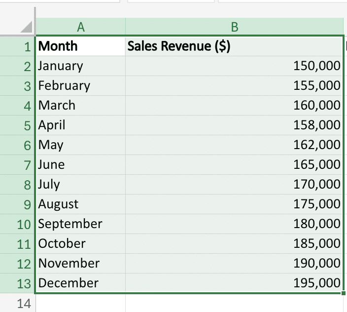
- Select your data: Highlight the cells containing the data you want to include in your line graph. This should include both the x-axis (category) data and the y-axis (value) data.
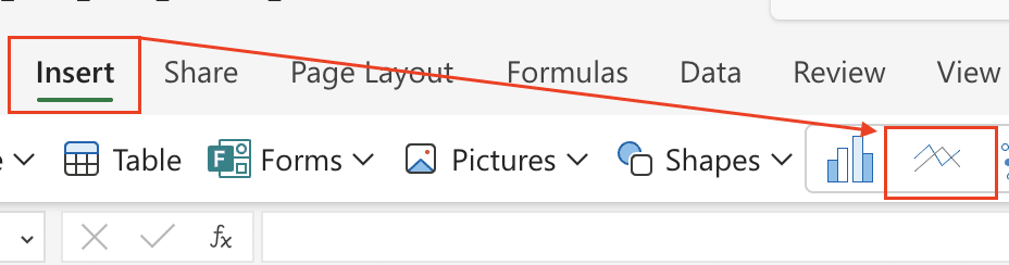
- Insert the line graph: Go to the “Insert” tab in the Excel ribbon and click on the “Line” button. Select the “2-D Line” option to create a basic line graph.
- Customize the chart title and axis labels: Double-click on the chart title, axis titles, and legend entries to edit them and make them more descriptive.
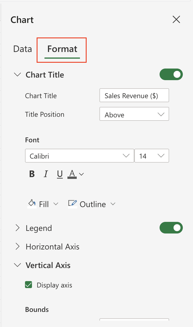
- Adjust the chart formatting: You can further customize the appearance of your line graph by changing the line colors, line styles, and other visual elements.
As you work through these steps, be sure to refer to the screenshots and examples provided to ensure you’re on the right track.
Customizing Your Line Graph
Once you’ve created your basic line graph in Excel, you can further customize it to make it more visually appealing and informative. Here are some tips for customizing your line graph:
Changing Colors and Styles
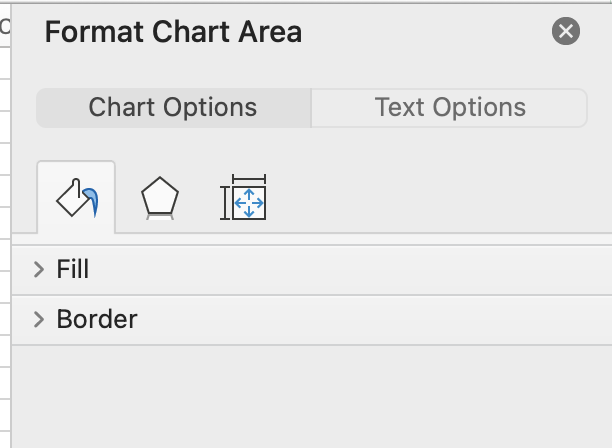
To change the color and style of your line graph, simply select the line(s) you want to modify and use the formatting options in the “Format” tab. You can choose from a variety of line styles, colors, and thicknesses to make your graph stand out.
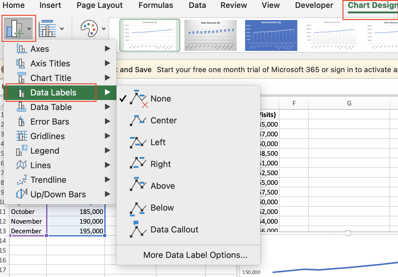
Adding Data Labels
Data labels can be a helpful addition to your line graph, allowing you to see the exact values at each data point. To add data labels, select the line(s) you want to label, then go to the “Chart Design” tab and click “Add Chart Element,” then select ‘Data Label.’ You can choose from different label styles and positions to best suit your needs.
Improving Readability
To make your line graph more readable, consider the following tips:
- Use clear, concise axis titles and labels
- Adjust the font size and style for optimal legibility
- Increase the spacing between data points for better visibility
- Experiment with gridlines and background shading to enhance contrast
Advanced Line Graph Techniques
While the basic line graph is a powerful tool, Excel offers more advanced options to create even more informative and visually compelling graphs.
Multiple Lines or Variables
You can create line graphs with multiple lines or variables to compare different data sets side-by-side. To do this, simply select the relevant data ranges and add them to the graph. Remember to use a consistent color scheme and clear labeling to differentiate the lines.

Stop exporting data manually. Sync data from your business systems into Google Sheets or Excel with Coefficient and set it on a refresh schedule.
Get Started
Dates on the X-Axis
When working with time-series data, you can use dates on the X-axis to create a more intuitive and meaningful line graph. Excel offers various date formatting options, allowing you to display the data in the most appropriate way for your needs.
Customizing Axes and Gridlines
Adjusting the scales, tick marks, and gridlines on your axes can greatly improve the clarity and impact of your line graph. Experiment with different settings to find the optimal balance between information and visual appeal.
Troubleshooting Common Issues
Even the most experienced Excel users can encounter problems when creating line graphs. Here are some common issues and solutions:
- Incorrect Data Plotting: Double-check that your data is properly formatted and selected for the graph. Ensure that the X and Y-axis data are aligned correctly.
- Formatting Problems: Ensure that your graph’s formatting, such as font sizes, colors, and labels, are consistent and easy to read.
- Accuracy Concerns: Regularly review your data sources and calculations to maintain the integrity of your line graph. Consider adding data validation measures to catch errors early.
Practical Applications of Line Graphs
Line graphs are versatile tools that can be used in a wide range of professional contexts. Here are a few examples of how line graphs can provide valuable insights:
- Financial Reporting: Track and analyze key financial metrics, such as revenue, expenses, and profit margins, over time.
- Marketing Analytics: Visualize the performance of marketing campaigns, website traffic, or social media engagement.
- Project Management: Monitor the progress of a project, including milestones, deadlines, and resource utilization.
- Scientific Research: Illustrate trends in experimental data, such as the relationship between variables or the effects of interventions.
Regardless of your field, line graphs can be a powerful tool for data analysis, decision-making, and effective communication of complex information.
Upgrade Your Line Graphs with Live Data
Excel’s line graphs help visualize trends. But keeping these graphs current with data from multiple sources can be time-consuming.
Coefficient connects Excel to your data in Salesforce, Google Analytics, and more. Create auto-updating line graphs today.


