When you need to compare data sets side by side, Excel’s double bar graph is your go-to visualization. Whether you’re contrasting sales figures, analyzing marketing campaigns, or comparing employee metrics, this chart type reveals patterns and differences at a glance.
This guide will walk you through creating and customizing double bar graphs in Excel. From data preparation to advanced features like secondary axes, you’ll learn to craft clear, impactful visualizations that drive informed decision-making.
Double Bar Graph in Excel 101: The Basics
A double bar graph, also known as a clustered bar chart, is a type of data visualization that displays two or more sets of data side by side using vertical bars. This chart type is particularly useful when you want to compare the values of two or more categories or groups, making it easy to spot differences and identify patterns.
Some common use cases for double bar graphs in Excel include:
- Comparing sales or revenue figures between different product lines or regions
- Analyzing the performance of marketing campaigns or advertising channels
- Visualizing employee productivity or engagement metrics across different departments
- Comparing customer satisfaction or feedback scores between different products or services
The key benefit of using a double bar graph is that it allows you to quickly and easily identify differences between the data sets, making it an invaluable tool for data analysis and decision-making.
Preparing Your Data for a Double Bar Graph in Excel
Before creating a double bar graph in Excel, it’s important to ensure your data is properly organized and formatted. This will make the chart-building process easier and help ensure that your final visualization is clear, accurate, and easy to interpret.
Here are some tips for preparing your data:
- Organize your data: Arrange your data in a table with the categories or groups you want to compare in the rows and the data values in the columns. Make sure that the data is consistent and that there are no missing values.
- Label your data: Clearly label the rows and columns of your data table to ensure that the information is easy to understand. Use descriptive labels that accurately reflect the content of each row or column.
- Format your data: Ensure that your data is formatted consistently, with consistent decimal places, currency symbols, and other formatting as needed. This will help ensure that your chart looks clean and professional.
- Check for duplicates: Scan your data for any duplicate entries or values, as these can skew the results of your double-bar graph.
- Consider data ranges: Decide on the data ranges you want to include in your chart. This will help you determine the appropriate scale and axis labels for your graph.
By taking the time to properly prepare your data, you’ll be well on your way to creating a clear, informative, and visually appealing double bar graph in Excel.
Step-by-Step Guide: How to Make a Double Bar Graph in Excel
Now that you’ve prepared your data, let’s dive into the step-by-step process of creating a double bar graph in Excel:
- Open a new Excel workbook or navigate to the worksheet containing your data.
- Select the data you want to include in your double-bar graph. This should include the category labels in the rows and the corresponding data values in the columns.
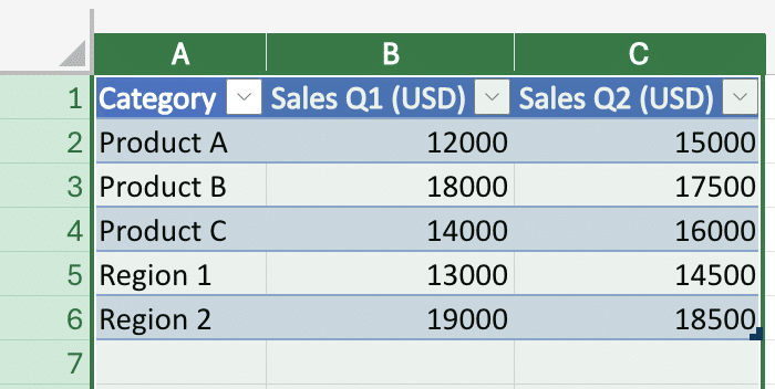
- Click on the “Insert” tab in the Excel ribbon, then click on the “Column” button and select “Clustered Column” from the dropdown menu. This will insert a basic double-bar graph into your worksheet.
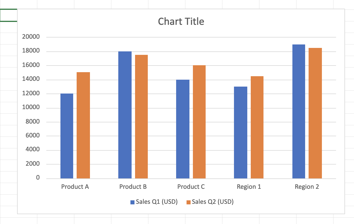
- Customize the chart as needed. You can adjust the chart title, axis labels, legend, and other elements to ensure that the graph is clear and easy to understand.

- Format the chart elements. You can change the color, size, and style of the bars, as well as the font and formatting of the text elements.
- Adjust the chart size and position as needed. You can resize the chart and move it to a suitable location on the worksheet.
- Add any additional annotations or callouts to highlight key insights. This can include data labels, trend lines, or other visual elements that help to emphasize important information.
- Review the final chart and make any necessary adjustments. Ensure that the double bar graph is clear, accurate, and effectively communicates the data you’re trying to present.
By following these steps, you’ll be able to create a professional-looking double bar graph in Excel that will help you analyze your data and communicate your findings effectively.
Customizing Your Double Bar Graph in Excel
Once you’ve created your double bar graph, you can customize its appearance to make it more visually appealing and informative. Excel provides a range of options to help you fine-tune your graph.
Adjusting Colors and Styles
To change the colors of your bars, simply select the bars you want to modify and use the “Fill” and “Border” options in the Format menu. You can choose from a variety of preset color schemes or create your own custom color palette.
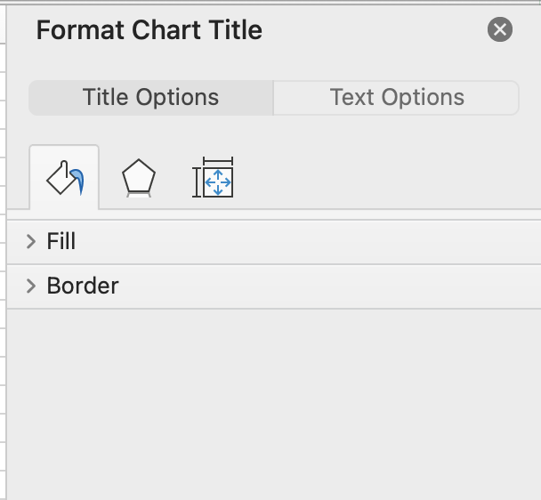
Additionally, you can adjust the style of your bars by changing the bar width, spacing, and even the shape (e.g., from rectangular to cylindrical). These customization options can help you create a more polished and professional-looking graph.
Enhancing Labels and Titles
Clearly labeling your graph is crucial for helping your audience understand the data. Start by adding a descriptive title that summarizes the main message of your graph. You can also customize the axis labels, legend, and data labels to provide more context.
For example, you might want to use more descriptive axis labels instead of generic “X” and “Y” labels. This can help your readers quickly grasp the meaning of the data being displayed.
Advanced Customization Options
Excel offers a range of advanced customization options to further enhance your double bar graph. Some examples include:
- Adding data labels to the bars to display the specific values
- Adjusting the axis scales and tick marks to optimize the visual representation of your data
- Incorporating gridlines or reference lines to provide additional context
- Changing the graph’s size and positioning within your worksheet
By exploring these advanced features, you can create a double bar graph that is not only visually appealing but also highly informative and easy for your audience to understand.
Adding a Secondary Axis to Your Double Bar Graph
In some cases, you may need to display two different types of data on the same graph, such as sales figures and profit margins. In these situations, a secondary axis can be a valuable tool.
Step-by-Step Guide to Adding a Secondary Axis
- Select the data series you want to display on the secondary axis.
- Right-click on the selected data series and choose “Format Data Series.”
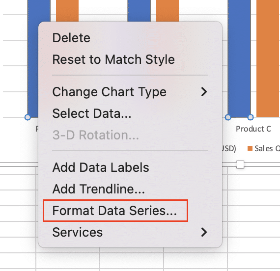
- In the Format Data Series pane, locate the “Axis” option and select “Secondary Axis.”
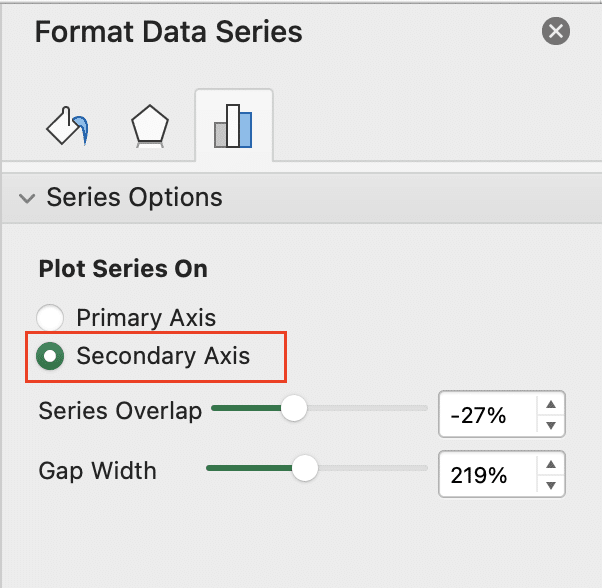
- Adjust the scale and formatting of the secondary axis as needed to ensure the data is displayed clearly.
When to Use a Secondary Axis
A secondary axis is particularly useful when the values of your two data series differ significantly in scale. For example, if one series represents sales in millions of dollars and the other represents profit margins as a percentage, a secondary axis can help ensure that both sets of information are clearly visible and easy to interpret.
Additionally, a secondary axis can be helpful when you want to compare the trends of two related but distinct metrics, such as revenue and customer satisfaction. By displaying these metrics on the same graph with separate axes, you can more easily identify any correlations or divergences between the two.
Video Tutorial
Handling Multiple Data Sets in a Double Bar Graph
As your data becomes more complex, you may need to visualize multiple data sets within a single double bar graph. Excel provides several options for managing and displaying this type of information effectively.
Clustered Bar Charts
One approach is to create a clustered bar chart, where each cluster of bars represents a different data set. This can be useful when you want to compare the values of multiple categories or groups side-by-side.
Stop exporting data manually. Sync data from your business systems into Google Sheets or Excel with Coefficient and set it on a refresh schedule.
Get Started
To create a clustered bar chart, simply add the additional data sets to your graph. Excel will automatically group the bars by category, making it easy to compare the values across different data sets.
Stacked Column Charts
Alternatively, you can use a stacked column chart to display multiple data sets within a single graph. In this format, the bars are stacked on top of each other, allowing you to show the cumulative values for each category.
Stacked column charts can be particularly helpful when you want to visualize the relative contributions of different components to the overall total. This can be useful for analyzing things like revenue breakdowns or market share.
Choosing the Right Visualization
When deciding between a clustered bar chart and a stacked column chart, consider the specific insights you want to convey. Clustered bar charts are better for comparing individual values, while stacked column charts are more effective for showing the overall totals and relative proportions.
Ultimately, the best approach will depend on the structure and purpose of your data. Experiment with different graph types to determine which one most effectively communicates your message to your audience.
Troubleshooting Common Issues with Double Bar Graphs in Excel
As with any data visualization tool, you may encounter some common challenges when creating double bar graphs in Excel. Here are a few common issues and how to address them:
Overlapping or Crowded Bars
If your bars are overlapping or the graph feels too crowded, try adjusting the bar width and spacing. You can also consider using a clustered bar chart or stacked column chart to better organize the data.
Unclear or Inconsistent Labeling
Make sure your axis labels, legend, and data labels are clear and consistent. Use descriptive text that helps your audience quickly understand the information being displayed.
Difficulty Comparing Values
If it’s hard to compare the values between the two data series, consider adding data labels or a secondary axis to provide more context.
Scaling Issues
Ensure that the axis scales are appropriate for the data being displayed. Adjust the minimum, maximum, and tick mark values as needed to optimize the visual representation.
Lack of Customization
Take advantage of Excel’s advanced formatting and customization options to make your double bar graph more visually appealing and informative. Experiment with different color schemes, styles, and layout options to find the best fit for your data.
By addressing these common issues, you can create double bar graphs that are not only visually striking but also highly effective at communicating your data insights.
Create Dynamic Double Bar Graphs in Excel
Excel’s double bar graphs offer powerful data comparison tools. But manually updating these graphs with new information from various sources can be time-consuming.
Coefficient links Excel directly to your data in Salesforce, Google Analytics, and other systems. Build auto-updating double bar graphs today.


