Ever wondered how to quickly grasp your data’s spread and outliers? Box plots in Excel can help. This guide shows you how to create these handy charts step-by-step.
You’ll learn to set up your data, use Excel’s features, and customize your box plot to reveal key insights about your dataset.
Box Plot 101: Understanding the Basics
A box plot, also known as a box-and-whisker diagram, is a statistical graph that provides a visual representation of a dataset’s distribution. It displays a five-number summary of the dataset: the minimum value, the first quartile (Q1), the median, the third quartile (Q3), and the maximum value.
The key components of a box plot are:
- Whiskers: The lines extending from the box that indicate the minimum and maximum values, excluding outliers.
- Box: The rectangular area that represents the middle 50% of the data, with the median line dividing the box.
- Outliers: Data points that fall outside the whiskers, typically represented as individual points.
Box plots are particularly useful for identifying the central tendency, spread, and skewness of a dataset. They allow you to quickly assess the distribution of your data, identify potential outliers, and compare multiple datasets side by side.
Step-by-Step Guide: How to Make a Box Plot in Excel
Creating a box plot in Excel is a straightforward process. Follow these steps to get started:
- Prepare your data: Ensure that your data is organized in a single column or row, with each data point in a separate cell.
- Select the data you want to enter on the box plot.
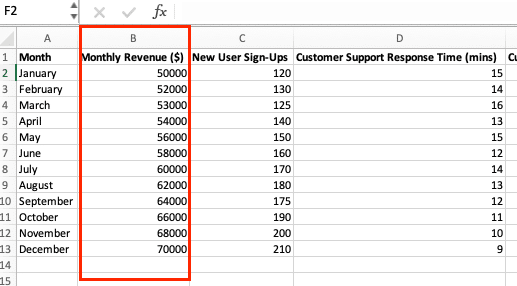
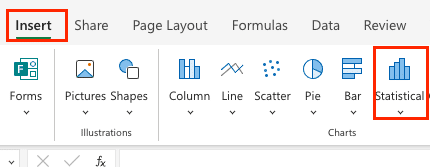
- Click ‘Insert’ in the Excel ribbon and navigate to ‘Statistical Chart’ in the array.
- Select the ‘Box and Whisker’ option in the chart dropdown
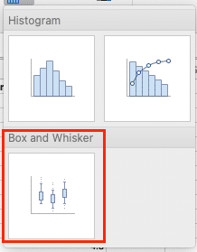
- The chart automatically shows on the Excel page
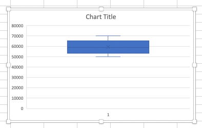
- Customize the plot (optional): You can further customize your box plot by adjusting the chart title, axis labels, and other visual elements.
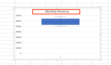
- Create the box plot: Click “OK” to generate the box plot in a new worksheet.
That’s it! You’ve successfully created a box plot in Excel. Remember, you can further refine and customize the plot to suit your specific needs and preferences.
Video Tutorial
Interpreting Your Box Plot: What the Data Tells You
Box plots are a powerful tool for visualizing the distribution of your data. By understanding how to read and interpret the different components of a box plot, you can gain valuable insights about your dataset.
The key elements of a box plot include:
- Median: The middle value, represented by the horizontal line in the center of the box.
- Interquartile Range (IQR): The range between the 25th and 75th percentiles, shown by the box itself.
- Whiskers: The lines extending from the box that represent the minimum and maximum values, excluding outliers.
- Outliers: Data points that fall outside the whiskers, typically more than 1.5 times the IQR above the 75th percentile or below the 25th percentile.
A symmetrical box plot with the median line in the center of the box indicates a normal distribution. Skewed distributions will have the median line shifted towards one side of the box. Wider boxes represent greater variability in the data, while narrower boxes indicate less dispersion.
By analyzing the shape and positioning of the box plot, you can quickly identify key characteristics of your data, such as:
- Central Tendency: The median value provides a measure of the central tendency of your data.
- Spread: The size of the IQR and the length of the whiskers indicate the overall spread or variability of the data.
- Symmetry: The symmetry (or lack thereof) of the box plot can reveal the underlying distribution of the data.
- Outliers: Identifying outliers can help you detect anomalies or data points that may require further investigation.
Understanding how to interpret these box plot elements will allow you to draw meaningful insights from your data and make more informed decisions.
Common Mistakes and Troubleshooting Tips for Box Plots in Excel
While creating box plots in Excel is generally straightforward, there are a few common pitfalls to watch out for:
- Incorrect Data Range: Ensure that you have selected the correct data range for your box plot. Double-check that you haven’t accidentally included or excluded any relevant data points.
- Missing Outliers: If your box plot is not displaying any outliers, check that your data does not contain any extreme values that fall outside the whisker range. Adjust the whisker settings or the outlier threshold if necessary.
- Overlapping Boxes: When creating multiple box plots in the same chart, make sure to adjust the spacing between the boxes to ensure they are clearly visible and don’t overlap.
- Incorrect Axis Scaling: Verify that the axis scaling is appropriate for your data. Adjust the minimum and maximum values, as well as the tick intervals, to ensure the box plot is displayed clearly.
- Incorrect Sorting: If your data is not sorted, the box plot may not accurately represent the distribution. Consider sorting your data before creating the box plot.
- Incorrect Grouping: Ensure that you have properly grouped your data if you are creating multiple box plots for different categories or variables.
To troubleshoot these issues, try the following steps:
- Inspect Your Data: Carefully review your data to identify any potential errors or outliers that may be affecting the box plot.
- Experiment with Settings: Adjust the box plot settings in Excel, such as the whisker length, outlier threshold, and spacing between boxes, to see how they impact the visualization.
- Consult Excel Help: Refer to Excel’s built-in help resources or online tutorials for guidance on properly creating and customizing box plots.
- Seek Community Support: If you’re still struggling, consider reaching out to Excel user forums or communities for additional troubleshooting assistance.
By addressing these common issues, you can ensure that your box plots accurately represent the distribution of your data and provide meaningful insights.
Comparing Tools: Box Plots in Excel vs. Google Sheets vs. R
While Excel is a popular choice for creating box plots, it’s not the only option available. Let’s explore the pros and cons of using Excel, Google Sheets, and the R programming language for this task:
Excel:
- Pros: Widely accessible, easy to use, and integrated with other Microsoft Office tools.
- Cons: Limited customization options, may struggle with large datasets, and can be prone to formatting issues.
Google Sheets:
- Pros: Cloud-based, collaborative, and often more user-friendly than Excel for basic data visualization.
- Cons: Fewer advanced charting options, limited functionality compared to Excel, and may not handle large datasets as well.
R:
- Pros: Highly customizable, powerful for advanced data analysis and visualization, and can handle large datasets with ease.
- Cons: Steeper learning curve, requires programming knowledge, and may not be as accessible for non-technical users.
Depending on your specific needs and preferences, you may find one tool more suitable than the others. For example, if you’re working with a small to medium-sized dataset and need a quick and easy way to create box plots, Excel or Google Sheets may be the better choice. However, if you require more advanced customization options or need to handle large datasets, R may be the more appropriate tool.
Regardless of the platform you choose, the key is to select the one that best fits your workflow and provides the functionality you need to effectively analyze and interpret your data.
Stop exporting data manually. Sync data from your business systems into Google Sheets or Excel with Coefficient and set it on a refresh schedule.
Get Started
Real-World Examples: Using Box Plots in Data Analysis
Box plots are a versatile data visualization tool that can be applied in a wide range of industries and scenarios. Here are a few real-world examples of how box plots can be used:
Finance: In the financial sector, box plots can be used to analyze stock price distributions, compare the performance of different investment portfolios, or identify outliers in financial data.
Healthcare: In the healthcare industry, box plots can be used to visualize the distribution of patient outcomes, such as hospital stay durations or medication dosages, to identify potential areas for improvement.
Marketing: Box plots can be used in marketing to analyze the distribution of customer satisfaction scores, website traffic data, or campaign performance metrics, helping identify trends and outliers.
Manufacturing: In manufacturing, box plots can be used to monitor the quality of production processes, identify sources of variability, and detect potential issues in the manufacturing workflow.
Education: Box plots can be used in the education sector to analyze student test scores, compare the performance of different schools or classrooms, and identify areas where additional support may be needed.
By incorporating real-world examples and case studies, you can help readers better understand the practical applications of box plots and how they can be used to gain valuable insights from their own data.
Advanced Tips: Enhancing Your Box Plots in Excel
While the basic box plot in Excel is a powerful tool, there are several ways you can enhance your visualizations to make them more informative and visually appealing:
- Add Trend Lines: Overlay trend lines on your box plot to identify patterns or trends in the data over time. This can be particularly useful when analyzing data series with multiple box plots.
- Combine with Other Charts: Combine your box plot with other chart types, such as scatter plots or line charts, to provide a more comprehensive view of your data and the relationships between different variables.
- Handle Large Datasets: When working with large datasets, consider creating small multiples (also known as trellis plots) to display multiple box plots in a grid-like layout. This can help you identify patterns and trends more easily.
- Customize Appearance: Experiment with different color schemes, font styles, and formatting options to make your box plots more visually appealing and aligned with your brand or design guidelines.
- Add Annotations: Enhance your box plots by adding annotations, such as labels, data points, or explanatory text, to provide additional context and insights to your audience.
- Integrate with Other Tools: Leverage the power of Excel by integrating your box plots with other tools, such as Power BI or Tableau, to create more sophisticated data visualizations and dashboards.
By incorporating these advanced techniques, you can create box plots that not only provide valuable insights but also engage your audience and elevate the overall quality of your data analysis.
Take Your Data Visualization to the Next Level
Box plots in Excel offer a clear way to show data distribution. By following the steps in this guide, you can now create your own box plots to analyze datasets. Remember to organize your data properly and use Excel’s Chart Tools to refine your plots.
For more advanced data visualization, consider using real-time data connections. Coefficient can help you automate your Excel reporting and keep your box plots up-to-date.
Want to learn more? Start using Coefficient to connect live data to your Excel sheets and create dynamic box plots.
