
Want to learn how to find outliers in Excel? You’re in the right place!
This guide shows you practical methods to spot unusual data points in your spreadsheets. You’ll learn to use Excel’s built-in functions and simple formulas to identify outliers.
Let’s dive in!
Outliers 101: Understanding the Basics
Outliers are data points that deviate significantly from the rest of the dataset. They can be caused by a variety of factors, such as measurement errors, data entry mistakes, or unique circumstances that influence the value of a particular observation.
Outliers can have a significant impact on your data analysis in several ways:
- Skewing the mean and other central tendency measures: Outliers can pull the mean, median, and other measures of central tendency towards their extreme values, leading to inaccurate representations of the dataset.
- Distorting the distribution: Outliers can cause the dataset to appear more or less dispersed than it truly is, affecting the interpretation of measures like standard deviation and variance.
- Influencing regression analysis: Outliers can have a disproportionate influence on the slope and intercept of regression lines, leading to biased estimates of the relationships between variables.
By identifying and addressing outliers, you can ensure that your data analysis accurately reflects the underlying trends and patterns in your dataset, leading to more informed decision-making.
Methods to Find Outliers in Excel
#1 Using the IQR Method to Find Outliers in Excel
The Interquartile Range (IQR) method is a simple and effective way to identify outliers in your Excel data. This approach relies on the concept of the middle 50% of the data, which is the range between the 25th and 75th percentiles.
To use the IQR method in Excel:
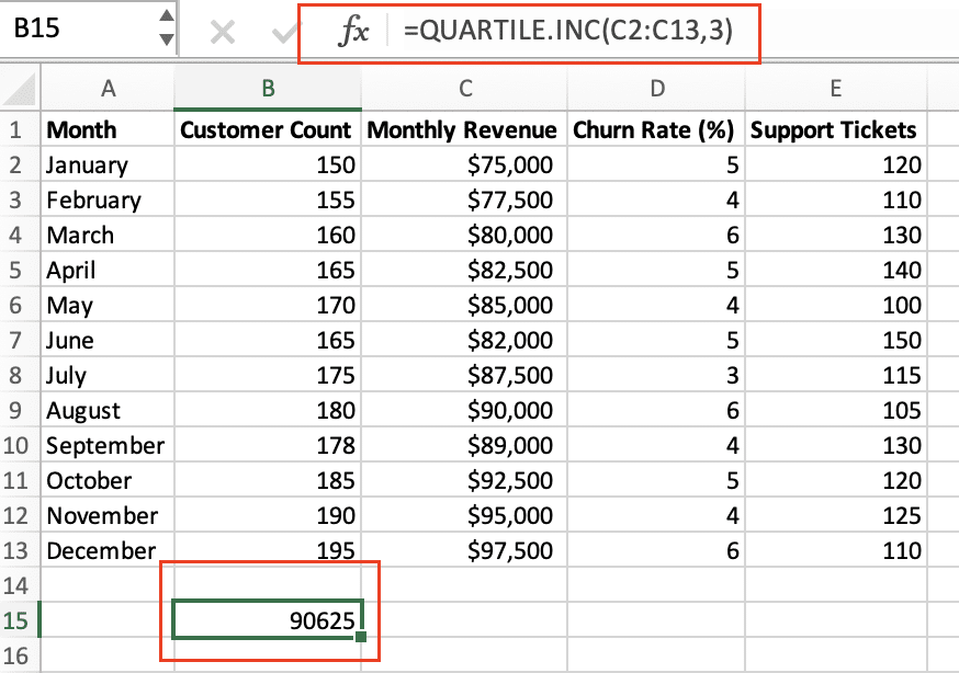
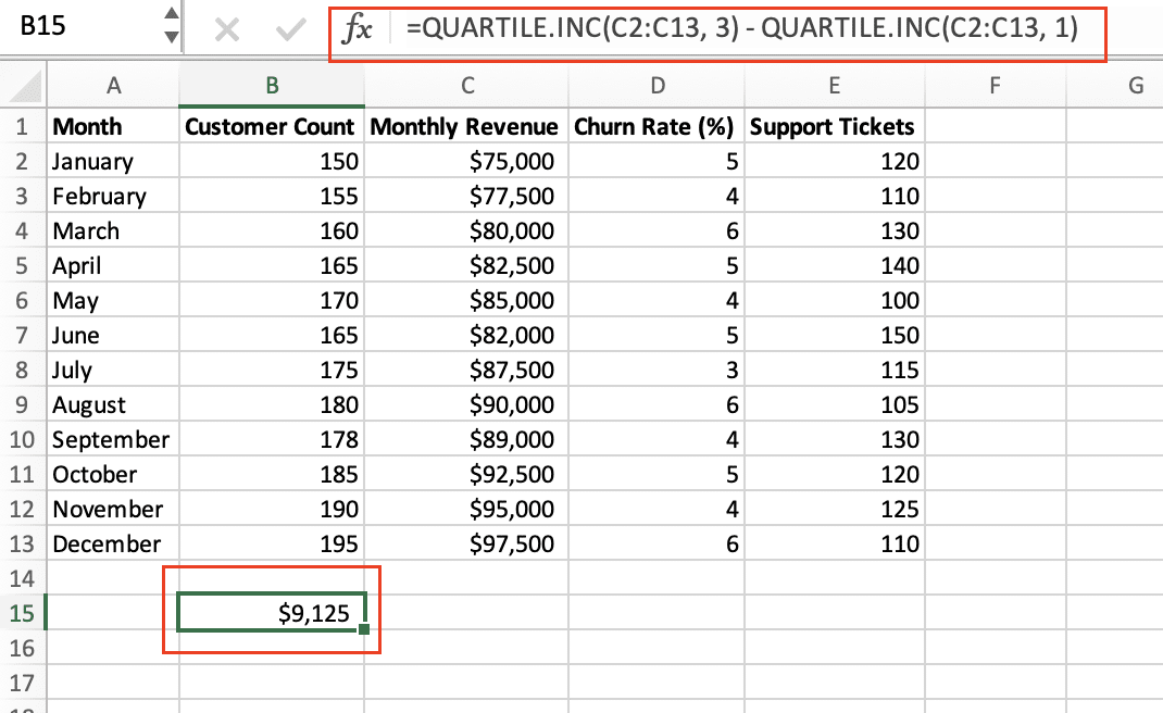
- Calculate the Interquartile Range: First, you’ll need to determine the 25th and 75th percentiles of your data. You can do this using the QUARTILE.INC() function in Excel. The IQR is then calculated by subtracting the 25th percentile from the 75th percentile.
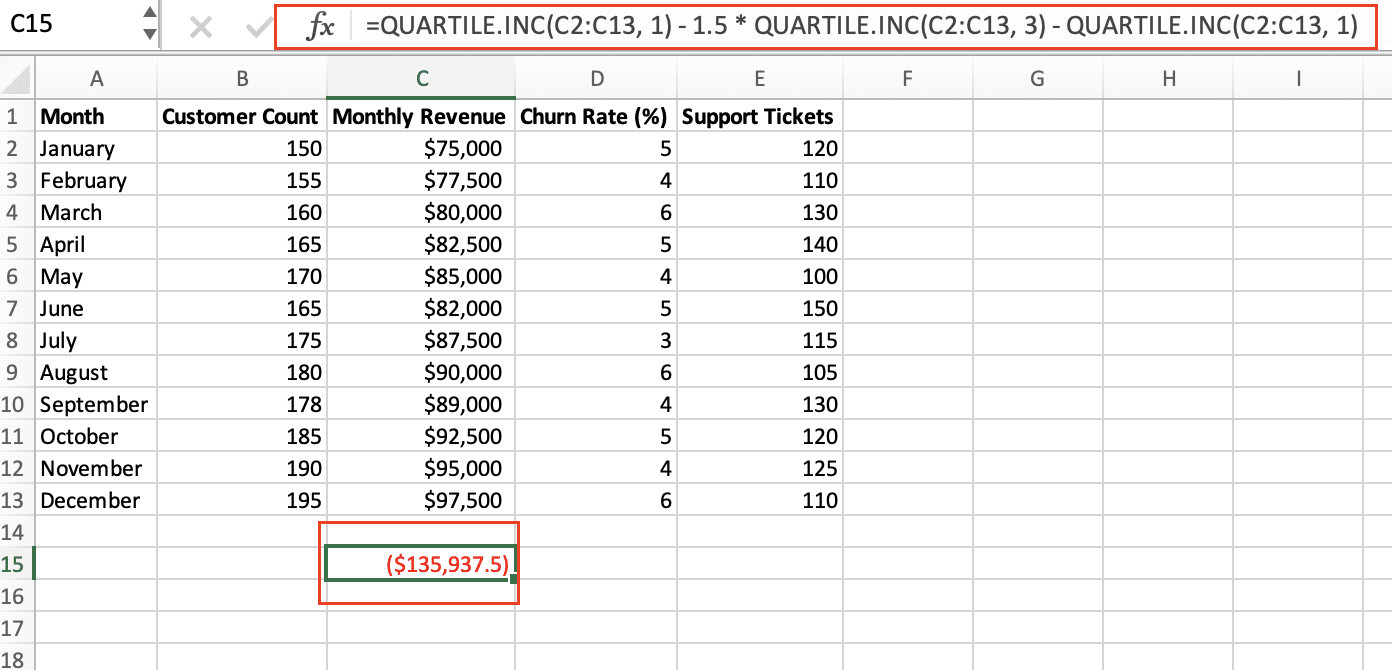
- Identify Outliers: Any data points that fall below the 25th percentile minus 1.5 times the IQR, or above the 75th percentile plus 1.5 times the IQR, are considered outliers.
Here’s an example of how this would look in Excel:
- Calculate the 25th and 75th percentiles:
- =QUARTILE.INC(data_range, 1) to get the 25th percentile
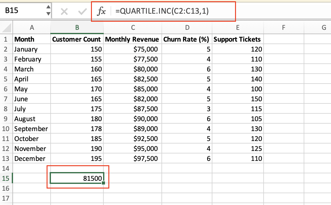
- =QUARTILE.INC(data_range, 3) to get the 75th percentile
- Calculate the IQR:
- =QUARTILE.INC(data_range, 3) – QUARTILE.INC(data_range, 1)
- Identify outliers:
- Lower outlier threshold: =QUARTILE.INC(data_range, 1) – 1.5 * IQR
- Upper outlier threshold: =QUARTILE.INC(data_range, 3) + 1.5 * IQR
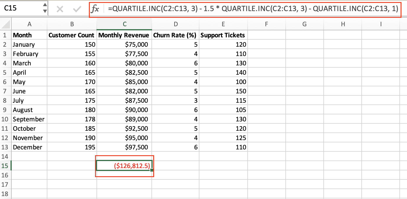
- Any data points below the lower threshold or above the upper threshold are considered outliers.
By following these steps, you can easily identify and remove any outliers in your Excel data using the IQR method.
#2 Finding Outliers with Standard Deviation in Excel
Another common method for detecting outliers in Excel is to use standard deviation. This approach is based on the assumption that most of your data will fall within a certain range around the mean, and any values that fall outside of that range can be considered outliers.
To find outliers using standard deviation in Excel:
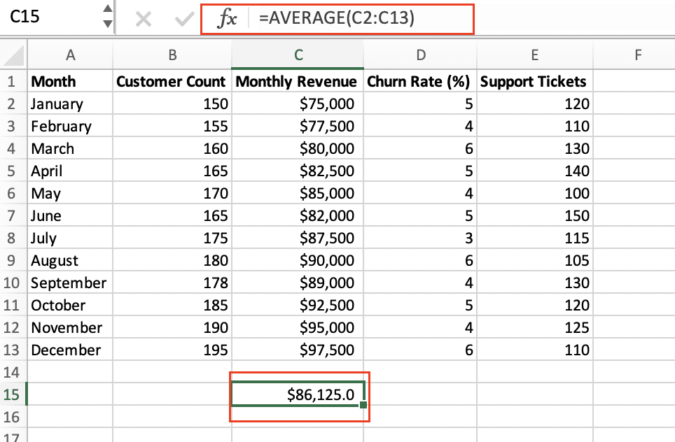
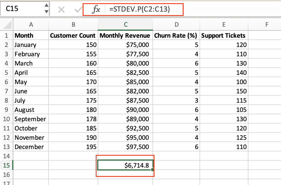
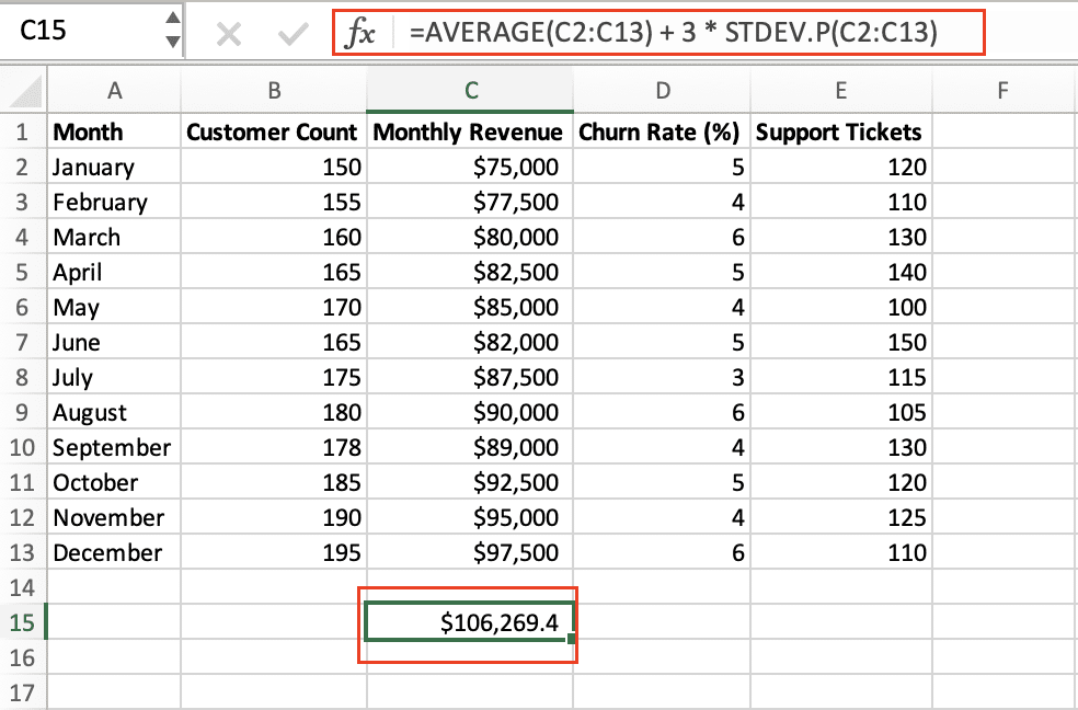
- Calculate the Mean and Standard Deviation: First, you’ll need to calculate the mean and standard deviation of your data using the AVERAGE() and STDEV.P() functions, respectively.
- Identify Outliers: Any data points that fall more than 3 standard deviations away from the mean are considered outliers. You can calculate the upper and lower thresholds using the following formulas:
- Lower threshold: =AVERAGE(data_range) – 3 * STDEV.P(data_range)
- Upper threshold: =AVERAGE(data_range) + 3 * STDEV.P(data_range)

- Any data points below the lower threshold or above the upper threshold are considered outliers.
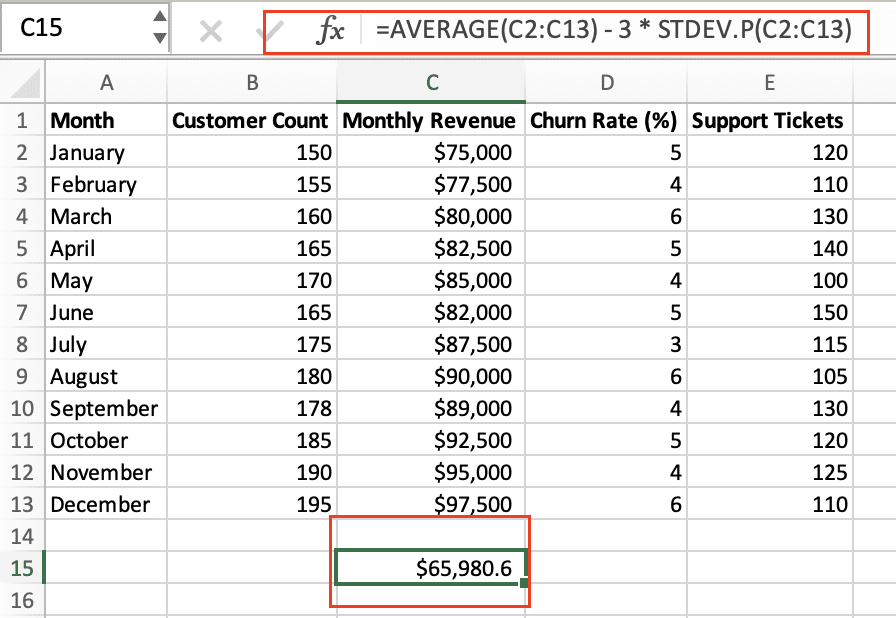
Here’s an example of how this would look in Excel:
- Calculate the mean and standard deviation:
- =AVERAGE(data_range) to get the mean
- =STDEV.P(data_range) to get the standard deviation
- Identify outliers:
- Lower outlier threshold: =AVERAGE(data_range) – 3 * STDEV.P(data_range)

- Upper outlier threshold: =AVERAGE(data_range) + 3 * STDEV.P(data_range)
- Any data points below the lower threshold or above the upper threshold are considered outliers.
By using standard deviation, you can quickly identify any data points that are significantly different from the rest of your dataset, making it a valuable tool for outlier detection in Excel.
For Advanced Use Cases: Grubbs’ Test and Z-Score
While the IQR and standard deviation methods are effective for many datasets, there are some advanced techniques you can use for more complex outlier detection in Excel.
Grubbs’ Test
Grubbs’ test is a statistical test that can be used to identify a single outlier in a dataset. It works by calculating a test statistic and comparing it to a critical value, which determines whether a data point is considered an outlier.

Stop exporting data manually. Sync data from your business systems into Google Sheets or Excel with Coefficient and set it on a refresh schedule.
Get Started
To perform Grubbs’ test in Excel, you can use the following formula:
- Calculate the test statistic:
- =(MAX(data_range) – AVERAGE(data_range)) / STDEV.P(data_range)
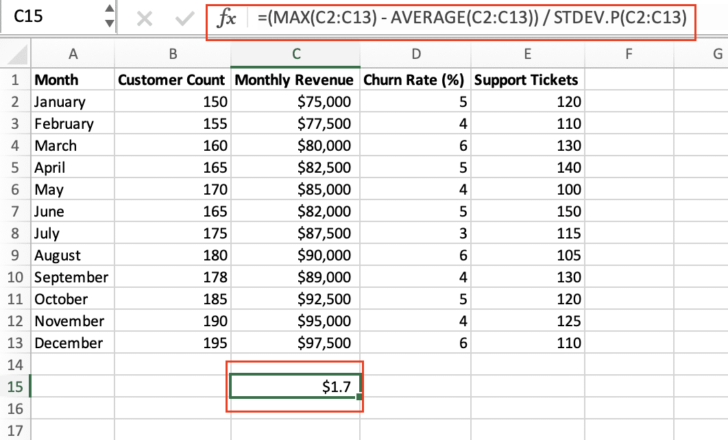
- This formula calculates the z-score of the maximum value in the dataset.
- Compare the test statistic to the critical value:
- You can find the critical value based on the number of data points and the desired significance level (e.g., 0.05) using a Grubbs’ test critical value table or an online calculator.
- If the test statistic is greater than the critical value, the maximum value is considered an outlier.
Z-Score
The Z-score is a measure of how many standard deviations a data point is from the mean. It can be used to identify outliers by setting a threshold for the acceptable Z-score range.
To calculate the Z-score in Excel:
- Calculate the Z-score for each data point:
- =(data_point – AVERAGE(data_range)) / STDEV.P(data_range)
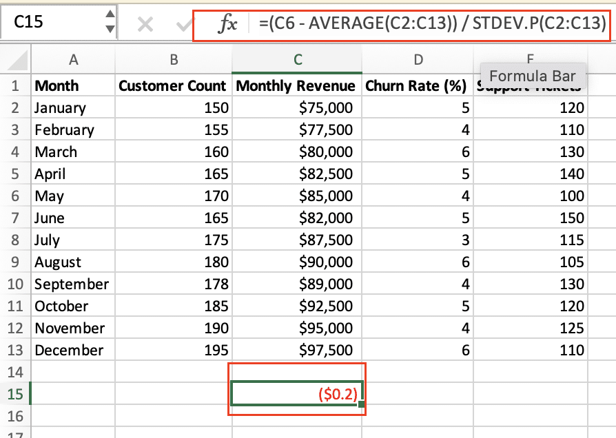
- Identify outliers:
- Set a threshold for the acceptable Z-score range (e.g., -3 to 3)
- Any data points with a Z-score outside of the threshold are considered outliers.
Both Grubbs’ test and Z-score can be powerful tools for identifying outliers, especially in more complex datasets. However, it’s important to choose the right method based on the characteristics of your data and the specific goals of your analysis.
Visualizing Outliers in Excel
In addition to the statistical methods discussed, visualizing your data can be a helpful way to identify outliers. Excel provides several chart types that can be useful for this purpose, such as box plots and scatter plots.
Box Plots
Box plots, also known as box-and-whisker plots, provide a visual representation of the distribution of your data, including the median, quartiles, and any outliers. To create a box plot in Excel:
- Select your data range.
- Go to the Insert tab and choose the Box & Whisker chart type.
- Customize the chart as needed to highlight any outliers.
Scatter Plots
Scatter plots can be useful for identifying outliers, especially when you have multiple variables in your dataset. By plotting the data points on a coordinate plane, you can easily spot any data points that are significantly different from the rest.
- Select the data you want to plot.
- Go to the Insert tab and choose the Scatter (X, Y) or Bubble chart type.
- Customize the chart to make it easier to identify outliers, such as adjusting the axis scales or adding gridlines.
Both box plots and scatter plots can provide valuable insights into your data and help you identify outliers that may not be immediately apparent from the raw numbers alone.
Beyond Outlier Detection: Dynamic Data Analysis
Excel provides functions to identify outliers, crucial for data cleaning and analysis. However, detecting outliers in large, constantly changing datasets can be time-consuming. Coefficient connects your Excel sheets to live data sources. This allows you to automatically update your datasets, perform real-time outlier detection, and refresh your analysis without manual data entry. To see how this can enhance your data quality processes, explore Coefficient.


