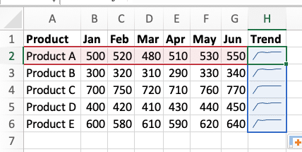
Excel sparklines transform complex data into clear, compact visualizations that fit within a single cell. These mini-charts help you spot trends and patterns instantly, making them invaluable for data analysis. Whether you’re tracking sales performance or monitoring financial metrics, sparklines provide immediate visual insights without the complexity of full-sized charts.
Create Your First Excel Sparkline
Follow these steps to create your first sparkline:
- Prepare Your Data
Select the range containing your data (e.g., A2:A10) - Select Target Cell
Click the cell where you want your sparkline to appear - Access Sparkline Tools
Navigate to Insert tab > Sparklines group

- Choose Sparkline Type
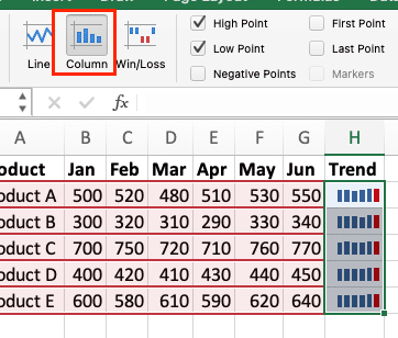
Select Line, Column, or Win/Loss based on your data

Define Data Range

In the Create Sparklines dialog box:
– Confirm or adjust the Data Range
– Verify the Location Range
- – Click OK
Pro Tip: Keep your data and sparklines close together for easier reference and maintenance.

Customize Sparkline Appearance
Adjust Line Sparkline Design
Transform basic line sparklines into informative visualizations:
- Modify Line Properties
|
Setting |
Options |
|---|---|
|
Line Color |
Choose from theme colors or custom RGB |
|
Line Weight |
Select from 0.25pt to 6pt |
|
Line Style |
Solid, dashed, or dotted |
Add Data Markers
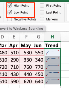
Sparkline Tools > Design > Show > Select markers for:

– High Points
– Low Points
– First Point
-Last Point
Scale Adjustments
Sparkline Tools > Design > Axis

Choose from:
– Same for All
– Custom Min/Max
– Show Axis
Format Column Sparklines
Create effective column sparklines with these customizations:
- Color Settings
|
Element |
Customization |
|---|---|
|
Positive Values |
Set custom colors |
|
Negative Values |
Define contrast colors |
|
Base Value |
Adjust reference point |
- Layout Options
Adjust spacing between columns:
Design > Style > Column Spacing
Configure Win/Loss Charts
Set up win/loss sparklines for binary data visualization:
Define Thresholds
Set criteria for wins/losses:
– Above target = Win
– Below target = Loss
- – Equal to target = Tie
- Apply Custom Colors
|
Outcome |
Recommended Colors 
Try the Free Spreadsheet Extension Over 500,000 Pros Are Raving About
Stop exporting data manually. Sync data from your business systems into Google Sheets or Excel with Coefficient and set it on a refresh schedule. Get Started |
|---|---|
|
Wins |
Green or Blue |
|
Losses |
Red or Orange |
|
Ties |
Gray or Neutral |
Types of Excel Sparklines and Their Uses
Choose the right sparkline type for your data:
|
Type |
Best For |
Example Use Case |
|---|---|---|
|
Line |
Continuous data |
Stock prices, temperature readings |
|
Column |
Discrete values |
Monthly sales, inventory levels |
|
Win/Loss |
Binary outcomes |
Target achievement, pass/fail rates |
Real-World Applications
Sales Performance Tracking
Monitor sales metrics effectively:
Daily Trends
Create line sparklines for Monthly sales figures
- Add markers for peak selling Month

Regional Comparison
Use column sparklines to compare regions
- Group related metrics for easy comparison
Financial Analysis
Visualize financial data:
Stock Performance
Track price movements with line sparklines
- Add markers for 52-week highs/lows

Budget Tracking
Monitor variances with column sparklines
- Highlight over/under spending

Next Steps
Sparklines offer a powerful way to visualize data trends in a compact format. Start with basic implementations and gradually incorporate more advanced features as needed. Remember to keep your visualizations simple and focused on the story you want to tell.
Ready to take your Excel data visualization to the next level? Try Coefficient to automatically sync live data from your business systems directly into your spreadsheets and create dynamic, real-time sparkline visualizations.

