Are you struggling to visualize your sales pipeline or customer journey effectively? Excel’s funnel chart feature can help you clearly illustrate sequential processes and identify bottlenecks. This guide will walk you through creating, customizing, and analyzing funnel charts in Excel, empowering you to make data-driven decisions.
Creating a Basic Funnel Chart in Excel
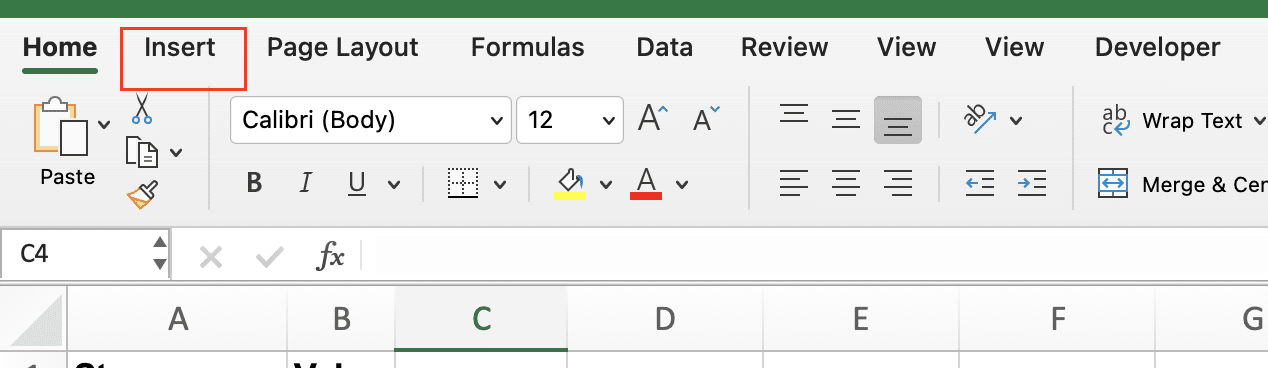
Selecting your data
- Highlight the range of cells containing your stage names and values
- Ensure you’ve selected both columns, but not any header rows
Inserting a funnel chart
- Click the “Insert” tab on the Excel ribbon
- In the “Charts” section, click “Insert Waterfall, Funnel, or Stock Chart“
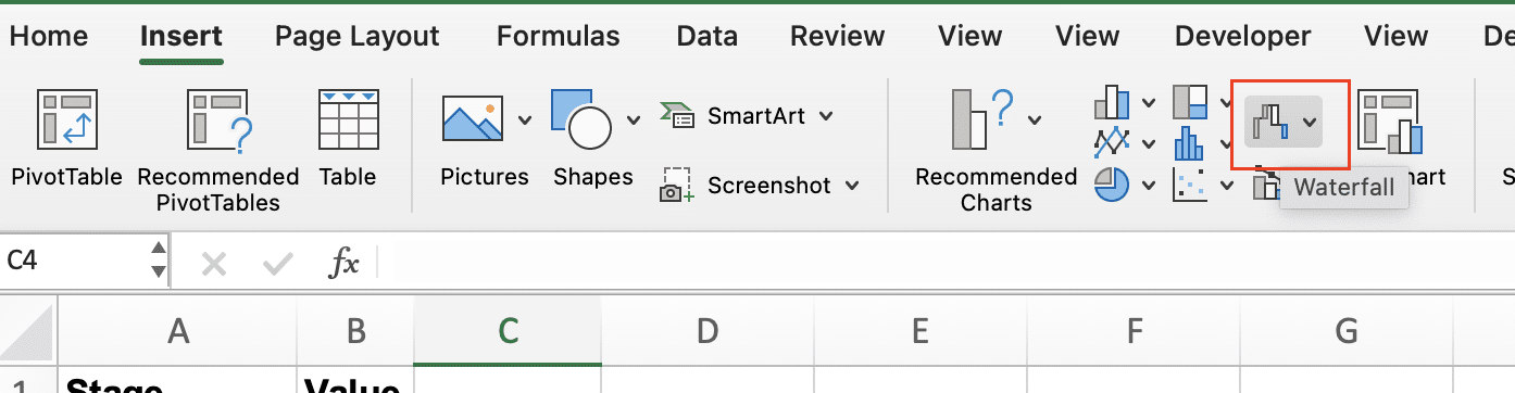
- Select “Funnel” from the dropdown menu
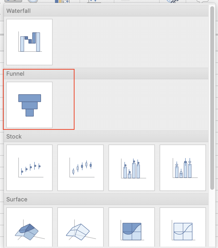
Excel will now generate a basic funnel chart based on your selected data.
Customizing Your Funnel Chart
Changing colors and styles
- Click on the funnel chart to select it
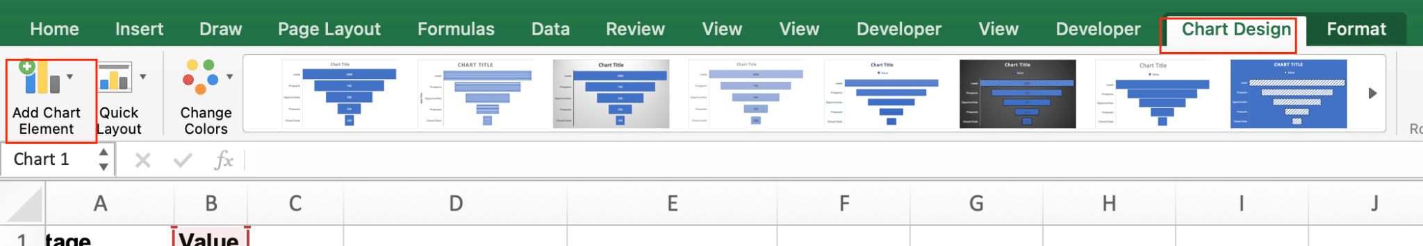
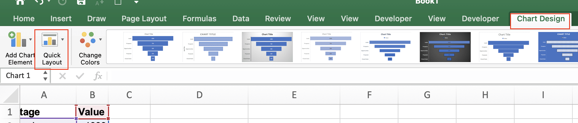
- Go to the “Chart Design” contextual tab
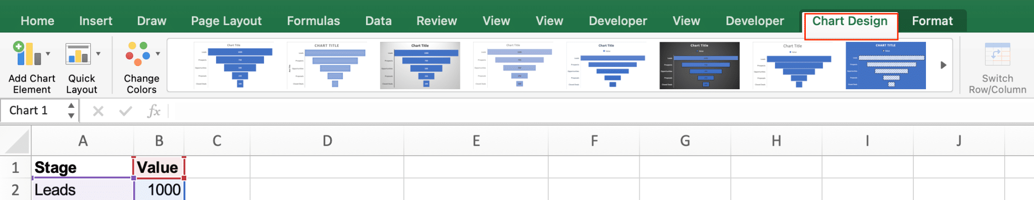
- Click “Change Colors” to choose a new color scheme
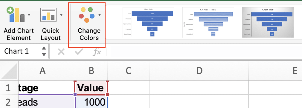
- Use the “Style” options to apply pre-designed formats
For more control:
- Right-click on a funnel segment
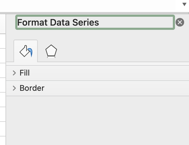
- Select “Format Data Series“
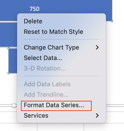
- Use the “Fill” and “Border” options to customize individual segments
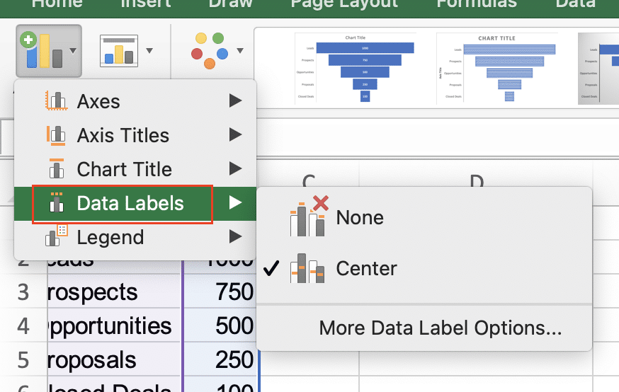
Adjusting labels and data points
- Click on the chart labels
- Go to the “Chart Design” tab and select “Add Chart Element“
- Choose “Data Labels” to display values, percentages, or both
To modify label position:
- Right-click on a label
- Select “Format Data Labels“
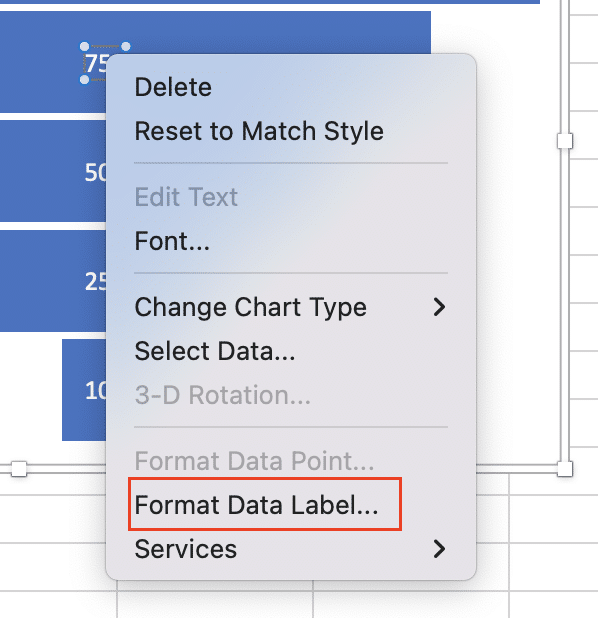
- Choose your preferred position (inside, outside, or best fit)
Adding and formatting titles
- Click on your chart
- Go to “Add Chart Element” in the “Chart Design” tab

- Select “Chart Title” and choose your preferred style

To edit the title:
- Click on the title text box
- Type your desired title
- Use the “Home” tab to adjust font, size, and color
Modifying chart layout and size
- Click and drag the corners of the chart to resize it
- Use the “Layout” options in the “Chart Design” tab to adjust the chart’s position on your worksheet
For a more compact funnel:
- Right-click on the chart
- Select “Format Chart Area“
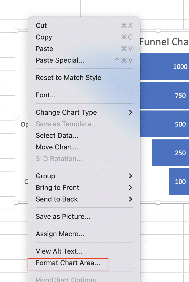
- Adjust the “Gap Width” to bring funnel segments closer together
Advanced Funnel Chart Techniques
Creating a funnel chart using a stacked bar chart
For more customization options, you can create a funnel chart using a stacked bar chart:
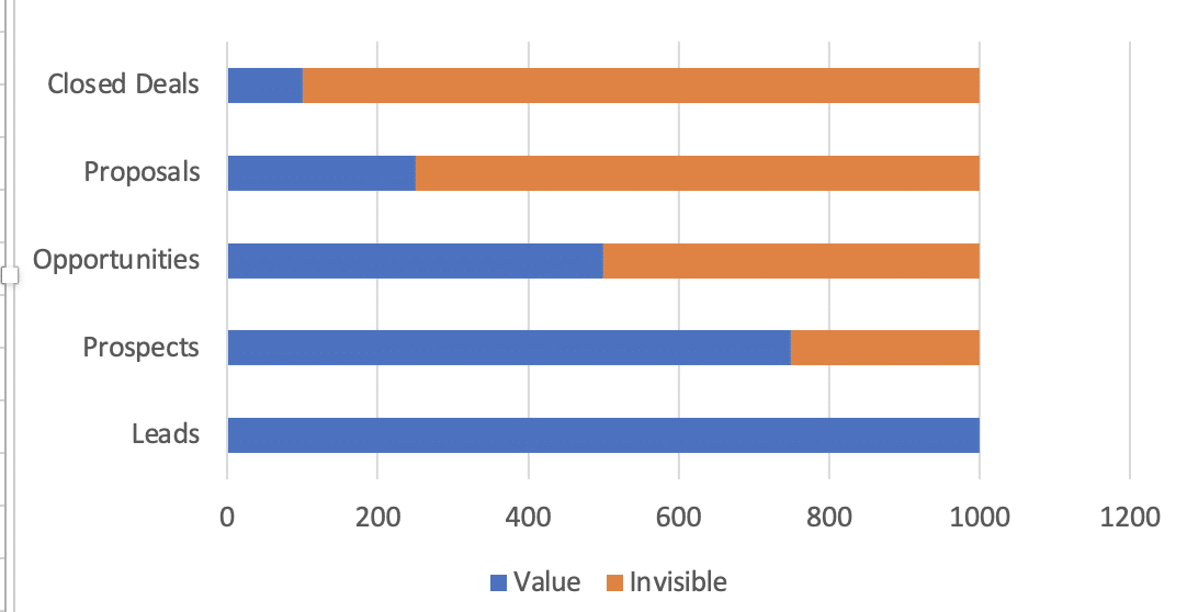
- Organize your data with an additional “Invisible” column:
|
Stage |
Value |
Invisible |
|---|---|---|
|
Leads |
1000 |
0 |
|
Prospects |
750 |
250 |
|
Opportunities 
Try the Free Spreadsheet Extension Over 500,000 Pros Are Raving About
Stop exporting data manually. Sync data from your business systems into Google Sheets or Excel with Coefficient and set it on a refresh schedule. Get Started |
500 |
500 |
|
Proposals |
250 |
750 |
|
Closed Deals |
100 |
900 |
- Select your data and insert a stacked bar chart
- Format the “Invisible” series to have no fill and no border
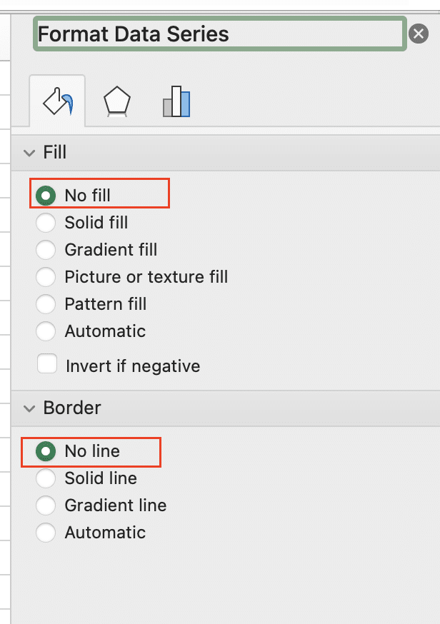
- Rotate the chart 270 degrees for a vertical orientation
- Adjust the gap width to create the funnel shape
Adding multiple measures to your funnel chart
To compare different metrics in one funnel:
- Add additional columns to your data set for each measure
- Select all data and insert a funnel chart
- Right-click the chart and choose “Select Data“
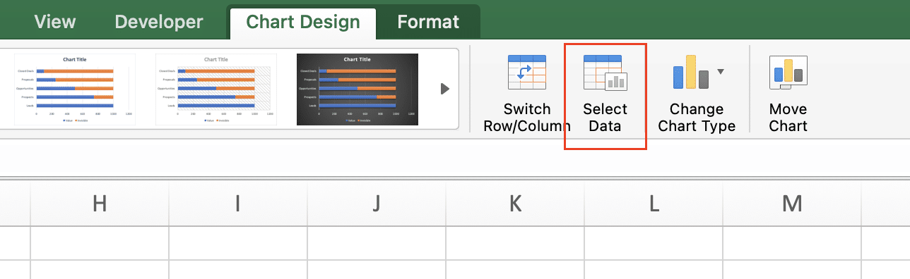
- Add or remove series as needed
Incorporating data filters
Use Excel’s built-in filtering capabilities to create dynamic funnel charts:
- Organize your data in a table format
- Insert a funnel chart based on this table
- Add slicers or timeline filters to your worksheet
- Connect these filters to your funnel chart’s data source
This allows users to interact with the chart, filtering by date, category, or other relevant factors.
Understanding Funnel Charts
What is a funnel chart?
A funnel chart is a data visualization tool that represents a process with sequential stages. It typically has a wide top that narrows towards the bottom, resembling a funnel shape. Each stage is represented by a segment, with the width of each segment proportional to the value it represents.
When to use funnel charts
Funnel charts are ideal for visualizing:
- Sales pipelines: Tracking leads from initial contact to closed deals
- Customer acquisition: Showing the journey from awareness to purchase
- Website conversion: Illustrating user flow from landing page to checkout
- Recruitment processes: Displaying candidate progression through hiring stages
Funnel charts vs. other chart types
While bar charts and pie charts are common for data visualization, funnel charts offer unique advantages:
- Clarity in sequential processes: Unlike bar charts, funnel charts clearly show the progression through stages
- Emphasis on dropoffs: Funnel charts highlight where the biggest decreases occur between stages
- Intuitive representation: The funnel shape naturally conveys the idea of narrowing down or filtering
Master Funnel Charts in Excel
By mastering funnel charts in Excel, you’ll gain valuable insights into your business processes and be better equipped to make data-driven decisions.
Ready to take your data analysis to the next level? Coefficient offers powerful tools to enhance your Excel and Google Sheets capabilities. Get started with Coefficient today and unlock the full potential of your data.


