Clustered column charts are powerful tools for visualizing and comparing data in Microsoft Excel. These versatile charts display multiple data series as vertical bars grouped by category, allowing you to easily spot trends and make comparisons. Whether you’re a beginner or an advanced Excel user, this guide will walk you through creating and customizing clustered column charts to effectively present your data.
Creating a Basic Clustered Column Chart
Step 1: Prepare Your Data
Proper data organization is crucial for creating an effective clustered column chart. Follow these guidelines:
- Arrange your data in a table format
- Place category labels in the first column
- Use subsequent columns for each data series
- Include clear, descriptive headers for each column
Example data structure:
| Month | Product A Sales | Product B Sales | Product C Sales |
| Jan | 1000 | 1200 | 800 |
| Feb | 1100 | 1300 | 900 |
| Mar | 1200 | 1100 | 1000 |
Tips for data preparation:
- Ensure consistent data types within each column
- Avoid blank cells or non-numeric data in value columns
- Use short, clear labels for categories and series
Common pitfalls to avoid:
- Mixing data types (e.g., text and numbers) in value columns
- Using overly long category or series labels
- Including totals or summary rows in your data range
Step 2: Insert the Chart
To insert a clustered column chart:
- Select your data range, including headers
- Navigate to the “Insert” tab on the Excel ribbon

- Click on the “Column” chart button in the “Charts” group

- Choose “Clustered Column” from the dropdown menu
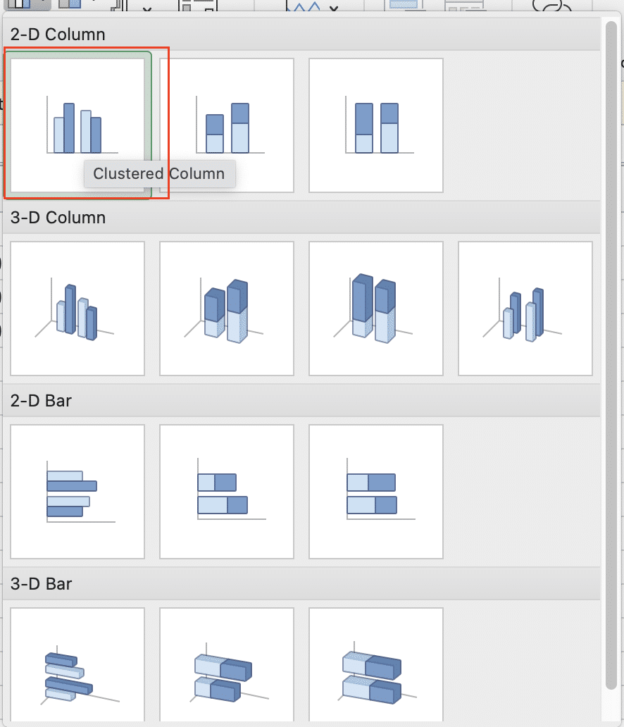
Alternatively, use these keyboard shortcuts:
- Select your data range
- Press Alt + N to open the Insert tab
- Press ‘C’ to open the column chart menu
- Press ‘L’ to select the clustered column chart option
Step 3: Select Your Data Range
If Excel doesn’t automatically select the correct data range, you can manually adjust it:
- Right-click on the chart and select “Select Data“

- In the “Select Data Source” dialog, click “Edit” under “Legend Entries (Series)“
- Adjust the series name and values as needed
- Click “OK” to apply changes
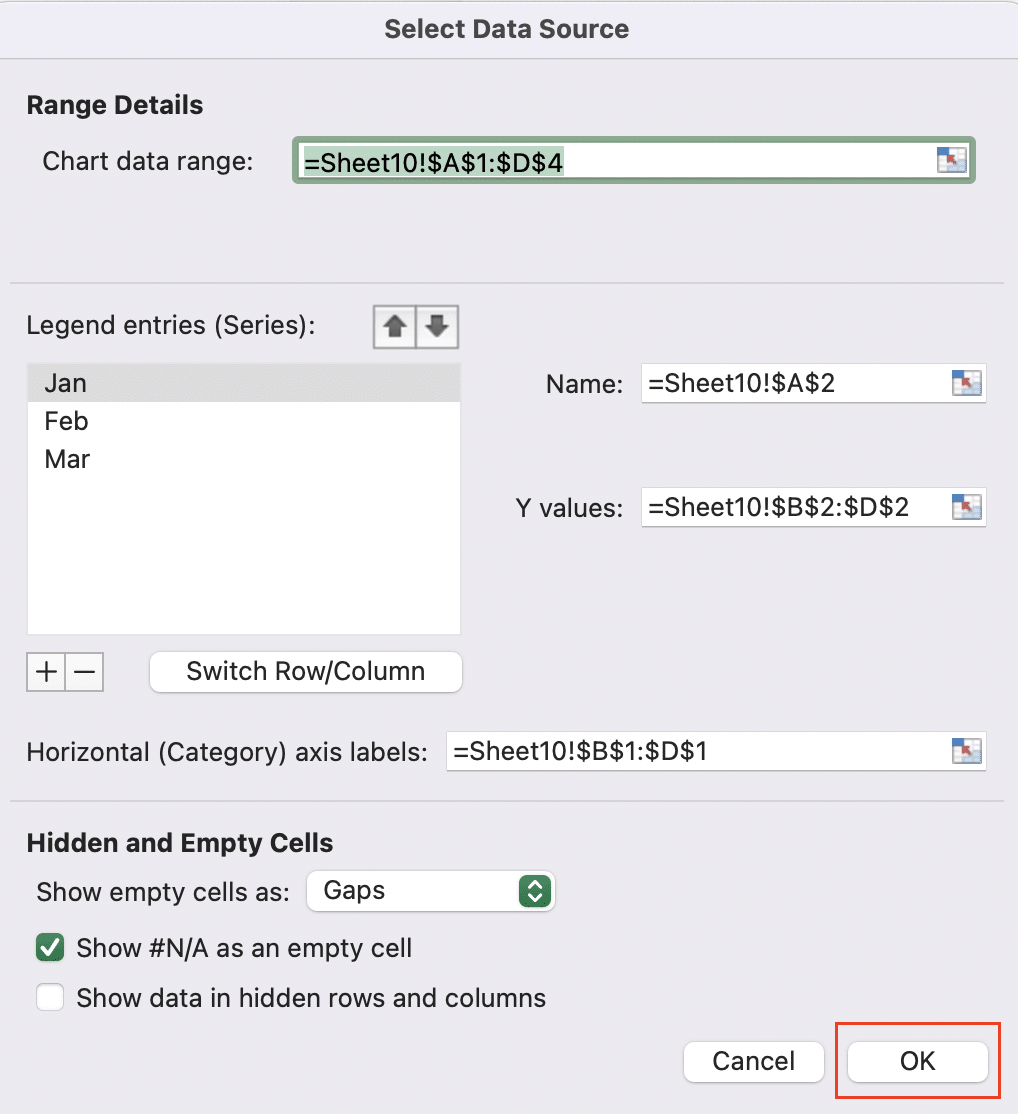
For non-adjacent data ranges:
- Hold the Ctrl key while selecting multiple ranges
- Use named ranges to simplify selection of scattered data
Verify your data selection:
- Click on the chart to reveal the “Chart Tools” contextual tabs
- Go to the “Chart Design” tab
- Click “Select Data” to review and modify your data range

Video Tutorial
Customizing Your Clustered Column Chart
Modifying Chart Elements
Changing column colors and styles
- Click on a column series to select all columns in that series
- Right-click and choose “Format Data Series“

- In the Format Data Series pane, adjust fill color, border color, and other style options
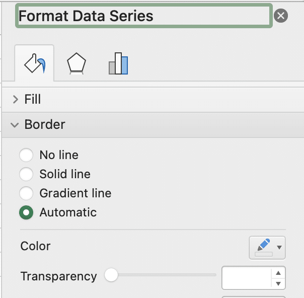
Adding and formatting data labels
- Click on the chart to reveal Chart Tools
- Go to the “Add Chart Element” tab

- Click “Data Labels” and choose a position (e.g., “Outside End”)
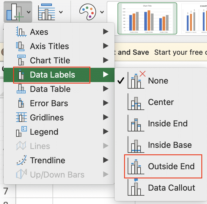
- To format labels, right-click on a label and select “Format Data Labels“

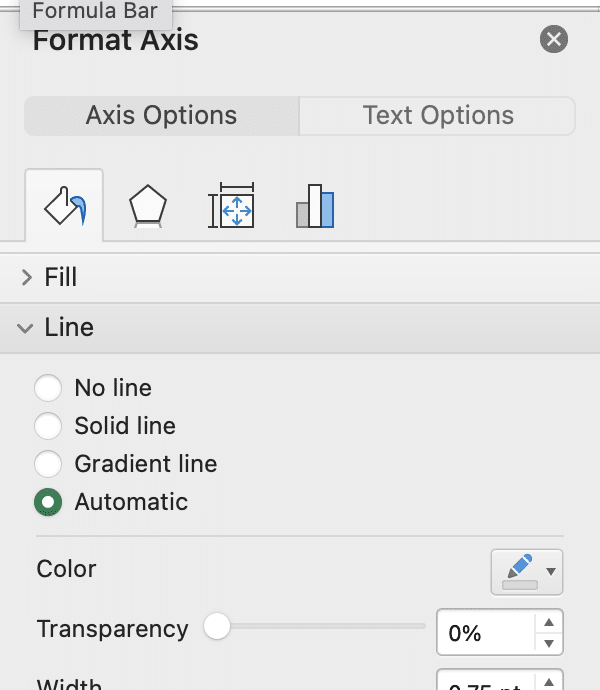
Customizing the legend and axis labels
- Click on the legend or axis labels to select them
- Right-click and choose “Format Legend” or “Format Axis“

- Adjust font, size, color, and position as desired
Adjusting Chart Layout and Design
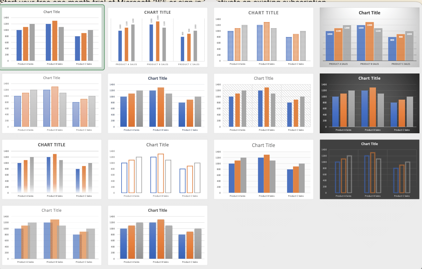
Applying built-in Excel chart styles
- Click on the chart to reveal Chart Tools
- Go to the “Chart Design” tab

- Browse and select from the “Chart Styles” gallery
Modifying chart title and axis titles
- Click on the chart title or axis title to select it
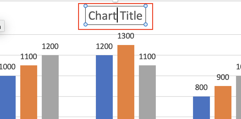
- Edit the text directly in the chart
- To add missing titles, use the “Layout” tab under Chart Tools

Changing the chart’s position and size
- Click and drag the chart to reposition it on the worksheet
- Use the resize handles to adjust the chart’s dimensions
- For precise sizing, right-click the chart, select “Format Chart Area,” and enter specific dimensions

Advanced Techniques for Clustered Column Charts
Working with Multiple Data Series
As your data grows more complex:
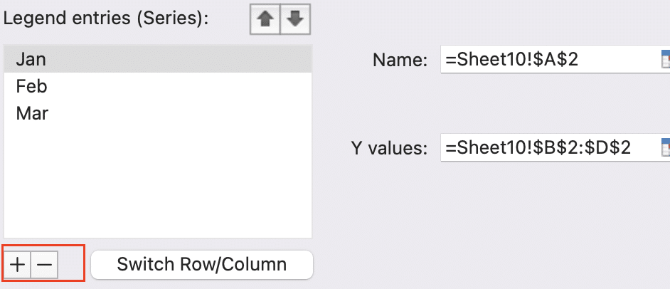
- Add or remove data series:
- Right-click the chart and choose “Select Data“
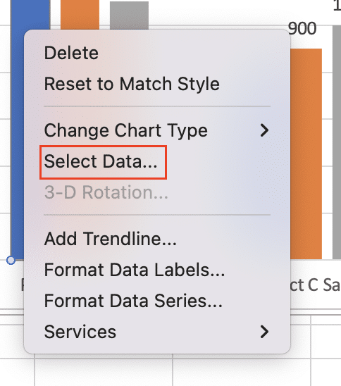
- Use the “Add” and “Remove” buttons in the Series section
- Compare more than three data series effectively:
- Use distinct colors or patterns for each series
- Consider using a secondary axis for series with different scales
- Explore alternatives like small multiples for many series
- Use secondary axes for data with different scales:
- Right-click a series and choose “Format Data Series“

- Check “Plot Series on Secondary Axis“

- Adjust axis scales as needed
Enhancing Data Visualization
Take your charts to the next level:
- Incorporate error bars and trendlines:
- Use the “Add Chart Element” button on the “Chart Design” tab

- Choose Error Bars or Trendline and customize as needed

- Use data markers and custom shapes:
- Right-click a data series and choose “Change Series Chart Type“
- Experiment with combination charts for added visual interest
- Apply conditional formatting to chart elements:
- Select the data range in your spreadsheet
- Use Conditional Formatting rules
- The chart will automatically update to reflect the formatting
What is a Clustered Column Chart?
A clustered column chart is a type of graph that displays data in vertical bars, grouped by categories. Each group contains multiple bars representing different data series, allowing for easy comparison within and across categories.
Key characteristics of clustered column charts include:
- Vertical bars of varying heights
- Multiple bars per category, side-by-side
- Distinct colors or patterns for each data series
Clustered column charts differ from other column chart types in the following ways:
| Chart Type | Description | Best Used For |
| Clustered Column | Multiple series shown as separate columns within each category | Comparing values across categories for multiple series |
| Stacked Column | Series values stacked on top of each other in a single column per category | Showing the composition of each category and the total |
| 100% Stacked Column | Series values displayed as percentages of the whole for each category | Comparing proportional contributions of each series across categories |
When to Use Clustered Column Charts
Clustered column charts excel at:
- Comparing multiple data series across categories
- Visualizing trends and patterns in categorical data
- Displaying changes over time for different groups
Some effective applications include:
Stop exporting data manually. Sync data from your business systems into Google Sheets or Excel with Coefficient and set it on a refresh schedule.
Get Started
- Sales data for multiple products across regions
- Monthly website traffic from different sources
- Student test scores by subject and grade level
- Comparing budget vs. actual spending for departments
FAQ: Common Questions About Clustered Column Charts in Excel
How do I create a cluster in Excel?
To create a cluster in Excel:
- Select your data range
- Go to the “Insert” tab
- Click on the Column chart button
- Choose “Clustered Column” from the 2-D Column options
Excel will automatically group your data into clusters based on your categories and series.
How can I make a clustered bar chart in Excel with two sets of data?
To create a clustered bar chart with two data sets:
- Organize your data with categories in the first column and two data series in adjacent columns
- Select your data range
- Go to the Insert tab and choose the Bar chart option
- Select “Clustered Bar” from the 2-D Bar options
Excel will create a horizontal clustered bar chart with your two data series.
How do I create a chart in Excel with multiple columns?
To create a chart with multiple columns:
- Arrange your data with categories in the first column and multiple data series in adjacent columns
- Select your entire data range
- Go to the Insert tab and click the Column chart button
- Choose “Clustered Column” or another appropriate option
Excel will create a chart with multiple columns based on your selected data series.
How can I create a clustered column chart in Excel with a secondary axis?
To add a secondary axis to a clustered column chart:
- Create your clustered column chart as normal
- Right-click on the data series you want on the secondary axis
- Choose “Format Data Series“
- Check the box for “Plot Series on Secondary Axis“
- Adjust axis scales and labels as needed
This allows you to display data with different scales on the same chart.
Take Excel Data Visualization to the Next Level
Clustered column charts in Excel offer a powerful way to visualize and compare data across categories and series. By mastering the techniques covered in this guide, you’ll be able to create clear, informative, and visually appealing charts that effectively communicate your data insights.
Ready to take your Excel data visualization to the next level? Get started with Coefficient to unlock advanced features and seamlessly integrate your data sources for even more powerful Excel charts and analyses.


