
Open your Excel spreadsheet with time-series data organized with time periods in one column and corresponding values in another
Select your data range including time periods and values, then go to the “Insert” tab on the Excel ribbon
Click on “Scatter” in the Charts group and choose the basic scatter chart with markers for trend visualization
Right-click on any data point in your scatter plot and select “Add Trendline” from the context menu
Choose the appropriate trendline type that best fits your data (Linear for steady rate changes, Exponential for increasingly higher rate changes)
Excel trend analysis helps you uncover patterns in data over time. This guide shows you how to use Excel’s powerful features for visualizing and predicting trends.
Step 1. Open your Excel spreadsheet with the data for analysis.
- Launch Excel and open the workbook containing your time-series data.
- Ensure your data is organized with time periods in one column and corresponding values in another.
Step 2. Select your data range, including time periods and values.
- Click and drag to highlight the cells containing your data.
- Make sure to include headers if present, as they’ll be used for labeling your chart.
Step 3. Go to the “Insert” tab on the Excel ribbon.

- The Insert tab contains all the chart options you’ll need for visualizing your data trends.
Creating a Scatter Plot for Your Data
A scatter plot is an excellent way to visualize trends in your data:
Step 1. Click on “Scatter” in the Charts group.
- Find the Scatter chart option in the Charts section of the Insert tab.
- Click the dropdown arrow to see different scatter chart types.
Step 2. Select the appropriate scatter chart type for your data.
- For most trend analyses, choose the basic scatter chart with only markers.
- If your data points should be connected, select the scatter with smooth lines option.
Step 3. Adjust the chart area and axis labels as needed.
- Click on the chart title to edit it, describing what the chart represents.

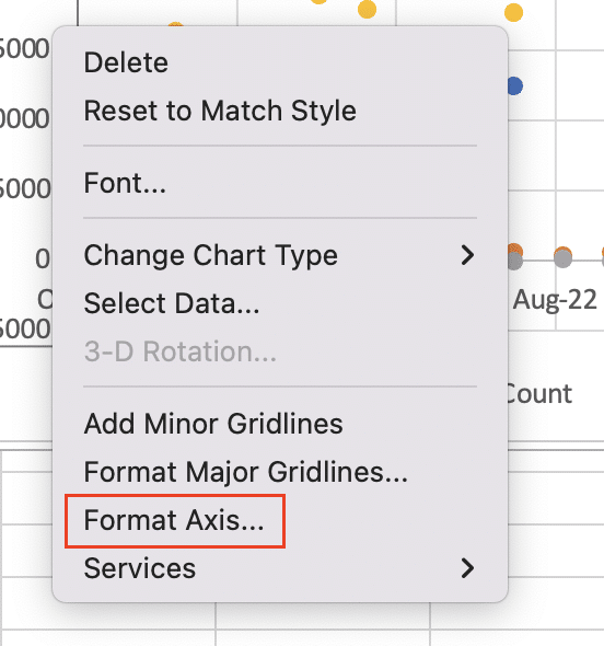
- Right-click on each axis to format it, ensuring the scales are appropriate for your data.
Adding a Trendline to Your Chart
Trendlines help visualize the overall direction of your data:
Step 1. Right-click on any data point in your scatter plot.
- This will bring up a context menu with various chart options.
Step 2. Select “Add Trendline” from the context menu.
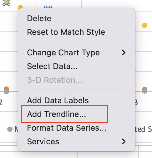
- This opens the Trendline options pane on the right side of your Excel window.
Step 3. Choose the type of trendline that best fits your data.
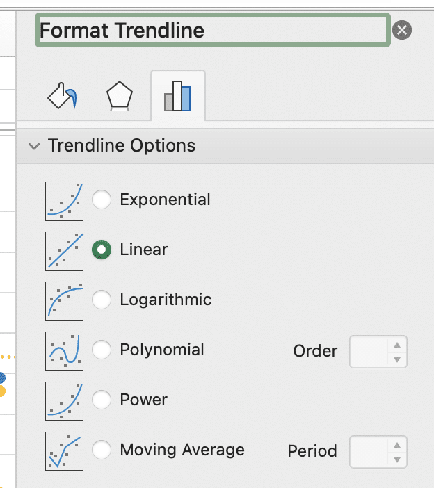
- Linear: For data that increases or decreases at a steady rate.
- Exponential: For data that changes at an increasingly higher rate.
- Logarithmic: For data that changes quickly then levels out.
- Polynomial: For data with multiple highs and lows.
- Power: For data that changes at a specific rate.
- Moving Average: To smooth out fluctuations and show the pattern more clearly.
Customizing Your Trendline for Better Insights
Customizing your trendline can provide more detailed information about your trend:
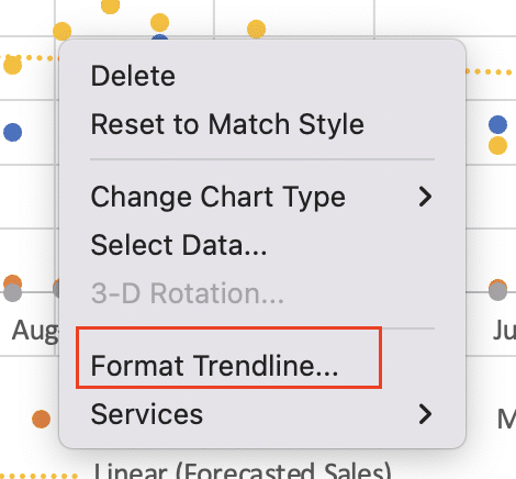
Step 1. Open the Format Trendline pane.
- If it’s not already open, right-click on the trendline and select “Format Trendline.”
Step 2. Adjust trendline color, style, and transparency.
- Change the line color to contrast with your data points.
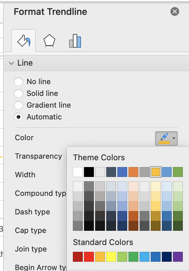
- Adjust line style (solid, dashed, etc.) and width for better visibility.
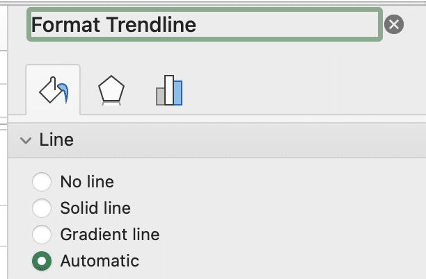
- Set transparency if you need to see data points behind the line.
Step 3. Display the trendline equation on the chart for numerical analysis.
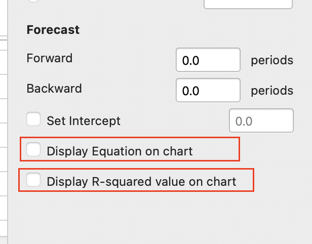
- In the Format Trendline pane, check the box for “Display Equation on chart.“
- Also consider checking “Display R-squared value on chart” to show how well the trendline fits your data.
Using the TREND Function for Numerical Trend Analysis
The TREND function allows for precise numerical trend analysis:
Step 1. Identify your known x and y values in your spreadsheet.
- X values are typically your time periods.
- Y values are the corresponding data points.
Step 2. Use the TREND function syntax: =TREND(known_y’s, known_x’s, new_x’s)
- known_y’s: The range of your existing y values.
- known_x’s: The range of your existing x values.
- new_x’s: The x value(s) for which you want to predict y values.
Step 3. Apply the function to predict future values based on your trend.
- Enter the function in a cell, replacing the parameters with your actual data ranges.
- For example: =TREND(B2:B10, A2:A10, A11) would predict the y value for the x value in A11, based on the trend in A2:B10.
Creating a Forecast Sheet for Extended Trend Analysis
Forecast Sheets provide a more comprehensive trend analysis tool:
Stop exporting data manually. Sync data from your business systems into Google Sheets or Excel with Coefficient and set it on a refresh schedule.
Get Started
Step 1. Select your time series data.
- Highlight both your x (time) and y (value) columns.
Step 2. Go to the “Data” tab and click “Forecast Sheet”.
- This opens the Create Forecast Sheet dialog box.
Step 3. Adjust forecast end date and confidence interval as needed.
- Set how far into the future you want to forecast.
- Adjust the confidence interval to show the range of potential values.
- Click “Create” to generate a new sheet with your forecast chart and data.
What is Trend Analysis in Excel?
Trend analysis in Excel is the process of examining data over time to identify consistent patterns or tendencies. It’s a crucial tool for:
- Identifying long-term movements in data
- Predicting future values based on historical data
- Understanding seasonal fluctuations
- Spotting anomalies or outliers in your data set
Excel provides built-in tools for trend analysis, including:
- Trendlines in charts
- The TREND function for numerical analysis
- Forecast Sheets for comprehensive projections
These tools enable data-driven decision making by providing insights into past performance and potential future outcomes.
When to Use Different Trend Analysis Methods in Excel
Different trend analysis methods suit various scenarios:
- Trendlines in charts:
- Best for visual representation of trends
- Useful when presenting data to non-technical audiences
- Ideal for quickly identifying the general direction of data
- TREND function:
- Perfect for precise numerical predictions
- Useful when you need to forecast specific future values
- Ideal for incorporation into larger formulas or models
- Forecast Sheets:
- Best for comprehensive trend analysis and forecasting
- Useful when you need to consider seasonality and confidence intervals
- Ideal for presenting a full trend analysis report
Choose the method that best fits your data type, analysis needs, and audience.
Interpreting Trend Analysis Results in Excel
Understanding your trend analysis results is crucial for making informed decisions:
- Understanding the slope and intercept of linear trendlines:
- Slope indicates the rate of change over time
- Positive slope: Upward trend
- Negative slope: Downward trend
- Intercept shows the starting point of the trend
- Analyzing R-squared values for trend reliability:
- R-squared ranges from 0 to 1
- Closer to 1 indicates a stronger fit between the trendline and data
- Lower values suggest the trendline may not reliably represent the data
- Interpreting forecast confidence intervals:
- Wider intervals indicate less certainty in the forecast
- Narrower intervals suggest more reliable predictions
- Consider both upper and lower bounds when making decisions
Remember, trend analysis is a tool for insight, not a crystal ball. Always consider external factors that might influence future trends.
Enhancing Your Trend Analysis with Excel Features
Excel offers additional features to enhance your trend analysis:
- Using sparklines for quick trend visualization in cells:
- Select the data range you want to visualize
- Go to Insert > Sparklines and choose Line, Column, or Win/Loss

- Select the cell where you want the sparkline to appear
- Applying conditional formatting to highlight trends in data tables:
- Select your data range
- Go to Home > Conditional Formatting > Color Scales

- Choose a color scale that highlights high and low values
- Leveraging PivotCharts for dynamic trend analysis across categories:
- Create a PivotTable from your data
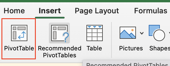
- Insert a PivotChart based on your PivotTable

- Use slicers or timeline filters to analyze trends across different dimensions of your data
These features allow for more nuanced trend analysis and can help uncover insights that might be missed with basic charting alone.
Putting Excel Trend Analysis into Practice
Excel trend analysis is a powerful tool for understanding your data and making informed predictions. We’ve covered several key techniques:
- Creating and customizing trendlines in scatter plots
- Using the TREND function for numerical forecasting
- Generating comprehensive Forecast Sheets
- Interpreting trend analysis results
- Enhancing analysis with features like sparklines and conditional formatting
Remember, the most effective trend analysis combines multiple methods and considers external factors that might influence your data.
Ready to take your data analysis to the next level? Coefficient allows you to sync live data from over 50 business systems directly into your Excel spreadsheets.
Get started with Coefficient and transform your Excel trend analysis with real-time, automatically updating data.

