Stock traders need clear, accurate price data visualization. Excel candlestick charts show price movements in an easy-to-read format. This tutorial walks you through creating and customizing professional candlestick charts using OHLC (Open, High, Low, Close) data in Excel.
Creating Your First Candlestick Chart in Excel
Let’s start with the basics. You’ll need price data with these four components:
|
Date |
Open |
High |
Low |
Close |
|---|---|---|---|---|
|
1/1/23 |
100 |
105 |
98 |
103 |
|
1/2/23 |
103 |
108 |
101 |
107 |
Step 1: Prepare Your Data
- Arrange your OHLC data in columns
- Ensure dates are in chronological order
- Check for missing values or errors
Step 2: Create the Chart
- Select all columns containing your OHLC data
- Click the Insert tab on Excel’s ribbon
- Find the Stock Charts button in the Charts group
- Select the Candlestick option

Formatting Your Chart for Maximum Impact
A well-formatted chart makes price patterns stand out. Here’s how to customize your chart’s appearance:
Step 1: Set Candlestick Colors
- Right-click any candlestick
- Select ‘Format Data Series‘

- Choose these recommended colors:
- Green or white for rising prices (close > open)
- Red or black for falling prices (close < open)
Step 2: Adjust Chart Dimensions
- Set width-to-height ratio to 1.6:1 for optimal viewing
- Resize chart area to fill available space
Pro Tip: Keep your y-axis scale tight enough to show price movement clearly, but not so tight that it distorts the visual story.
Adding Technical Indicators
Technical indicators help identify trends and potential entry/exit points.
Step 1: Add Moving Averages
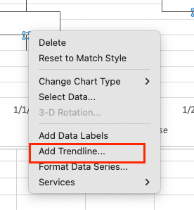
- Right-click the chart
- Select ‘Add Trendline‘


Stop exporting data manually. Sync data from your business systems into Google Sheets or Excel with Coefficient and set it on a refresh schedule.
Get Started
- Choose ‘Moving Average‘
- Enter these common periods:
- 20-day for short-term trends
- 50-day for intermediate trends
- 200-day for long-term trends
Step 2: Format Indicators
- Set different colors for each moving average
- Use dashed lines for longer-term averages
- Add a legend to identify each indicator
Enhancing Your Candlestick Charts
Take your chart to the next level with these advanced features:
Step 1: Add Support/Resistance Levels
- Insert horizontal line at key price levels
- Right-click line to format
- Use dotted style for clarity
- Add price labels
Step 2: Create Multiple Time Frames
- Set up separate worksheets for different intervals
- Link data between sheets using OFFSET formulas
- Create synchronized charts for comparison
Incorporating Volume Analysis
Volume confirms price movements and adds depth to your analysis.
Step 1: Add Volume Bars
- Select volume data column
- Insert a combination chart
- Position volume beneath price chart
- Set volume scale to right y-axis
Step 2: Color-Code Volume
- Format volume bars to match price movement
- Use conditional formatting:
- Green when price closes higher
- Red when price closes lower
Automating Data Updates
Keep your charts current with automatic updates:
Step 1: Connect Data Sources
- Use Excel’s Data tab
- Select ‘Get Data‘ from external source

- Choose your market data provider
- Set connection properties
Step 2: Configure Refresh Settings
- Right-click connection
- Select ‘Properties’
- Set refresh interval (5-15 minutes recommended)
Exporting and Sharing
Create portable versions of your charts:
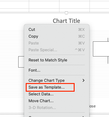
- Save as Template
- Right-click chart
- ‘Save as Template‘

-
- Name it descriptively
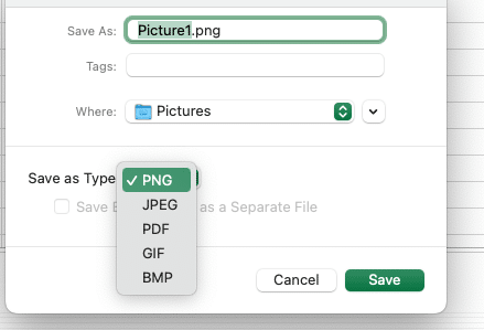
- Export Options

-
- PNG for web use
- PDF for documents
- Excel file for collaboration
Next Steps
You’ve built a professional candlestick chart system in Excel. Keep your data fresh and adjust indicators based on market conditions. For real-time data updates and automated connections to market data sources, try Coefficient’s Excel add-on.
Get started with Coefficient to automate your market data imports and keep your candlestick charts current with live data feeds.

