
A KPI dashboard is only as useful as its data is current. Dashboards that require manual exports, stale CSV uploads or weekly copy-paste sessions stop getting checked within a month. Every useful KPI dashboard in 2026 connects to live data, updates automatically and surfaces changes without someone having to go look.
This guide covers eight tools across the full spectrum: from spreadsheet-native options at $49/month to enterprise BI platforms at $75/user/month. Each is reviewed with current 2026 pricing, honest strengths and the use cases it actually fits.
What Is a KPI Dashboard?
A KPI dashboard is a visual display of key performance indicators, meaning the metrics an organisation tracks to measure progress toward its goals. A sales team might track pipeline by stage, close rate and revenue vs quota. A finance team might track cash flow, burn rate and gross margin. A marketing team might track MQLs, cost per lead and channel ROI.
The difference between a useful KPI dashboard and a decorative one is live data. A dashboard that shows last week’s numbers because someone forgot to update the CSV is worse than no dashboard. It creates false confidence. In 2026, every dashboard tool worth using connects to source systems directly and refreshes automatically.
How to Build a KPI Dashboard in 5 Steps
Regardless of which tool you choose, the process for building a useful KPI dashboard follows the same logic.
Step 1: Define which KPIs matter for your audience. A sales dashboard for a VP and a sales rep show different things. Limit to 5 to 7 metrics per view to avoid information overload. Lead with the metrics that drive decisions rather than metrics that simply describe activity.
Step 2: Connect to your live data source. This is where most dashboards fail. If the connection is not live and automatic, the dashboard will go stale within weeks. Use a tool that connects directly to your CRM, ERP or data warehouse with scheduled auto-refresh.
Step 3: Choose the right visualisation for each KPI. Line charts for trends over time. Bar charts for comparisons across categories. Single-number scorecard widgets for current vs target. Avoid pie charts for more than 4 categories.
Step 4: Set context. A KPI without context is just a number. Add the target, the prior period comparison and the trend direction. A revenue number means nothing without knowing whether it is above or below plan.
Step 5: Make it shareable without friction. A dashboard stakeholders have to log into to access is a dashboard most stakeholders will not check. Use a tool that produces a shareable live link accessible without a platform login.
KPI Dashboard Tools at a Glance
| Tool | Starting Price | Best For | Live Data |
|---|---|---|---|
| Coefficient | From $49/month | Finance, RevOps, ops teams working in spreadsheets | Yes: auto-refresh from 100+ systems |
| Microsoft Power BI | $14/user/month (Pro) | Microsoft 365 organisations | Yes: DirectQuery and scheduled refresh |
| Tableau | $75/user/month (Creator) | Visualisation-first enterprise teams | Yes: live connections and Tableau Pulse |
| Databox | Free; Pro from $59/month | Marketing and SMB teams; quick setup | Yes: 100+ pre-built integrations |
| Geckoboard | From $49/month | Office TV dashboards and real-time team displays | Yes: 90+ integrations, near real-time |
| Klipfolio | From $80/month (Klips) | SMBs needing custom dashboards; agencies | Yes: 130+ data sources |
| Zoho Analytics | Free; from $30/month | Zoho ecosystem users; affordable BI | Yes: 500+ app connectors |
| Looker Studio | Free (Pro $9/user/month) | Google ecosystem teams; free dashboards | Yes: native Google data sources |
1. Coefficient
Best for: Finance, RevOps and ops teams that do their analytical work in Google Sheets or Excel
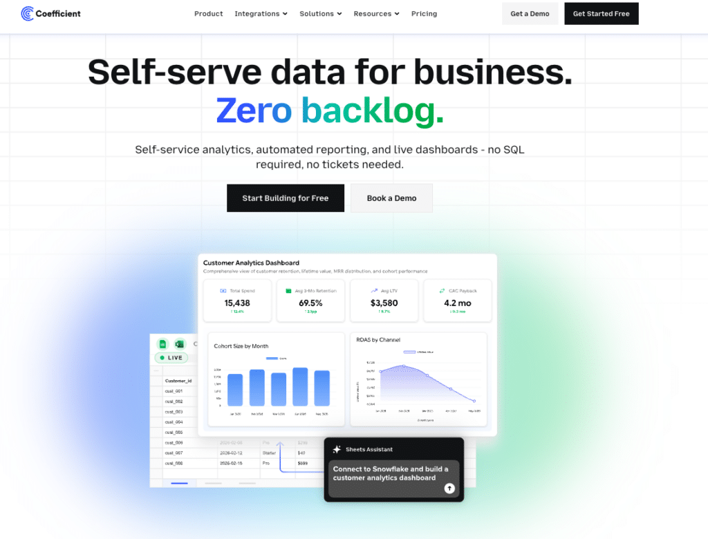
Coefficient connects Google Sheets and Excel directly to 100+ source systems, including Salesforce, HubSpot, NetSuite, Snowflake, QuickBooks, Xero and more, with scheduled auto-refresh and two-way sync. Rather than building a KPI dashboard in a separate BI tool, Coefficient turns the spreadsheet itself into a live dashboard source. Vibe Reporting (in early access, April 2026) lets teams describe the KPI dashboard they want in plain English and publish a live, shareable web dashboard from their spreadsheet data. The dashboard updates automatically as the underlying data refreshes.
For finance managers tracking monthly close metrics, RevOps leads monitoring pipeline by stage, or ops teams watching headcount and capacity, Coefficient removes the manual export cycle entirely. Live data flows into the spreadsheet, KPI charts update automatically and stakeholders access the output via a shared link with no BI platform login required.
Pros
- Works inside Google Sheets and Excel with no new interface to learn.
- Connects to 100+ systems including all major CRM, ERP, accounting and data warehouse platforms.
- Vibe Reporting publishes live, shareable KPI dashboards from spreadsheet data in plain English.
- Two-way sync pushes updates back to source systems with full write-back capability.
- AI Sheets Assistant builds formulas, charts and pivot tables from plain-English prompts.
Cons
- Not a standalone BI platform. Requires Google Sheets or Excel as the working environment.
- Less suited to complex cross-departmental analytics than enterprise BI platforms.
Pricing: Free plan available. Paid plans from $49/month. See coefficient.io/pricing.
| “Coefficient automated everything. Instead of manually exporting data every day, I just sit back and watch the data update automatically.” Christian Budnik, FP&A Analyst, Solv |
2. Microsoft Power BI
Best for: Microsoft 365 organisations that need enterprise BI at a low per-user cost
Power BI is the most widely deployed BI platform for Microsoft-stack organisations. At $14/user/month Pro, it is the most cost-effective enterprise KPI dashboard tool available. In 2026, Copilot AI (add-on at $30/user/month) generates complete report pages from plain-English prompts, writes DAX formulas automatically and summarises KPI changes with narrative insights. Power BI sits inside Microsoft Fabric, Microsoft’s unified data platform. Organisations on Azure benefit from treating it as part of a broader infrastructure investment.
Pros
- Lowest per-user cost of any enterprise BI platform at $14/user/month Pro.
- Native integration with Excel, Teams, SharePoint, Azure and Dynamics 365.
- Copilot AI generates KPI dashboard pages and DAX formulas from plain-English prompts.
- Widest connector library of any BI tool: 500+ data sources.
Cons
- Copilot AI requires an additional $30/user/month add-on.
- DAX formula language has a meaningful learning curve for complex custom KPI calculations.
- Best value for organisations already invested in Microsoft 365 or Azure.
Pricing: Free Desktop; Pro at $14/user/month (annual); Premium Per User at $24/user/month; Copilot add-on $30/user/month.
3. Tableau
Best for: Enterprise teams where visualisation quality and Salesforce integration are primary requirements
Tableau remains the benchmark for interactive KPI visualisation. Its chart library depth, VizQL engine and drag-and-drop authoring give analysts the widest creative control of any BI platform. The 2025 addition of Tableau Pulse shifts Tableau from a pull model (check your dashboard) to a push model (Pulse tells you when a KPI changes). Available in Tableau+, Pulse delivers personalised KPI summaries via Slack, email or Salesforce workflows when trends, anomalies or threshold breaches are detected.
Pros
- Industry-leading KPI visualisation quality and chart type depth.
- Tableau Pulse delivers proactive KPI monitoring with AI-generated summaries pushed to users.
- Native Salesforce CRM data flow for sales and revenue KPI dashboards.
- Largest BI practitioner community for implementation support and talent.
Cons
- $75/user/month Creator is among the most expensive per-user BI licences.
- Tableau Pulse requires the Tableau+ cloud tier, not included in standard plans.
- Static CSV exports only, with no live connection to Google Sheets or Excel.
Pricing: Creator at $75/user/month; Explorer at $42/user/month; Viewer at $15/user/month (all annual).
4. Databox
Best for: SMBs and marketing teams that need KPI dashboards fast without SQL or BI setup
Databox has one of the lowest barriers to entry in the KPI dashboard category. Pre-built metric libraries for 100+ platforms, including Google Analytics, Facebook Ads, HubSpot and Salesforce, mean most teams can publish their first live KPI dashboard in under an hour without writing a query. The free plan includes 3 data sources, 3 dashboards and daily refresh, enough to evaluate before committing. The AI Analyst (Genie) on Pro plans adds natural language data queries.
Pros
- Extensive pre-built metric libraries eliminate SQL for most common KPI use cases.
- Free plan is genuinely functional for small teams evaluating before committing.
- One of the fastest setups in the category. First KPI dashboard live in under an hour..
Cons
- Limited depth for custom KPI calculations. Complex metrics require workarounds.
- Genie AI is Pro-only; not available on the free tier.
- Less analytical depth than Power BI or Tableau for complex cross-departmental KPI reporting.
Pricing: Free (3 data sources, daily refresh); Pro from $59/month for unlimited data sources and faster refresh.
5. Geckoboard
Best for: Teams that need real-time KPI dashboards on office TV displays or for all-hands visibility
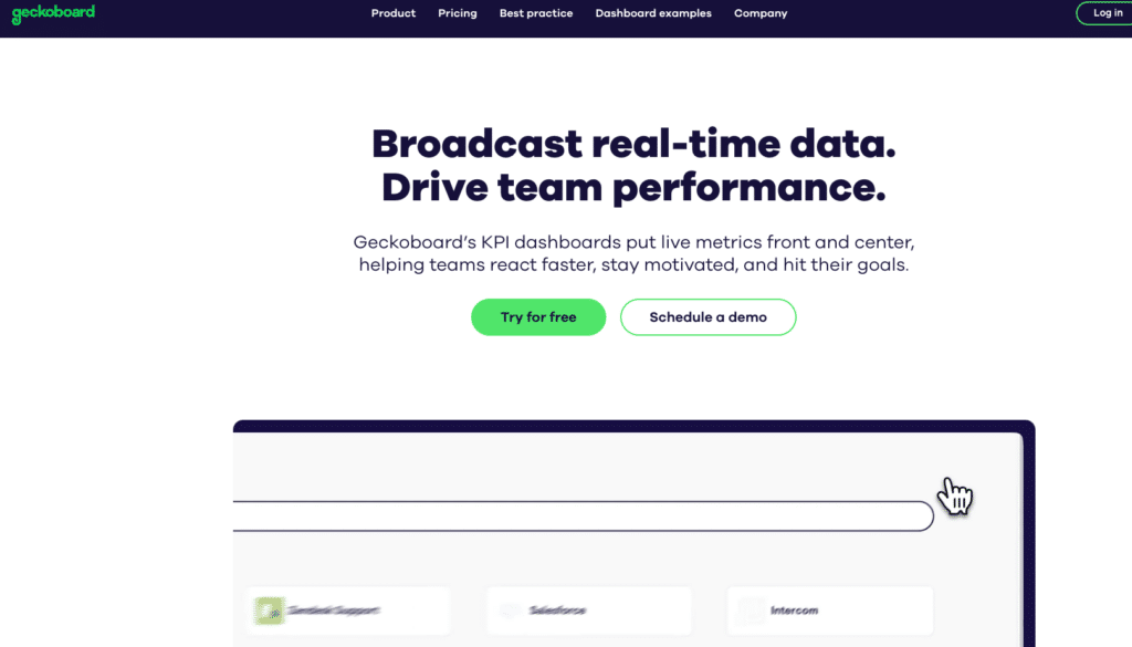
Geckoboard is purpose-built for the TV wall dashboard use case: KPIs visible to the whole team in real time, updating continuously throughout the day. Pricing starts at $49/month for up to 3 users and 1 dashboard. Geckoboard connects to 90+ data sources including Salesforce, HubSpot, Zendesk, Shopify and Google Analytics with no SQL required for standard metrics. Setup is fast. Most teams have a live TV dashboard running within a day.

Stop exporting data manually. Sync data from your business systems into Google Sheets or Excel with Coefficient and set it on a refresh schedule.
Get Started
Pros
- Purpose-built for TV and office display KPI dashboards with optimised large-format rendering.
- No SQL required for standard integrations. Non-technical teams can self-serve.
- Slack and Teams alerts when key KPIs shift and keeps distributed teams informed without checking the screen.
Cons
- 90 integrations is far fewer than Power BI or Tableau. Less useful for complex multi-source KPI blending.
- Designed for monitoring, not exploration or analytical depth.
- Custom KPIs beyond pre-built integrations require Datasets API or spreadsheet uploads.
Pricing: Starter at $49/month (3 users, 1 dashboard); Essential from $99/month; Scale from $369/month.
6. Klipfolio
Best for: SMBs and agencies that need custom KPI dashboards with full data source flexibility
Klipfolio offers two products: Klips for custom SMB dashboards and PowerMetrics for larger organisations. Klips starts at $80/month (annual, 3 dashboards) and connects to 130+ data sources including SQL databases, flat files and APIs. Klipfolio’s strength is flexibility. It can connect to virtually any data source, including custom API endpoints that pre-built integrations miss. The trade-off is setup complexity: custom connections and formula-based data manipulation require technical skill.
Pros
- 130+ data source connections including custom API and SQL connections.
- Full flexibility in dashboard design and metric calculation for teams with technical resources.
- Trusted by thousands of agencies for client KPI reporting with white-labelling options.
Cons
- G2 reviewers consistently note that approximately 78% flag the learning curve: custom connections require SQL or JavaScript knowledge.
- Dashboard build process is slower than drag-and-drop alternatives; each Klip widget is built separately.
- The highest plan caps at 80 dashboards, which constrains agencies at scale.
Pricing: Klips from $80/month (annual, 3 dashboards); PowerMetrics pricing on request.
7. Zoho Analytics
Best for: Small to mid-market teams in the Zoho ecosystem seeking affordable, published-pricing BI
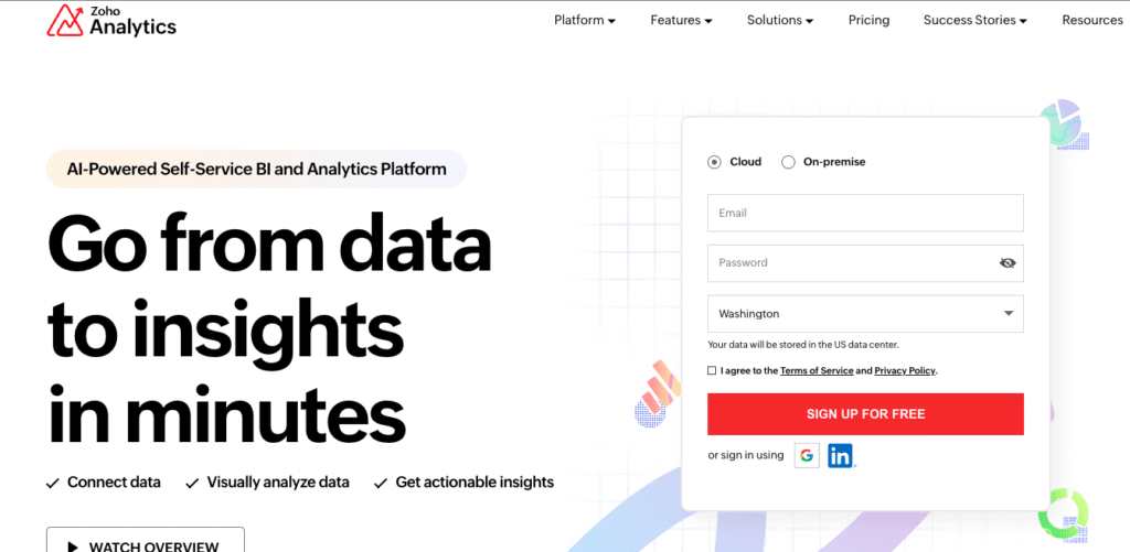
Zoho Analytics is one of the few KPI dashboard tools with fully transparent, published pricing, from $0 to $575/month on annual billing. Zia AI provides natural language querying across all plan tiers at no extra cost. For organisations already using Zoho CRM, Zoho Books or Zoho Desk, the native ecosystem integrations make it the most straightforward path to connected KPI dashboards without additional connector work.
Pros
- Published pricing across all tiers with no sales call required for standard plans.
- Zia AI natural language querying included on all plans at no extra cost.
- Strong value within the Zoho ecosystem; Zoho One bundling makes it particularly cost-effective.
Cons
- Visualisation depth and chart customisation fall short of Tableau or Power BI for complex KPI dashboards.
- Performance slows noticeably with row counts above 10 million on any plan.
- Non-Zoho integrations require more technical effort than native Zoho ecosystem connections.
Pricing: Free (2 users, 10K rows); Basic $30/month; Standard $60/month; Premium $145/month; Enterprise $575/month.
8. Looker Studio
Best for: Google ecosystem teams that need free, shareable KPI dashboards built on Google data

Looker Studio (formerly Google Data Studio) is free for the standard product. It connects natively to Google Analytics, Google Ads, BigQuery, Google Sheets and Search Console, making it the natural entry point for marketing teams already in the Google ecosystem. Looker Studio Pro at $9/user/month adds enterprise governance, scheduled reporting and workspace management. Note: Looker Studio is a separate product from the enterprise Looker BI platform. See the comparison table above.
Pros
- Free for the standard product with unlimited KPI dashboards and reports.
- Native connection to Google Analytics, Google Ads, BigQuery and Google Sheets.
- Easy sharing via Google Workspace permissions with no platform login required for viewers.
Cons
- Slow load times are consistently flagged in G2 reviews for complex or multi-source KPI dashboards.
- No native connector for Salesforce, HubSpot or NetSuite. A paid third-party connector or workaround via Google Sheets required.
- Email reporting limited to 20 recipients per report as of March 2025.
Pricing: Free (standard); Looker Studio Pro at $9/user/month (annual).
Frequently Asked Questions
What is the best free KPI dashboard tool?
Looker Studio is the strongest free option for Google ecosystem teams. Databox’s free plan (3 data sources, 3 dashboards, daily refresh) is the best free option for marketing teams using HubSpot, Google Analytics or Salesforce. Zoho Analytics has a permanent free plan supporting 2 users and 10,000 rows. Power BI Desktop is free for report creation but requires a Pro licence ($14/user/month) to share dashboards.
How often should KPI dashboards update?
It depends on the KPI. Sales pipeline dashboards benefit from hourly or daily refresh. Finance dashboards tracking monthly close metrics are typically sufficient with daily updates. Marketing KPI dashboards measuring ad spend ROI often need hourly refresh during active campaigns. TV wall dashboards showing customer support queue depth or real-time sales need near-real-time (sub-minute) refresh.
How many KPIs should a dashboard show?
5 to 7 KPIs per view is the practical limit before cognitive overload sets in. This does not mean you can only track 7 metrics. It means each dashboard view should show 5 to 7. Use drill-down layers or separate dashboard pages for deeper cuts. Executive dashboards should show fewer metrics with more context per metric, not more metrics with less context.
What is the difference between a KPI dashboard and a report?
A KPI dashboard shows the current state of key metrics at a glance, updated in real time or near-real time. A report explains what happened over a period, usually with narrative context. Dashboards are for monitoring. Reports are for communicating. Most teams need both: a live dashboard for daily tracking and a monthly report for stakeholder communication.
Can I build a KPI dashboard in Google Sheets?
Yes. Google Sheets supports charts, conditional formatting and data connections via tools like Coefficient. Coefficient connects Sheets directly to Salesforce, HubSpot, NetSuite, Snowflake and other systems with auto-refresh, then Vibe Reporting publishes the result as a live web dashboard. For teams already working in Sheets, this is often the fastest path to a live, shareable KPI dashboard without learning a new BI tool.
What KPI dashboard tool is best for finance teams?
Finance teams typically track GL data, budget vs actual, cash flow and multi-entity consolidations. Tools that connect natively to QuickBooks, NetSuite, Xero or Sage and auto-refresh into a familiar spreadsheet environment work best for finance workflows. Coefficient (Google Sheets or Excel, auto-refresh from accounting systems), Power BI (for Microsoft-stack finance organisations) and Zoho Analytics (for Zoho Books users) are the strongest options at different price points.


