When analyzing data, choosing the right visualization tool is crucial.
Two popular options are histograms and bar graphs. But what’s the difference between them, and when should you use each one?
In this post, we’ll dive into the key distinctions between histograms and bar graphs, helping you make the best choice for your data analysis needs.
Understanding Histograms
A histogram is a graph that displays the frequency distribution of continuous data. It’s constructed by dividing the data into bins or intervals and representing the frequency of data points within each bin using bars.
The key characteristic of a histogram is that there are no gaps between the bars, emphasizing the continuity of the data.
Histograms are particularly useful for analyzing sales data or performance metrics across different time periods. For example, a histogram could help you identify trends and distributions in your monthly revenue figures.
How to Create a Histogram in Google Sheets
Creating a histogram in Google Sheets is a straightforward process.
- Open Google Sheets and organize your data in a single column.
- Select the data range for your histogram.
- Click “Insert” and choose “Chart.”
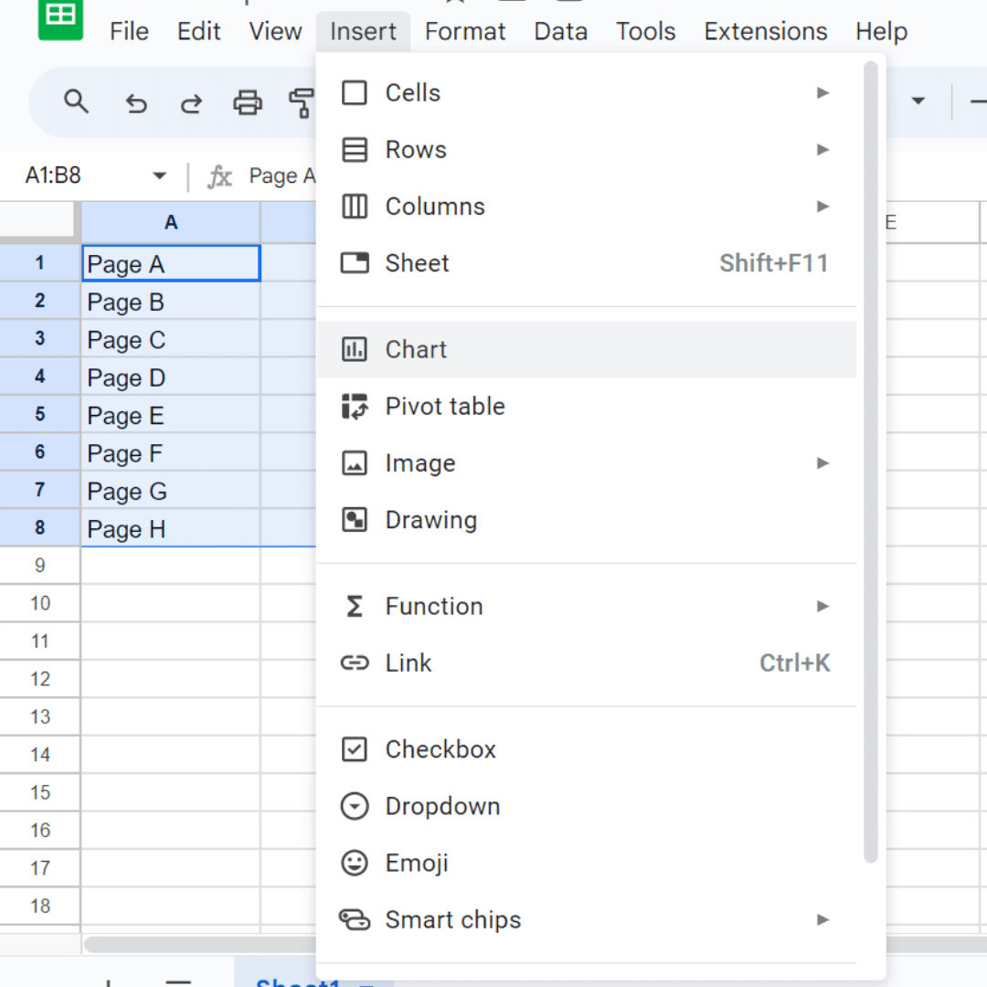
- In the Chart editor, select “Histogram” as the chart type.
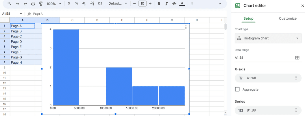
- Customize your histogram’s title, gridlines, axis labels, and colors.
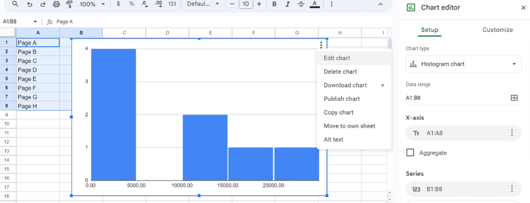
- Click “Insert” to add the histogram to your sheet.
Understanding Bar Graphs
A bar graph, on the other hand, is used to compare categorical data. It consists of bars of equal width, with spaces between them to signify distinct categories.
Bar graphs are ideal for comparing data such as sales performance across product categories or customer demographics.
For instance, a bar graph could be used to compare quarterly sales results across different regions or product satisfaction ratings from customer surveys.

Stop exporting data manually. Sync data from your business systems into Google Sheets or Excel with Coefficient and set it on a refresh schedule.
Get Started
How to Create a Bar Graph in Google Sheets
Creating a bar graph in Google Sheets is just as simple.
- Open Google Sheets and arrange your data in columns.
- Select the data range for your bar graph. For this example, we’ll compare monthly sales figures across over a six-month period.
| Month | Sales ($) |
| January | 1200 |
| February | 1500 |
| March | 1800 |
| April | 1350 |
| May | 1600 |
| June | 2000 |
- Click “Insert” and choose “Chart.”
- In the Chart editor, select “Bar chart” as the chart type.
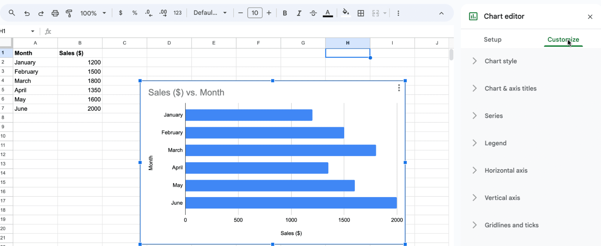
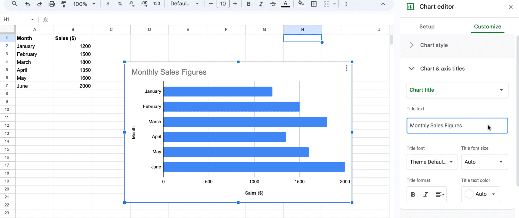
- Customize your bar graph’s title, gridlines, axis labels, and colors.
- Click “Insert” to add the bar graph to your sheet.
Key Differences: Histogram vs Bar Graph
- Data Type: Histograms are for continuous data, while bar graphs are for categorical data.
- Visual Appearance: Histograms have no gaps between bars; bar graphs have spaces between bars.
- Statistical Insights: Histograms analyze distributions; bar graphs compare categories.
Histogram vs Bar Graph: Choosing the Right One
When choosing between a histogram and a bar graph, consider the type of data you have and the insights you want to present:
- For continuous data and distribution analysis, use a histogram.
- For categorical data and group comparisons, use a bar graph.
Conclusion
Understanding the difference between histogram vs bar graph is crucial for effective data visualization. By selecting the right graph for your data, you can gain clearer insights and make better decisions.
Enhance your data visualization skills with Coefficient. Create histograms and bar graphs with live data in Google Sheets, and focus on interpreting insights.
Get started with Coefficient today and unlock the power of data visualization for your business.


