Data is the lifeblood of modern business. But raw data alone isn’t enough. To extract meaningful insights and drive informed decisions, you need effective data visualization. Let’s explore the key data visualization benefits that can transform your business intelligence efforts.
Data Visualization 101: Understanding the Basics
Data visualization is the graphical representation of information and data using visual elements like charts, graphs, and maps. It’s a powerful way to present complex data sets in a format that’s easy to understand and interpret.
For stakeholders, data visualization:
- Simplifies complex information
- Highlights key trends and patterns
- Facilitates quicker, more informed decision-making
The importance of data visualization lies in its ability to bridge the gap between raw data and actionable insights, enabling faster and more accurate strategic choices across organizations.
Improved Data Comprehension
One of the primary advantages of data visualization is its ability to simplify complex data sets.
Simplifying Complex Data
Visualizations can condense thousands of data points into a single, easy-to-understand image. For example, a heat map can instantly show sales performance across different regions, allowing executives to quickly identify high and low-performing areas without sifting through lengthy reports.
Pattern Recognition
The human brain processes visual information much faster than text. By presenting data visually, patterns and trends become immediately apparent.
A line graph showing website traffic over time can reveal seasonal patterns or the impact of marketing campaigns at a glance, enabling marketing teams to make quick, data-driven decisions.
Enhanced Decision Making
Data visualization significantly improves the decision-making process for stakeholders across the organization.
Better Insights
Visual data aids in extracting actionable insights quickly. A scatter plot comparing customer lifetime value to acquisition cost can immediately highlight which customer segments are most profitable, guiding resource allocation decisions.
Faster Decisions
With clear visual representations, decision-makers can quickly understand complex scenarios and make informed choices. Real-time dashboards showing key performance indicators (KPIs) allow for rapid responses to changing business conditions, crucial in fast-paced industries.
Effective Communication of Data Insights
Data visualization is a powerful tool for communicating insights across an organization.
Clearer Reports
Visual elements make reports more engaging and easier to understand. Instead of lengthy text explanations, a well-designed infographic can convey key findings at a glance, making it easier for stakeholders to grasp important information quickly and act on it.
Collaboration
Visualizations serve as a common language between different teams. For example, a sales pipeline dashboard enables better collaboration between sales and marketing teams by providing a shared view of the customer journey and conversion rates. This shared visual representation allows both teams to align their strategies and work towards common goals more effectively.
Identifying Trends and Outliers
Data visualization excels at revealing patterns and anomalies within data sets.
Trend Analysis
Visualizations excel at showing how data changes over time. This makes it easier to identify long-term trends, cyclical patterns, and potential future outcomes.
For instance, a business analyst could use a multi-line chart to compare the growth rates of different product lines over several years. This visualization would quickly reveal which products are trending upward, which are stagnating, and which might be in decline.
Outlier Detection
Visual representations make it easy to spot data points that don’t fit the overall pattern. This is crucial for maintaining data integrity and identifying both potential problems and unique opportunities.
A scatter plot of customer lifetime value against acquisition cost, for example, might reveal a small group of highly profitable customers that warrant further investigation. This insight could lead to targeted marketing strategies or the development of new products tailored to this valuable segment.
Increased Engagement
Interactive visualizations can significantly boost engagement with data across an organization.
Using Interactive Dashboards
Dynamic, interactive dashboards allow stakeholders to explore data on their own, fostering a culture of data-driven decision making. Users can filter, drill down, and customize views to answer specific questions, leading to deeper insights and more engaged decision-making processes.
Tools and Techniques for Data Visualization
To create effective visualizations, data and BI professionals should be familiar with various tools and techniques.
Popular Tools
Coefficient
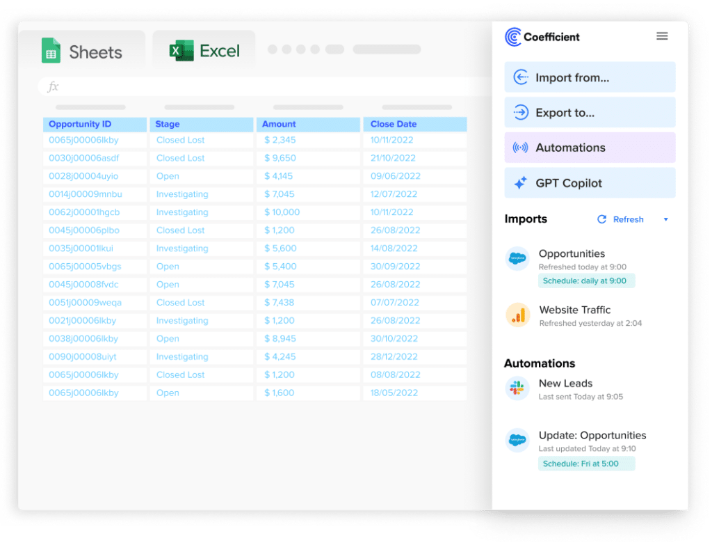
Coefficient allows you to sync live data from over 50 business systems directly into Excel and Google Sheets. It allows for real-time data updates and connects to multiple data sources, making it ideal for creating dynamic dashboards. This seamless integration—and a library of free, dynamic dashboard templates—makes creating up-to-date visualizations and reports easy.

Stop exporting data manually. Sync data from your business systems into Google Sheets or Excel with Coefficient and set it on a refresh schedule.
Get Started
Pros:
- Seamless integration with familiar spreadsheet interfaces
- Real-time data updates
- User-friendly for non-technical stakeholders
Cons:
- Limited to spreadsheet-based visualizations
- May require some spreadsheet knowledge
- Fewer advanced customization options compared to standalone BI tools
Use cases:
- Creating live financial dashboards
- Generating automated sales reports
- Building collaborative project management trackers
Tableau

Tableau is known for its powerful visualization capabilities and ease of use. It offers a wide range of chart types and strong data connection features, making it suitable for complex data analysis and visualization needs.
Pros:
- Extensive visualization options
- Strong data connection capabilities
- Large community for support and resources
Cons:
- Steeper learning curve for advanced features
- Can be expensive for smaller teams
- May require dedicated hardware for optimal performance
Use cases:
- Creating interactive data stories for stakeholders
- Building complex, multi-source dashboards
- Performing advanced data analysis and visualization
Power BI
Microsoft’s Power BI offers strong integration with Microsoft products and services, featuring AI-powered analytics and regular updates.
Pros:
- Seamless integration with Microsoft ecosystem
- AI-powered insights
- Cost-effective for organizations already using Microsoft services
Cons:
- Less intuitive for non-Microsoft users
- Limited customization compared to some competitors
- Can be resource-intensive for large datasets
Use cases:
- Analyzing and visualizing data from Microsoft Dynamics CRM
- Creating embedded analytics for Microsoft-based applications
- Building comprehensive business intelligence dashboards
Techniques
To create impactful visualizations, data and BI professionals should master these advanced techniques:
1. Choose the Right Visualization Type
Selecting the appropriate chart or graph is crucial for effective data communication:
- Bar Charts: Ideal for comparing categories. Use horizontal bars for long category names.
- Stacked bar charts show composition within categories.
- Grouped bar charts compare multiple metrics across categories.
- Line Charts: Best for showing trends over time.
- Multiple lines can compare trends across different segments.
- Area charts (filled line charts) emphasize volume.
- Scatter Plots: Excellent for showing relationships between two variables.
- Bubble charts add a third dimension with varying circle sizes.
- Pie Charts: Use sparingly for showing composition, limited to 5-7 categories.
- Consider donut charts for a more modern look with space for central metrics.
- Heatmaps: Effective for showing patterns across two categories.
- Treemaps: Useful for displaying hierarchical data and relative sizes.
- Sankey Diagrams: Visualize flow and transitions between states or categories.
2. Implement Effective Color Usage
- Use a consistent color palette aligned with brand guidelines.
- Employ sequential color schemes for numerical data, and diverging schemes for data with a meaningful midpoint.
- Leverage color to highlight key data points or outliers.
- Ensure sufficient color contrast for accessibility.
- Use color-blind-friendly palettes (avoid red-green combinations).
3. Implement Interactivity and Layering
- Use tooltips to provide additional context on hover.
- Implement drill-down functionality for hierarchical data.
- Allow filtering and sorting to enable user-driven analysis.
- Use layers to progressively disclose information, starting with an overview and allowing users to access details on demand.
4. Incorporate Contextual Elements
- Add clear titles, labels, and legends.
- Include data sources and timestamps for credibility.
- Use annotations to highlight key points or explain anomalies.
- Provide brief explanatory text or insights alongside visualizations.
5. Align Visualizations with Business Objectives and Stakeholder Needs
- Conduct stakeholder interviews to understand key business questions and metrics, then design visualizations that directly address specific KPIs and performance indicators.
- Create different views or dashboards tailored to various organizational levels (e.g., executive summary, departmental deep dives) while maintaining a consistent reporting structure.
- Incorporate actionable insights and recommended next steps based on the data presented, guiding viewers from high-level insights to detailed analyses.
- Implement version control and change logs to track the evolution of reports and dashboards over time.
- Establish feedback loops with key stakeholders to continuously refine and improve visualizations, ensuring they remain aligned with evolving business needs.
Transform Data into Actionable Insights
Data visualization transforms complex information into clear, actionable insights for stakeholders. By leveraging effective visualization techniques and tools, data and BI professionals can significantly enhance decision-making processes, improve data comprehension, and drive business success across their organizations.
Ready to enhance your data visualization capabilities? Get started with Coefficient today and create dynamic, insightful visualizations that bring your data to life.


