Business intelligence reporting is crucial for organizations to make data-driven decisions. This guide explores the best practices, processes, and tools for effective BI reporting. We’ll cover everything from understanding the basics to implementing advanced strategies.
Understanding Business Intelligence Reporting
Business intelligence (BI) reporting is the process of collecting, analyzing, and presenting data to support decision-making within an organization. It’s a critical component of modern business strategy, allowing companies to gain valuable insights from their data.
Definition and Importance of BI Reporting
BI reporting involves transforming raw data into meaningful information through various analytical and visualization techniques. It’s important because it:
Provides a clear picture of business performance
Identifies trends and patterns
Supports data-driven decision making
Improves operational efficiency
Helps predict future outcomes
Key Components of Effective BI Reporting
Data Sources: Reliable and relevant data from various systems
Data Warehouse: A centralized repository for storing and managing data
ETL Process: Extract, Transform, Load – preparing data for analysis
Analytics Tools: Software for processing and analyzing data
Visualization Tools: Creating charts, graphs, and dashboards
Distribution Channels: Methods for sharing reports with stakeholders
How BI Reporting Differs from Traditional and Enterprise Reporting
BI reporting differs from traditional and enterprise reporting in several ways:
Scope: BI reporting covers a broader range of data sources and types
Interactivity: BI reports often allow users to drill down into data
Real-time Updates: Many BI tools offer real-time or near-real-time reporting
Self-service: BI tools often enable non-technical users to create reports
Predictive Capabilities: BI reporting can include forecasting and predictive analytics
The Role of BI in Data-Driven Decision Making
BI reporting plays a crucial role in data-driven decision making by:
Providing accurate and timely information
Offering insights that might not be apparent from raw data
Enabling quick responses to market changes
Supporting strategic planning and goal setting
Measuring and tracking key performance indicators (KPIs)
Types of BI Reports and Dashboards
Understanding different types of BI reports and dashboards is crucial for effective reporting:
Static vs. Interactive Reports
Static Reports:
Fixed format and content
Typically distributed as PDFs or printed documents
Suitable for formal presentations and record-keeping
Interactive Reports:
Allow users to explore data dynamically
Enable drill-down and filtering capabilities
Better for exploratory analysis and ad-hoc queries
Real-time vs. Batch Reporting
Real-time Reporting:
Provides up-to-the-minute data updates
Ideal for monitoring critical business processes
Requires robust data infrastructure
Batch Reporting:
Updates data at scheduled intervals
More efficient for large-scale data processing
Suitable for periodic performance reviews
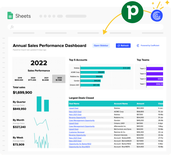
Example BI Reporting Dashboard
Coefficient’s Pipedrive Sales Operations Package offers real-time reporting capabilities, allowing sales teams to monitor performance metrics directly in Google Sheets. This dashboard updates automatically, providing a current view of sales data without manual intervention.
Operational vs. Strategic Dashboards
Operational Dashboards:
Focus on day-to-day operations and short-term goals
Often include real-time or near-real-time data
Used by front-line managers and employees
Strategic Dashboards:
Provide a high-level view of business performance
Focus on long-term goals and KPIs
Used by executives and senior management
Common BI Report Formats
Tables: Detailed data presentation in rows and columns
Charts: Visual representations of data (e.g., bar charts, line graphs)
Scorecards: Compact views of KPIs and their status
Heat Maps: Color-coded representations of data intensity
Geospatial Maps: Data visualization on geographical maps
Pivot Tables: Interactive tables for data exploration
Infographics: Visual storytelling with data and graphics
7 Best Practices for BI Reporting
To maximize the value of your BI reporting, follow these best practices:
#1 Set Clear Goals and Objectives
Define specific, measurable goals for your BI reporting initiative
Align reporting objectives with overall business strategy
Identify key stakeholders and their information needs
Establish timeline and milestones for implementation
#2 Choose the Right Data Sources and Metrics
Identify relevant data sources within your organization
Ensure data quality and consistency across sources
Select metrics that align with your business goals
Define KPIs that provide actionable insights
#3 Design User-Friendly Dashboards and Visualizations
Use intuitive layouts and color schemes
Employ appropriate chart types for different data sets
Provide context with benchmarks and historical data
Allow for customization and interactivity
#4 Ensure Data Accuracy and Reliability
Implement data validation processes
Regularly audit and clean data
Use version control for reports and dashboards
Provide metadata and data lineage information
#5 Implement Proper Security and Access Controls
Define user roles and permissions
Use encryption for sensitive data
Implement single sign-on (SSO) for ease of access
Regularly review and update access controls
#6 Embrace Self-Service BI Capabilities
Provide user training on BI tools
Create a library of reusable report templates
Encourage exploration and experimentation with data
Offer support for users creating their own reports
#7 Automate Report Generation and Distribution
Set up scheduled reports for regular distribution
Use alerts for significant data changes or thresholds
Implement report bursting for personalized distribution
Follow this step-by-step process to implement effective BI reporting:
Assess Data Maturity
Evaluate current data management practices
Identify gaps in data collection and storage
Assess data quality and consistency
Determine readiness for advanced analytics
Data Collection and Preparation
Identify and connect to relevant data sources
Extract data from various systems
Clean and transform data for analysis
Load data into a centralized repository or data warehouse
Analysis and Insight Generation
Apply statistical and analytical techniques to data
Identify trends, patterns, and anomalies
Generate predictive models and forecasts
Validate findings and hypotheses
Report Creation and Visualization
Design dashboards and reports based on user needs
Choose appropriate visualizations for different data types
Apply consistent branding and formatting
Incorporate interactivity and drill-down capabilities
Distribution and Sharing of Reports
Determine the most effective distribution channels
Set up automated report scheduling
Implement secure sharing mechanisms
Provide mobile access to reports when necessary
Continuous Improvement and Iteration
Gather user feedback on reports and dashboards
Monitor usage patterns and adoption rates
Regularly review and update report content
Stay informed about new BI technologies and best practices
Top BI Reporting Tools for Modern Businesses
Coefficient
Coefficient enables better reporting by seamlessly integrating data from various sources into Google Sheets and Excel. It allows users to create real-time, automated reports and dashboards directly in their spreadsheets, making data analysis accessible to non-technical users.
Highlights:
Direct integration with popular business tools
Real-time data syncing
Automated report scheduling
Pros:
User-friendly interface
No-code solution for data analysis
Seamless integration with Google Sheets
Cons:
Some advanced features, such as scheduled automations, are only available on paid plans. However, Coefficient’s pricing is still very competitive compared to other solutions.
Pricing:
Free plan available
Business plan: $49/month per user
Enterprise plan: Custom pricing
Tableau
Tableau offers powerful data visualization and analytics capabilities, allowing users to create interactive dashboards and reports. It excels in turning complex data into easily understandable visual insights, supporting data-driven decision-making across organizations.
Highlights:
Advanced data visualization
Strong data connection capabilities
Mobile-friendly dashboards
Pros:
Intuitive drag-and-drop interface
Extensive visualization options
Robust community and learning resources
Cons:
Steep learning curve for advanced features
Can be expensive for small businesses
Pricing:
Try the Free Spreadsheet Extension Over 500,000 Pros Are Raving About
Stop exporting data manually. Sync data from your business systems into Google Sheets or Excel with Coefficient and set it on a refresh schedule.
Microsoft Power BI is a comprehensive BI platform that enables users to connect to various data sources, prepare data, and create interactive reports and dashboards. It integrates seamlessly with other Microsoft products, making it a popular choice for organizations using the Microsoft ecosystem.
Highlights:
Strong integration with Microsoft products
AI-powered insights
Embedded analytics capabilities
Pros:
Affordable pricing for small businesses
Regular feature updates
Extensive data connectivity options
Cons:
Some advanced features limited to Premium version
Can be complex for non-technical users
Qlik
Qlik offers a range of BI and analytics solutions, with Qlik Sense being its flagship product for self-service analytics and reporting. It uses a unique associative engine that allows users to explore data relationships and uncover hidden insights.
Highlights:
Associative data model for flexible analysis
Strong data governance features
Embedded analytics capabilities
Pros:
Powerful data exploration capabilities
Supports both cloud and on-premises deployment
Robust security and governance features
Cons:
Can be complex for beginners
Pricing can be high for small businesses
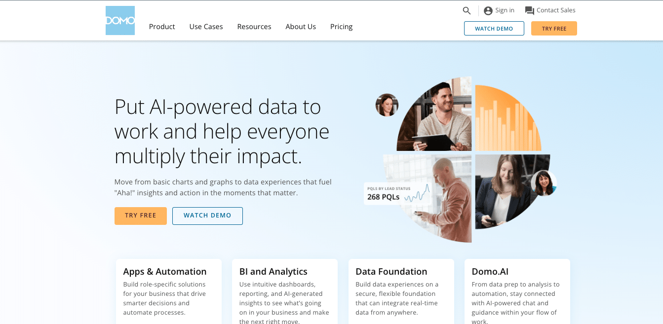
Domo
Domo is a cloud-based BI platform that focuses on providing a user-friendly experience for creating and sharing business insights. It offers a wide range of pre-built connectors and visualizations, making it easy for users to quickly create dashboards and reports.
Highlights:
Extensive library of data connectors
Social collaboration features
Mobile-first design
Pros:
User-friendly interface
Strong data governance capabilities
Robust mobile experience
Cons:
Can be expensive for larger organizations
Some users report a steep learning curve
Overcoming Common Challenges in BI Reporting
Dealing with Data Quality Issues
Implement data validation rules at the source
Use data profiling tools to identify inconsistencies
Establish data cleansing processes
Create a data quality scorecard
Implement master data management practices
Balancing Self-Service and Governance
Define clear data governance policies
Provide training on data ethics and best practices
Implement role-based access controls
Create a centralized data catalog
Regularly audit self-service BI usage
Addressing Data Silos and Integration Problems
Identify and map data sources across the organization
Implement a data integration strategy (e.g., ETL, ELT)
Consider using a data virtualization layer
Encourage cross-departmental data sharing
Implement API-based integrations where possible
Managing User Adoption and Training
Develop a comprehensive training program
Create user guides and documentation
Offer ongoing support and mentoring
Showcase success stories and use cases
Implement a feedback loop for continuous improvement
Handling Big Data and Complex Data Sources
Implement a scalable data architecture
Consider using cloud-based solutions for flexibility
Implement data sampling techniques for faster analysis
Use data compression and archiving strategies
Measuring the Success of Your BI Reporting Initiatives
Key Performance Indicators for BI Reporting
Report usage and adoption rates
Time saved in report generation
Data accuracy and consistency metrics
User satisfaction scores
Number of data-driven decisions made
User Engagement and Satisfaction Metrics
Active users per report or dashboard
Time spent interacting with reports
Number of ad-hoc queries generated
User feedback and ratings
Training completion rates
Business Impact and Decision-Making Improvements
Reduction in decision-making time
Increase in data-driven decisions
Improvement in key business metrics (e.g., revenue, cost savings)
Number of new insights generated
Reduction in manual reporting efforts
Demonstrating ROI of BI Reporting Initiatives
Calculate cost savings from automated reporting
Measure productivity improvements
Quantify the value of faster decision-making
Track revenue increases attributed to BI insights
Compare BI investment to overall business impact
Empowering Your Organization with Effective BI Reporting
Implementing best practices in business intelligence reporting can transform how your organization uses data to make decisions. By following the guidelines outlined in this comprehensive guide, you can create a robust BI reporting system that delivers valuable insights, improves decision-making, and drives business success.
Remember that effective BI reporting is an ongoing process that requires continuous improvement and adaptation to changing business needs. Stay informed about new technologies and trends in the BI space, and always seek feedback from your users to ensure your reporting initiatives remain relevant and impactful.
To get started with powerful, user-friendly BI reporting, consider trying Coefficient’s innovative solutions. Our tools can help you bridge the gap between complex data and actionable insights, empowering your team to make data-driven decisions with confidence.
Sync Live Data into Your Spreadsheet
Connect Google Sheets or Excel to your business systems, import your data, and set it on a refresh schedule.
Try the Spreadsheet Automation Tool Over 700,000 Professionals are Raving About
Tired of spending endless hours manually pushing and pulling data into Google Sheets? Say goodbye to repetitive tasks and hello to efficiency with Coefficient, the leading spreadsheet automation tool trusted by over 350,000 professionals worldwide.
Sync data from your CRM, database, ads platforms, and more into Google Sheets in just a few clicks. Set it on a refresh schedule. And, use AI to write formulas and SQL, or build charts and pivots.
Julian AlvaradoContent lead
Julian is a dynamic B2B marketer with 8+ years of experience creating full-funnel marketing journeys, leveraging an analytical background in biological sciences to examine customer needs.
700,000+ happy users
Wait, there's more!
Connect any system to Google Sheets in just seconds.