
A sales rep scorecard is a great tool to keep your sales team accountable, encourage healthy competition, assess your sales process, and identify top performers.
After all, it’s tough to push your sales teams to give their best if you don’t even keep score of their performance.
And so the big question is, how do you create a sales rep scorecard?
This guide covers the nitty-gritty of what a sales scorecard is, why it’s important, what Key Performance Indicators (KPIs) to include, and how you can easily build one using Google Sheets.
Table of Contents:
- What is a sales scorecard?
- What are the use cases for a sales rep scorecard?
- Which KPIs should be on my sales scorecard?
- How sales rep scorecards can help your business
- Can I build my sales rep scorecards in Salesforce?
- How to build a sales rep scorecard in Google Sheets using Salesforce data
- Build your sales rep scorecard in Google Sheets
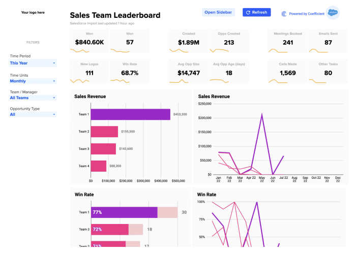
Want to skip the cumbersome build process? Grab a pre-built sales team leaderboard for Salesforce or Hubspot. Don’t use either? No worries. Make a copy and customize to make your own.
What is a sales scorecard?
In simple terms, a sales scorecard (or sales rep scorecard) is a report that monitors the KPI of your sales team members. It allows sales reps and managers to view their progress and performance to achieve the team’s goals.
Members can also use the scorecard to compare their scores with other employees, and managers can utilize it to track and help improve each sales rep’s performance.
A sales rep scorecard differs from a sales dashboard because it is more personalized and specific to each rep and their goals and development.
It provides more granular information, letting you track rep activities and their results and any opportunities for improvement.
On the other hand, a sales dashboard looks at specific KPIs, such as pipe leakage, revenue, and quota attainment.
Sales scorecard benchmarks set standards for your new and existing sales team. They communicate the expectations from your entire sales department.
The scorecard’s data helps managers with coaching and simplifies giving feedback, making them more effective. It can also help forecast when and whom to hire, including what your sales reps need to succeed.
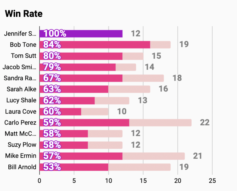
Also, a sales scorecard lets you visualize employee behavior data by measuring specific behaviors leading to wide success. You can display this as individual wins or through a leaderboard ranking your sales reps by their performance.
What is a predictive scorecard?
From a 30,000-foot view, a predictive scorecard uses your sales rep assessment data, KPIs, and other relevant information to create a scorecard that allows managers to anticipate where potential performance issues may occur and how to address them.
A predictive scorecard can help you understand each sales rep’s unique strengths and weaknesses, assess areas where they might perform well (or not), and develop personalized, optimal coaching.
What are the use cases for a sales rep scorecard?
Sales managers primarily use sales scorecards in three ways: One-on-one coaching, weekly team meetings, and quarterly or monthly reviews.
A sales rep scorecard helps your sales managers keep everyone on track and achieve team targets while weeding out poor performers.
An effective sales scorecard should help you measure leading indicators, production metrics, and efficiency metrics to ensure reps perform as they should, and the team meets their goals.
Which KPIs should be on my sales scorecard?
How do you evaluate a sales rep’s performance? By tracking their sales metrics and measuring Key Performance Indicators (KPIs).
However, before you can do this, you’ll need to identify the necessary data for your scorecard, starting with these steps.
Step 1: Determine the KPIs your sales team wants to measure
Narrow down the top three or five metrics your team wants to use to rank sales rep performance (depending on your sales team’s targets and what you consider important).
Ideally, pulling your sales data from your sales intelligence platform or Customer Relationship Management (CRM) software for your metrics should be easy. This allows you to export your required information easily to a spreadsheet and create your sales scorecard seamlessly.
Step 2: Identify the baseline values
Determining the baseline values of your sales team’s metrics allows you to layer the results.
For instance, instead of simply pulling the average Annual Contract Value (ACV) and comparing it to each sales rep’s performance, you can move the tier of the ACV values up to see an average and other layers below and above that average.
The tiers give you a quick view of how an individual sales rep performs against the rest of the team. These also help managers identify the, let’s say, top or bottom 5% reps.
Small sales teams can limit the tiers at the start and increase them as the department expands.
Step 3: Assign more weight to specific metrics
Weigh particular metrics more heavily based on your sales team’s focus and assign a greater percentage to them.
Then, use them to apply a final point value to each sales rep’s performance in every metric and add up the point values to give a monthly final score.
Now that we have these out of the way, let’s checkout the scorecards used for several roles in your sales team and the best metrics to include in the scorecards.
- Outbound Business Development Representatives (BDRs) scorecards
Outbound BDRs and Sales Development Representatives (SDRs) are sales team members responsible for finding and reaching out to new prospects.
Measure Outbound BDRs (or SDRs) on two main dimensions: Quantity and quality metrics.
Quantity metrics can tell you if BDRs or SDRs are putting in the necessary effort to reach their targets.
Quality metrics allow you to identify the potential gaps in your sales process if reps don’t perform accordingly.
Outbound BDR quantity metrics you can include are connects, calls, accounts sourced, emails sent, contacts or leads sourced, opportunities accepted and passed, and meetings or demos set.
Some of the essential outbound BDR quality metrics for your scorecard include emails sent per contact, contacts sourced per account, connect rate, connects per opportunity, calls per opportunity, unique contacts called, and calls per contact.
- Inbound BDR scorecards
Inbound SDRs or BDRs are sales handling inbound lead qualification generated by your marketing team. They are generally responsible for meeting with inbound leads or setting up demos, and moving them to the next stage of your sales process.
Include both quality and quantity metrics in your inbound BDR scorecards. Measure BDR quantity metrics, such as emails sent, accounts called, contacts or leads sourced, sales qualified opportunities, meetings or demos set, opportunities passed, emails sent, and calls.
For inbound BDR quality metrics, measure the contacts sourced per account, percentage of lead called, connect rate, connects per opportunity, unique leads or contacts called, calls per lead, emails sent per contact, and calls per opportunity.
- Account Executive scorecards
Essentially, Account Executives (AE) turn your qualified leads into company revenue, so measure AE performance through four main metrics: Velocity, efficiency, pipeline, and results.
You can track the demo or Marketing Qualified Lead (MQL) to opportunity conversion rate and the demo completion rate for efficiency metrics. For results metrics, include quota attainment and bookings.
Monitor velocity metrics, such as the sales cycle, close rate, average selling price, and sales velocity.
As for your pipeline and leading indicators, include the pipelines created, pipeline created by product, opportunities created, average pipeline value created, and pipeline coverage in your scorecard.
How sales rep scorecards can help your business
Generally, sales rep scorecards give your team the information to help boost performance and allow your sales managers to adapt quickly and fix sales process bottlenecks for each rep.
Below are other benefits you can enjoy when you incorporate a sales rep scorecard in your process.
Keep everyone on track
Sales rep scorecards allow your team to review the previous day’s targets and where your reps are in achieving them.
This helps your team (usually small teams with ten or fewer reps) implement brief meetings to keep everyone on track and make quick, appropriate adjustments when necessary.
Sales scorecard data helps managers execute sales standups to identify coaching opportunities before they turn into bigger issues and deliver improvements promptly.
Conduct comprehensive weekly sales metrics assessments
A sales scorecard allows your team to perform a full weekly analysis of each rep’s metrics and compare the areas where they are weak or strong.
It’s an excellent way for your sales reps to understand their metrics clearly, discuss with managers and team members how to improve their performance, and raise questions to address current challenges.
Create monthly reports and identify top and bottom performers
Highlight high- and low-performing sales reps based on identified key metrics every month.
These monthly reports can help foster healthy competition among your high-performing reps to get the top spot for each metric.
The reports can also motivate low-performing reps to work harder, develop their skills, and improve their performance.
Managers can use sales scorecards during training to show reps their real weaknesses and strengths. Precise numbers and exact solutions from the scorecard data can encourage your team to monitor their targets and performance and ultimately improve results.
Also, sales scorecards provide evidence to show the reps who deliberately don’t do their jobs and might need to be cut loose if they show no improvements even after several coaching sessions.
Also, sales scorecards can also work as evidence to show poor-performing sales reps that they’re performance isn’t up to par.
Provide an overall picture of the sales team performance
Sales rep scorecard data can show the big picture of your entire team’s performance and your whole sales process.
By tracking relevant sales rep metrics, managers can decide based on crucial data, relying on hard figures instead of guessing.
Improve employee engagement
Sales team members could easily lose sight of their purpose if they don’t know what they’re supposed to aim for and achieve. This can lead to disengagement and, in turn, poor performance.
A sales rep scorecard can help get your team back on track and foster employee engagement. It allows your reps to see how they lag behind while also getting a clear picture of what excellent performance is supposed to look like.
This gives your sales team clear-cut targets that provide direction in their daily activities and something to aspire to (and even earn rewards from).
With a single, accessible scorecard, your sales reps know exactly where they stand and the specific areas they have to improve to move up and even gain top ranking. They can do all these with little to no micromanagement (as much as possible).
Can I build my sales rep scorecards in Salesforce?
Yes! You can create your sales rep scorecard in Salesforce and build out most, if not all of your metrics and graphics within the solution.
However, you will most likely run into these challenges:
- Lack of charting options. Salesforce doesn’t support nearly as many charting or visualization options as Google Sheets or its charting extensions. It has the basics covered, such as bar charts, pie charts, line graphs, and other stacked variants. However, anything more complex, such as maps, stepped line charts, and waterfall charts will be out of reach (without using data visualization software, such as Tableau).
- Data model changes. Row summary formulas in Salesforce reports have specific limitations. This means that certain calculations needed for your report must be added as formula fields to their respective objects in Salesforce. Also, it’s not always possible to create some of these fields without help from Apex, Flows, New Report Types, or a combination of fields to get the data you’re looking for. These take time to implement and test, adding complexity to your organization that your admins might be resistant to handle.
- Maintainability. Many users are familiar with spreadsheets, and while Salesforce reports follow the spreadsheet format, they also come with their quirks. Salesforce reports rely on certain things such as object relationships and report types instead of VLOOKUPS. Plus, calculations in reports aren’t as powerful, and graphs rely on groups. It’s a far cry from the flexibility offered by Google Sheets. Reporting in Salesforce is often so abstract that it’s almost a specialty on its own. It can require having someone who can look at the data model and the reporting requirements and know how to create the report (or reports) required by the business, including the necessary changes to the data model to build it. Add in things, such as Joined Reports and Dashboards, which are a piece of cake in Google Sheets, but require a lot of planning in Salesforce, and all bets are off.
None of this is to say that reports and dashboards aren’t worth building in Salesforce (though it may be challenging to get exactly what you want).
Creating reports in Google Sheets is critical to business operations that it’s worth investing time in rather than implementing them in Salesforce. Doing so allows you to leverage dashboards and in-line charts and grant access to many or all users in the org.
Building out your sales rep scorecard and other reports in Google Sheets is a critical first step to achieving this, and Coefficient takes the pain out of getting the data you need to get started.
How to build a sales rep scorecard in Google Sheets using Salesforce data
For our sales rep scorecard, let’s assume these are the things our SaaS business wants to look at:
- The total value of opportunities closed last quarter (by rep)
- The average value of opportunities closed last quarter (by rep)
- The value of up-sells purchased (by rep)
- The subscription growth for the last six months (by rep)
- The contacts subscribed to your mailing list (by rep)
The metrics allow us to see the size of the closed opportunities by the reps, the success in up-selling customers on add-ons, and the comparison among opportunity volumes.
These can also show whether the subscription volume grew over the last six months (e.g., customers who subscribed and maintained their subscriptions) and how successful the team was at getting those customers’ employees to subscribe to the mailing list to keep them informed about new products.
Importing Sales Data
In this article we will show you how to automate and accelerate your sales Rep Scorecards using Coefficient, but if you want to do this the manual way we have an article that shows you how to export and import data from Salesforce without Coefficient.
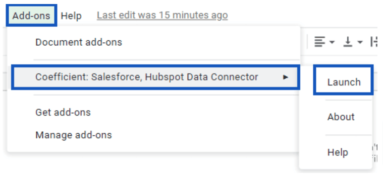
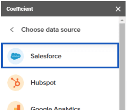
Let’s launch the Coefficient add-on for Google Sheets by clicking the Add-ons tab, expanding the Coefficient tab, and clicking Launch.
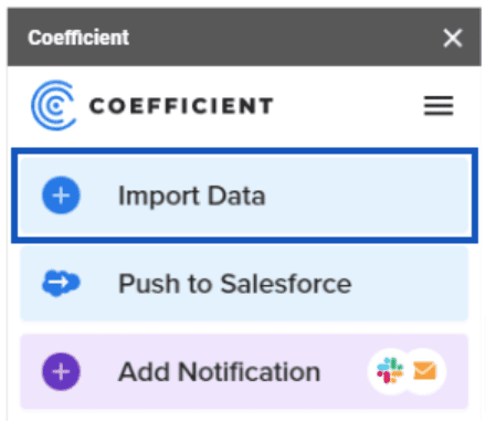
Click Import Data.
Then, choose Salesforce.
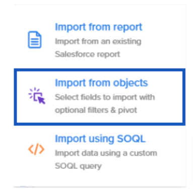
You can choose to:
- Import from report
- Import from objects
- Import using SOQL
Choose Import from objects this time.
NOTE: If you already have a report set up with all your data, save yourself TONS of time by selecting the Import from report option. You can also use this option if this is a bulk update you expect to do often.
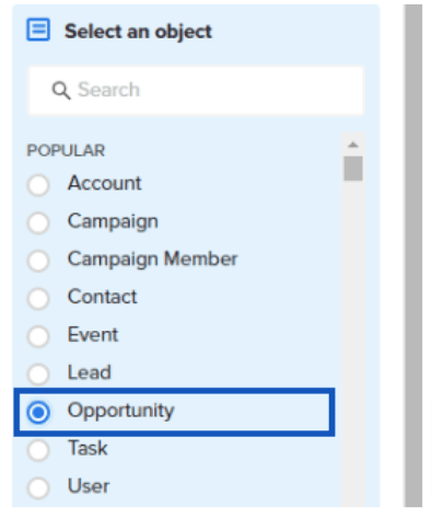
You should now see the radio selections for all objects in the system. If this is a large org, you may want to use the search box at the top to find objects quickly.
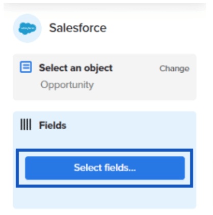
Then, select Opportunity (which should be conveniently near the top).
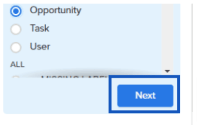
Click Next at the bottom of the sidebar.
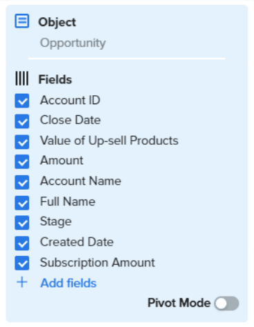
Next, let’s start pulling in fields into our dataset. Click Select fields…
Choose the fields listed for the first import above.
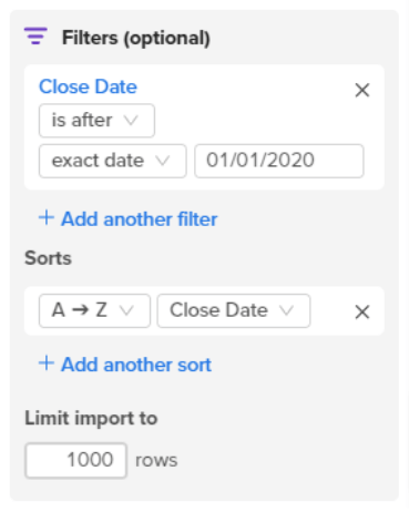
We’re looking for closed sales in the last six months, so choose our starting date (in this case, we’ll use a close date of 01/01/2020:
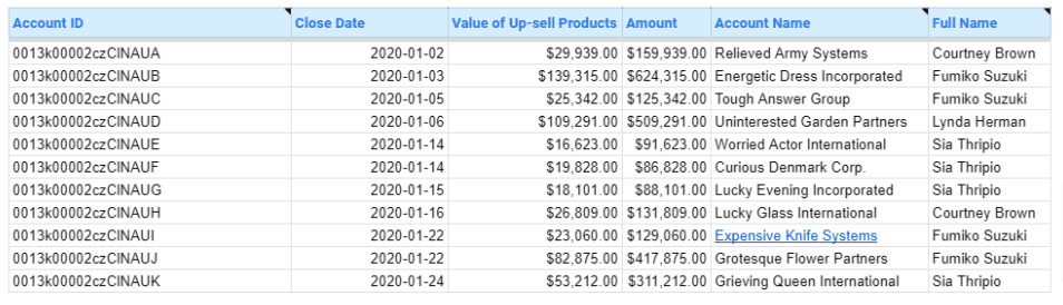
This should give you an export that looks something like this:
Total Value of Opportunities Closed Last Quarter
Getting the total value of Opportunities closed last quarter is pretty simple in Google Sheets.
Highlight the whole imported table (select a cell in the table and hit CTRL + A on Windows, or CMD + A on Mac).
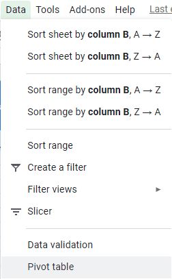
Click Data, then Pivot Table.
Note: You can also use the Pivot Table import in Coefficient to skip this step in many circumstances.
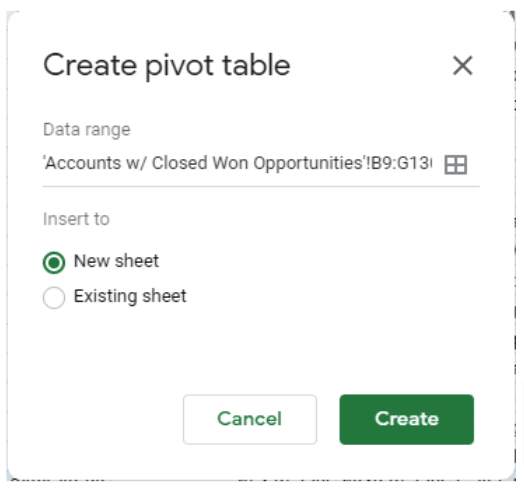
Let’s go ahead and insert this first pivot table into a new sheet.
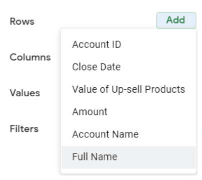
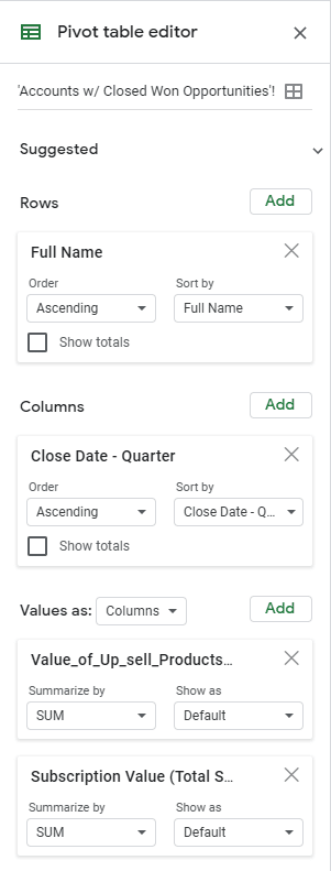
Next, choose Full Name (Full Name of Opportunity Owner) for the rows section on the Pivot Table Editor since we want to analyze our sales managers’ performance.
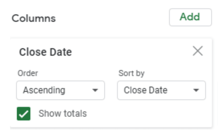
Next, choose Close Date for columns to view the sales manager performance over time.
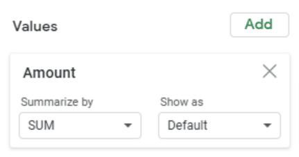
Set Values to reflect the Opportunity Amount.
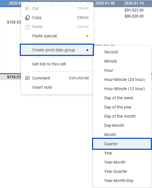
The pivot table will look a little empty because our Close Dates aren’t grouped.
To group our Close Dates, right-click one of the dates across the top, and choose Create pivot date group, then Quarter.
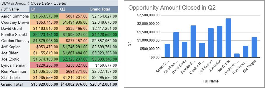
Our Pivot Table now looks like this:
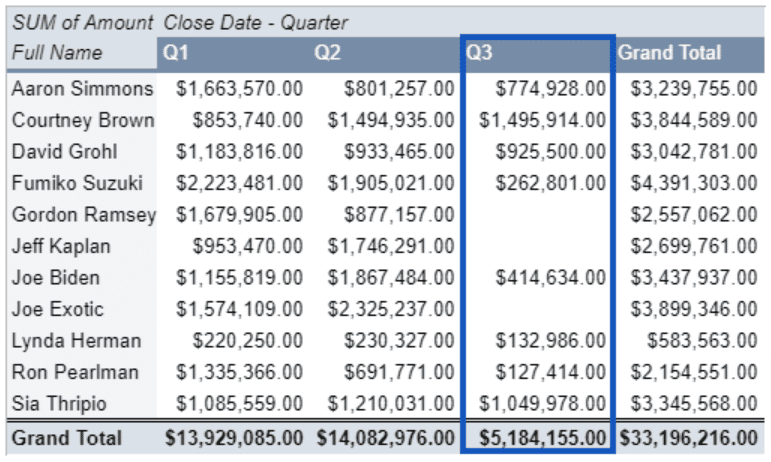
Notice that Q3 looks a little low compared to the other data. That’s because our most recent data takes us through the end of July. We can filter that out since we’re only interested in the completed quarters.
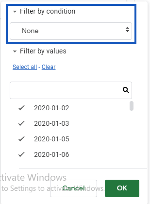
Add a filter on Close Date.
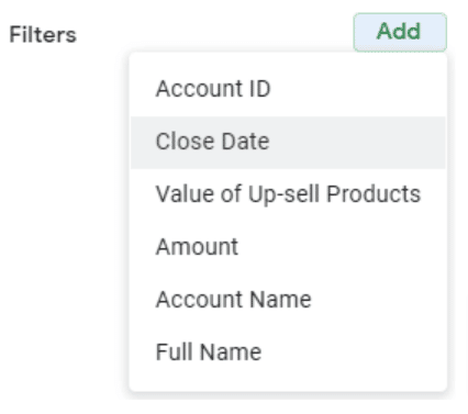
You should now have an option for filtering Close Date with the Status displaying Showing all items.

Click that filter, and then open Filter by condition.
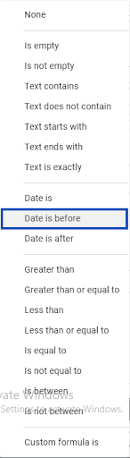
Click the filter condition, then select Date is before.
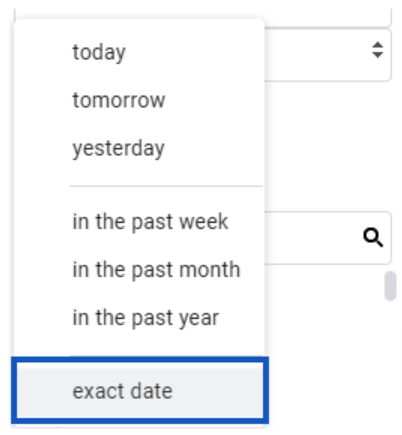
A new field will pop up for the date. Click it to change today to exact date.
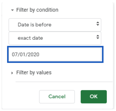
In this example, we want to end this particular chart at 07/01/2020 (or 01/07/2020 if you’re using a non-US format), which is the first day of Q3.
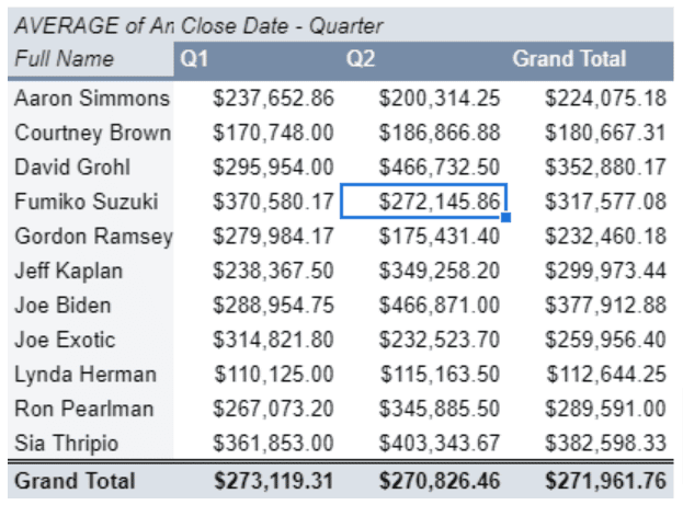
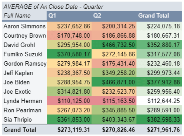
You’ll get a pivot table with Q1 and Q2’s opportunity volumes by rep.
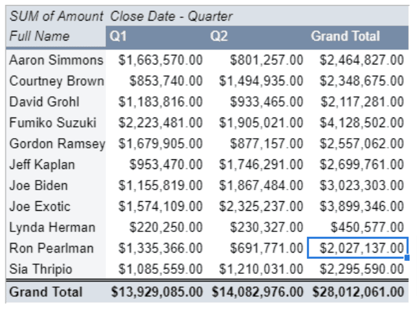
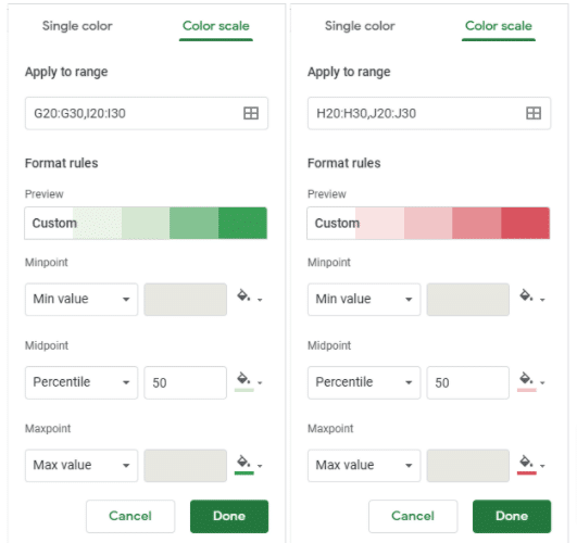
To make things a bit clearer, apply some conditional formatting to make our good performances stand out. Select the amounts under the Q1 header.
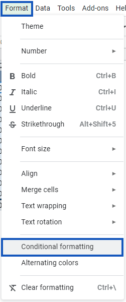
Click Format, then Conditional Formatting.
Open the Color scale tab.
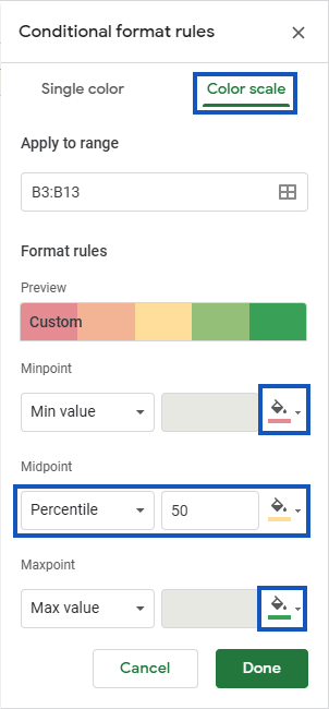
In our example, we used a light red for the lower bound (min value), light yellow for the midpoint, and medium green for the upper bound.
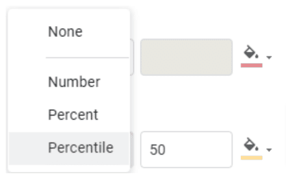
Change the midpoint from None to Percentile and update the color. This helps prevent getting a lot of ugly color bleeding.
You should now see the top performers over Q1 and Q2.
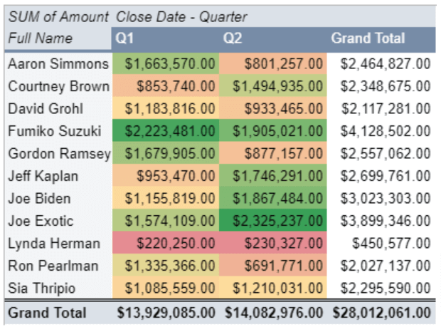
Note: Separately format the Q1 and Q2 amounts because if there’s a significant difference between those quarters in total, it can cause the previous quarter to look worse since the highlighting uses the better quarter’s values to determine its midpoint.
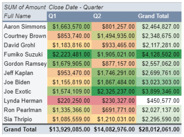
Repeat the same process to highlight the Grand Total column. We used very light green for the 50th percentile and white for the lower bound in this example.
Lynda’s results were significantly worse than the rest, and you can assign colors this way to avoid causing the highlighting to be heavily skewed toward the dark green.
You could also address this by raising the percentile from 50th to, let’s say, 75th–80th.
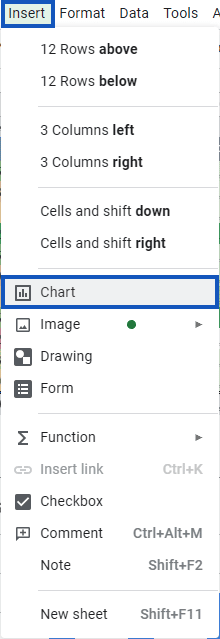
Add a bar graph to put the numbers in perspective and polish things off.
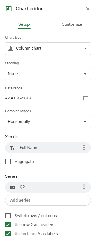
Highlight the Full Name column and Column 2 (you can select Full Name through Q2 and remove the Q1 series). Click Insert, then Chart.
Remove that Q1 Series by clicking the three dots next to it and select Remove.
When you’re done, you’ll get a bar graph that looks like this:
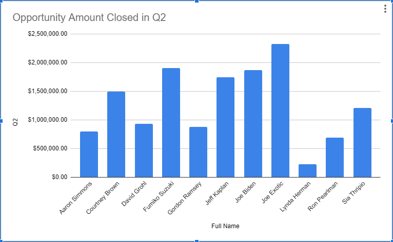
Move it around, resize it however you like, and rename the chart.
Average Value (and Total Number) of Opportunities Closed Last Quarter (By Rep)
We can repeat a lot of the work we did for the last chart for our average Opportunity Values.
Head back to the sheet where we imported our data. Click Data>Pivot Table again. This time, choose Existing Sheet and select the sheet you created the last Pivot Table on.
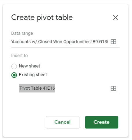
Select your preferred location. Remember that it will build out that pivot table down and to the right of the cell you selected.
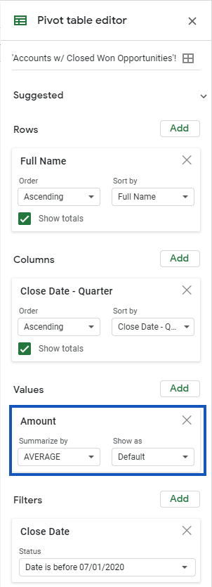
We’ll repeat many of the same settings from last time, except instead of SUM in the values column, use AVERAGE.

Stop exporting data manually. Sync data from your business systems into Google Sheets or Excel with Coefficient and set it on a refresh schedule.

You’ll end up with something like this:
Apply some of that conditional highlighting magic that we did last time.
You should already get some clues about the strategies your team may have employed in seeking out customers.
For example, Sia Thripio’s Q1 and Q2 closures showed average results, but her average Closed Opportunity size was pretty high. This can mean that she might have focused on a few big opportunities.
Another aspect to look at is the average size of Joe Exotic’s opportunities, which were fairly modest.
However, the number of his total sales was the second highest over those two quarters, which could mean he probably focused a lot on the number of opportunities to close each quarter.
It doesn’t make much sense to compare the averages in a chart side-by-side, so let’s use that space to get a feel for how many opportunities were closed by each sales manager.
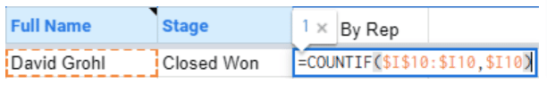
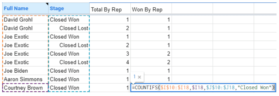
To get to that, we’ll need a little more information. Head back to the import table, and add a new column called Total By Rep. We’re going to add in this formula:
=COUNTIF($I$10:$I10,$I10)
Use the $ signs to lock in your row selections. This allows you to count the number of times you encounter an opportunity closed by the sales rep in the same row.
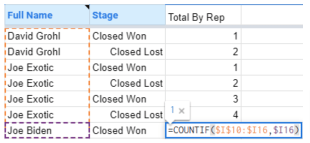
Pull the formula down to apply it to the rest of your dataset, so you go from this:
To this:
Note: If you didn’t arrange your data by Close Date on import, now is a good time to do it so it won’t throw off your charts.
Create another column for Won By Rep. This time, we’ll count the number of times we encounter the Sales Rep, but only if they won the opportunity using this formula.
=COUNTIFS($I$10:$I10,$I10,$J$10:$J10,“Closed Won”)
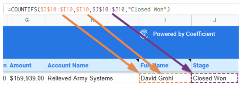
Like what we did with the Total By Rep, drag the formula down the rest of the column, but it will automatically skip any records for lost opportunities.
Create one more column for Lost By Rep. To get this value, subtract the current row in the Won By Rep column from the current row in the Total By Rep column:
=K10–L10
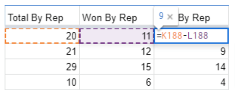
Again, drag that down to the rest of your column’s dataset.
When you’re done, create the pivot table. Ensure you include the three new columns in our dataset.
Follow the previous process, but this time, set Won By Rep and Lost By Rep as values.
Also, make sure you summarize by MAX. Using a different summary will throw off your data table.
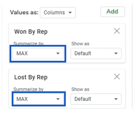
You can apply conditional formatting to turn the Lost columns pink and the Won columns red.
Finally, you’ll get something like this.
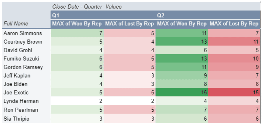
The numbers are cumulative, so if you want them to be per quarter, you’ll need to reset your counts if the Close Date enters the next quarter.
There you have it.
We were spot-on with our assessment of Sia’s focus on high-value opportunities, but it also appears that Fumiko might have quite the eye for good potential customers.
Joe Exotic may have also just barely missed the cut-off for Q1, considering how many opportunities he wound up closing in Q2 versus Q1.
Value of Up-Sells Purchased (By Rep)
Another important thing to understand about our sales managers’ performance is how well they did on getting customers to sign up for up-sell products. These could be additional user licenses, additional API Calls, paid software features, or support packages.
Knowing this can help us understand how well a sales manager marketed these products to customers or if there’s room to gain more revenue out of your clients.
Determining this can vary (depending on the business model), but we’ll look at the value of those add-ons versus the total opportunity size. You can also do this based on license quantities or some other specific metric.
Let’s head right back to that import page and generate another Pivot Table from our data. Drop the new pivot table back on the scorecard page and make the following changes.
Uncheck both Show totals of the Rows and Columns, so we don’t get redundant data since we’ll focus only on the Q2 for now.
First, add two value columns — one for the Subscription Price and the other for the Up-sell Value.
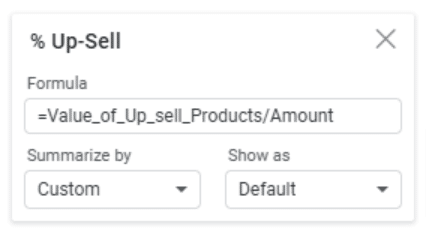
Next, add a formula column for % Up-sell. You can do this by adding a calculated field to the values in the pivot table:
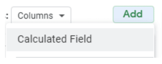
For the formula, use our up-sell value name from our data import page, and divide that from the opportunity amount. Here’s the formula you can use.
=Value_of_Up_sell_Products/Amount
Grab Q1 and Q2 again, and this is what your table will look like.
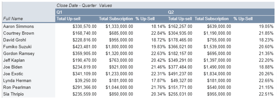
The pivot table now tells us the proportion of sales that come from the basic subscription. You’ll also see the up-sell items and the percentage of the total sale that were up-sell items.
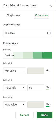
Choose how you want to highlight your data. For instance, you can select a color scheme to exaggerate outliers on the top-end.
In this example, we used blue for Q1 and green for Q2 to differentiate them a little better in the table.
Once you’ve highlighted the values you want to emphasize, you can see your reps’ up-selling performance for the last quarter.
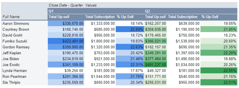
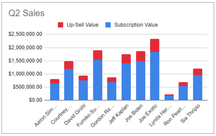
The data shows us who up-sold the most, but looking at the percentage is also critical. If you compare the up-sell value, it aligns with the previous Q2 Sales Amount values, but the percentage tells a different story.
Lynda and Sia made up higher up-sell percentages than anyone else, but Lynda also had the lowest sales volume by far in both quarters.
Note: Consider using the midpoint for comparing against up-sell targets. If your team’s goal is to have 20% up-sells on all new contracts, you can use that as your mid-point to make under- and over-performances stand out.
Now that we have these numbers, we can also update our Q2 Sales bar chart.
Note: The columns are named similarly, so ensure you select the second Total Subscription and Total Up-sell to get Q2’s results.
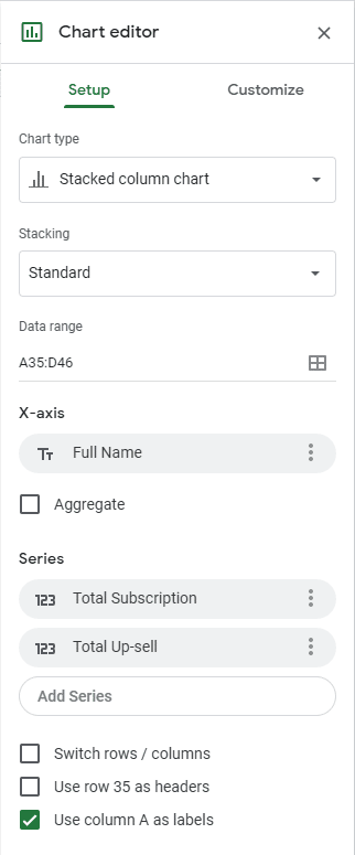
Now that we’ve broken down the Sales amounts, we can visualize it through a stacked column chart, with stacks for the Subscription and the Up-sell values.
Include a couple more pieces of data, such as seeing how Q2’s up-sell performance compares to Q1’s.
Add a formula below each of the two % Up-sell columns.
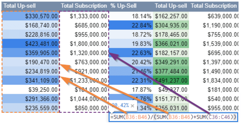
Use this formula:
=SUM(B36:B46)/(SUM(B36:B46)+SUM(C36:C46))
The formula divides the total up-sell by the sum of the up-sell and the subscription cost to find the % up-sell for the whole team.
Repeat that for Q2, and you’ll get something like this:

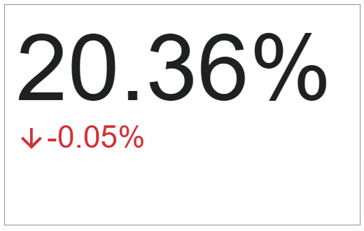
You can add some conditional highlighting here if you wish or highlight both fields by navigating to Insert > Chart > Scorecard Chart.
Set the Q2 Up-sell percentage as the Key Value and the Q1 Up-sell percentage as the Baseline Value.
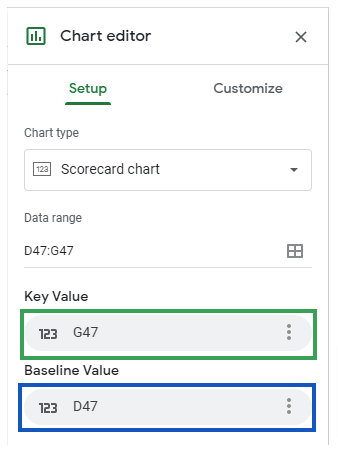
This gives you a nice big indicator of the most recent quarterly performance for the whole team and whether it’s an improvement or a decrease from one quarter to the next.
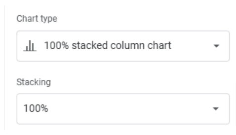
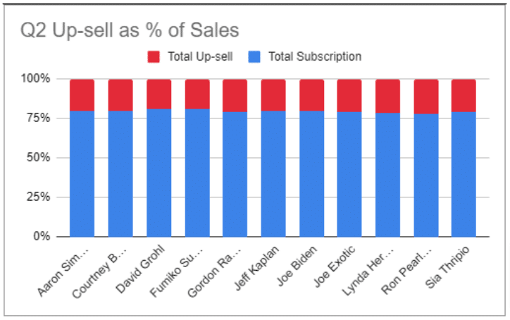
Finally, copy the Q2 Sales chart we created earlier and paste it onto the same sheet where it’s easy to view or visually make sense of. Change the new chart’s type to the 100% stacked column chart.
You’ll get a nice comparative visual showing the reps’ up-selling products performance.
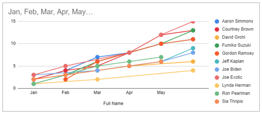
Subscription Growth Last Six Months (By Rep)
The final metric we’ll cover is the number of new subscriptions generated by our sales reps over the last six months.
Let’s go back to the data import page to create one last Pivot Table. Let’s follow what we did in the previous steps, but we’ll use MAX of Won By Rep.
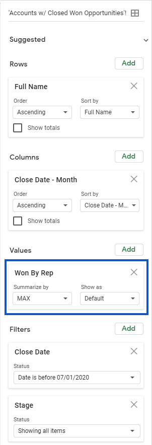
To avoid confusion, since we’re using MAX again to get our cumulative amounts, disable the Show Totals again.
Add some conditional highlighting to your table data once, which gives us something like this:
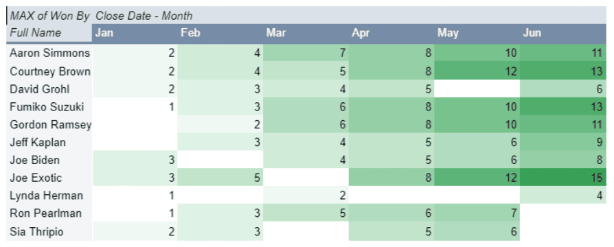
The table tells us the cumulative number of closed sales for each of the last six months. The blanks indicate that no sales were made during that month.
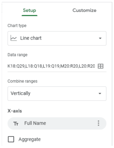
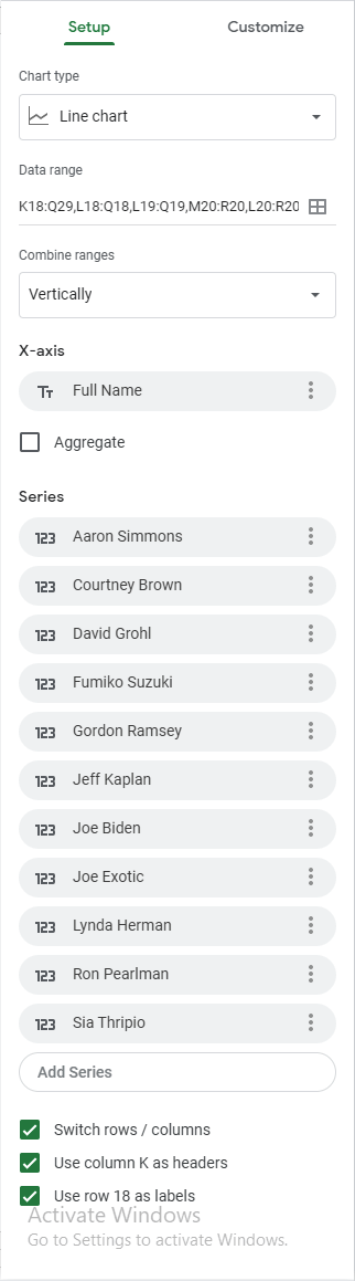
To chart this out, select your Pivot Table and go to Insert > Chart > Line chart. If it doesn’t look like the configuration below, update it to match using these options:
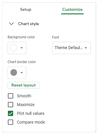
Also, go to the Customize tab, check the Plot null values checkbox, and prevent gaps between our data points where a rep may not have made a sale.
The final chart should look like this:
Go over your chart titles, column labels, and anything else in your pivot tables that might be confusing. Add headers to your dashboard too, and group your datasets logically.
Here’s the final look of all your sales rep scorecard and report in Google Sheets.
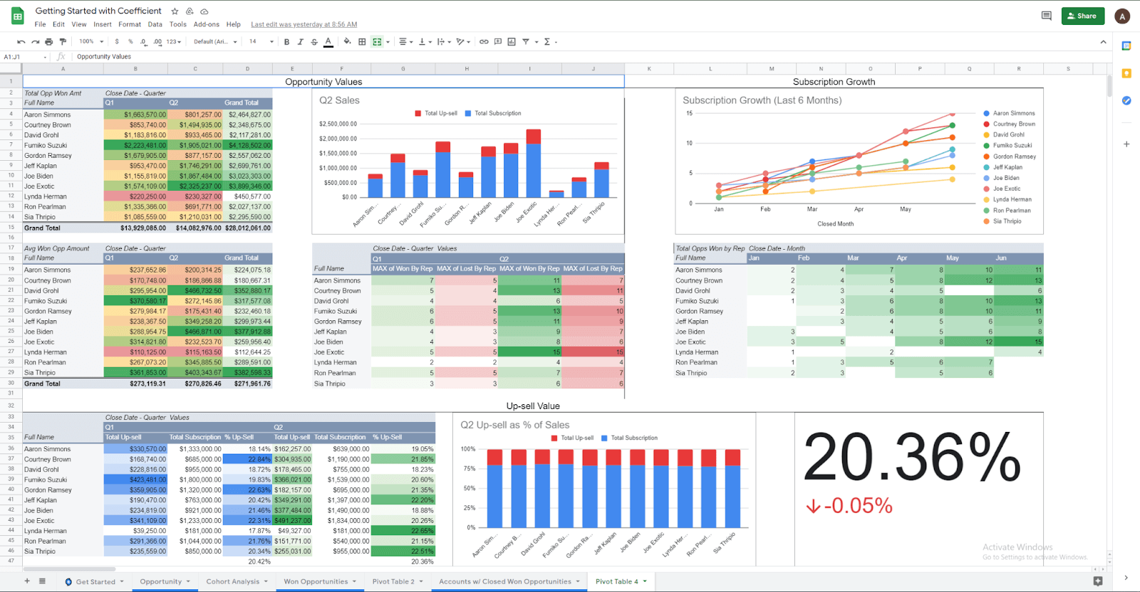
We have a comprehensive scorecard with information on both individual and group performances over the last first and second quarters.
Don’t stop exploring here. Depending on your business and your goals, you may want to go deeper to uncover data, such as the points in the sales process where your potential customers drop out.
You can create more reports and perform analyses in Google Sheets with your Salesforce data. Additionally, with Coefficient.io, getting all that data into Google Sheets is quick and easy with a couple of clicks.
Build your sales rep scorecard in Google Sheets
Now that you know how to create your sales rep scorecards using Google Sheets, it’s time to take action.
With the spreadsheet formulas, functions, methods, and tools shared in this guide, creating a comprehensive sales rep scorecard becomes a straightforward process.
Your team’s sales scorecard can provide relevant data and visual representations that refine your reps’ schedules and tasks to help them perform better.
Additionally, the Coefficient app makes the creation of the sales rep scorecard in Google Sheets quicker, easier, and automated once everything is set up.
It lets you fetch your data from your CRM or other data sources in a few clicks and schedule auto-refresh. This ensures you always work with only the updated data you need without repeating the data importing process.
Try Coefficient for free today!


