In an earlier post, we discussed how to produce a dashboard or report using Google Sheets. Using Google Sheets (or any other spreadsheet software) is pretty useful but sometimes leadership doesn’t want to look at the spreadsheet-based report and would rather have it in a visual dashboard.
There are good reasons for this too:
- They help turn your data into informative and easy-to-read dashboards.
- It can be easier to communicate insights with your team.
Many companies and individuals stick to the simpler forms of the spreadsheet. But when changes are frequent in the layout of the report and there is a lot of data available to be analyzed and displayed, we revert to solutions like Power BI from MS or Google Data Studio.
What is Google Data Studio?
Google Data Studio is a “free” tool that turns your data into informative, easy to read and share files, and into customizable formats. For this tutorial, we will demonstrate using Google Studio, along with the plugin Coefficient.io (for Google Sheets) to fetch data from various resources.
The Google Data Studio is accessible at https://datastudio.google.com.
The user can log in using their Gmail account.
Building a Dashboard Report
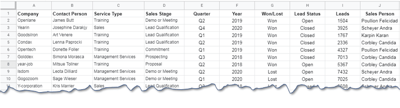
Let’s analyze the same sales data that we did in an earlier post to get a comparison of how easy it is to set up reports with Google Data Studio. The first step to creating any dashboard report is to set up a data source.
Once we log in, it gives us the option to set up the report as well as the data source.
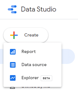
Filename: Building a World-Class Dashboard with Google Data Studio–01–Data Studio setup options.
Alt-text: The options to set up your Data Studio Report, Data source, and Explorer.
Caption: Select your desired option to start building your dashboard.
Setting up a Data Source (Google Sheets)
Google Data Studio provides a variety of options to manage data for the report. In this guide, we will use Google Sheets. With Google Sheets, we can use Coefficient.io to import data from external platforms, such as Salesforce, HubSpot, Google Analytics, MySQL, Redshift, PostgreSQL, Snowflake, Looker, Mailchimp, Google Sheets, and CSV files, among others.
The screenshot below shows the Google Sheet that we set up earlier through the Coefficient.io plugin to get data.
Once the sheet is ready, we can add the data to our report by clicking Report then Add data.
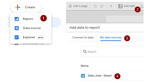
The user needs to click Add and confirm that he/she wants to add a data source.
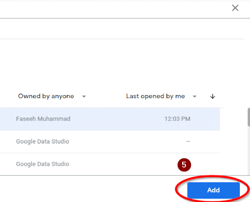
This will direct us to the Blank Report Canvas.
Adding Data to Report
Click Add to Report to insert a table. From there, you can start modifying based on your needs.
Let’s assume that we want to see the following tables in the report:
- Total number of deals that are won or lost by the company for a given year
- Deals at various stages within a sales pipeline
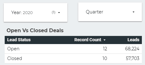
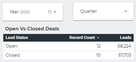
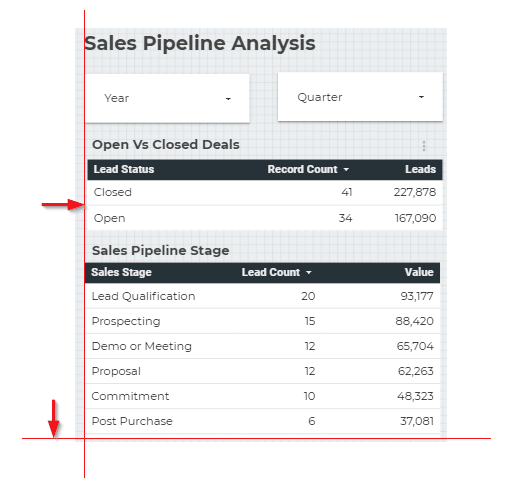
Total Number of Deals for a Given Year
We have the following table inserted in the report. We will modify the data that is displayed in the report from the option given on the right side of the report canvas.
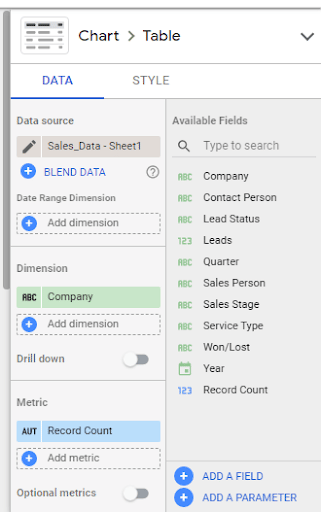
To display the data, go to the left side and choose:
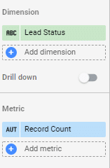
- Lead Status in Dimension
- Record Count in Metric
This gives us the following table.
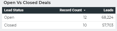
For the Year 2020, we have 12 deals open for the company and 10 deals closed. A total of $68,224 is still to be received and $57,703 is already gained from clients. We can see that the company has most of its deals closed (without selecting any filter for a year and/or quarter).
We can also select quarter and further drill down the table for this type of analysis.
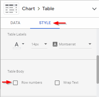
To further format the table, we can hide the row numbers and modify the font size to 14 for better display.
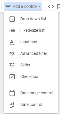
Now that we have the table in place, we need to add a drop-down for “Year” and “Quarter” so that the user can drill down the data. In order to add these two options, we will use Toolbar > Add a Control.
Add a Control gives us options like:
- Drop-Down list
- Fixed-Size list
- Input box
- Advanced filter
- Slider
- Checkbox
- Date range control
- Data control
For now, we will be using the Drop-Down list only.
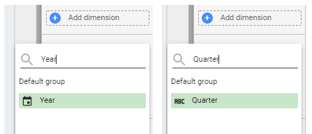
When the drop-down is placed, select it and on the left panel, select “Year” as a Control Field. Repeat the same step when adding “Quarter.”
After this, we can “Preview” the report to see the filters in action.
The above figure shows the preview mode of the report that can be filtered Yearly or Quarterly.
Adding a Sales Pipeline Stage Table
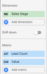
In order to add the sales pipeline table, we will simply copy the lead status table (that is the easiest way) and will edit the fields in it. Google Data Studio provides a handy alignment feature that appears when we arrange elements, hence making our work easy.
Once the table is copied, go to the left side and adjust:
- Sales Stage in Dimension
- Lead Count and Value in Metric
We will also hide the pagination and the row numbers of the table. We already know that our table will not span over more than one page so these are not required here.
To hide the pagination and the row numbers, just uncheck the option on the left pane under the Style tab.
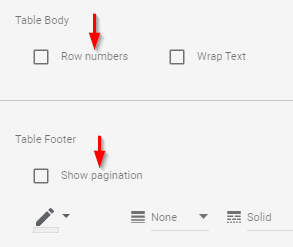
A few other formatting options are also available like wrap text and line formatting options for footers (line color, width, and style), but let’s keep the default options for this table.
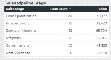
The final table will look like below:
The alignment lines that appear in the table look like the lines below. They appear as you move the table from one position to another.
Adding Performance of a Salesperson/Salesperson Leads and Dollar Value
The next table that we will add is the salesperson’s contribution to the business. We will copy the last table and edit the fields to display the results in a new table. The final table is shown in the following picture:
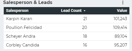
The performance of all four salespeople along with the deals that they have handled with their dollar value is now displayed.
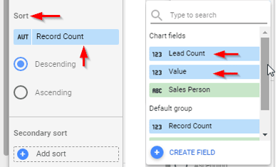
In the current table, we have the values sorted for the lead count. One may desire to sort it based on dollar value. In order to sort the values based on any metric, go to the left panel and select from any metric available in the table. For this case, the Lead Count and the Value are present, and they can be sorted in ascending and descending orders.
A variation of the table can also be produced with values sorted for dollar value instead of lead count.
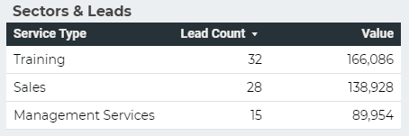
In a similar way, we can produce a sector breakdown of the business.
Inserting Charts – Number of Leads over Quarter and Year Data
No dashboard or report is complete without the presence of charts. Google Data Studio provides us with a variety of charts that can be added to the reports. In order to add a chart, the user needs to go to Insert Menu where more than 10 chart types are available for use.

Stop exporting data manually. Sync data from your business systems into Google Sheets or Excel with Coefficient and set it on a refresh schedule.

For this case, we will be using a simple bar chart as it is the easiest one to read. In this chart, we will be plotting the number of leads on the Y-axis and the time on the X-axis.
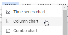
First, insert a Column chart.
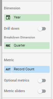
Now we have to configure the chart for the data source and how variables will be displayed. Select the chart and revert to the options displayed on the left side (left pane).
- Variables to be displayed on the Y-axis in the Metric
- Year and Quarter to be displayed on the X-axis in Dimension and in Breakdown Dimension, respectively
The final output on the left pane should be like this:
Once this setup is complete, the following chart is displayed.
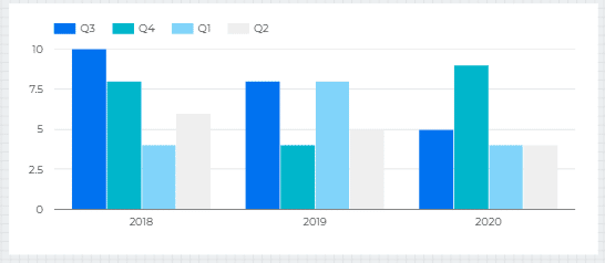
Just like all other tables, this chart can be filtered by year or quarter. Ideally, the user should display the results by quarter so that all three years are displayed and can be compared with each other. But if a user wants to compare performances within two years and two quarters, he/she may do so as well.
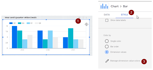
The chart can also be configured based on colors depending on how you want it displayed. Usually, charts use tones of a single color only to look more professional. But the user may also select from the company’s official color scheme.
Select Chart> Style > Color by > Manage dimension value colors to show the relevant options.
The dialogue box for setting color will be displayed.
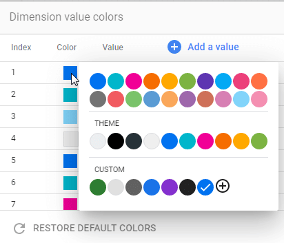
Select colors from a wide variety in the color picker. We can also add new values or restore default colors.
Adding a TreeMap
A tree diagram or a treemap is a management planning tool that shows the order of tasks and subtasks needed to complete an objective. The tree diagram starts with one item that branches into two or more, and so on.
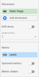
In our report, we are using a tree diagram to show the stages of the sales pipeline. Insert > Treemap to start. Select the variables to be displayed on the treemap from the left pane.
We want the map to display Sales Stage over Lead so that we can see how many leads are at a certain stage. We will keep the Sales Stage in Dimensions and Lead in Metric.
The diagram should look like this:
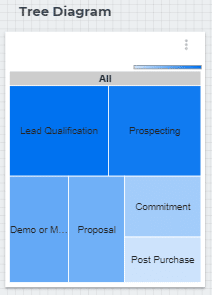
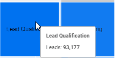
Notice that as the user hovers the cursor over each block, it shows the values (in dollars) for that step.
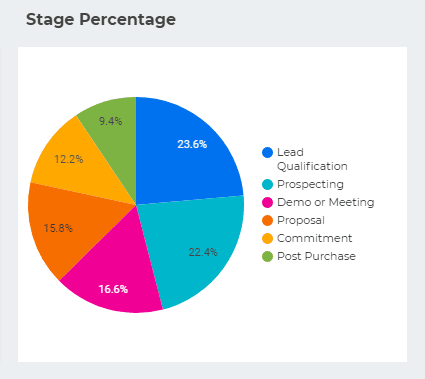
Inserting a Pie Chart
The last element we would like to insert is a Pie Chart showing the breakdown of various stages in terms of percentage. Go to Insert > Pie Chart and adjust the variables. Sales Stage in Dimension and Leads in Metric will give us the following:
Finishing the report
Each part on the pie chart has been given a title using a textbox:
We can also change the font type and size, and there are a few more options to play with.
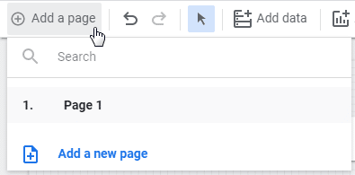
What if we run out of space while creating a report?
A report can be as small as a single table or chart or as large as a booklet published annually. For reports that are shared online, we usually see multiple sheets (if we are sharing spreadsheets). With Google Data Studio, creating reports of more than one page is not a problem.
From the Menu, select Add Page, and a new page will be added to the report for a more detailed analysis.
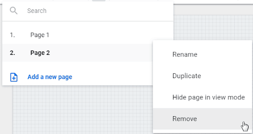
We can delete a page, rename it, or add more pages or hide it in display mode.
Conclusion
It’s possible to create complex reports with spreadsheets but creating great dashboards within google sheets can be tough. Use a reporting tool such as Google Data Studio in conjunction with google sheets to give yourself an advantage.
Coupled with Coefficient, a software that automatically fetches and updates data, you can create your reports in minutes and keep your reports and dashboards up-to-date with live data. This gives you more time to focus on analyzing data and taking action on the meaningful insights you obtained.
Try Coefficient for free today!


