
If you want to obtain insights about your user app engagement, the people who visit your website repeatedly, or why (and when) they lose interest, then you need to conduct a cohort analysis in Google Sheets.
With it, you can analyze how various client groups behave within a specific period, identify patterns, and use those insights to determine problems, design engagement strategies, and satisfy your customers’ needs better, among other things.
This guide covers the steps to creating a cohort analysis in Google Sheets by running it on a small dataset of Opportunities. We’ll group our data based on the first time the customer purchased a product (using the Opportunity Close Date).
What is cohort analysis?
Cohort analysis is a behavioral analytics subset that takes a data selection from a bigger dataset (within a specific period).
Instead of looking at all users within the data as a single unit, cohort analysis splits them into smaller (related) groups based on various attribute types.
In business applications, you can compare cohorts, such as software users sharing a common experience over a particular time frame, or analyze single cohort behavior.
The goal is to identify patterns that will support your business growth hypothesis.
Creating a cohort analysis in Google Sheets can help you uncover the patterns and insights to prove the hypothesis.
While some use cohorts and segments interchangeably, it’s crucial to note that the two are not the same.
A cohort is a subset of a segment, but a common time frame and common event bind users who belong to the same cohort. For instance, the customers who signed up for your service in a particular month.
On the other hand, segments are groups you can create using almost any condition as a basis that doesn’t necessarily have to be an event- and time-based, such as users in a particular demographic.
In a nutshell, you can have a cohort AND segment of new users this month, but cohorts are those who performed the same action at the same time.
Benefits of creating a cohort analysis
Let’s go over some of the advantages of performing a cohort analysis for your business.
Test a hypothesis
Cohort analysis simplifies testing a hypothesis about your marketing and sales performance and outcomes while helping you gain timely and relevant insights.
For instance, setting a hypothesis that specific actions users take on your website, such as using a discount code, will boost the chances of your clients signing up for your free trial.
With this, you can lay out the specific cohorts and compare the results to assess how each cohort responded to the action.
You’ll have a data-based way of comparing and assessing user behavior instead of just guesswork or your hypothesis remaining, well, a theory.
Know the effects of unique behaviors
At times, you won’t get the granular analysis you need when you segment customers based on the date they signed up or purchase your service. This is because segmenting customers this way isn’t specific enough to give you a clear picture of how each one is unique.
By sorting your customers into cohorts based on their app or website behavior, you can get a clearer view of how clients interact with your service or app throughout its lifecycle.
Cohort analysis lets you define these user groups according to the actions they do or don’t take. This can be anything from when their app usage starts to drop off, how they navigate your site, or why and when users abandon their cart and do not complete the purchase.
Improve customer retention
The cohort analysis process is an excellent way to improve customer retention. It helps you dive deep into your customer groups and observe their behaviors that lead to action (or inaction) on your offers.
You can do this by using behavioral and acquisition cohorts, allowing you to measure engagement over time. This makes it easy to see where your customers drop off.
For example, a decrease in your old users’ activity can be masked by impressive new user growth. This can result in concealing the lack of engagement from a small group of people.
With cohort analysis, you’ll better view the product life cycle and the user life cycle. You can also see specific actions over a particular period with acquisition and behavioral cohorts.
A/B or split testing
Many businesses combine A/B testing software with cohort analysis to track a user base and gain more insights.
Cohort analysis allows for split testing since you have control over variables that will affect multiple outcomes at some point, such as place and time.
This means you can learn more from your customers, make better A/B tests, and you’ll get to see them from various angles as you create cohorts in new ways.
When you use both cohort analysis and A/B testing, you’ll gain access to more detailed and accurate information.
Why create a cohort analysis in Google Sheets?
Google Sheets is free and one of the most widely used tools, making it familiar and relatively easy to use.
It allows you to input, store, and organize data and use formulas and functions that streamline your cohort analysis, including your other report and dashboard creation.
Google Sheets also allows for efficient teamwork since users with access to your spreadsheet can contribute data and make edits directly on your file.
Importing, exporting, and syncing volumes of information from various data sources, such as Salesforce, HubSpot, Looker, and other databases and data warehouses, to Google Sheets is also a breeze with the Coefficient application. Need to create a Google Analytics cohort analysis? We’ve got a connector for that, too.
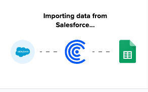
Importing Data
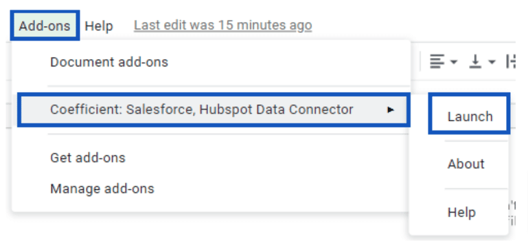
Start by launching the Coefficient add-on for Google Sheets, by clicking the Add-ons tab, expanding the Coefficient tab, and clicking Launch.
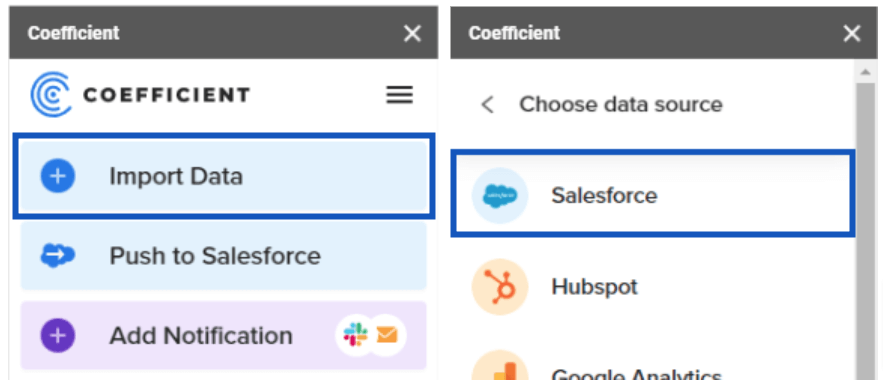
Click Import Data and choose Salesforce.
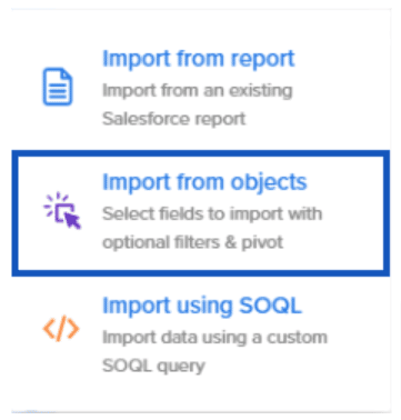
You can either choose to import from a report, objects, or using SOQL, but for this sample cohort analysis Salesforce, select Import from objects.
If you already have a report set up with all your data, you can save yourself TONS of time by selecting the Import from report option. This also works well if this is a bulk update you expect to do often.
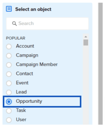
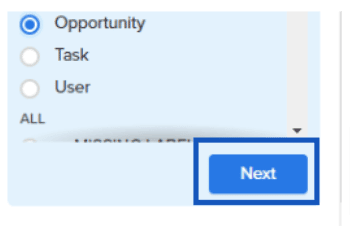
You should now see the radio selections for all objects in the system. If this is a large (Salesforce) organization, use the search box to find objects quickly.
Select Opportunity, which is usually found near the top of the list.
Click Next at the bottom of the sidebar.
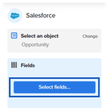
Next, let’s start pulling in fields into our dataset. Click Select fields…
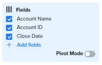
Since we’re trying to group on First Close Date (or the first time someone was a customer) and their recurrent purchases/renewals, let’s use Account ID and Close Date.
However, while you can use Account Name in some instances, if you’re using Person-Accounts or have many accounts, you could run into duplicates. You’re better off using Account IDs instead, and then pull in Account Name as an additional field for more reporting you may do.
If you want to use multiple criteria for your cohorts, such as competing products, regions, platforms, and industries, ensure you include those fields in your export.
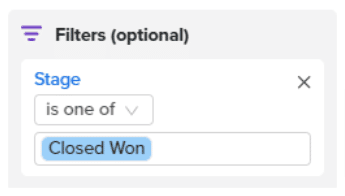
We’re not using Pivot Mode for our import and since we only want Opportunities that have closed and resulted in a sale, add a filter for Opportunities in the Closed Won stage.
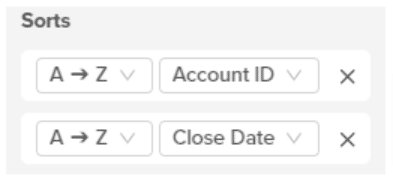
Add your sort criteria to the import, sorting first by Account ID, then by Closed Date. This will make Initial Subscription Month easier to calculate.
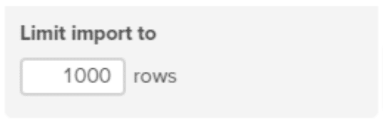
Finally, ensure that your dataset will fit into the Limit Import amount. It defaults to a maximum of 1000, but you can change that limit depending on your business’ size and how far back you’re building your analysis.
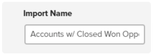
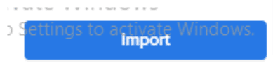
Name your import so you can easily reuse it in the future and click Import.
Importing can take a few seconds to several minutes, depending on the size of your dataset.
You can set the import to re-run on your preferred schedule automatically. This allows for automated data updates, keeping your Google Sheets report periodically up-to-date.
You can choose Not right now if you don’t need the data to refresh automatically.
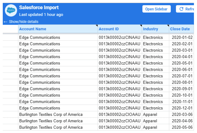
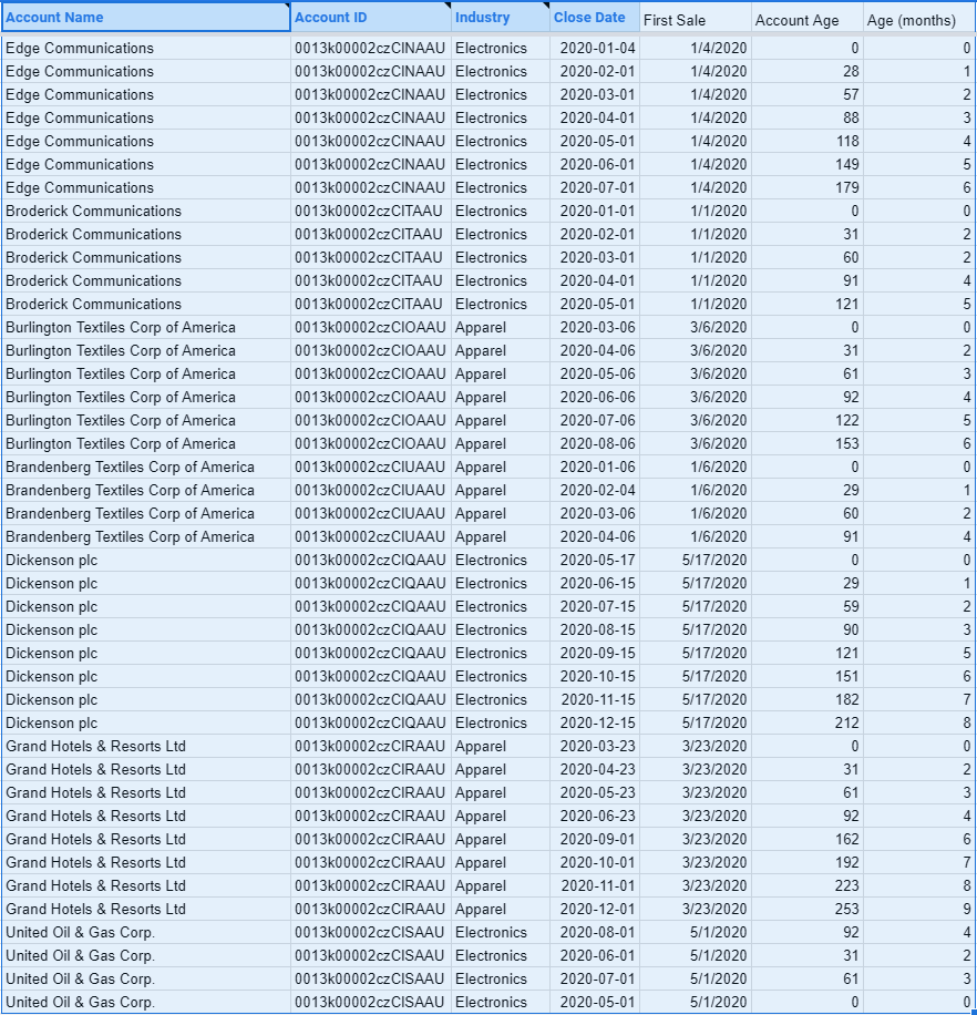
Your loaded data should look like this.
Setup Calculations – Cohorts by First Sale Date
If you don’t want to group your cohorts by the First Sale Date, you can skip this step and move to the next section.
A few quick notes before starting this step:
If you’re trying to report on irregular transactions (e.g., you have more than one transaction in a month, such as subscriptions versus renewals), decide now whether you want that data grouped inside your report or if you want those transactions to compound.
If you see them in your dataset but want to exclude them, it’s best to review your Opportunities for a corresponding classification and add it to the filter.
If that’s not possible, clean up that data in your spreadsheet now, but remove any additional transactions taking place within your chosen date range.
If you’re expecting multiple transactions per month (e.g., selling in bundles of data, transactions, and others of a standard size), expect your dataset to look different in the Pivot tables and graphs.
First Sale Calculation
Create a column for First Sale, and use this formula:
=MINIFS({First Row Close Date}:{Last Row Close Date},{First Row Account ID}:{Last Row Account ID},{Current Row Account ID})
The formula is taking the Minimum Close Date of all Close Dates that have a matching Account
ID.
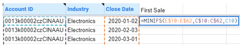
Remember to lock the ranges with a $, so it doesn’t move when you copy it down the table.
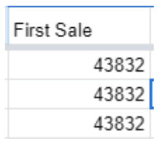
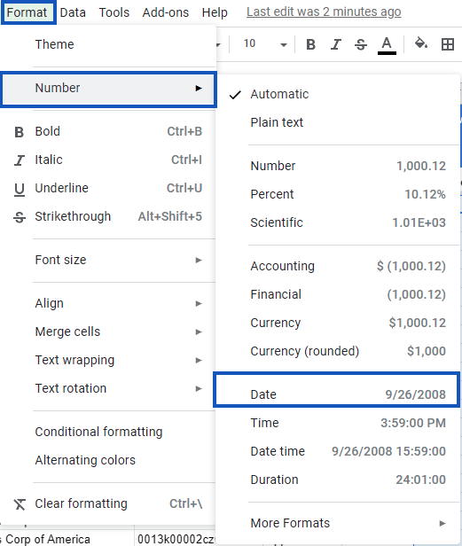
You might notice that you get a weird number when you enter this formula. The MINIFS formula converts the date value to a number, so you’ll need to format those as a Date again.
Account Age Calculation
Calculating the Account Age is pretty simple since you can just subtract the First Sale date from the Close Date using this formula.
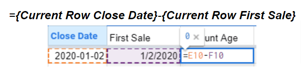
The calculation tells you the number of days between the current transaction and the first transaction posted for the account.
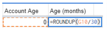
Account Age (Months) Calculation
Assuming your software renewals are done monthly, calculate how old your account is in months using the formula below.

Stop exporting data manually. Sync data from your business systems into Google Sheets or Excel with Coefficient and set it on a refresh schedule.

You can also do this in weeks, quarters, or years, depending on your service’s renewal period.
We’ll use this formula to help us:
=ROUNDUP({Current Row Account Age}/{Grouping Size})
If you’re grouping by quarters, you can do 90 days and 30 days (among others). You can either hard code this or add a field to hold the grouping size if you’re anticipating reviewing the data with various size groupings.
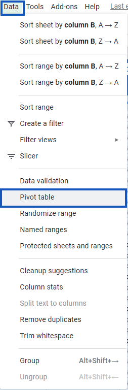
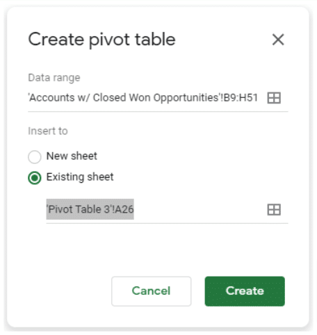
Creating the Pivot Table – First Sale
After following the previous steps, you should have all the information you need to create the Pivot table. Highlight the table.
Click Data, then select Pivot table.
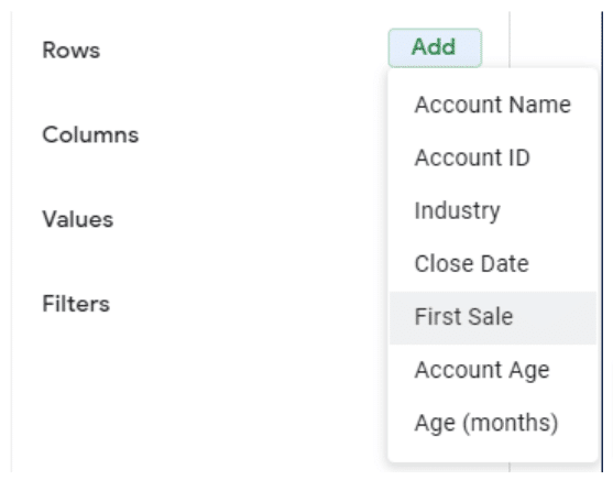
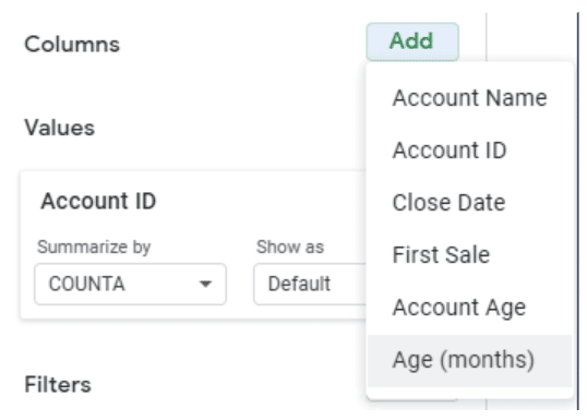
In the Pivot table editor, click Add next to Rows, then select First Sale.
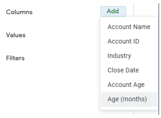
Next, click Add next to Columns, then Age (months).
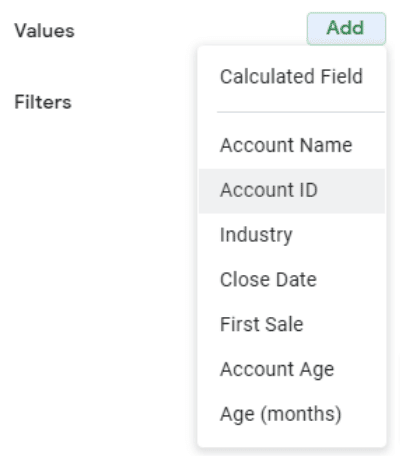
Finally, click Add next to Values, then click Account ID.
Your Pivot table configuration should now look like this.
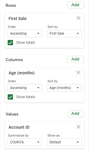
You can also remove the totals if you prefer.
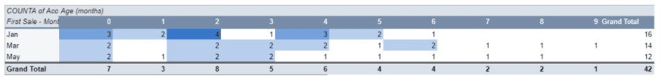
Now you’ll need to do a bit more work because your dataset includes your multiple accounts that started the same month.
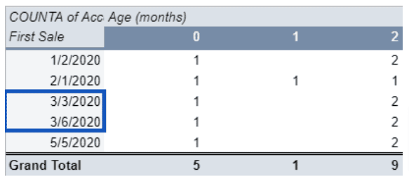
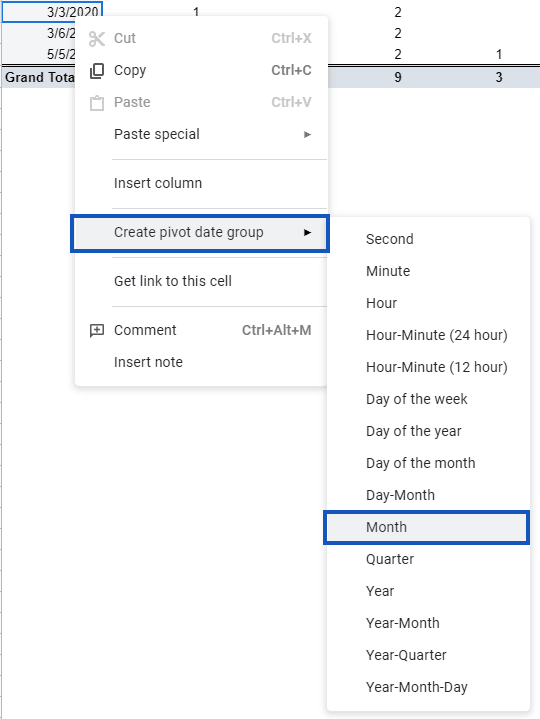
Right-click one of the First Sale columns, then click Create pivot date group, then group by Month (or your preferred reporting period).
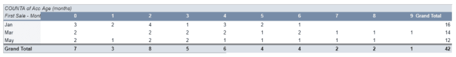
Doing so groups your Pivot table around the First Sale Month, with column 0 indicating the number of subscriptions that began the corresponding month. This also includes the corresponding Age (Month) columns indicating that a renewal transaction took place.
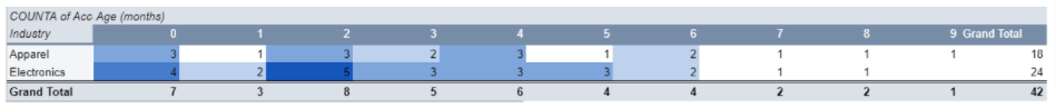
Creating the Pivot Table – Industry
To create the Pivot table report in Google Sheets, repeat the same process as above.
You can put the second Pivot table on the same sheet as the other Pivot table, but you’re welcome to use a new sheet.
Click Create.
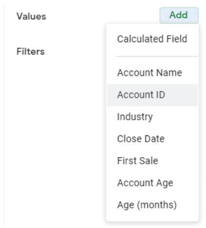
Let’s use Age (months) again for the Columns.
Choose Industry for Rows.
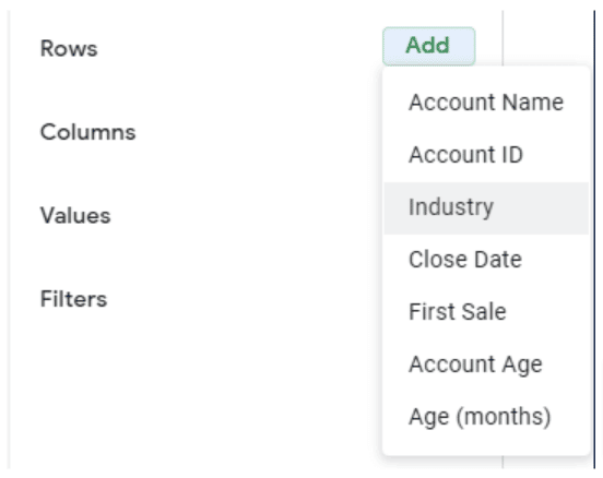
We’ll use Account ID under Values.
Visualizing Data
Below are a few ways to format and create visualizations of your Pivot table data.
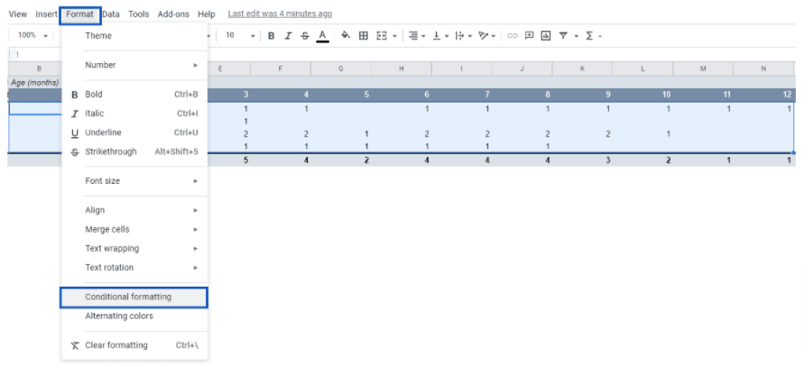
Conditional Highlighting
To help visualize the Pivot table data, set up conditional highlighting.
Select the full range of values in your Account Age pivot, then click Format and Conditional Formatting.
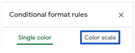
In the Conditional Formatting sidebar, switch to Color scale.
Choose a light color like white for the Min value and a dark one for Max value.
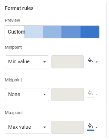
Then click Done.
Repeat the same process for the Industry Pivot table, and you should get something like this:
Line Graphs
Let’s add some line charts to show how these groupings change over time.
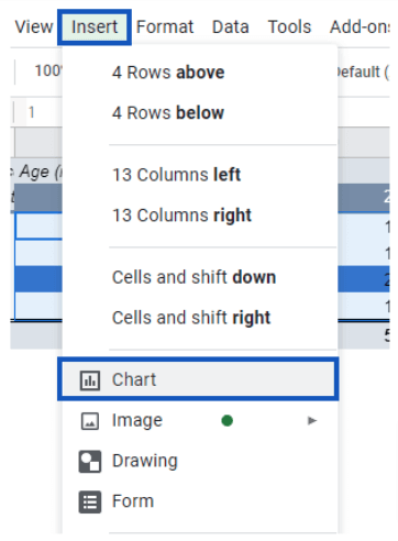
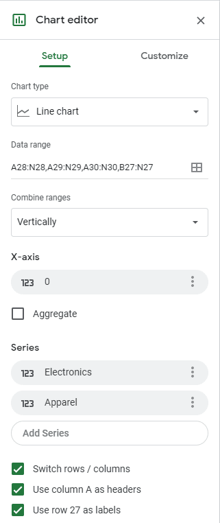
Highlight the First Sale Pivot table and click Insert, then Chart.
Google Sheets is pretty smart, so you should get something like this, which is pretty close to what we want:
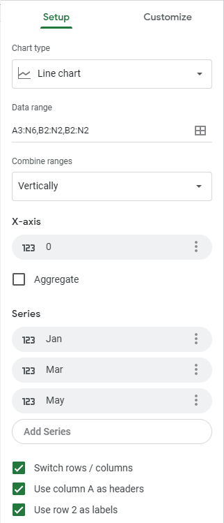
Ensure that the Switch rows/columns and Use column A as headers options are checked. Be sure to define a series for each Month in the First Sale table.
Finally, add the X-axis:
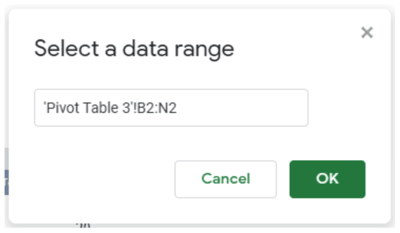
Click Add X-axis, then select the button to define a custom data range.
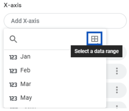
Choose the range that corresponds with your Account Age (months) row in the first Pivot table, then click OK.
Follow the same process for the Industry table.
Once you’re done, you’d get a nice, neat graphic showing how your subscription retention changed over time.
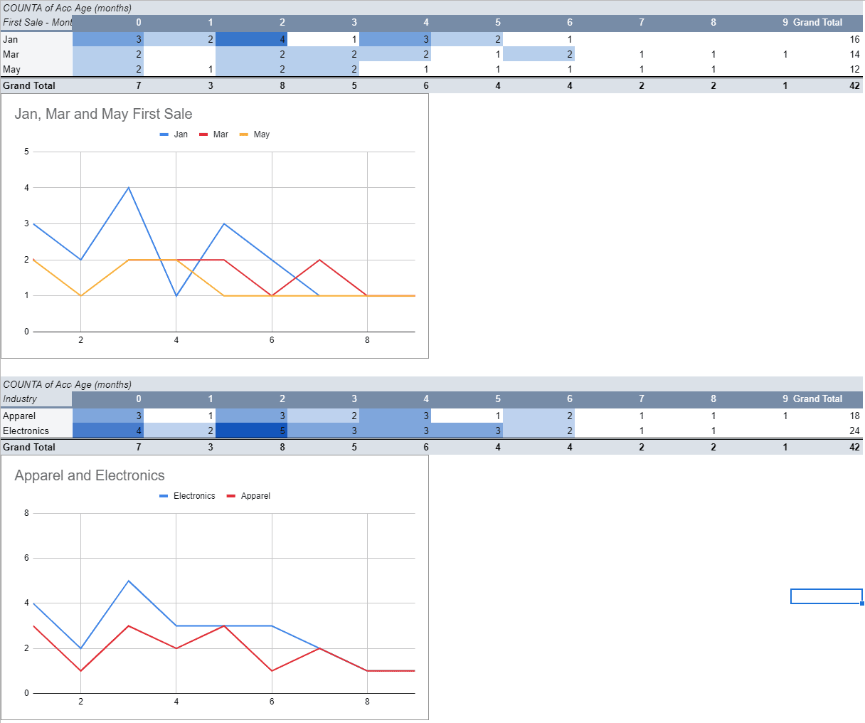
You’ll also get some insights, such as patterns and trends, into the potential cause of increases or decreases in your subscription counts over time.
Build your first cohort analysis in Google Sheets
Performing a cohort analysis of how multiple groups behave within a standard period allows you to uncover valuable trends and insights.
You can then use all that information to drill down on issues, such as high churn rate, to uncover data-driven solutions, and to refine your engagement strategies (among others).
Do clients you acquired the previous month behave differently from the ones who signed up two months ago? Do users who purchased your software at full price respond differently from customers who used a promo or discount?
Building a cohort analysis in Google Sheets will answer these questions, allowing you to discover clear patterns across various customer groups and establish the right strategies.
A cohort analysis is even made easier with Coefficient, a reliable app that instantly connects your data to Google Sheets.
You won’t need to import and export your data manually. You can schedule your information to auto-refresh, so you always have the latest data, keeping your cohort analysis and other reports updated at all times.


